
这个项目是我们作为设计工作室的一次尝试,将身份转变成甲方,并将所思所想不受限制地展示。之所以是一家咖啡店,大抵是因为这满足了我们的私心,我们希望能有一个生活化的场景,将基于艺术和设计的思考带入其中,咖啡刚好是这烟火日常中的必需品,也让空间具有更多变化的可能性,这里也是我们和客户以及市场对话的窗口。
This project marks our attempt as a design studio to transform identity into client and display our thoughts without restriction. The reason why such a project manifests itself as a coffee shop is likely because it satisfies our selfishness. We want a lived-in scenario that would introduce into the project art and design-based thinking. Coffee is a necessity in the rigors of daily life, and it gives the space more possibilities for change. It is also a window for us to communicate with customers and the market as a whole.
▼项目概览, Overview of the project ©Kaji
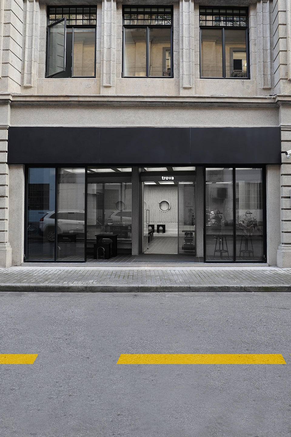
trova所在的历史建筑经过百年里几轮修缮,下三层外立面保留了原有的造型结构,并以水刷石覆盖,至此岁月并没有留下痕迹,如果捕捉片段,还是仿佛身处在那些年代里。从公共停车库到鞋帽批发部,再由凯恩宾馆辗转数十年至今,这里该是遇见过无数的人,留下过数不清的记忆。我们希望延续这段历史,在这栋建筑的一隅中,装下些细腻的文字和绵长的故事。
The historic building where trova is located has undergone several rounds of repairs over the past century, and the lower three-story facade retains its original modeling structure. It remains covered with water brushed stone, protecting it from the wear of time. If you are to observe even a small piece of the project, it appears as if one has returned to an old era.With usage ranging from a public parking garage to a wholesale department store selling shoes and hats, before transitioning to its role as the Kane Hotel and other changes across the decades until now, this building has encountered countless people and left countless memories.We hope to continue this history, and place some delicate words and long stories in a corner of this building.
▼外立面,Facade ©hoii design
不像其他设计项目,需要深入了解客户,探究品牌,揣摩喜好并寻其根由,我们知道自己所想要的结果。因为团队都喜欢粗野主义建筑,这些服务于大众的功能性产物,暴露在外的混凝土不加掩饰的展示自己的沧桑和坚韧,区别于在物质丰富之后以更多流光溢彩去粉饰的美学,他们有直击内心的真挚和创造性。因此我们想在这个不足百平的空间里去呈现这份印记,服务于功能,裸露材质本身,运用简易的几何元素,以及结合现代的设计手法,这个过程自然而顺利。
Unlike other design projects that require an in-depth understanding of the client, brand exploration, identification of preferences and discovery of customer roots, we know exactly what we really want.Because the team has an affinity for brutalist architecture — functional products that serve the public — the exposed concrete unabashedly displays the vicissitudes it has faced and its toughness in adversity. This differs from aesthetics that are decorated with more brilliance and with material abundance, giving this project greater sincerity and creativity that directly hits the heart.Therefore, we want to present such an imprint in this space of less than 100 square meters. We want to serve our function well, and give display to the material itself. The process is natural and smooth, using simple geometric elements and the combining of modern design methods.
▼项目外观,Exterior of the project ©hoii design
我们一直在寻找合适的方式。
结合传统与现代。
平衡艺术与生活。
我们希望能有一个作品,呈现着历史感。
带着对未来的向往,述说对生活的热爱。
于是我们找到了这个答案:trova”。
We always look for a suitable way.
Combining traditional and modern styles.
Balancing art and life.
We hope there is work that presents a sense of history.
We share our love of life with our dreams of future.
And we find the answer: “trova”.
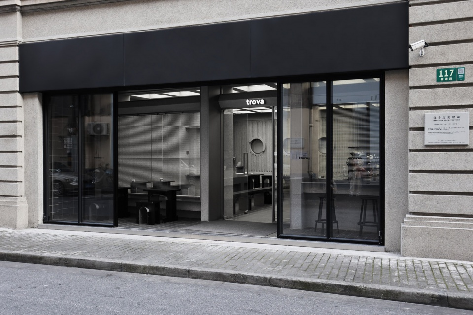
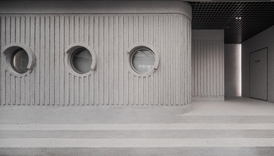
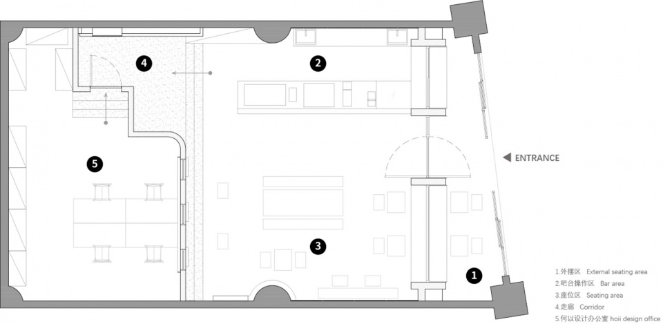
因其历史保护建筑的性质,我们并不能对外立面的门窗进行改动,但我们依旧希望能有一个区域,将这片街道与店铺内的空间相连接,因此我们在入口处划分出外摆区,并重新设计了一个室内门头,不仅重组了原本空间的梯形平面,也让其呈现出老建筑包裹新建筑的意外效果。
Due to the nature of historically protected buildings, we cannot make changes to the doors and windows of the facade. But we retain our desire to have an area which connects the street to the space inside the store. Therefore, we have opted to divide the outside area at the entrance and we have redesigned an interior door. This not only reorganizes the trapezoidal plane of the original space, but also presents the unexpected effects of the old building wrapping the new building.
▼入口及室外座位区,The entrance and external seating area ©hoii design and Kaji

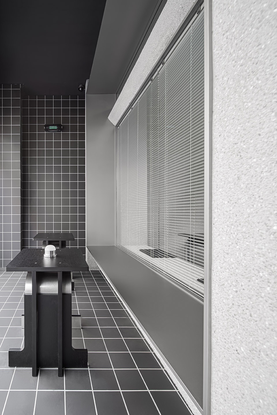
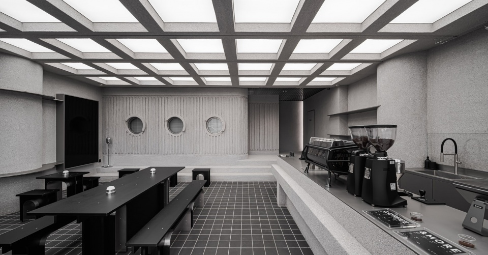
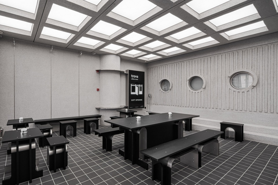
走入店内,顶面与地面的方格元素所形成的透视线条,将视线拉入尽头。咖啡店和办公室由一堵三扇圆窗的墙面相隔,整个办公区像放置于空间中的另一个建筑体,我们希望模糊室内和室外的边界,以此扩大空间内有限的视觉延伸。
Walking into the store, the perspective lines formed by the grid elements on the top and the ground draw the line of sight from beginning to end. The coffee shop and the office are separated by a wall of three round windows, and the entire office area is placed like another architectural body in the space. We want to blur the boundary between indoor and outdoor, and thus expand the space’s limited visual extension.
▼室内座位区,Seating area inside the room ©Kaji
▼操作台,The operating area ©Kaji
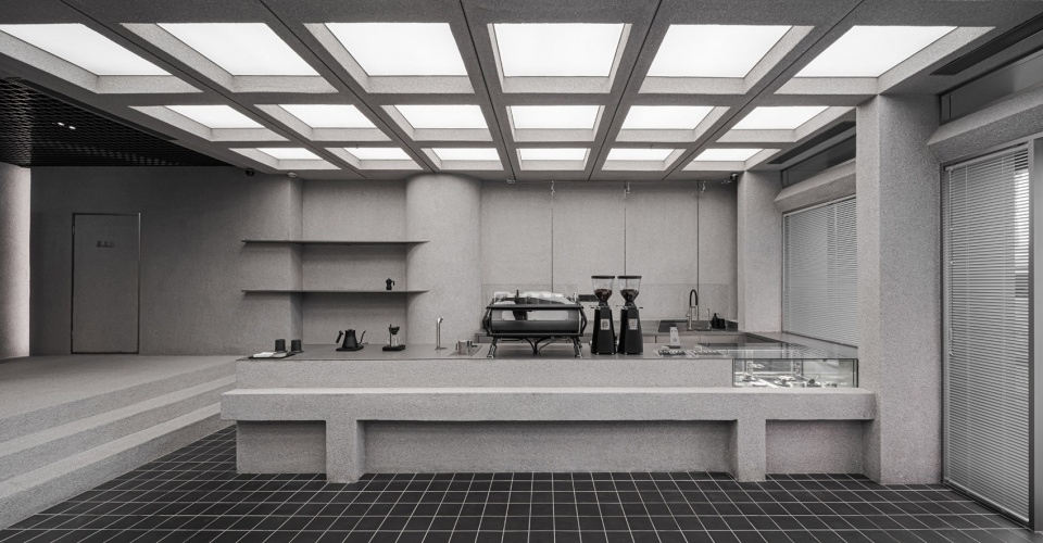
空间内大面积使用了和所处建筑外立面相似的材料:水洗石,这更像是由外而内的延续,在保留其自然朴实的同时,将和纹不锈钢作为室内功能区的主要材料,没有繁复的造型,一切都追寻优先服务功能的原则。
A large area of the space uses materials similar to the facade of the building. Washed stone is used, which appears as if a continuation from the outside in, thus retaining the project’s natural simplicity. At the same time, patterned stainless steel is used as the main material for the interior functional area. There is no complicated modeling, and everything pursues the principle of prioritizing service functions.
▼通过工作室的走廊及墙面近景,Corridor and detailed view of the featured wall ©Kaji
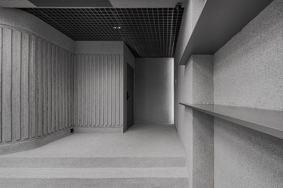
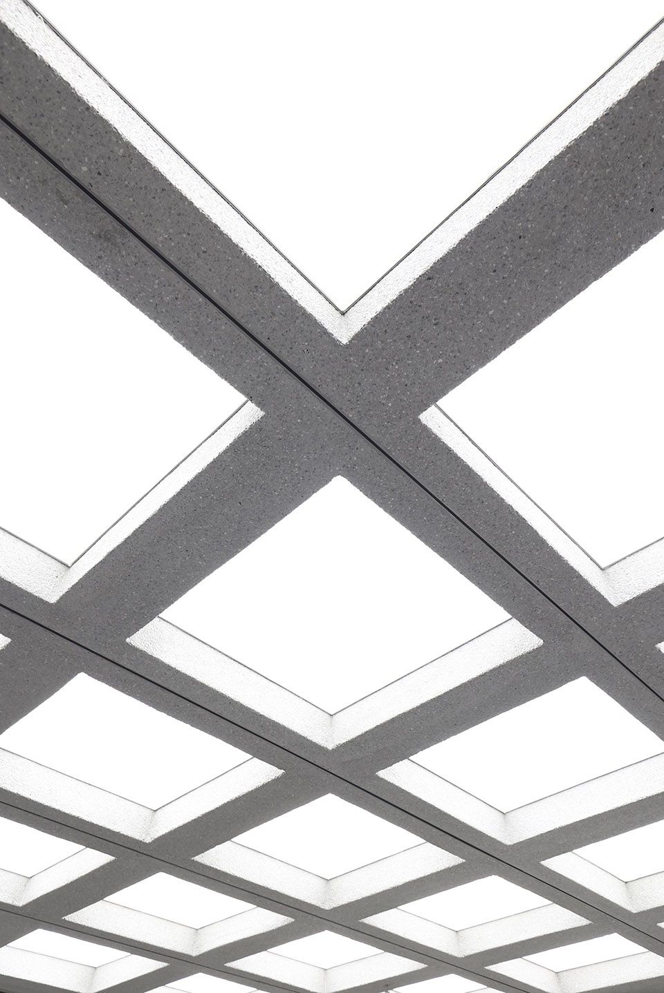
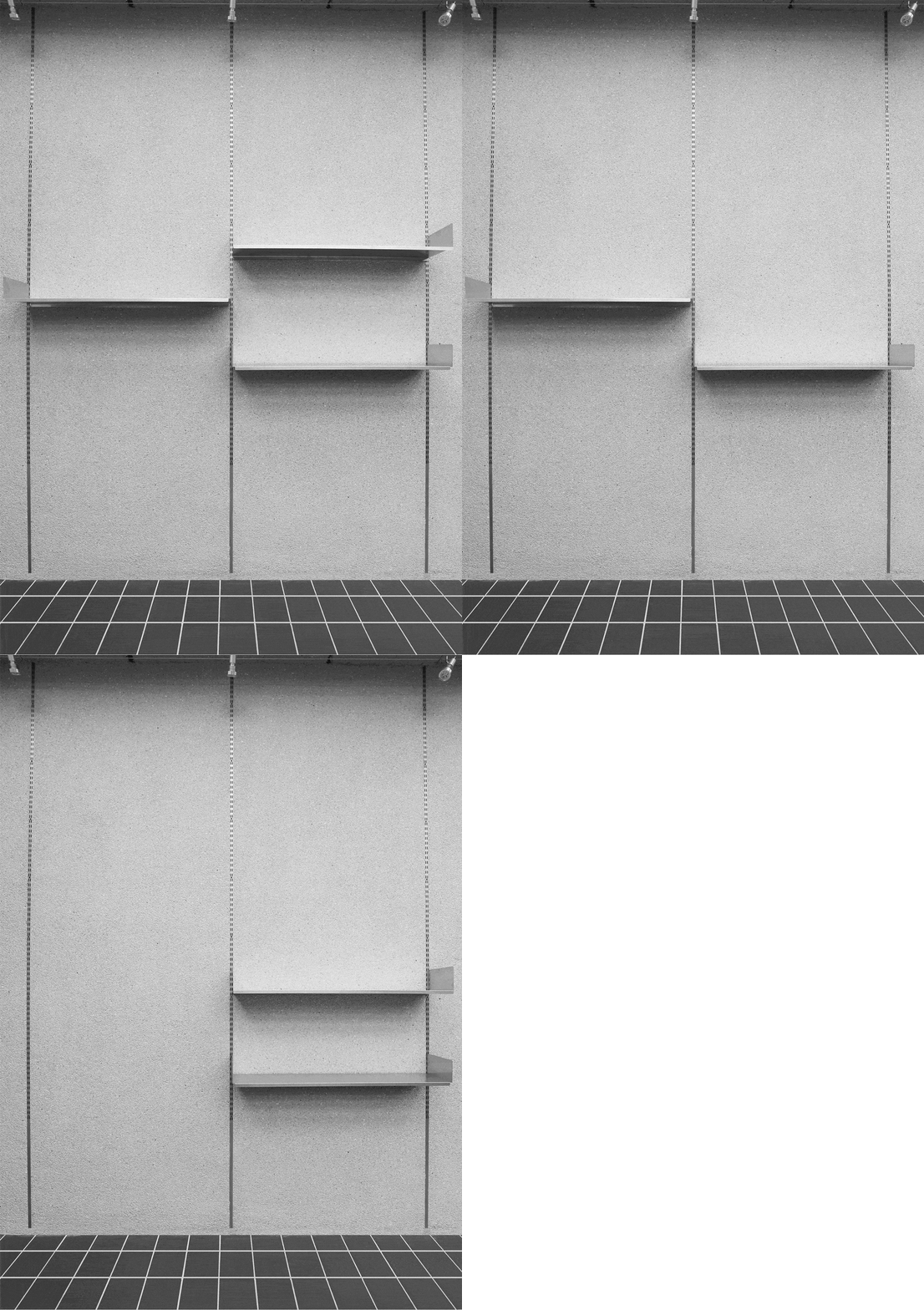
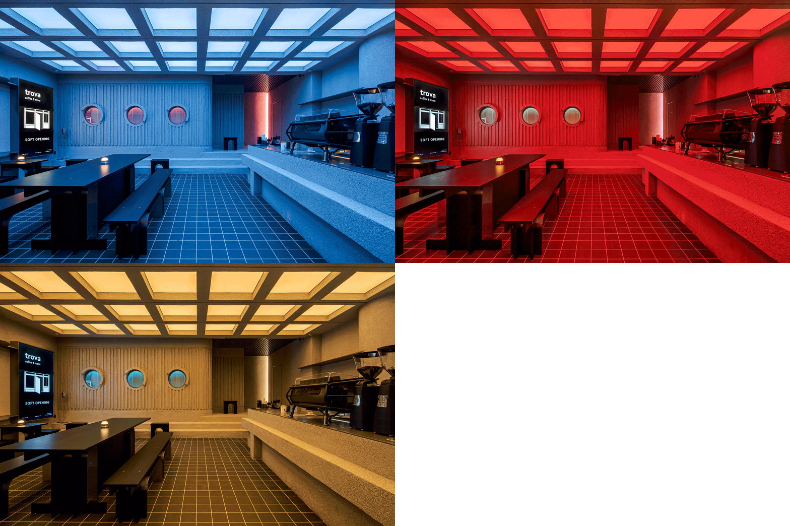
操作台前的凸出造型是供客人临时放置随身物品的;圆窗是基于后方工作室的通风和对外的交流而设计;墙面预埋的a柱和吊顶中内嵌的轨道,是对后期空间适应不同展览形式的考虑;顶面的幕布灯,采用了RGBWW的灯光,可调节色温明暗以及不同颜色,以营造更多样的氛围。
The protruding shape in front of the operating table enables guests to temporarily place their belongings. The round window is designed based on the ventilation of the rear studio. The pre-buried A-pillars on the wall and the tracks embedded in the ceiling enable adaptation of the space to different forms of exhibition. RGBWW lights are used as curtain lights from above, which can adjust the color temperature and use different colors to create a more diverse atmosphere.
▼带有通风功能的圆窗,The round window for ventilation ©Kaji
▼吊顶处的内嵌轨道及墙面预埋的a柱,
The tracks embedded in the ceiling and the pre-buried A-pillars on the wall ©hoii design & Kaji
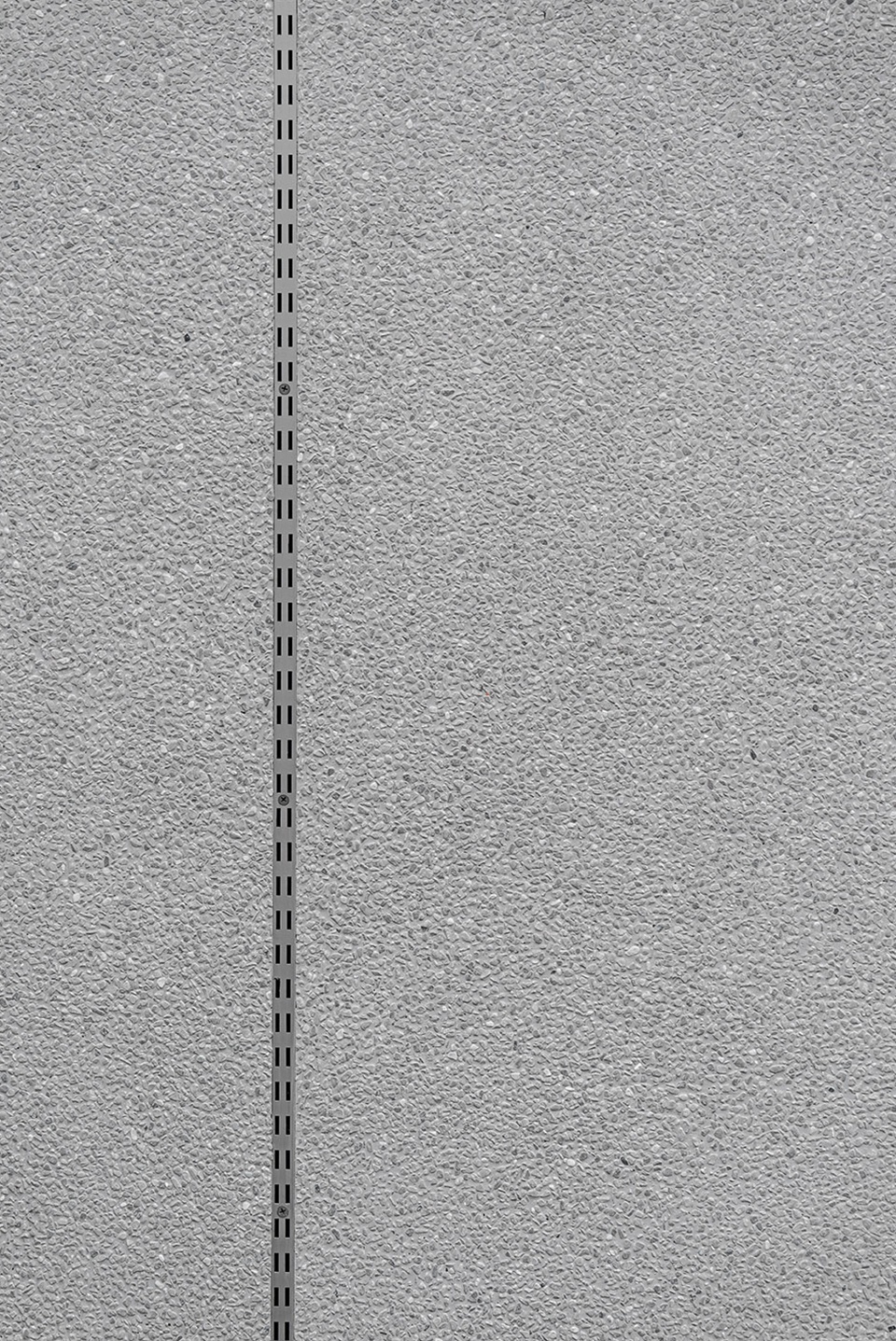
▼墙面层板系统,Wall shelving system ©Kaji
▼室内灯光系统可帮助营造多重氛围,
RGBWW lighting system to help creating a more diverse atmosphere ©Kaji
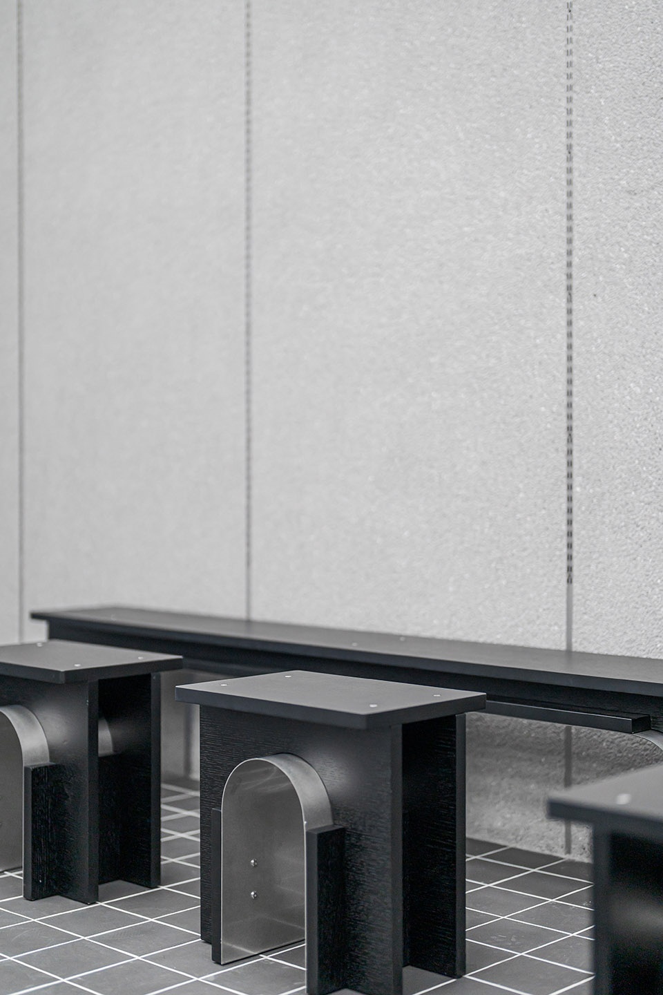
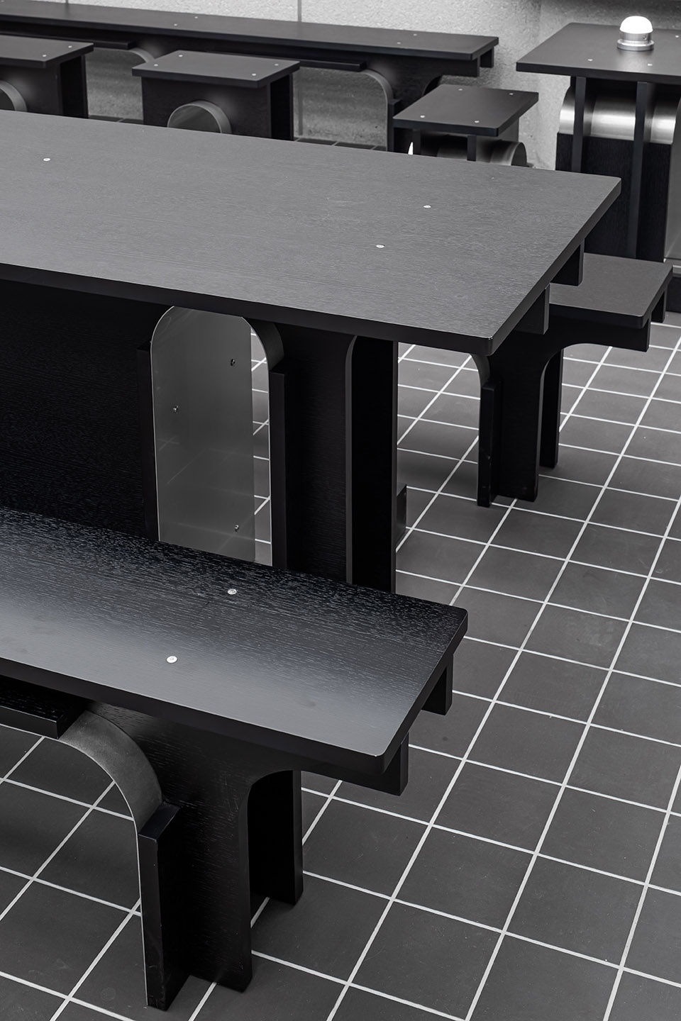
店内的家具由我们团队与设计师班弓合作完成,以传统木质建筑为出发点,在保留传统造型元素的同时,还原建筑本身的结构感和手作感。我们也将其作为trova的第一个展览,希望班弓的作品可以通过咖啡店这样一个生活场景,让顾客们更真实地使用和感受,以及进行购买。这是我们发起这个项目的目的,让更多设计师和艺术家将他们基于日常的思考,通过店内的家具、陈设传递给大家,让艺术趋于寻常,让美学融入生活。
The furniture in the store was completed by our team in cooperation with designer Gong Ban. With a traditional wooden building as the starting point, and in the process of retaining the traditional modeling elements, it restores the structure and the hand-made feel of the building itself. We also use it as trova’s first exhibition, hoping that the works of Gong Ban can be used, felt, and purchased more realistically through a life scene, such as that in a coffee shop. We hope to facilitate a greater number of designers and artists pass on their everyday thinking through the furniture and furnishings in the store, thus making art trends commonplace and powerful aesthetics integrated into everyday life, which is the ultimate purpose behind our initiation of this project.
▼家具近景,Detailed view of the furniture ©Kaji
▼平面图,Floor plan ©Kaji
项目名称:trova咖啡店
项目类型:室内设计
设计方:何以设计/hoii design
项目设计:2021年7月
完成年份:2021年11月
设计团队:朱耀文,周轶哲,官祥
项目地址:上海市黄浦区香港路
建筑面积:115㎡
摄影版权:Kaji
施工方:上海珅辰建筑装饰工程有限公司
灯具供应商:上海永静合电子科技有限公司
客户:trova
材料:定制不锈钢,水洗石,黑色地砖
品牌:trova


