项目背景
Project background
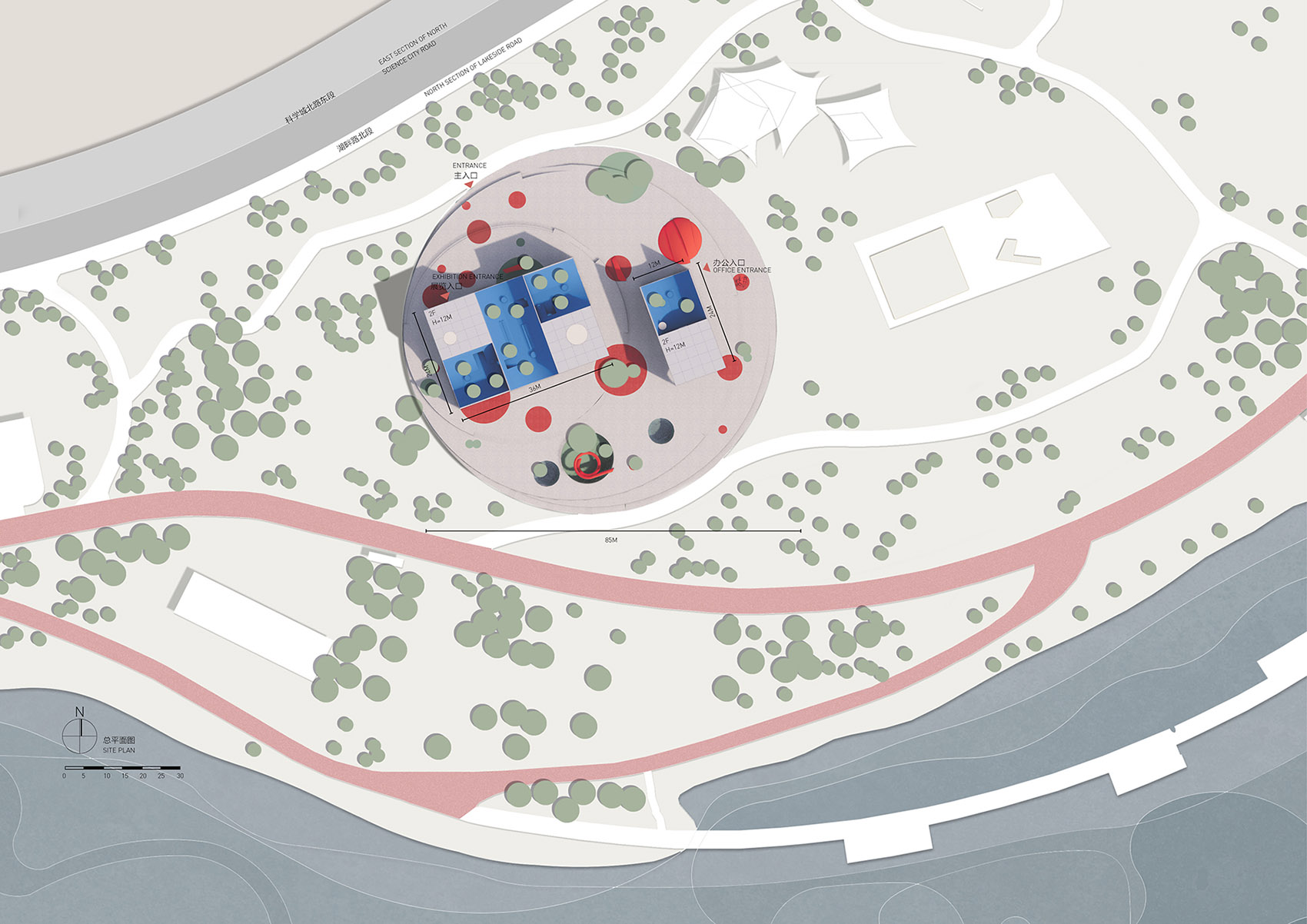
兴隆湖,位于成都市天府大道,被称为天府新区的“城市绿心”, 环湖周边有湖畔书店,独角兽岛等公共建筑。2020年,在“后疫情”的背景下,四川天府新区成都管委会公园城市建设局发起,以呈现“水清、岸绿、兴业、人和”的公园城市典范为目标,沿兴隆湖,新增两个公共建筑节点的概念设计方案征集。我们的设计“方·FUN”在此次《双心联动,全球方案征集》竞赛中赢得第一名,并有幸获得落地机会。
Xinglong Lake is located on Tianfu Avenue in Chengdu, surrounded by public buildings like lakeside bookstores and unicorn islands, known as the “green heart” of Tianfu New Area. In the post-epidemic era in 2020, the Park City Construction Bureau of the Chengdu Management Committee of Sichuan Tianfu New Area, initiated an announcement for proposed public building design in Xinglong Lake, to present the goal with “clear water, green shore, prosperous industry and harmony unity”, as well as further upgrading the model of “Park City” development. Our project, the Children’s Art Center “FANG· FUN”, emerged as the first prize in this campaign and had the pleasure to get implement opportunity.
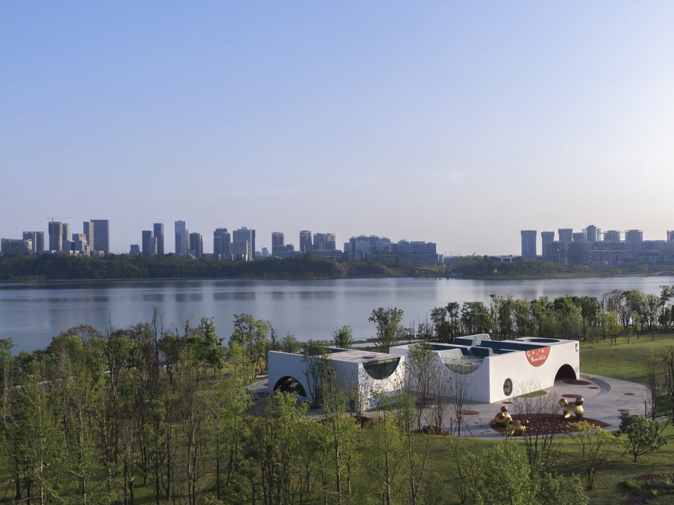
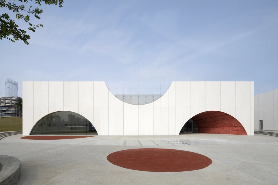
▼项目概览
Overall view ©梁文耀
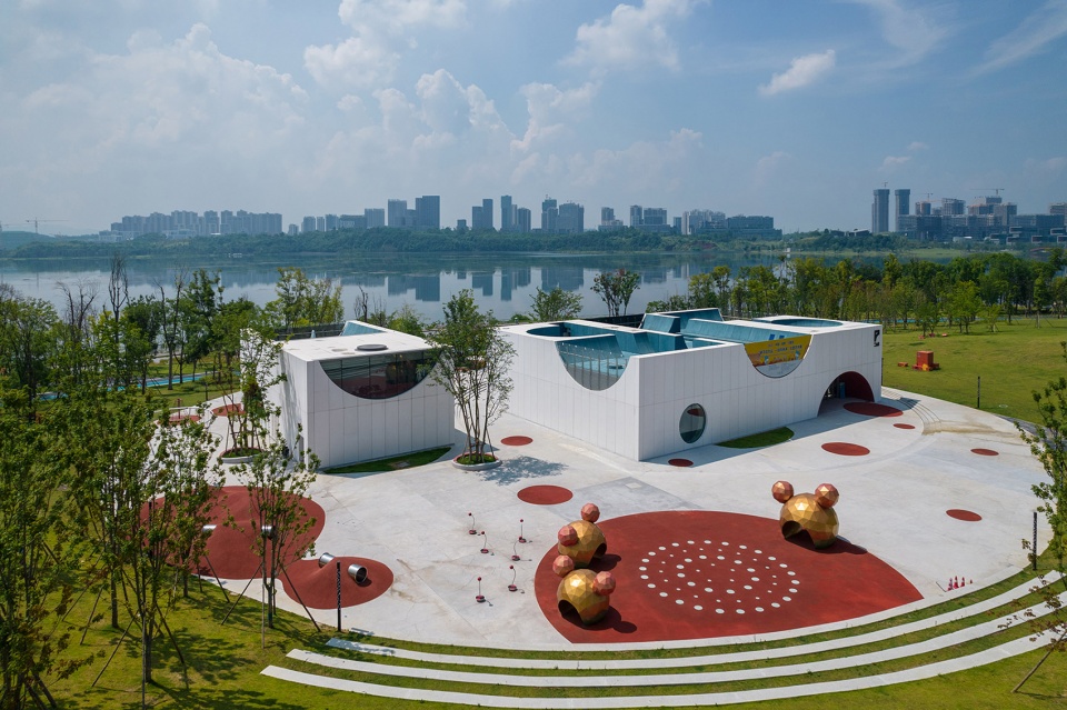
以兴隆湖为景,环形底座微介入,白色的建筑在湖畔形成了一个纯粹的界面,与环境有机结合。 同时,儿童艺术中心作为一个艺术空间存在于成都,补充了兴隆湖对于儿童和艺术休闲功能的需求,为儿童艺术提供了展示的空间。
▼项目区位分析图
Site analysis of the project ©相对建筑
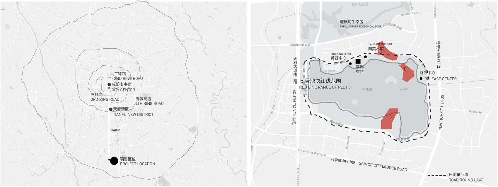
With Xinglong Lake as the background and the ring-shaped base intervening, the white building forms a pure interface, organically shaped to conform with the environment. At the same time, existing as an art space in Chengdu, the Children’s Art Center provides room to display art, complements for children’s need, and also served for art functions in the vicinity.
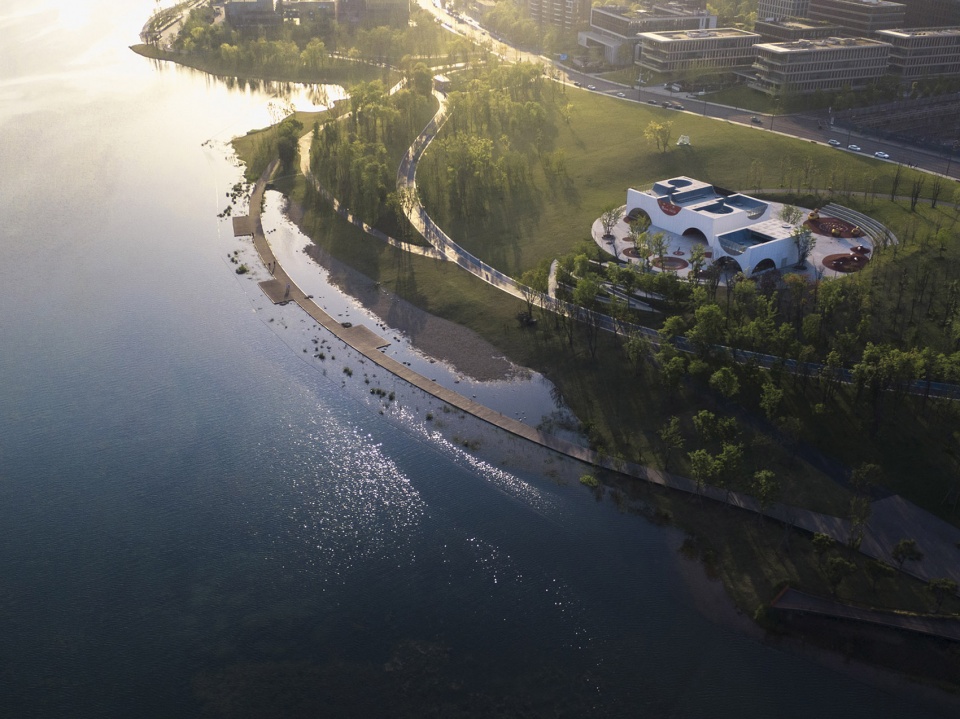
▼项目鸟瞰
Aerial view ©存在建筑
设计起源
Design origins
儿童艺术,由弗朗茨·艾克在1890年代提出,指由孩子们创造的素描、油画或其它艺术作品。儿童艺术往往是轻松、纯粹、活泼的。这不禁让我们想到马列维奇的至上主义艺术,采用最为简单的几何形组成一幅幅画作。其中,通过方形的变形和运动塑造出不同反映知觉的形状,如长方形(方形的一维拉伸)、十字形(两个方形的相交)和圆形(一个方形的旋转)等。这些元素和形状恰好也是儿童最先接触的简单几何体,儿童往往通过接触积木玩具来完成二维到三维的转换认知,因此“积木”的组合能够启蒙儿童的想象力。
Children’s art, coined by Franz Eyck in the 1890s, refers to drawings, paintings and other works of art created by children. Children’s art is always relaxing, pure and lively, this can’t help but remind us of Malevich’s Suprematism art, uses the simplest geometric shapes to form different paintings. For example, the deformation and movement of squares can shape different shapes reflecting perception, such as rectangle (the one-dimensional extension of square), cross (the intersection of two squares) and circle (the rotation of square). These elements and shapes also happen to be the first simple geometries objects that kids come into contact with, by playing with those blocks and their combinations, kids can complete cognition transformation from two to three-dimensional, and enlighten imagination.
▼“积木”的组合
Combination of blocks ©存在建筑
马列维奇寻求更纯粹地表达,不管是在形式还是色彩方面。他用颜色表达内心最真实的情感,在其作品中至上的红色方块奔腾出艺术家所有纯粹的思绪,是一种情怀的雀跃;蓝色是对某种无垠的虚空幻境空间中的翱翔幻想;白色是对纯粹生活的向往以及形式与色彩的思考。
Malevich seeks a purer expression both in form and color, to show his most real and true emotions from the bottom of the heart. In his works, the rushing red squares reveal pure thoughts from artists, showing a kind of excitement; blue is the soaring fantasy about boundless space and void illusion; and white is the desire for pure life and reflection on form and color.
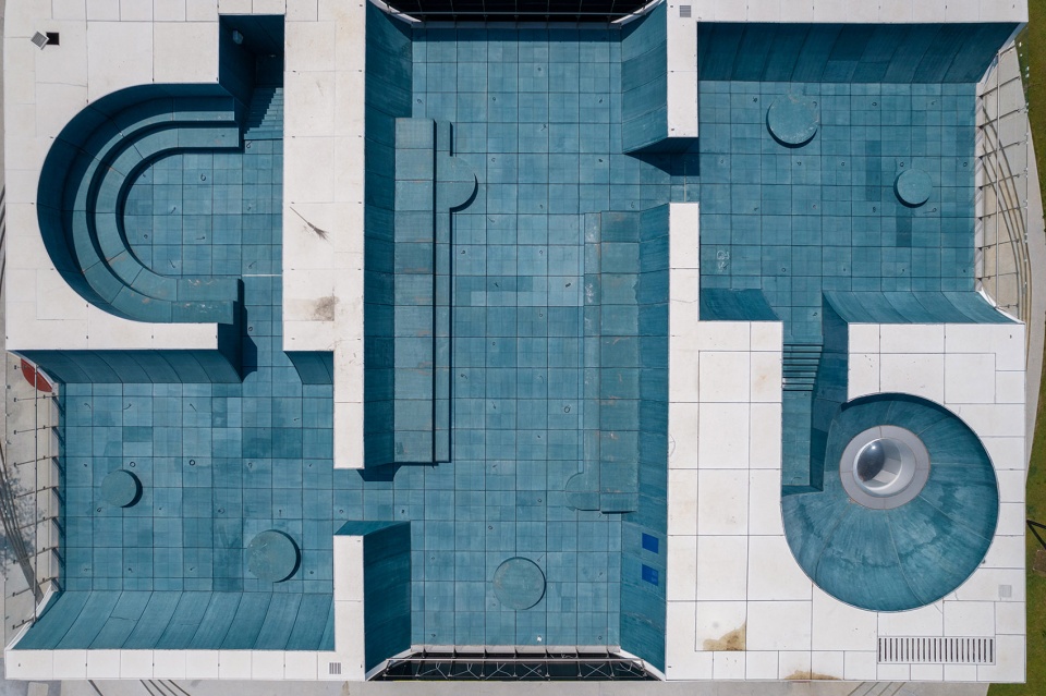
▼局部顶视图
Partial top view ©梁文耀
形体生成
Form generation
马列维奇采用最为简单的几何形,由最初的单一几何图形到简单几何图形的组合,然后慢慢再到复杂的几何图形,并且组合逐渐变得多样化。于是,我们选择了至上主义中的基本元素。方形,满足儿童天马行空的想象力;圆形是方形的自转,代表着运动,与儿童好动、探索的天性不谋而合。在方与圆中扯破天蓬,想象自己在无边的宇宙中自由飞翔。
▼建筑形体生成
Form generation of building ©相对建筑
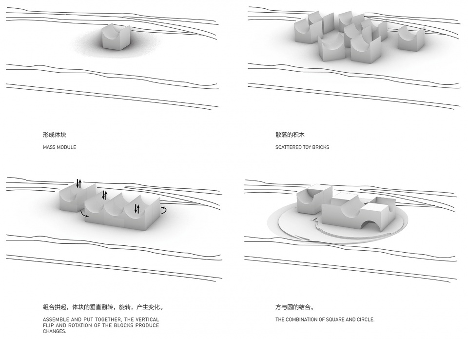
Malevich uses the simplest geometry shape, from the initial single unit to combination of simple figures, then to more complex geometric shape, and the combination becomes more diversified gradually. Therefore, we choose the most basic elements from Malevich’s supremacism art: the square, to satisfy children’s wild imagination; the circle, rotation of square, representing movement and corresponding with children’s active and keen on exploring. Tore through the blue canopy in the square and the circle, imagine flying freely in the boundless universe.
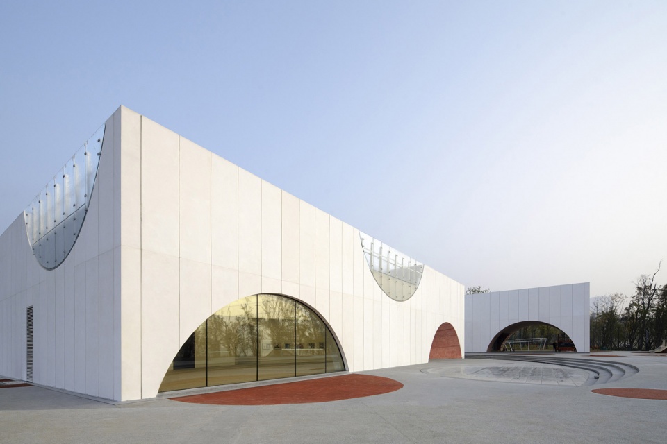
▼建筑外观
Exterior view ©存在建筑
▼由建筑望向湖面
View from facade to the lake ©相对建筑
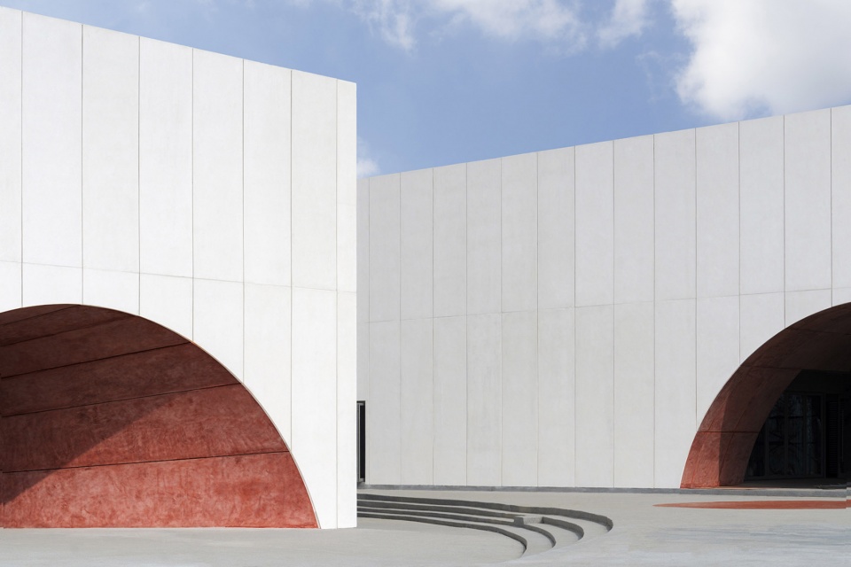
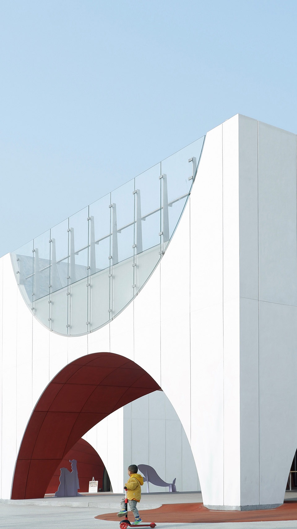
▼展厅出口与咖啡入口,形成进入建筑的仪式感,增加趣味。
The exit of the exhibition hall and the entrance of the coffee, form a sense of ceremony for entering the building and add interest ©存在建筑
由方与圆组合而成的基本形态生成体块单元,将体量单元散布开来,用孩子堆叠积木的方式组合拼接体量单元,产生变化。最后,方形的建筑形体与圆形的广场构成儿童艺术中心。
The combination of squares and circles forms basic blocks and generates mass modules, the scattered toy bricks appear, being assembled, put together, and received changes in children’s way. Finally, the square building and the circular square constitute the Children’s Art Center.
▼圆与方的孩童世界
A children’s world of circles and squares ©相对建筑
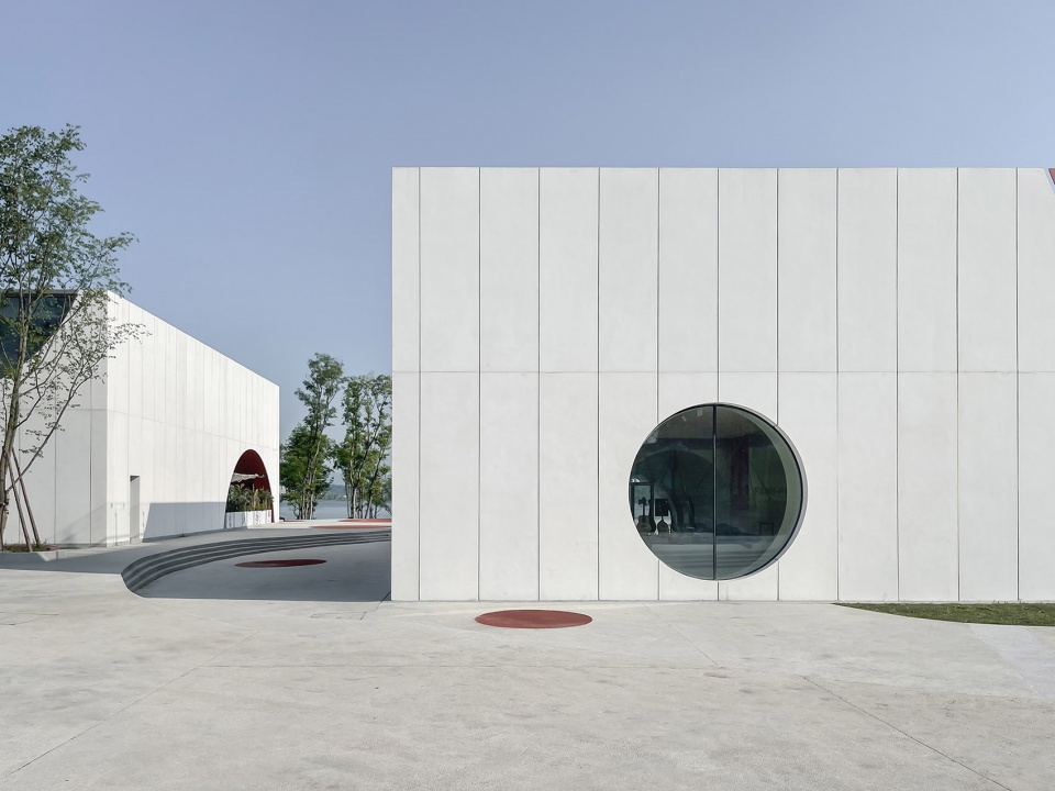
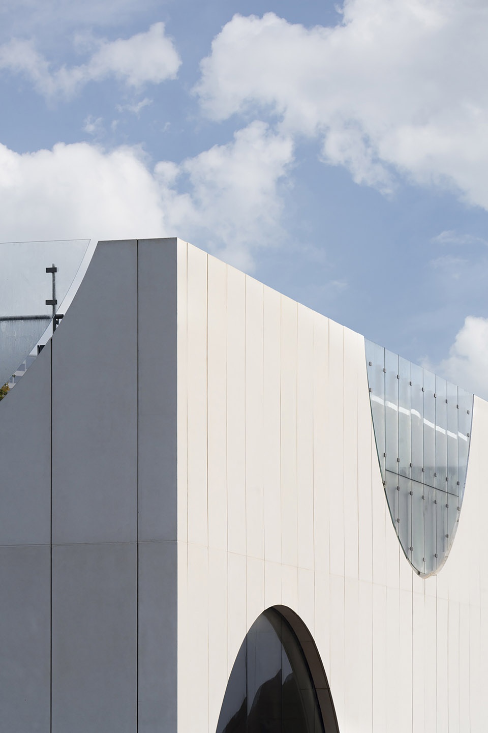
▼建筑外立面局部
Partial of the building facade ©存在建筑
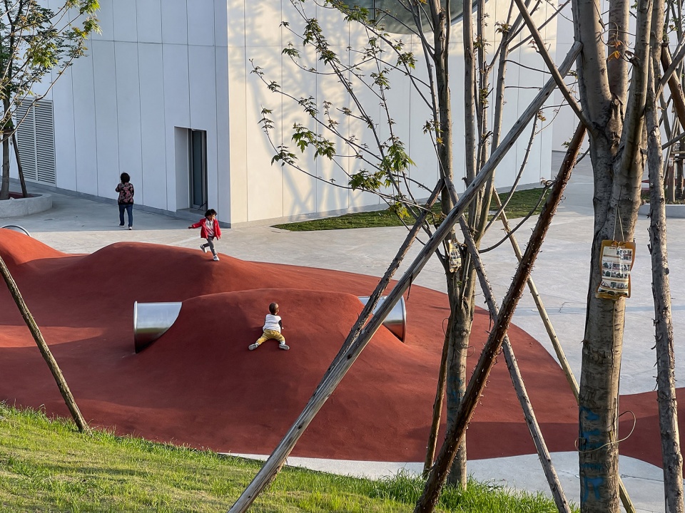
这是一个圆与方的孩童世界。环形底座加上围合式的建筑,给孩子提供了安全感,且在不同的圆上加以点缀,艺术雕塑,喷泉,游戏场地等,营造艺术氛围广场,吸引游览人群的驻足停留。孩童拥有了活动游乐区域的同时,增加了游览趣味性。场地南临湖岸观景,北接绿道引人,区域设计后,作为建筑室内与周围环境间的过渡。
This is a children’s world of circles and squares. The ring-shaped base and enclosed building provide children with a sense of security, while being embellished on different circles, art sculptures, fountains, play venues, etc., to create an artistic atmosphere and attract the stop and stay of the tourists. Providing the play area for children, and at the same time, adding more interesting to the visiting tour. The site is adjacent to the lake shore view in the south and the green-way in the north, served as the transition between interior of the building and surrounding environment.
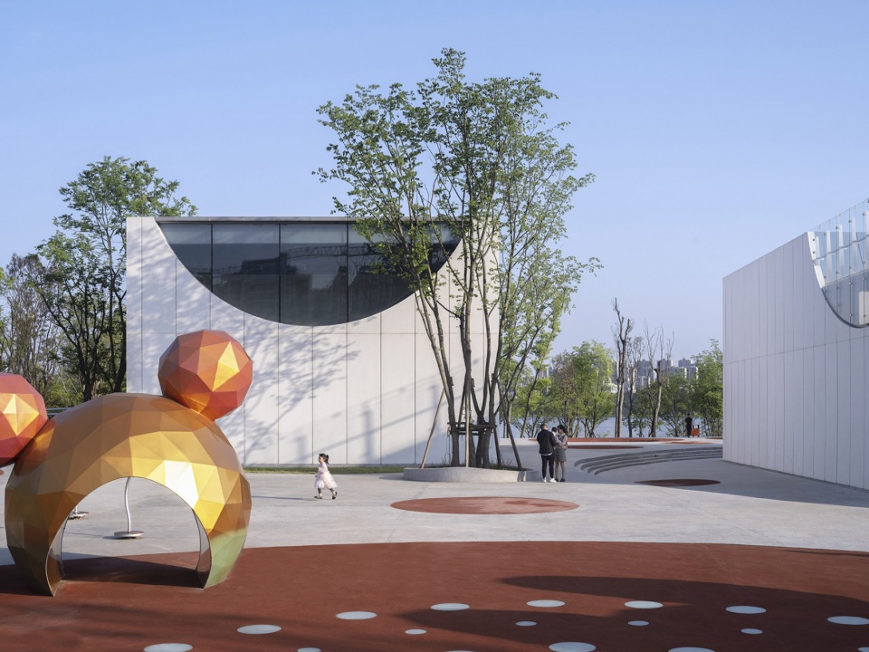
▼在景观中创造孩童游玩的场所
Creating places for children in site ©存在建筑
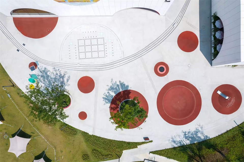
▼游戏场地
Playground ©相对建筑
对于颜色的选择,我们希望儿童的世界不是单调的灰白色,而是带有色彩的,丰富的,有温度的一个趣味空间。所以,我们选择了至上主义中的红色作为室内的颜色,不仅热情活泼而且充满想象力;蓝色铺满屋顶,作为对于天空翱翔的幻想;大面积的白色则是对童真简单和纯粹的保护,整体的效果既简洁又抽象,释放孩童无穷的想象力。
For the choice of colors, we hope that children’s world is not that monotonous gray and white, but a fun space with color, richness and warmth. Therefore, considering Suprematism, we choose the red as the interior color, which is enthusiastic and imaginative; the blue roof as a fantasy for soaring in the sky; the large white base, which is a reflection of innocence and simplicity. The overall effect is simple and abstract, freely releasing children’s imagination.
▼由蓝色铺满的屋顶
The roof covered by blue ©梁文耀
马列维奇曾经说过:“画中的颜色和质感本身就是全部”。因此我们除了谨慎的选择颜色外,在材料的选择上更加重视。建筑外立面与屋顶均采用GRC,材料硬度比石材小,相应的会更具有弹性与可塑性,消除建筑与儿童之间的距离感。景观地面采用了水洗石和红色EPDM,具有柔软耐脏的特性,营造一个适合儿童活动的场所。室内采用微水泥,乳胶漆和木地板,营造一个纯粹的展览空间。室内没有装饰性的元素,简化材质的表情,完全围绕人的使用需求展开布局设施。
Malevich once said: “The color and texture in the painting are all in themselves”. Therefore, in addition to careful choice of colors, we pay more attention to the materials. The exterior facade and roof of the building are made of GRC, which the hardness is smaller than that of stone, correspondingly more elastic and plastic and can better eliminate the sense of distance between the building and children. The floor is made of washed stone and red EPDM, which is soft and stain-resistant, creating a suitable place suitable for children’s activities. The interior uses micro-cement, latex paint and wooden floors, creating a pure exhibition space. There are no decorative elements inside to simplify, and completely consider about the layout facilities based on the needs of people.
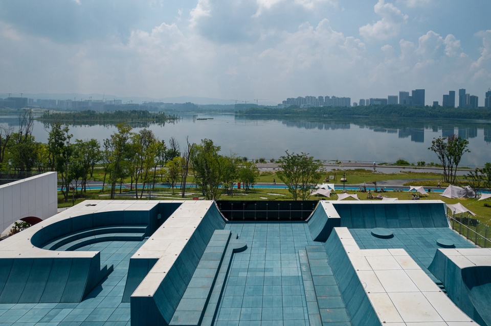
▼屋顶上的视角
View on the roof ©梁文耀
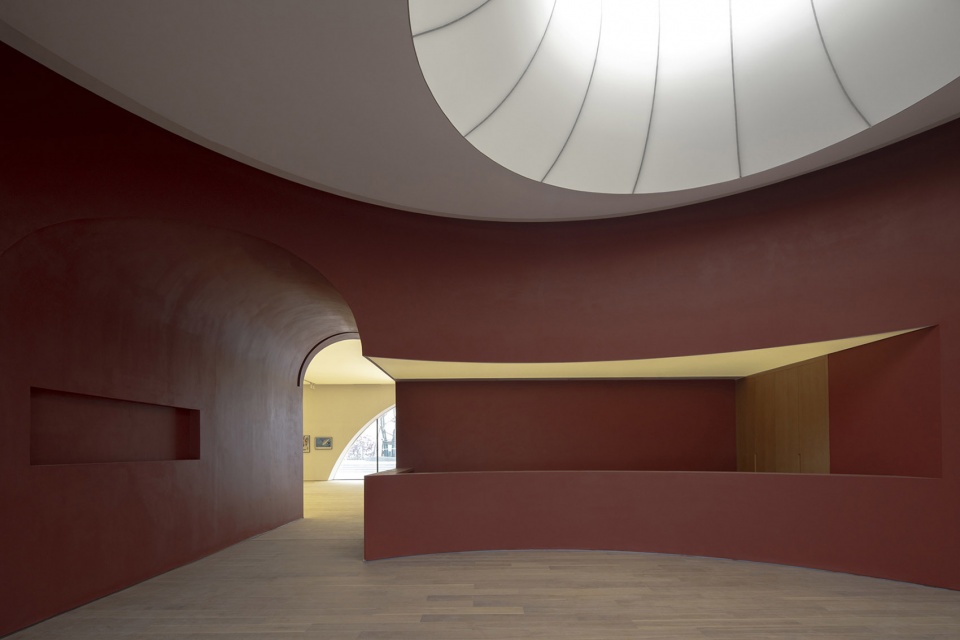
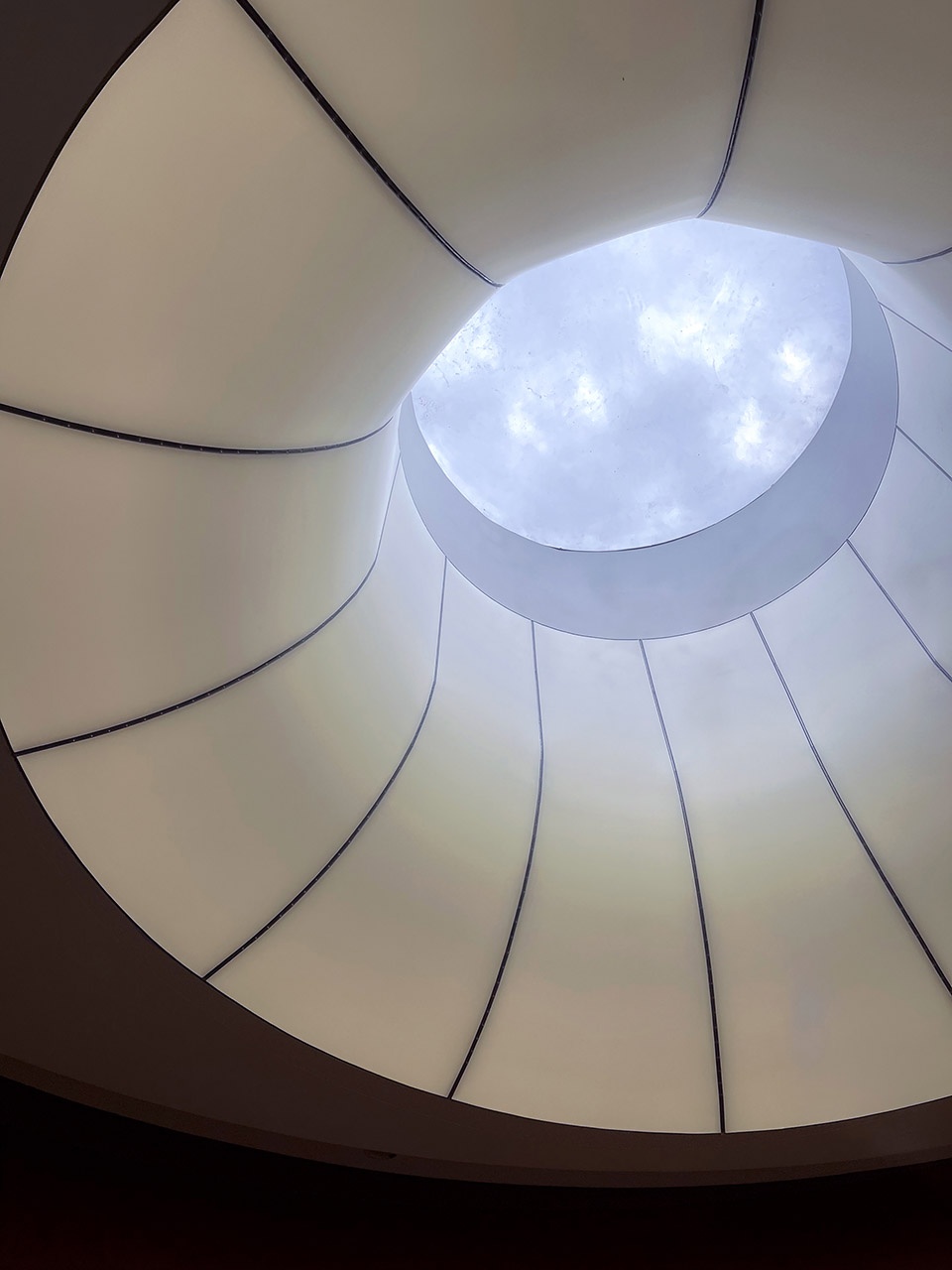
同时,室内大面积使用灯膜,形成面域光,柔和空间的同时保护展品的纯粹。空间顶部灯膜的透光性在白天可以柔和地引入光线,夜晚降临透出朦胧地光影,入口空间顶部附上的灯膜设计,光影从穹顶上倾泻而下,犹如孩童的想象力喷涌而出。
At the same time, using the light film in the interior to form area light, softens the space and protects the purity of the exhibitions. The top of the space using the light film can softly introduce light during the day with its , Its light transmittance, and at night, it will reveal a hazy light and shadow; and for the entrance space using the light film, the light and shadow pour down from the dome, like child’s imagination gushing out.
▼入口空间顶部的灯膜设计
Using the light film for the entrance left ©存在建筑;right©相对建筑
空间交融
Space blends
“运动和色彩感觉相对于形象来说占有更重要的地位,尤其是动态的色彩感觉” —— 卡西米尔·马列维奇
“Motion and color sensations occupy a more important place than image, especially dynamic color sensations” – Casimir Malevich
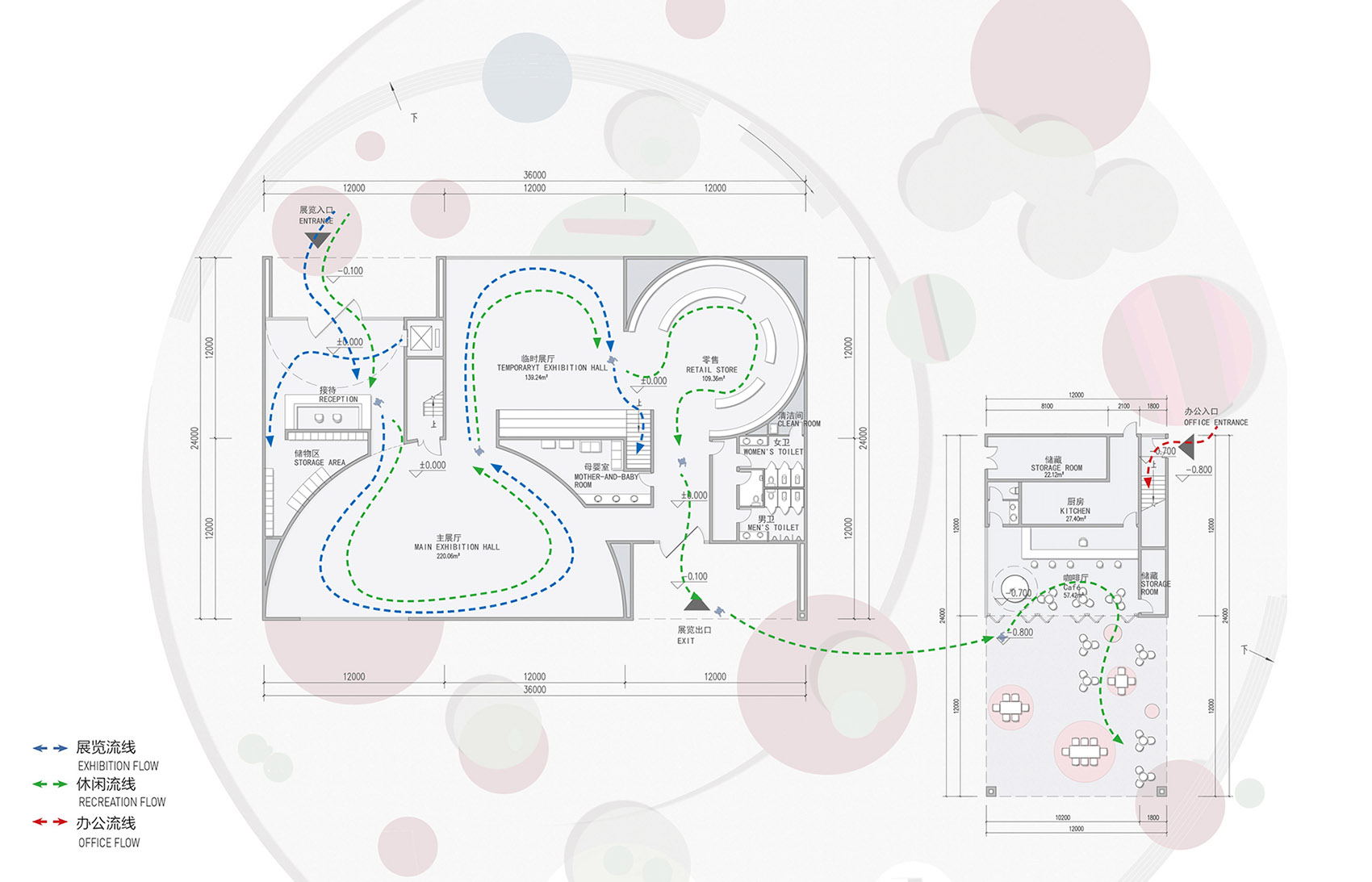
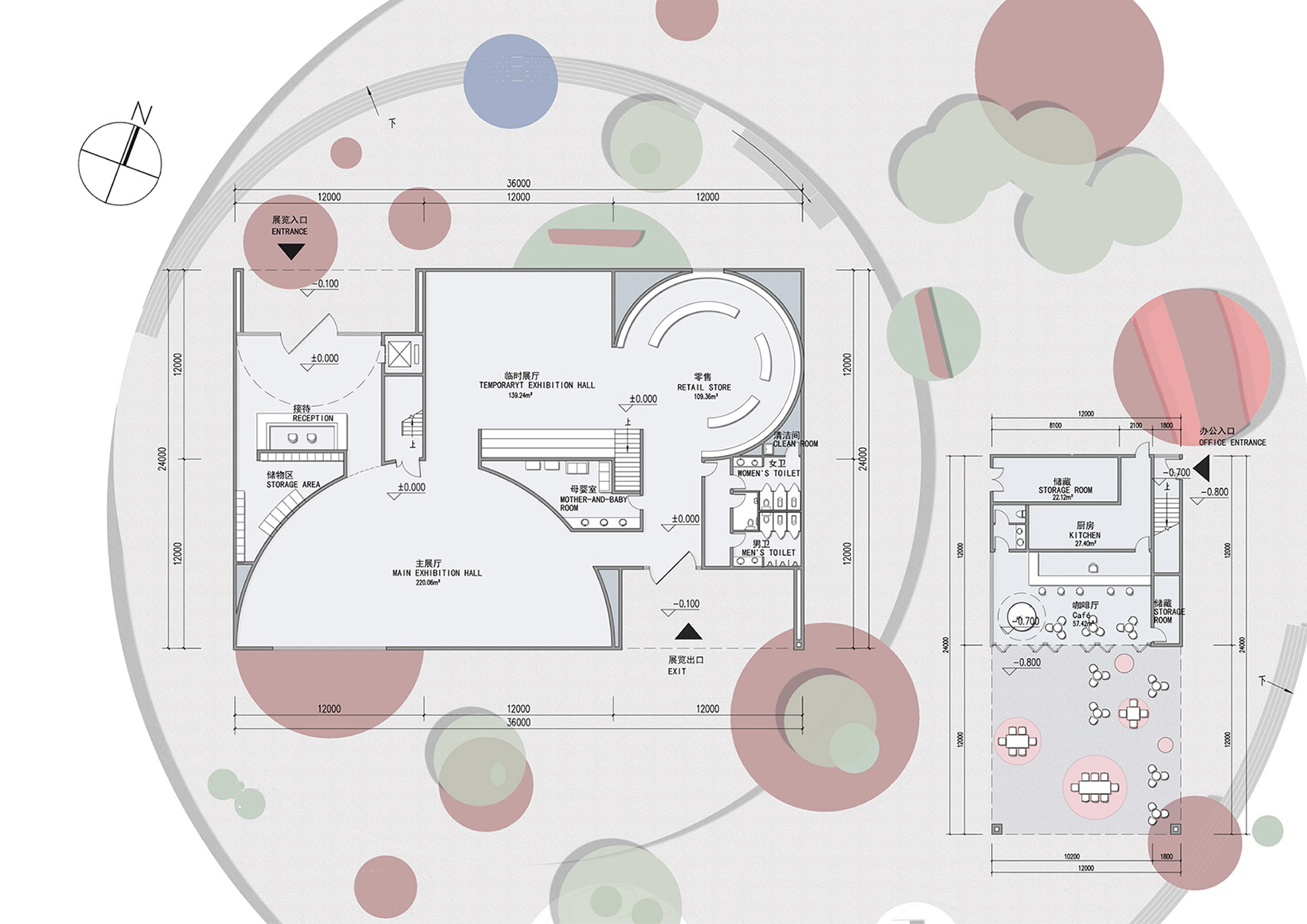
在功能流线上,我们设置了三条流线。即休闲、展览及办公流线。休闲流线由入口进入,游览两个展厅,穿过商店,最后可从出口到达室外活动区域和附楼的咖啡厅,厅外的外摆区域可供家长观景和更方便的照看在小孩。展览流线则是经过两个展厅,通过楼梯上到二楼可达到屋顶。屋顶有户外展览及休闲平台,是个有趣的场所。我们希望这里成为一个能够让孩子游玩,仰望天空的秘密花园,同时也可兼具展览及儿童走秀活动的场所。办公流线则从副楼的侧面进入,与展览和休闲流线互不打扰。
For the functional circulation, we set three streamlines, leisure, exhibition and office. The leisure’s enters through the entrance, visits the two exhibition halls, passes through the store, and finally reaches the outdoor area and the café in the annex from the exit, and the outside area is more convenient to view and take care of kids for parents. The exhibition’s passes through two exhibition halls, and the roof can be reached by stairs to the second floor. There are outdoor exhibitions and leisure platform, and we hope this will be a secret garden where children can play, enjoy the sky, visit exhibition and also children’s catwalk. The office streamline enters from the side of the annex building and does not interfere with the exhibition and leisure streamlines.
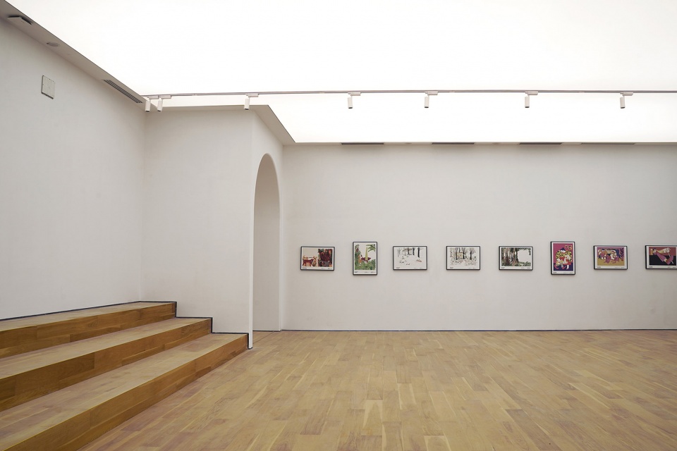
▼室内空间
Interior view ©相对建筑
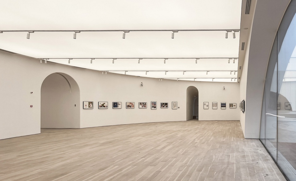
在功能布局上,展览空间与咖啡办公分成了两个体块,将儿童与大人的空间区分开,留给孩子一个独一无二,纯粹而有趣的世界。两个体块均以方形空间为基底,用构成的方式引入圆形和半圆形的空间,消解棱角,形成柔和而富于趣味的空间。在主体块内,含有一方一圆两个展览空间以及圆形的商店,最后形成完整的室内空间。
In terms of functional layout, the exhibition space and the coffee office are divided into two different blocks, which separates the space for children and adults, leaving children with a unique, pure and interesting world. The two blocks are based on square spaces, introducing circular and semicircular room by means of composition, dissolving edges, and forming soft and interesting spaces. Inside the main block, there are two exhibition spaces with one square and one circle, as well as a circular shop, and form a complete indoor space.
▼柔和而富于趣味的空间
Soft and interesting spaces ©相对建筑
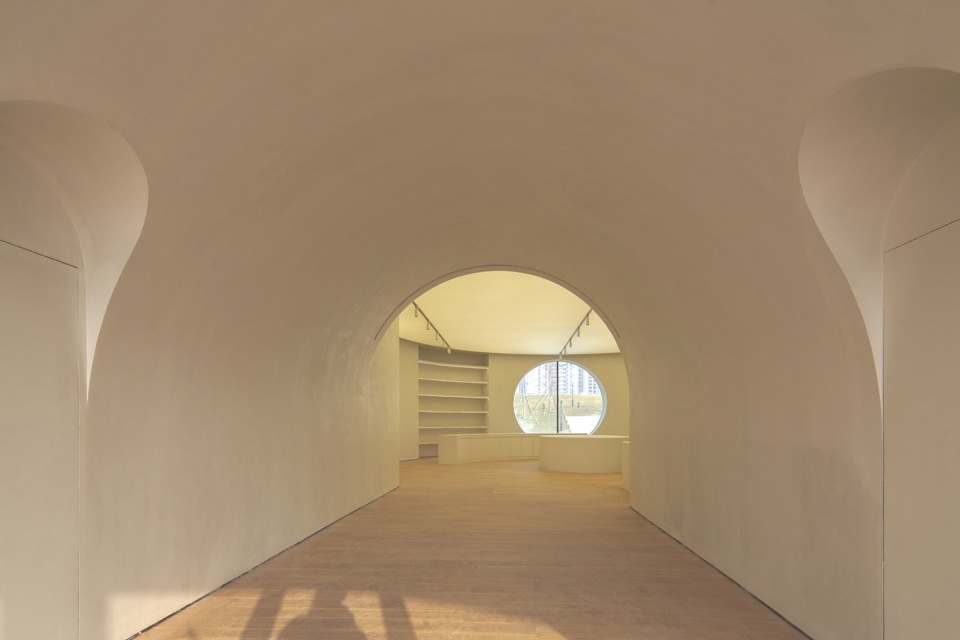
运用同样的设计语言,在展览空间及商店区域大面积的开窗,将室外景观引入室内,展览空间面朝湖泊,晓看朝阳,与环境相融。商店区域的开窗延伸了孩童玩耍的视线,增加视线层次,及形成空间深度感。此外,商店区域较大,可承载除了更多的功能,如儿童阅读,手工活动,展览延续等。附楼引入圆形球体,使咖啡厅的外摆区域变成半私密半开放的空间,供家长观景和照看玩耍的小孩,进入其内,感受空间、在穹顶上倾注宁静的柔和时光。
Using the same design language, large-scale windows are opened inside the exhibition and shop area, the exhibition space faces the lake, looks at the rising sun, to bring the outdoor landscape inside and integrate with the environment. The windows in the store area extend the sight of children’s play, increase the level of vision and form a sense of depth of space. In addition, the store area is larger and can host more functions, such as children’s reading, handicraft activities, exhibition continuation, etc. A circular sphere is introduced into the annex building, turning the outside area of the café into a semi-private and semi-open space for parents to take care of children. That is, enter it, feel the space, Pour tranquility, quiet and soft memory on the dome.
▼走廊的圆弧设计延伸至商店空间内,直至框景外部孩童游玩区域
The arc design of the corridor extends into the store space to the play area outside ©存在建筑
在各种主义的影响下,在艺术蓬勃发展的氛围中,马列维奇开启了他独特的艺术表现形式,以简单的矩形来表达艺术家情感的自然流露,至上主义的艺术为抽象主义开辟了一个新大陆;我们希望在纯粹且富有活力的儿童艺术中心中,创造一种独特的艺术氛围,可以启发孩童与生俱来的创造力,和天马行空的想象力,让艺术在兴隆湖畔自由翱翔。
Under the influence of various isms and vigorous atmosphere of art, Malevich opened his unique artistic expression by displaying the natural emotions with simple rectangles. The Suprematism opened up a new world for abstraction and we hope to create a unique artistic atmosphere in the children’s art center, which can inspire children’s innate creativity, and imagination, and art can fly freely by Xinglong Lake.
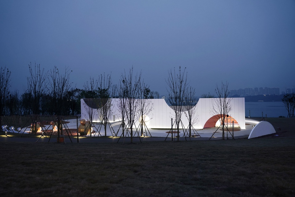
▼建筑夜景
Night View ©相对建筑
▼功能流线图
Functional circulation ©相对建筑
▼总平面图
Site plan ©相对建筑
▼一层平面图
1F plan ©相对建筑
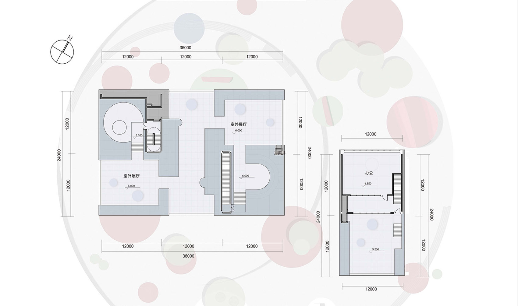
▼屋顶平面图
Roof plan ©相对建筑
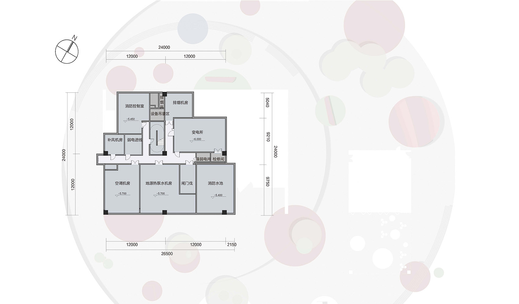
▼负一层平面图
B1 plan ©相对建筑
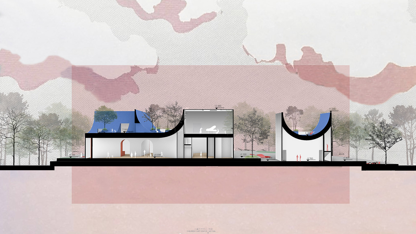
▼剖面图
Section ©相对建筑
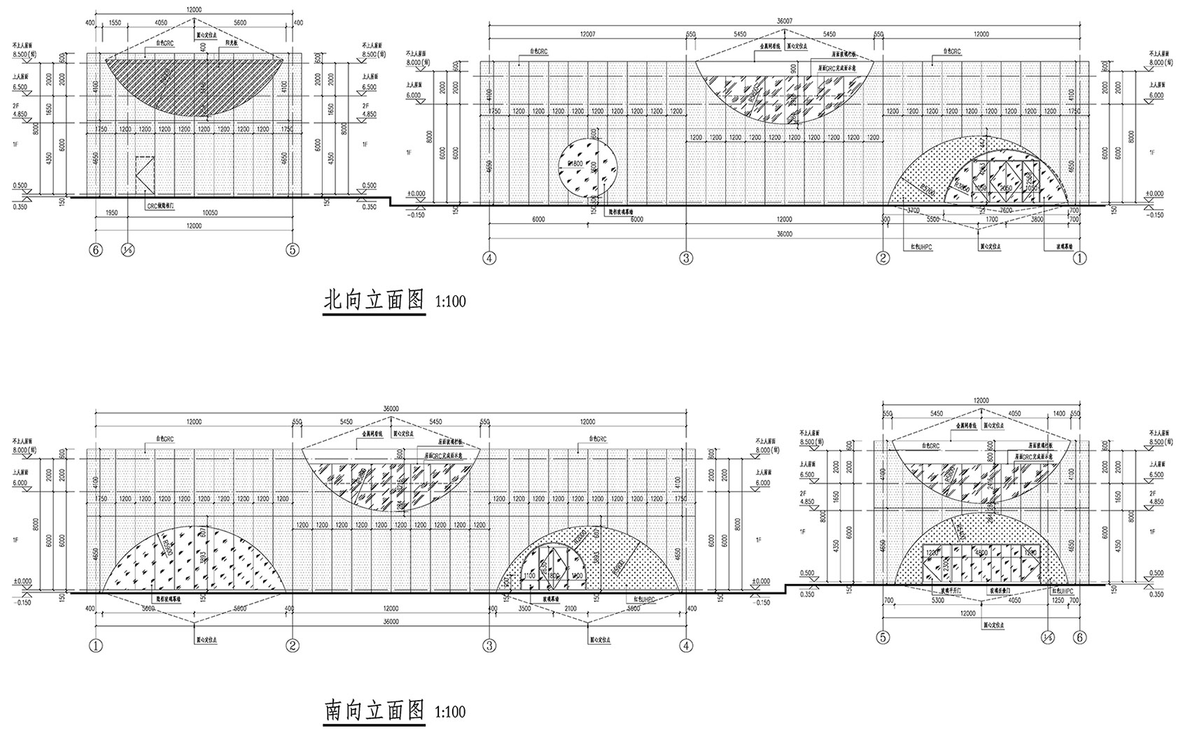
▼南北向立面图
Elevation south and north ©相对建筑
项目名称:方.fun 兴隆湖儿童艺术中心
项目类型:建筑
设计方:相对建筑设计有限公司
项目设计:2020.10-2021.02
完成年份:2021.01-2022.01
设计团队:方案设计:相对建筑设计有限公司(靳洪铎 王新娜 王婷婷 尹进 向悦);施工图设计:中国建筑西南设计研究院有限公司(李蕾 彭雨轩)
项目地址:成都市天府新区直管区兴隆湖畔路北段
建筑面积:1903㎡
摄影版权:存在建筑,相对建筑,梁文耀
合作方:规划&结构&照明:中国建筑西南设计研究院有限公司
建筑&景观&室内:相对建筑设计有限公司&中国建筑西南设计研究院有限公司
施工:成都建工集团有限公司
材料:GRC:南京倍立达新材料系统工程股份有限公司
客户:成都天府新区投资集团有限公司EPDM
材料:GRC;红色EPDM;微水泥
0
0