
在瓦维尔皇家城堡的皇家公寓内,NArchitekTURA团队为Lanckoroński系列画展打造了全新的陈列空间。除了画作和创作者本身,本次设计还从展场所在的建筑以及克拉科夫的城市环境中汲取了灵感。
The design of the exhibition Masterpieces from the Lanckoroński Collection is based on numerous – direct and indirect – references to the presented paintings and their authors, as well as to the location of the exhibition in the Royal Apartments in Wawel Royal Castle and the wider context of Krakow.
▼项目概览,Overview of the project ©Anna Stankiewicz
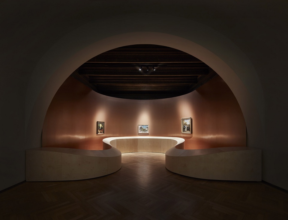
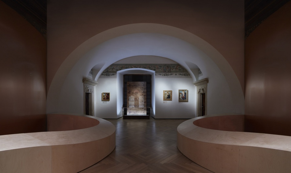
Paolo Uccello、Bartholomaeus Bruyn the Elder以及Barend Graat等文艺复兴时期艺术家的作品被放置在一个将当代形式、技术以及艺术、建筑文献中体现历史意义的室内材料相结合的空间内。瓦维尔大教堂的布局为项目提供了最初的灵感,文艺复兴风格和巴洛克风格的小教堂围绕中殿及回廊而建。而展览的新空间旨在将一系列房间以出其不意的方式融合在一起,以营造一个具有当代感的神圣空间。因此,为延续瓦维尔传统建筑中层次分明的风格与形式,采用与附近大教堂类似的形式,将这个新的“小教堂”与已经确定的空间内部以及主要参观路线相邻,打造出一种自主游览形式。
The works of Renaissance artists such as Paolo Uccello, Bartholomaeus Bruyn the Elder or Barend Graat were placed in a space combining contemporary forms, technologies and materials with historic interiors and historical references in the field of art and architecture history. One of the first inspirations for the project was the layout of the Wawel Cathedral, where Renaissance and Baroque chapels were located around the main nave and ambulatory. The new architecture of the exhibition was originally intended to resemble a contemporary quasi-sacred space, blended in a surprising way with an enfilade sequence of rooms. Similarly to the nearby cathedral, this new “chapel” was to adjoin the already defined interior and the main visiting route, constituting an autonomous form and continuing the tradition of layering various styles and architectural forms at Wawel.
▼项目内景,Arrangement inside the space ©Anna Stankiewicz
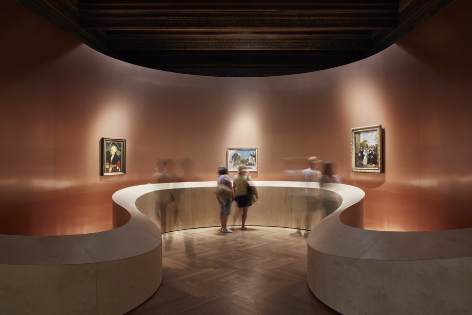
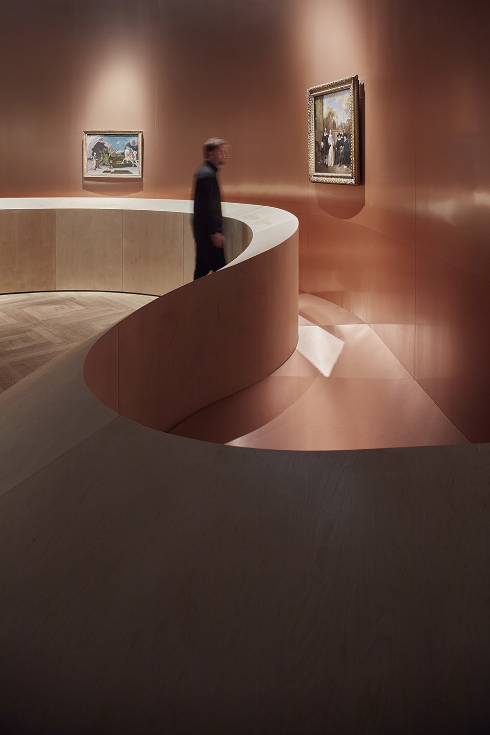
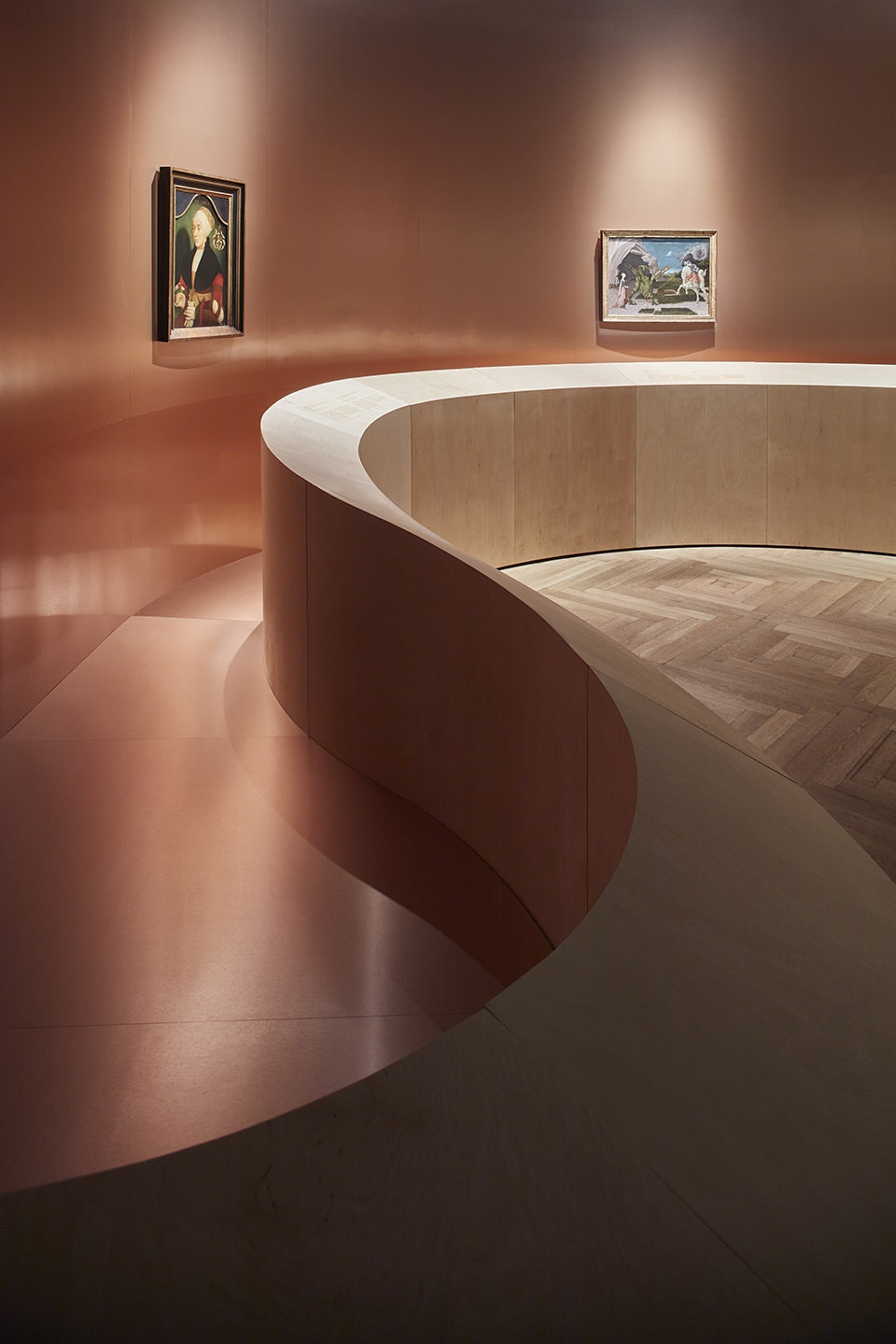
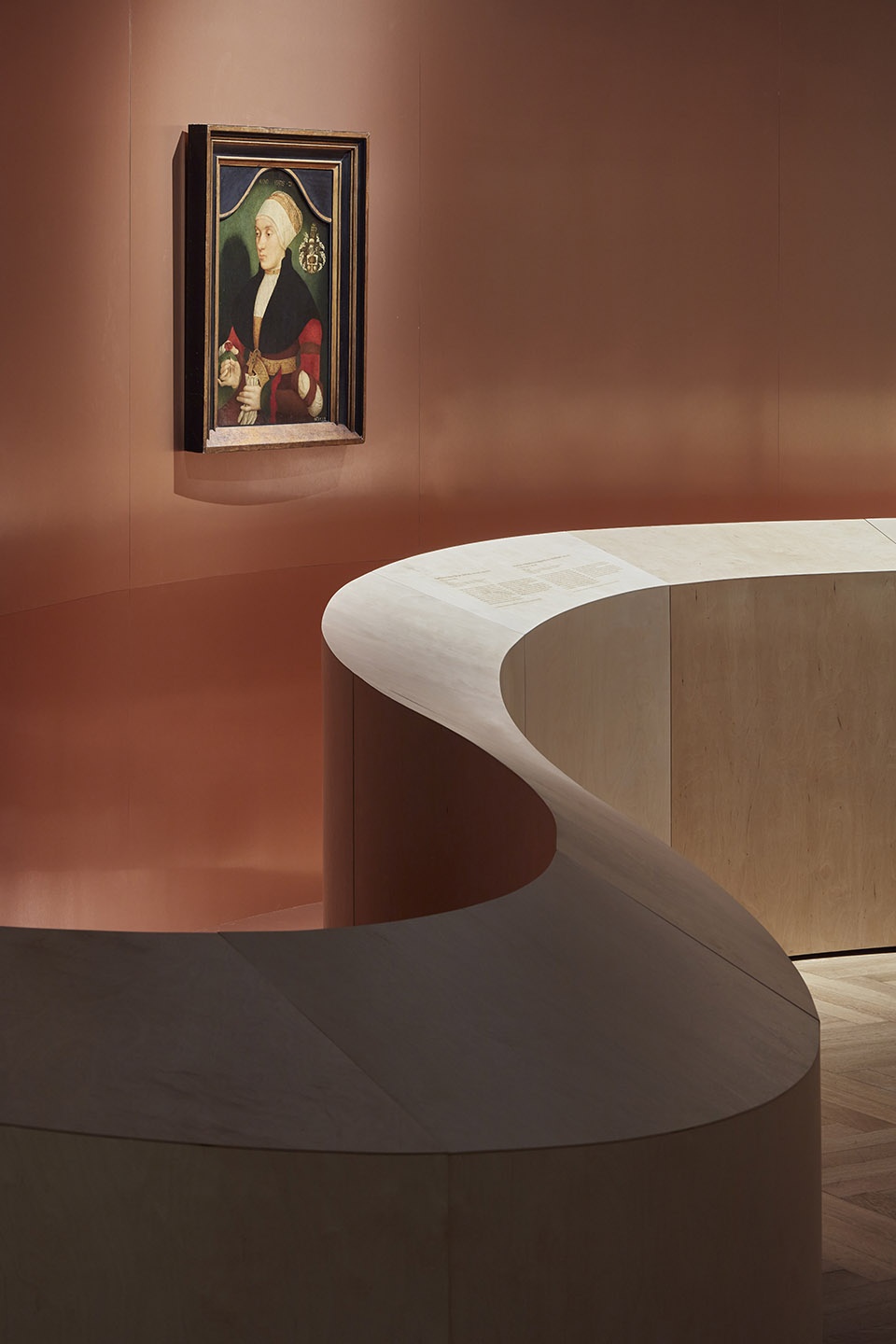
拱形结构为整个展厅奠定了基调,这里也是流线几何形状的起点。由底部开始,采用弯曲的缎带型胶合板充当栏杆,上面可作为作品描述的展示区域,下方处则隐藏着技术设备和聚光灯。其上表面的不均匀倾斜给人一种干扰正确透视的错觉,这可以被解读为对乌切罗(Uccello) 作品的参考,他在许多作品中都尝试将众多不同的视点加以结合,产生视错(这在后来影响了包括乔治·德·基里科和亨利·卢梭在内的诸多20世纪著名艺术家)。
The vaulted arch, defining the character of the exhibition hall, became the starting point for the fluid geometries used. From the bottom, it is complemented by a bent plywood ribbon, which acts as a balustrade, a carrier of descriptions of individual paintings, it also hides technical devices and spot lighting. The uneven inclination of its upper surface gives the illusion of a disturbance of the correct perspective, which can be read as a reference to the work of Uccello, who in many of his works experimented with combining several one- and two-run shots (which, in turn, fascinated many famous artists of the 20th century, such as Giorgio de Chirico or Henri Rousseau).
▼拱形拱门及流线几何栏杆,
The vaulted arch and the bent plywood ribbon balustrade ©Dariusz Błażewski
▼流线几何栏杆近景,
Detailed view of the bent plywood ribbon balustrade ©Anna Stankiewicz
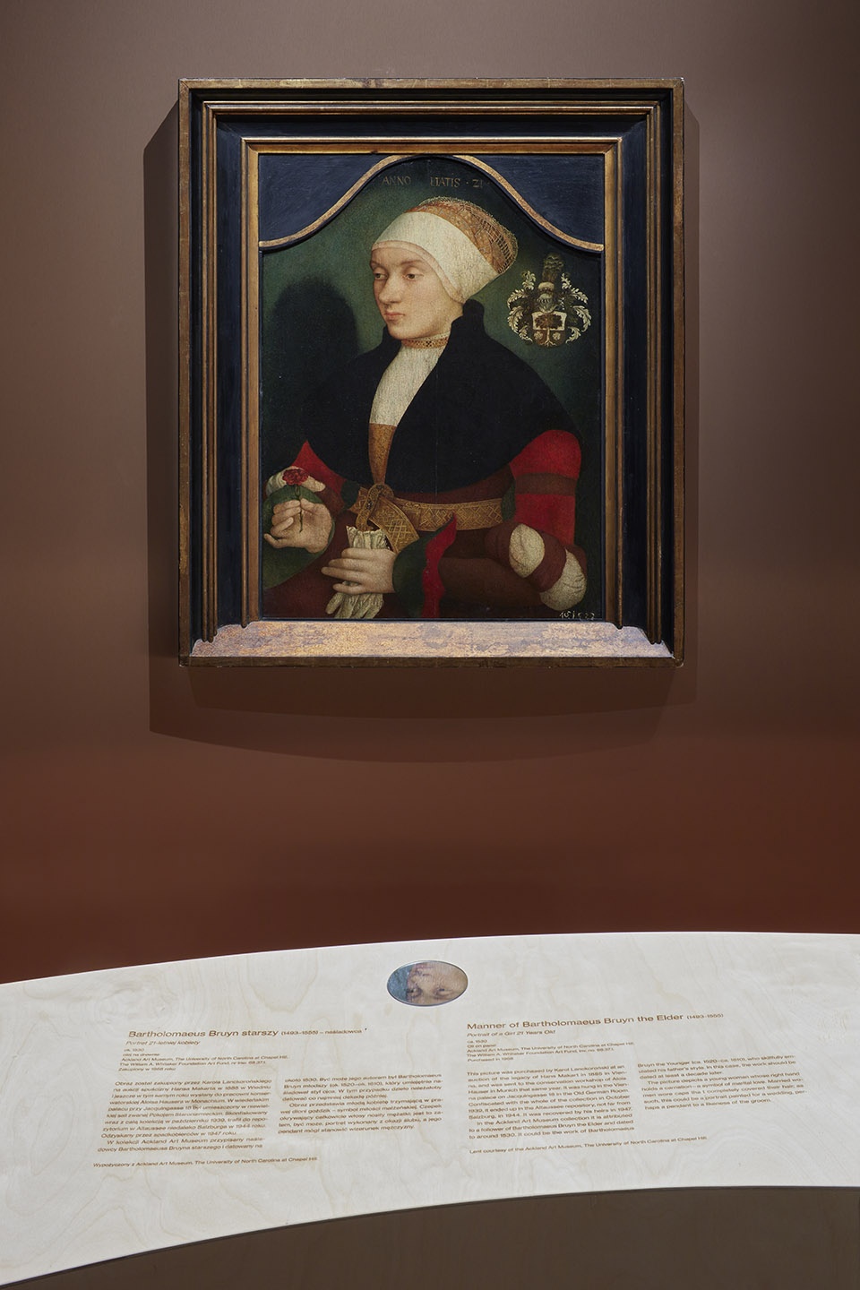
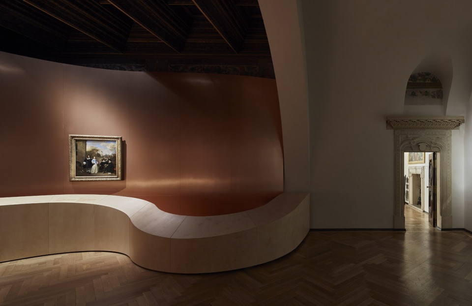
放置在栏杆作品描述上方的便携式小圆镜,是参考乌切罗(Uccello)作品中的另一种视错表达——在这种情况下,它们可将画作以及展厅中历史悠久的格子天花板局部反射在镜面上。在液体形态胶合板的后方为一面以铜质面板包覆的曲面墙,这里也是从阿姆斯特丹国立博物馆、伦敦国家美术馆以及教堂山阿克兰艺术博物馆借来的名画的放置处。铜墙的形状灵感来源于巴托罗梅厄斯·布鲁因(Bartholomaeus Bruyn)的画作《少女肖像》上方可见的线条。在最初的设计设想中,凹陷的形式采用类似于保罗·乌切洛(Paolo Uccello)在中央悬挂的画作《圣乔治与龙》中描绘的神秘洞穴内部。空间内新布置的柔和色彩是对第三幅作品——巴伦德·格拉特(Barend Graat)绘制的名为《花园中的公司》的致敬。与展览相辅相成的还有Lanckoroński收藏的三幅宗教画作,它们作为常设展览的一部分,陈列在城堡拱廊庭院周边的各房间内。
Portable small round mirrors, placed above the descriptions of the paintings on the balustrade, are another reference to optical illusions in Uccello’s works – in this case they reflect fragments of paintings and the historic coffered ceiling in the exhibition hall. Behind the liquid form of plywood there is a curved wall finished with copper panels. This is where the famous paintings borrowed for the exhibition from the Rijksmuseum in Amsterdam, the National Gallery in London and the Ackland Art Museum in Chapel Hill were hung. The shape of this copper wall was taken from the line visible in the upper part of the painting by Bartholomaeus Bruyn the Elder – Portrait of a Girl. In the first design assumptions, the recessed form was also to resemble the mysterious interior of the grotto illustrated by Paolo Uccelo on the centrally suspended canvas Saint George and the Dragon. The subdued colors of the new arrangement are, in turn, a nod to the third work presented, entitled Company in a Garden and painted by Barend Graat. The display is complemented by three religious paintings from the Lanckoroński collection, presented as part of the permanent exhibition in various rooms around the arcaded courtyard of the castle.
▼便携式小圆镜与栏杆上展示的作品描述,
Portable small round mirrors and the descriptions of the paintings on the balustrade ©Dariusz Błażewski
▼以铜质面板包覆的曲面墙,
A curved wall finished with copper panels ©Anna Stankiewicz
展览位于皇家公寓二层空间内,可在瓦维尔山上俯瞰历史悠久的克拉科夫老城。透过这些房间的窗户可以看到各式塔楼、尖顶和圆顶的教堂,各式楼宇覆盖着各种形式的铜板包覆屋顶,与城市全景相映成趣,因此使用这种在旧城区内特定高度中占主导地位的材料的想法也成为展览设计中的一部分借鉴。
The exhibition is located in the room on the first floor of the Royal Apartments, on the Wawel Hill overlooking the historic Krakow Old Town. From the windows of this room you can see the towers, spiers and domes of the churches, which stand out against the city panorama. Many of them are topped with various forms of roofs covered with copper sheet, hence the idea to use this material also as part of the exhibition. The idea was to use the material that dominates at this particular height within the Old Town.
▼展览与拱廊庭院,The exhibition and the arcaded courtyard ©Anna Stankiewicz
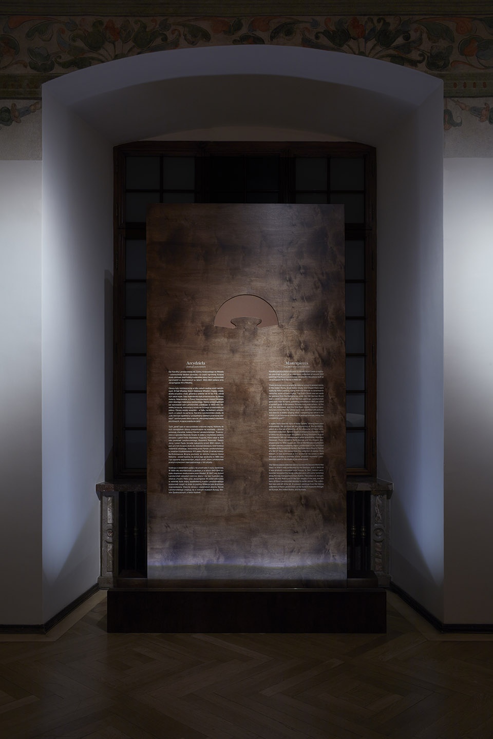
展览与拱廊庭院一侧凹处的窗户相辅相成。信息板的设计采用着色木饰面板,颜色则参考瓦维尔传统家具中的经典色彩。
The exhibition is complemented by the arrangement of the window recess from the side of the famous arcaded courtyard. The design of the information board uses tinted wooden veneer, the color of which is taken from historical furniture in Wawel.
▼木质信息板,
Tinted wooden veneer information board ©Dariusz Błażewski
展览中以借鉴文艺复兴时期以及经典巴洛克风格,使用对称几何形式排布,这是对所呈现的艺术作品以及周围的历史建筑的一种致敬。
The symmetrical geometry of the forms used in the arrangement of the exhibition refers to the Renaissance and Baroque canons, which is a nod to the presented works of art and the surrounding historical architecture.
▼游客在空间内欣赏作品,
Visitors view the art works in the space ©Anna Stankiewicz
