
我们担任了中国珠宝品牌“LIGHT MARK”的店铺设计。
We designed the shop for the Chinese jewelry brand “LIGHT MARK”.
▼外观
exterior view © 朱润资
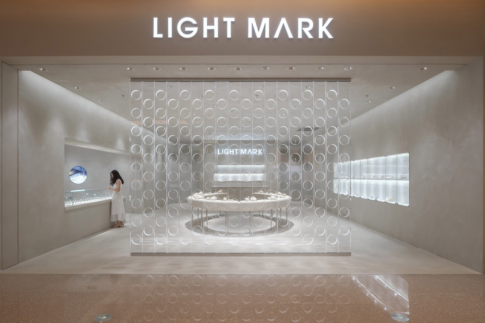
LIGHT MARK品牌成立时间不长,而且产品阵容不仅有婚礼饰品,还有休闲系列。因此,我们试着从橱窗购物的角度入手,试着创造一个能够从外部吸引顾客的眼球,从而进入店内查看的设计。
LIGHT MARK is a comparatively new brand, their product SKU includes not only wedding jewelry but also casual series. Therefore, we tried to start from the perspective of window shopping, create a design that would draw the customer’s eyes from the outside, then fascinate them to look inside the store.
▼吸引顾客的立面
a design that would draw the customer’s eyes © 朱润资
▼入口区域
entrance area © 朱润资
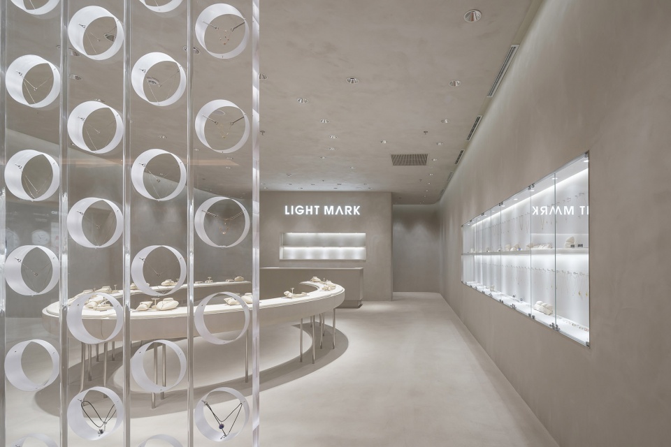
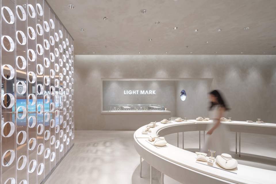
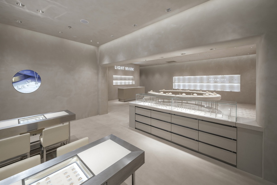
▼内部空间
interior view © 朱润资
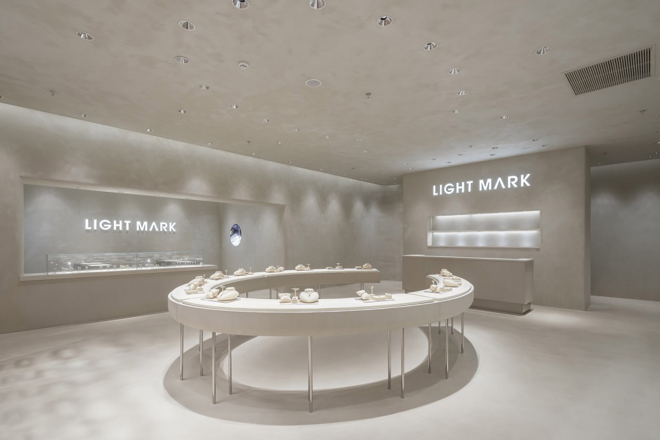
▼看向展示区
view of the wall display area © 朱润资
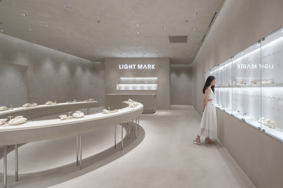
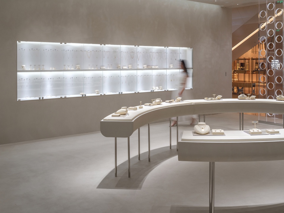
▼选购区
shop area © 朱润资
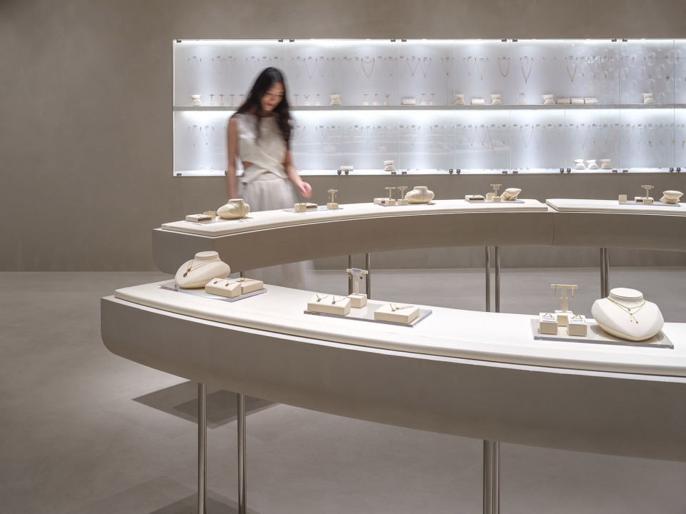
▼选购区吧台
round bar in shop area © 朱润资
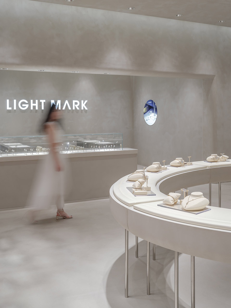
对于一般的服装店而言,客人是可以一定程度上从店外看到所售产品的设计的。然而,就珠宝的尺寸而言,客人很难从店外直观地感受每一件产品的设计。另一方面,具有华丽的装潢,通过玻璃柜与店员交谈的传统珠宝店,适合有意向购买较为高级珠宝的人士。然而,对于只是想恰好逛到或者轻松地欣赏珠宝设计的客人,可能会有一种被拒之门外的感觉。
Generally, for a clothing store or shoe store, customers are more or less able to see the design of the products from outside the store. However, when it comes to the size of the jewelry, customers can barely intuitively feel the design of the products from the outside. On the other hand, traditional jewelry stores with gorgeous decorations present their products in glass cases, with staff on the other side. Such a presentation method works for customers who have a clear intention to buy comparatively high-end jewelry. However, customers who merely want to look around or causally view the jewelry design might feel like being turned away.
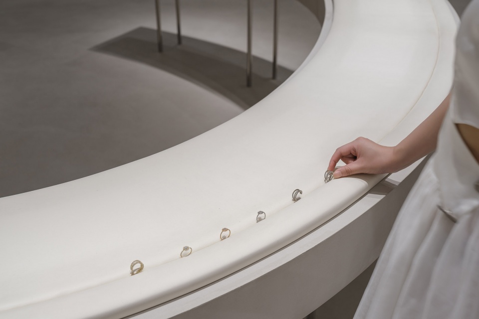
▼选购区吧台细部
details of the bar © 朱润资
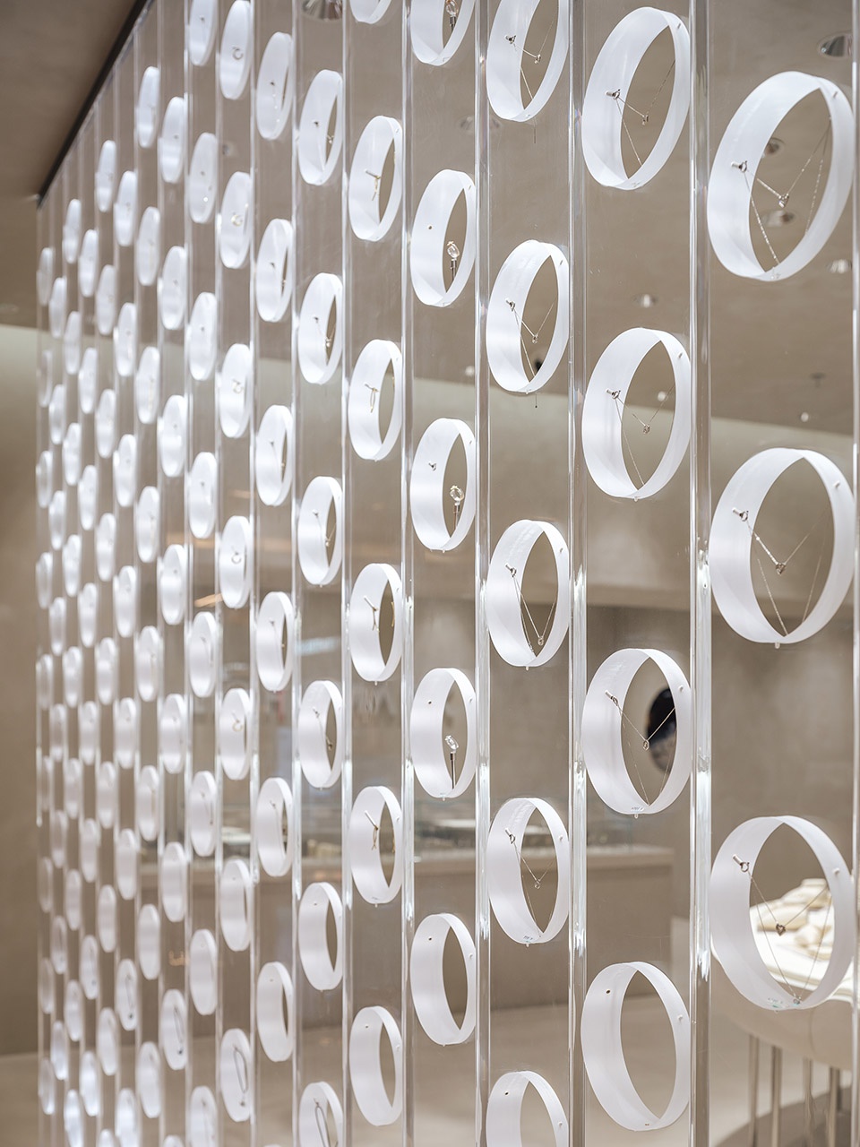
我们注意到,传统珠宝店是通过一个个玻璃柜来展示里面的珠宝, 平放在展柜中的珠宝需要客人走近去查看它才知道确切的设计。所以我们想到,是否有可能以尽可能以高透明度的状态垂直展示珠宝来解决这个问题,并尝试了从这个视点出发进行设计。
We noticed that in traditional jewelry stores, the jewelry is displayed through glass cabinets, and customers need to approach the glass cabinets to know the exact design of the jewelry. Therefore, we were thinking, is it possible to display the jewelry vertically in a highly transparent condition? We tried to design from this perspective.
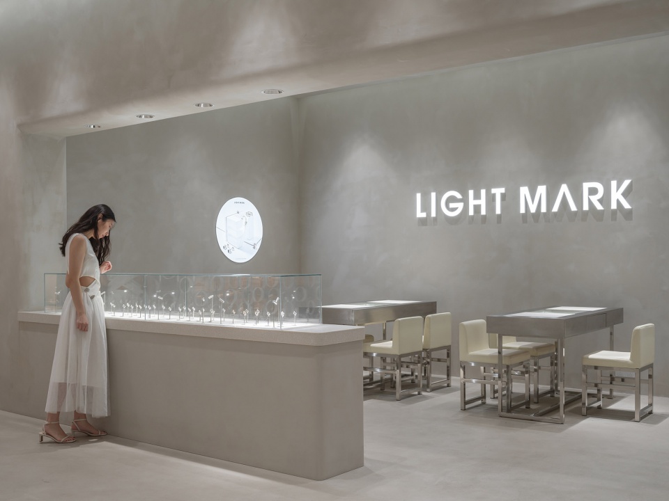
▼讨论区
discussion area © 朱润资
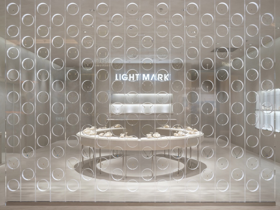
具体而言,我们垂直安装了一面面宽220mm,高3200mm,厚50mm的亚克力板,并在亚克力板上打出直径为170mm的圆洞。然后在圆洞的切面的三处嵌入用于固定珠宝的小型金属配件,并利用这三个配件来展示各种类型的珠宝。此外,透明亚克力镂空的圆形的切面经过磨砂处理,成为吸光面。通过这个漂浮在空中的光环中展示珠宝,我们为珠宝创造了一种优雅的状态,让每个珠宝都有一种特殊的感觉。
Explicitly speaking, we installed acrylic walls with a width of 220mm, a height of 3200mm, and a thickness of 50mm vertically, and punched 170mm-diameter round holes on them. Then small metal accessories for fixing jewelry are embedded in three places on the section surface of the round hole, and these three accessories have variations suitable for displaying all types of jewelry. In addition, the round section surface of the transparent acrylic hole has been frosted to become a light-absorbing surface. By presenting the jewelry in the floating halos, we create an elegant state for the jewelry and make every one of them feel special.
▼亚克力板垂直展示珠宝
the acrylic walls © 朱润资
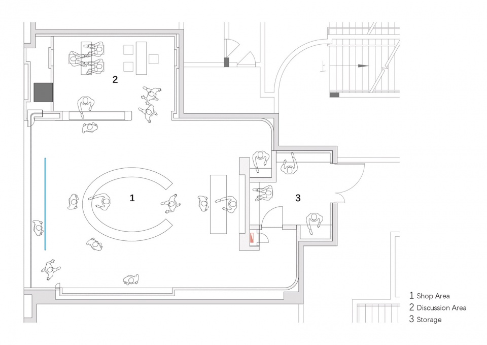
▼平面图plan © 小大建筑设计事务所
项目名称: LIGHT MARK 蘇州
设计&完成年份 2021.8.1-2021.10.11 / 2021.12.25
主创及设计团队 小嶋伸也 , 小嶋綾香 , 泰川恵多朗 , 陈舒天 , 黄永顺 , 罗伊, 遠藤直輝
项目地址:中国・蘇州
建筑面积:120平方米
摄影版权:朱润资
客户:LIGHT MARK


