
01. 时空的焦点
Focus of space
六工汇位于北京首钢园北区的核心地块内,由六个互通的地块组成,是一个汇聚企业独栋、复合式商业、多功能剧场和绿色公共空间的新型城市公园综合体。
Chang’An Mills located in the core plot of the North District of Beijing Shougang Park, which is composed of six interconnected plots. It is a new urban park complex which is integrating enterprise single house, compound commerce, multi-function theater and green public space.
▼项目概览,Preview © 李晓光
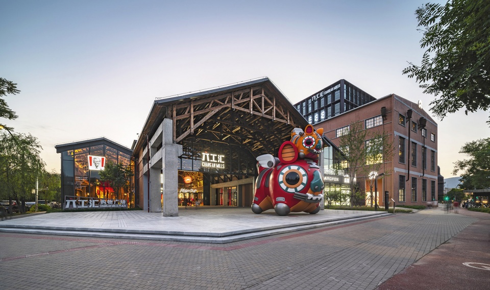
六工汇购物广场落位于地块东南角,是六工汇乃至首钢园北区内“时间与空间”的重要焦点,东侧为商业主干道,南侧为高线滨湖景观轴,远望冬奥大跳台与冷却塔,西侧为三高炉博物馆与群明湖之间的绿色通廊,沿途工业遗址风貌完整,西北远眺石景山。冬奥盛会、百年遗址、自然风光共同交织于此。
Chang’An Mills Shopping Plaza located in the southeast corner of the plot, it is an important focus of “time and space” of Chang’An Mills and even all north area of Shougang Park. On the east side is the main commercial road; on the south side is the lakeside viewing axis, which is overlooking the Winter Olympic ‘Big Air Shougang’ and Cooling Tower; and on the west side is the green corridor between the Shougang No.3 Blast furnace Museum and Qunming Lake, the industrial style is complete along the way; on the northwest side is the overlooking of Shijingshan mountain, the Winter Olympics, Centennial ruins and natural scenery are intertwined here.
▼六工汇购物广场东侧入口,East entrance of Chang’An Mills Shopping Plaza © 李晓光
02. 商业中的场景 场景中的商业
Scenario in Business, Business in Scenario
项目作为传承首钢工业遗产记忆与构建美好未来的新地标,弘石室内设计团队需要探索的不仅是新与旧的融合,更要打造符合当下体验与消费习惯的商业空间。
As a new landmark to inherit Shougang’s industrial heritage memory and build a better future, Hongshi indoor design team needs to explore not only the integration of the ‘new’ and the ‘old’, but also to create a commercial space that convenience to both the current experience and consumption custom.
▼层次丰富的商业空间,A multi-layered commercial space © 李晓光
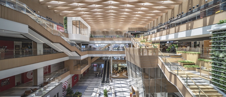
互联网时代下人的行为习惯呈现出典型的“目的性”,唯有变“商业中的场景”为“场景中的商业”,将呆板的传统商业空间改造为充满活力与交互的共享空间,方能让消费群体前往并持久的停留其中。
People’s behavior shows a typical ‘purpose’ in this Internet-age. Only by changing ‘Scenario in Business’ into ‘Business in Scenario’ and transforming the rigid traditional commercial space into a dynamic and interactive shared space, can make consumer groups go there and stay for a long time.
▼场景中的商业,Business in Scenario © 李晓光
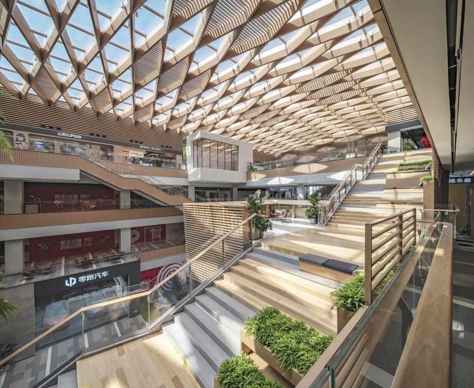
弘石团队主要采用群岛、天阶、平台、盒子等设计手法,带来动线及空间的戏剧性,打造只属于首钢IP文化的室内场景,灵活的业态布局,让小而出彩的共享空间遍及其间,呈现一种现代、开放、自由的生活方式。
Hongshi design team adopts the design techniques of archipelago, Traversing Stairs, platforms, boxes and so on, bringing the dramatic traffic flow and space, creating an unique indoor scenario which is known as ‘Shougang IP’, and the flexible commercial layout makes small and brilliant shared space everywhere, which presents a modern, open and free lifestyle.
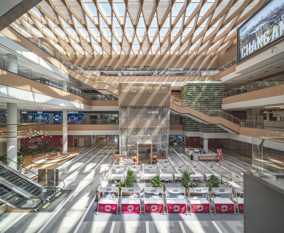
▼新建中庭空间,The new atrium © 李晓光
03. 新与旧
New and Old
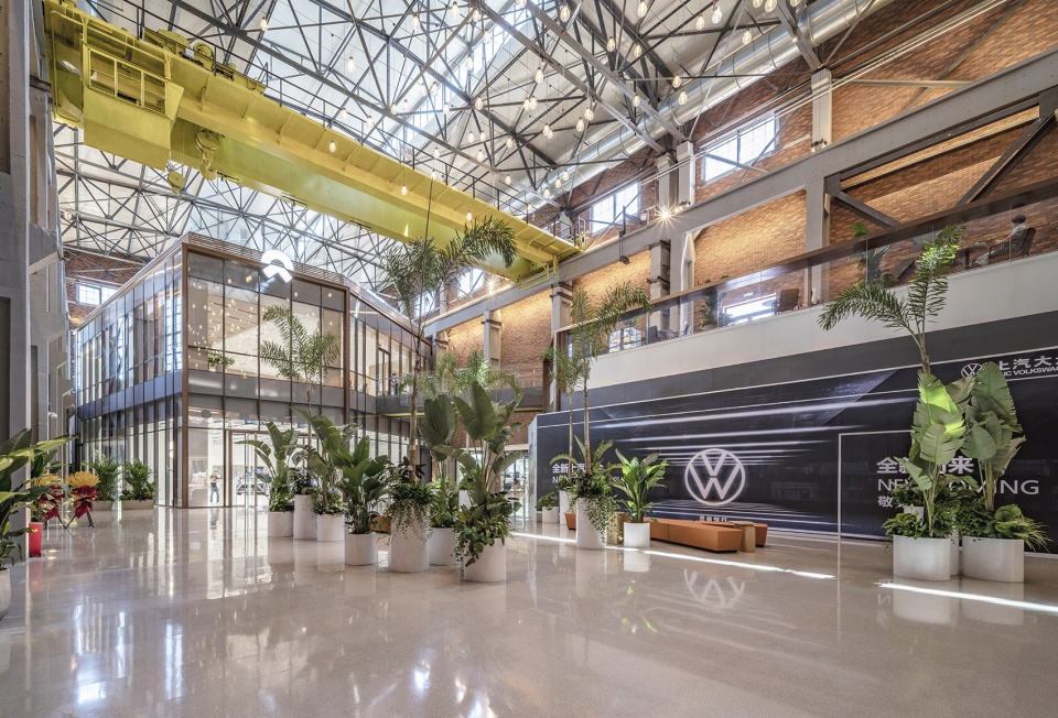
场地内保留建筑“二泵站”及“7000风机房”承担着购物中心东侧主入口与东区中庭的角色。7000风机房空间内本真的工业风貌,是室内设计中最好的造型构成,天花利用原厂房结构坡顶把天光引入空间,原有的桁架结构,生产天车、结构柱保留原始风貌,搭配老厂房立面的红砖肌理。
▼改造前的7000风机房,7000 Fan Room before renovation © Jerry Yin
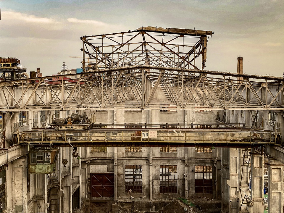
The ‘No.2 Pump Station’ and ‘7000 Fan Room’ are reserved in the site which play the role of the east main entrance and east area atrium in the shopping palza. The original industrial style of the ‘7000 Fan Room’ is the best modeling of indoor design. The design of celling is the slope top of original plant structure, which can introduce the skylight into the space. The original truss structure, production crown block and structural column are remained original style, to match the red brick texture of the old factory facade.
▼由7000风机房改造的东侧中庭,The east atrium renovated from the 7000 Fan Room © 李晓光
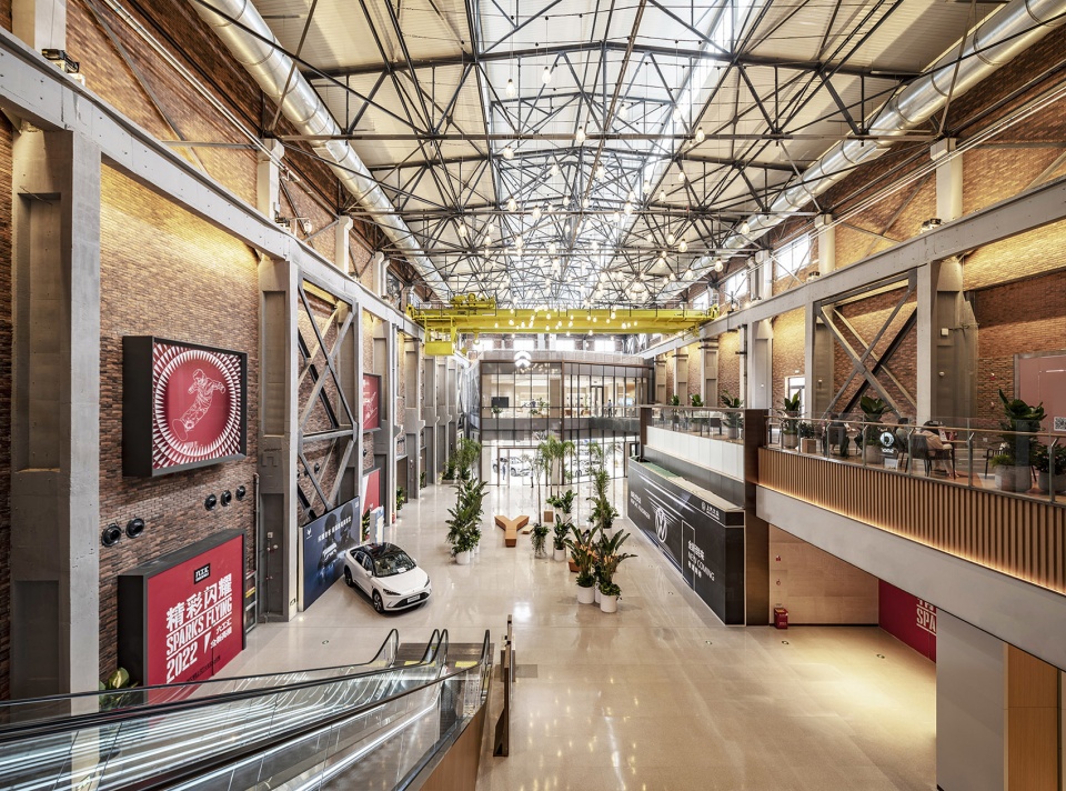
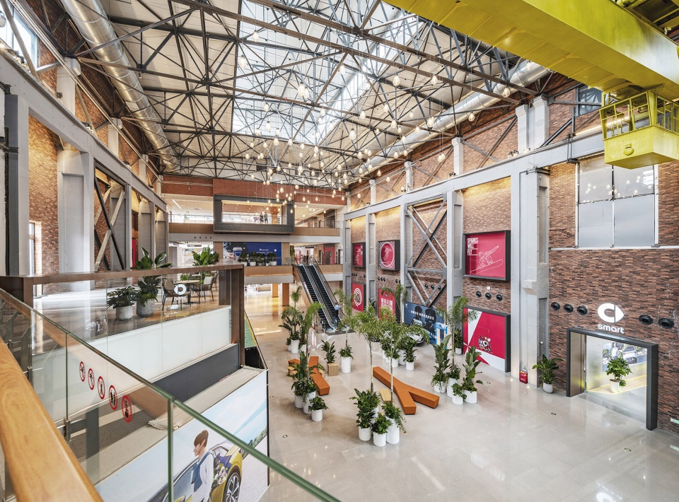
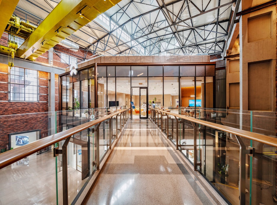
店铺墙体采用铜色材质与玻璃对比的方式烘托工业感中的现代元素。软装上用Y字型钢条为设计灵感的家具,匹配高绿植,围合成商业空间的休闲岛。7000风机房的总高度近25米,空中连桥连接二层的NIO蔚来旗舰店,整个空间层次丰富兼备现代感。
The wall of the store is made of copper and glass to contrast the modern elements in the industrial sense. The furniture with Y-shaped steel bars as the soft decoration design inspiration, matches the high green plants to enclose the leisure island in the commercial space. The total height of ‘7000 Fan Room’ is nearly 25 meters, and the air bridge connects NIO flagship store on the second floor. The whole space is modern and rich in every level.
▼厂房原始风貌搭配红砖立面肌理,The industrial sense with red brick surface © 李晓光
▼以Y字型钢条为灵感的软装家具,Furniture elements inspired by Y-shaped steel bars © 李晓光
04. 天与地
Heaven and earth
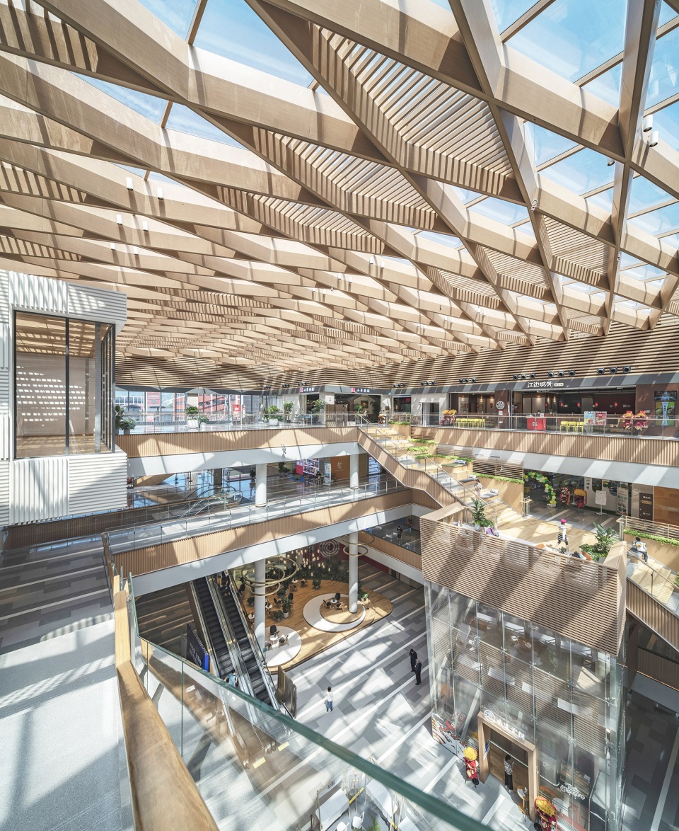
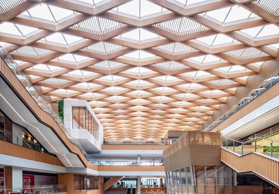
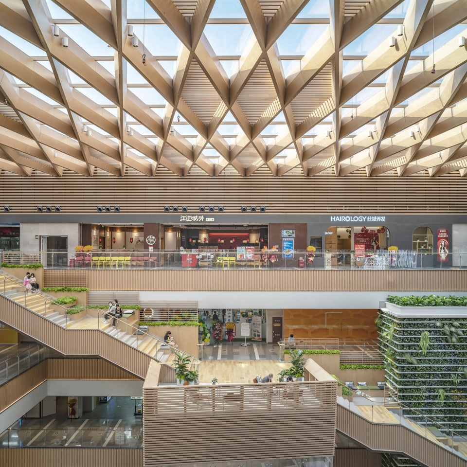
在与建筑设计团队密切合作下,中庭天花造型采用菱形阵列布置,通透的玻璃让自然光线散射室内,拉近人与自然的距离。通过设计与计算天花的细节造型,避免光线过明或过暗,从而达到节约能源的目的。
Through the close cooperation with the architecture design team, the atrium ceiling is arranged in a diamond array, so natural light scatters inside from the transparent glass, and shortening the distance between people and nature. Through the design and calculation of the detailed shape of the ceiling, to avoid too bright or too dark of the light, so as to achieve the purpose of energy conservation.
▼阳光透过天花散射室内空间,Natural light scatters inside from the transparent glass © 李晓光
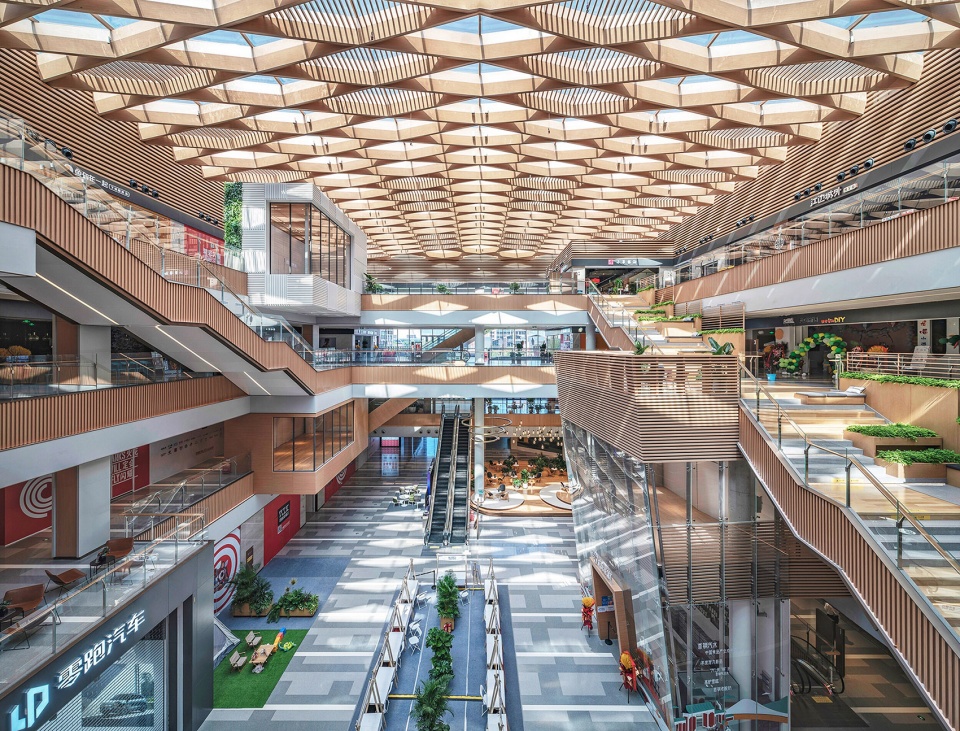
▼中庭空间菱形天花,The atrium ceiling is arranged in a diamond array © 李晓光
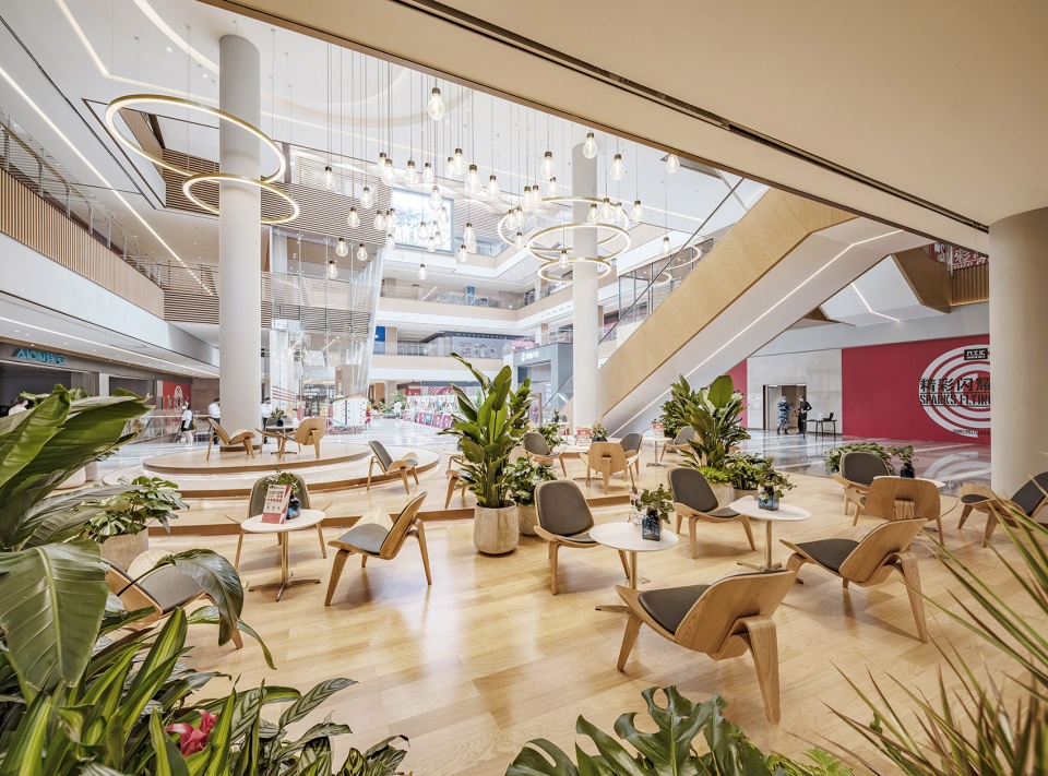
中庭地面布局增加“岛”的概念,休闲水吧、IP点位、外摆均可放置于此。空间的留白,则作为公共区域的交通组织、共享空间、周末集市等弹性使用。
The concept of ‘island’ is promoted to the ground layout of the atrium, where leisure drink bar, IP point and external booth can be placed. The blank space is used flexibly as the traffic organization, shared space, weekend market, etc. in public areas.
▼室内空间中“群岛”的概念,Interior design with the concept of ‘island’ © 李晓光
05. 天阶和趣盒
Traversing Stairs and boxy store
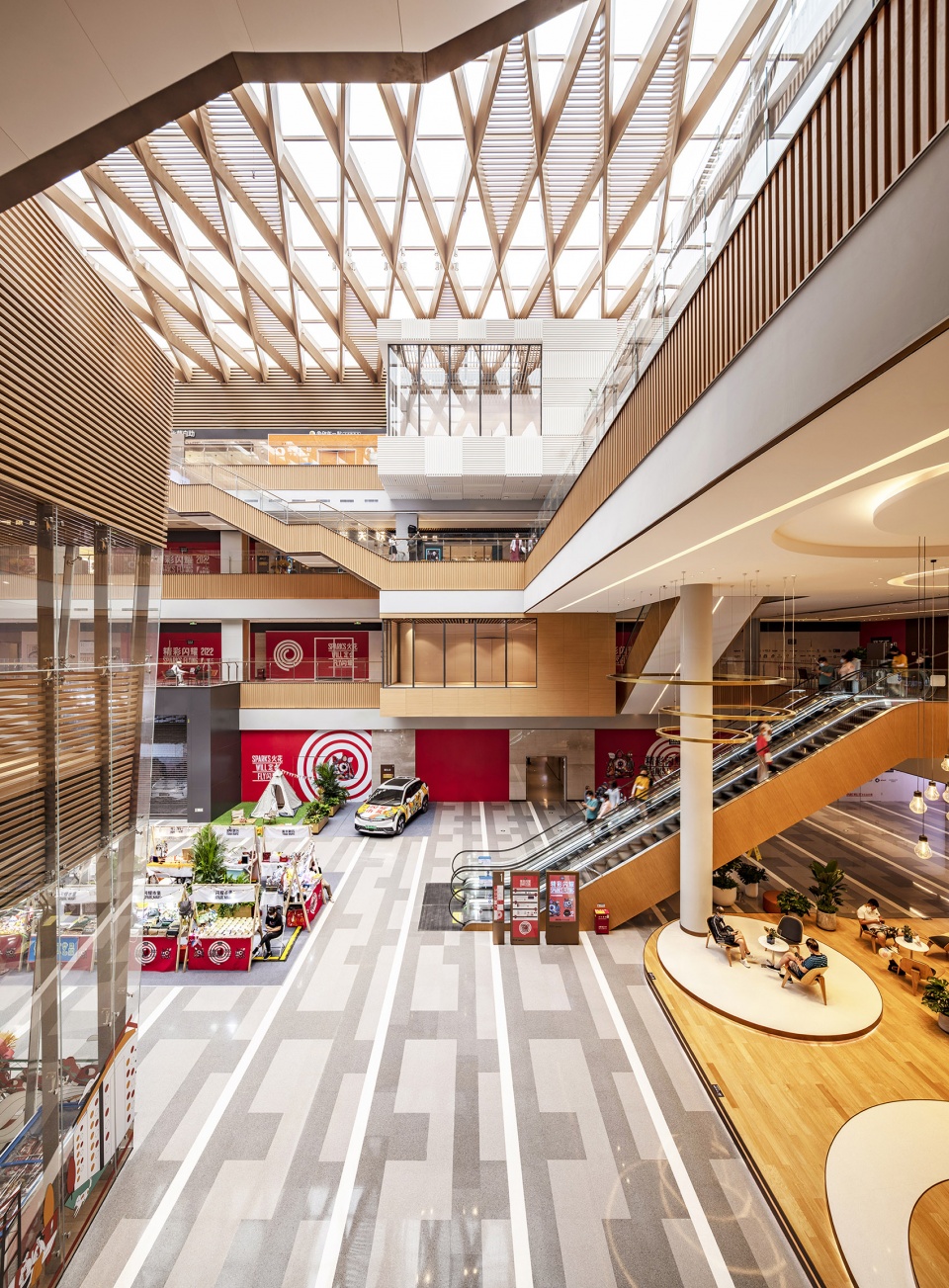
基于对传统商业空间的反思,在整个商业空间里分布着不同形态的半通透盒子,将零售、餐饮、休闲空间灵活混搭,盒子在表皮材质上进行区分设计,使空间更具丰富性与辨识度。小尺度商业空间的出现,为大量共享区域提供自由使用的可能性。
Based on the reflect of the traditional commercial space, there are different forms of semi-hyaline boxes distributed all-over the commercial space, which flexibly mix the retail, restaurant and leisure spaces. The boxes are designed differently on the surface material, making the space more abundant and recognizable. The emergence of small-scale commercial space provides the possibility of free use for a large number of shared areas.
▼悬浮的趣盒,The floating boxy stores © 李晓光
▼趣盒小尺度的商业空间,Boxy spaces © 李晓光
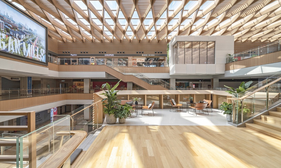
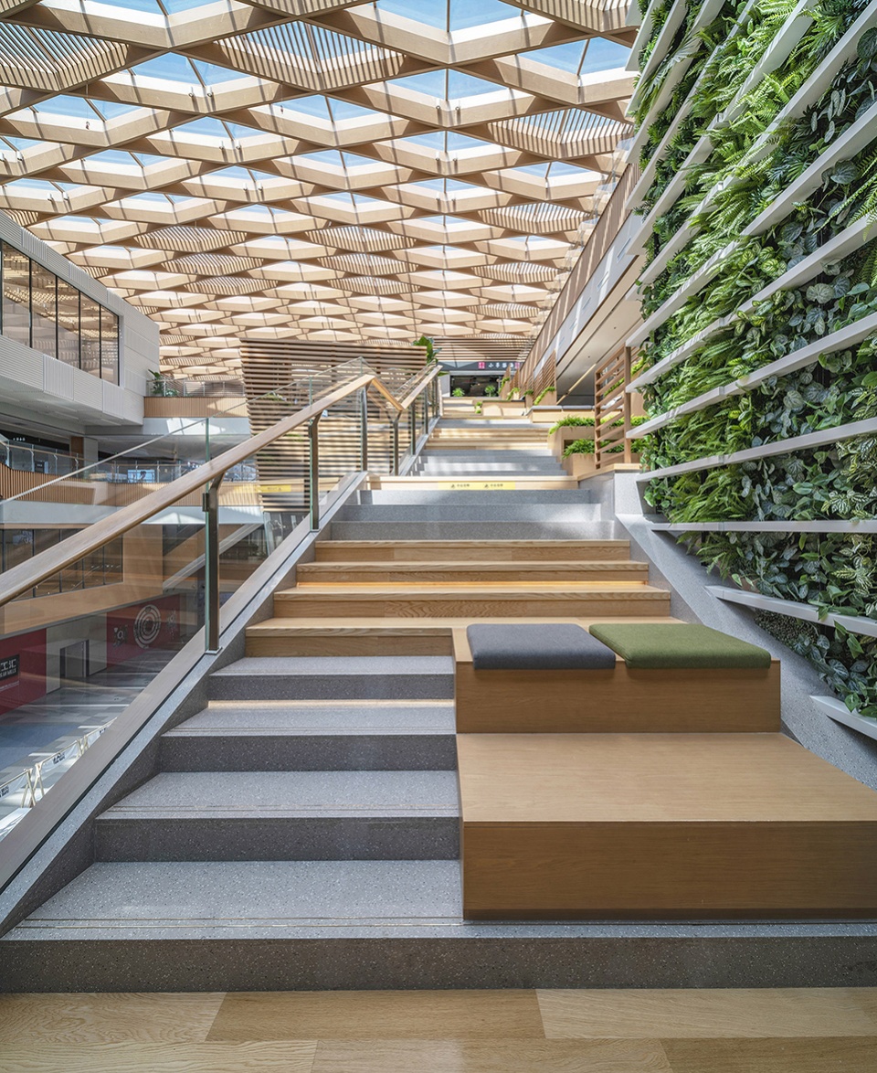
购物中心共有两处天阶的设计,其中从二层直达四层的天阶,左侧为通行动线,右侧为休闲共享空间,搭配适宜的家具与绿植,使空间舒适且自然。
There are two Traversing Stairs in the shopping mall, one of which is from the second floor to the fourth floor. The left side is the traffic flow, and the right side is the leisure shared space. the space is comfortable and natural with appropriate furniture and green plants.
▼带有共享空间的天阶, Traversing Stairs © 李晓光
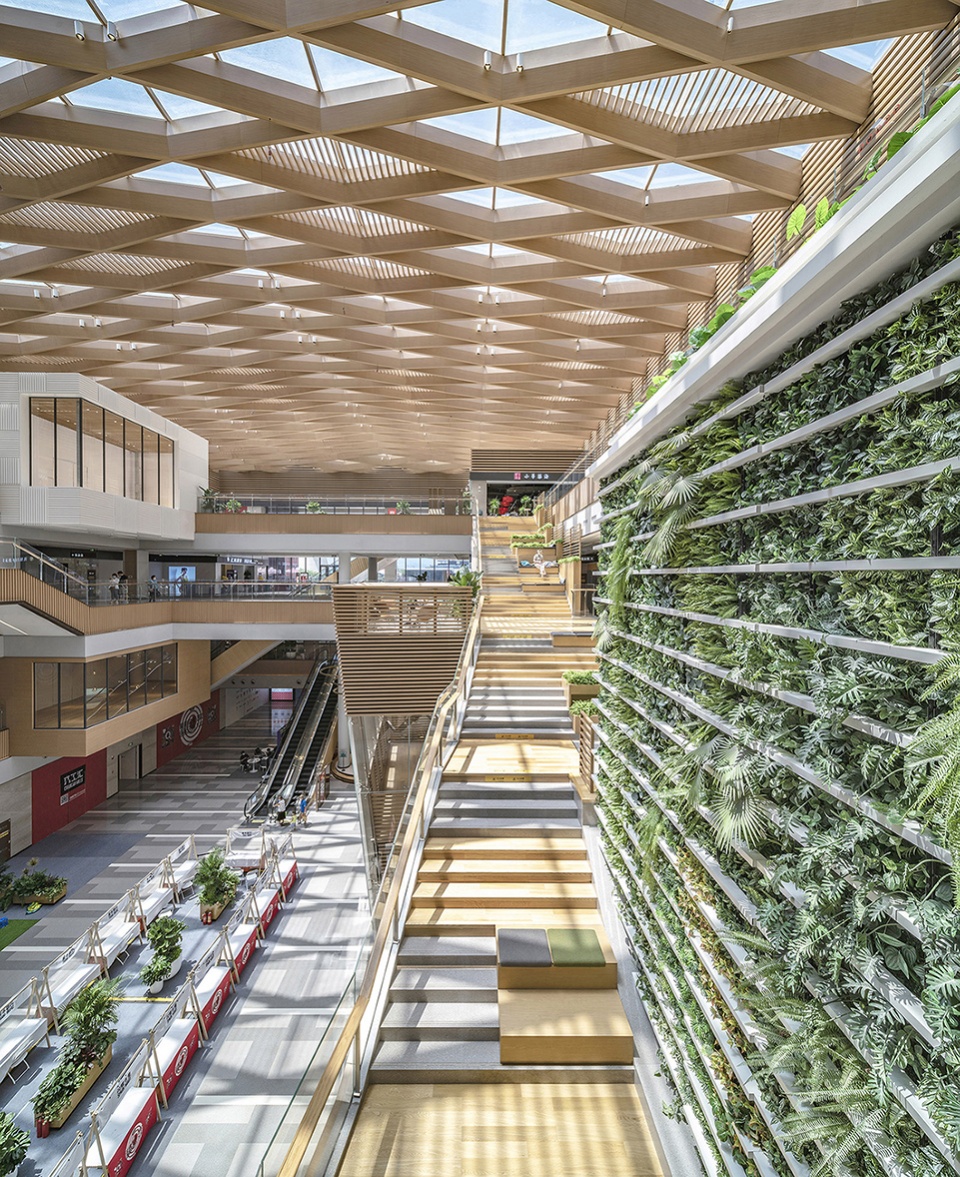
▼天阶与植物景墙,Stairs and planted wall © 李晓光
▼天阶与座椅,Stairs with seats © 李晓光
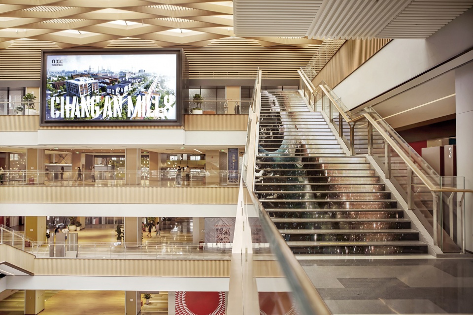
炫舞天阶位于商业中庭的南侧,连接3层到4层的通行动线,用LED屏作为踏步的立面,通过声、光、电的交互设计打造消费空间中的网红打卡地。
实现LED屏与踏步的结合并非易事,台阶踏步的高度是157mm,LED屏最低的高度为128mm,设计团队需要在有限高度内要解决LED及踏面石材的安装问题。规范要求楼梯的踏步高度是不可变的,故而只能在LED屏上方取消传统的的水泥砂浆粘接层改用胶粘。为避免LED屏受踩踏的伤害在LED屏上方增加5mm厚的钢板支撑,增加强度,并在踢面上增加超白有机玻璃对屏幕增加保护。
‘Cool Dancing’ Traversing Stairs is located in the south of the commercial atrium, connecting the traffic flow from the third floor to the fourth floor. The LED screen is used as the facade of the steps, it creates an internet-famous site in the consumption space through the interactive design of sound, light and electricity.
It is not easy to synchronize LED screen with steps. The height of step is 157mm, and the lowest height of LED screen is 128mm. The design team needs to solve the installation problem of LED and tread stone within the limited height. The specification requires that the stair step height is immutable, so the traditional cement mortar bonding layer is replaced by adhesive above the LED screen. 5mm thick steel plate is supported above the LED screen to increase its strength, in order to prevent the LED screen from being trampled, and to install ultra-clear plexiglass on the stair riser for better protection of the screen.
▼具有互动功能的阶梯,The interactive staircase ©蒋衍青
06. 人与场所
People and places
回溯首钢园的历史,无数的劳动者在此夜以继日地奋战。城市更新设计中独特的文化IP使得六工汇购物广场让人们能够穿越时空并享受生活,积淀出非凡的场所精神。
Looking back at the history of Shougang Park, countless workers fought here day and night. To create its unique cultural IP of the urban renewal design, which enable people to transport back through time and space, and feel Shougang’s extraordinary spirit of this place, then enjoy life in Chang’An Mills shopping plaza.
▼大量的休息空间,Seating area © 李晓光
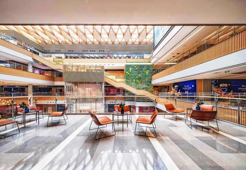
北欧古老谚语为我们总结出人的基本行为习惯——人往人处走。换言之,由于人的聚集进而形成更多人的聚集。购物广场内大量的共享空间为人们提供可以持续停留的地方,进而形成良性循环效应。由消费者定义消费空间的属性,从而使消费场景变为生活方式的提供者。
The old Nordic proverb sums up the basic behavior of people for us – ‘People like to go to people gathered place.’ In other words, the more numbers of people will make more people gathering. A large number of shared spaces in shopping malls provide people with places to stay continuously, thus a positive succession. Consumers define the attributes of consumption space, so that consumption scenarios become providers of lifestyle.
▼通向蔚来旗舰店的连桥,The connecting bridge leading to the NIO flagship store © 李晓光
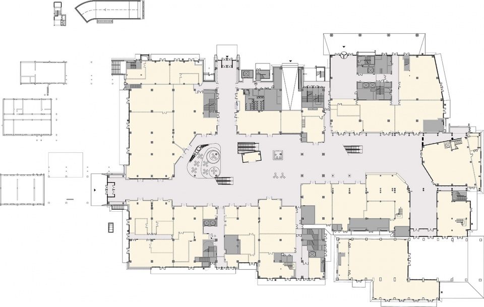
▼首层平面图,Ground floor plan © 李晓光
▼二层平面图,Second floor plan
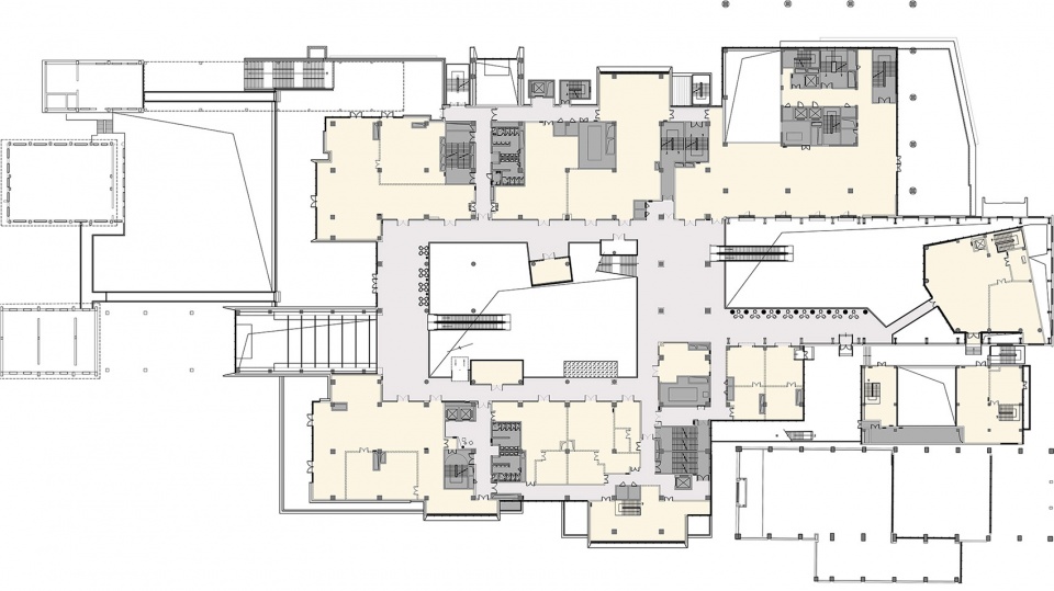
▼三层平面图,Third floor plan
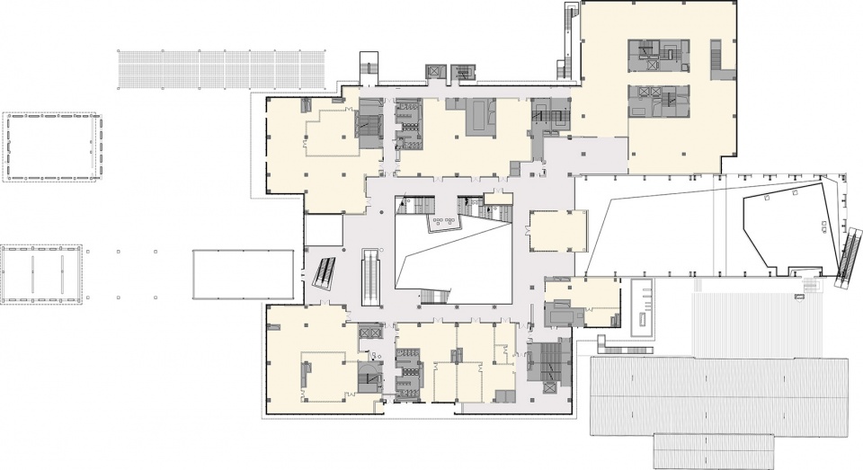
▼四层平面图,Fourth floor plan
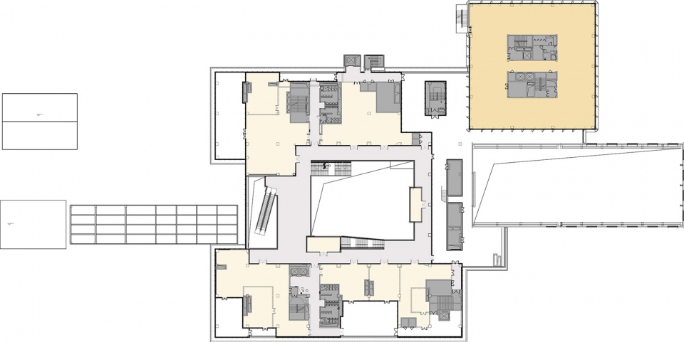
项目名称:首钢园 · 六工汇购物广场
业主单位:铁狮门 首钢基金 首奥置业
项目面积:3万平方米
设计时间:2019年
竣工时间:2022年
室内设计:弘石设计
设计范围:室内硬装设计&软装设计
设计总负责:李红庆
硬装团队:李然 雷春花 蔡东 李一黄 彭奎奎 王增志 姜非 张琪 于海贵 闫紫薇 孙萌 韩浩军
软装团队:于若兰 李鑫美 褚飞
建筑总师:张翠珍
图纸审核:胡祖忠
建筑设计:筑境设计
室内照明:同原(北京)照明设计有限公司
室内商业设计顾问:北京国创京品建筑装饰设计公司
标识设计:北京良好文化传播有限公司
景观设计:易兰规划设计院
木结构设计:上海隽执建筑科技有限公司
幕墙设计:同创金泰建筑技术(北京)有限公司
室内施工:北京乐孚装饰工程有限公司
软装供货:北京赛瑞迪普空间设计有限公司
项目摄影:Jerry Yin 李晓光 蒋衍青


