
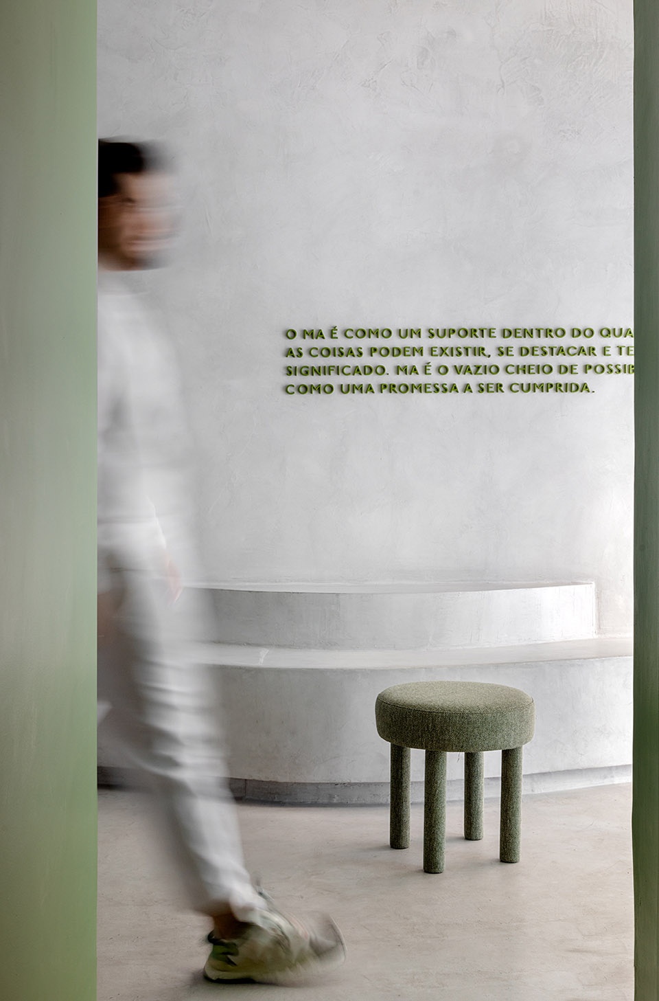
在这间抹茶咖啡店设计中,Studio Guilherme Garcia试图摆脱传统的概念,力求在极简主义风格之上展现一种更为健康有机的形态。空间内部采用浅色调为基底,如同空白画布与品牌的标志性绿色相辅相成,为空间带来清新的气息。
For the design of this matcharia, we sought to escape the traditional, with minimalist references that were translated into the organic forms that constitute the concept of the project. The base of light tones was used in order to bring a greater breath to the space and serve as a blank canvas to work on the green that is the brand’s signature at some points within the project.
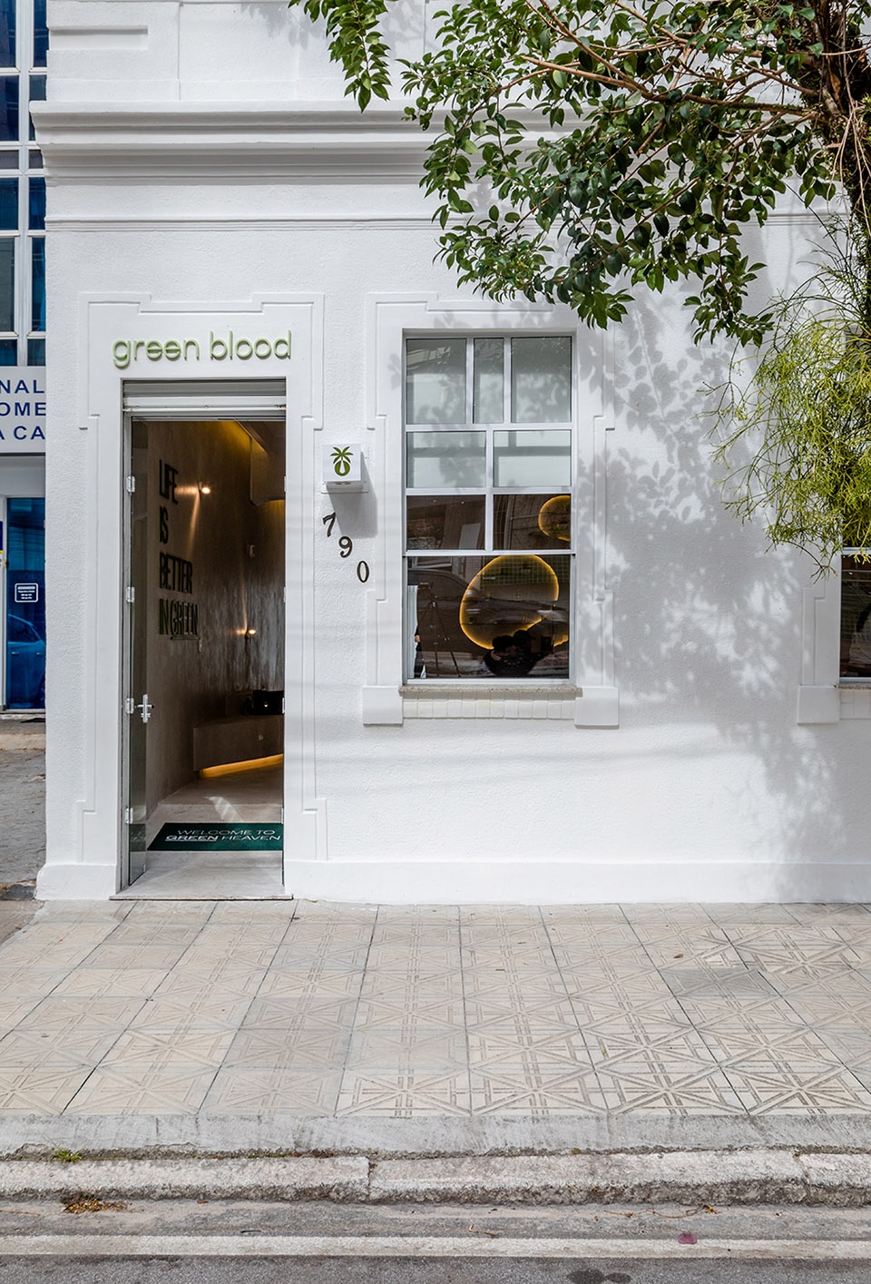
▼项目外观, exterior of the project ©Fabio Severo
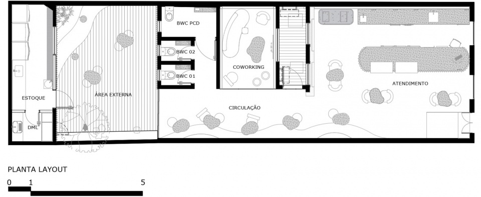
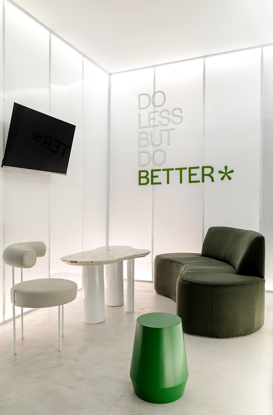
门店内部设有一间专营抹茶的咖啡店和一处共享办公空间。为满足空间内开展临时活动所需的功能,同时兼具简洁美学风格;工作室为此尝试开发了空间内如桌椅等部分家具,最终打造了这一处适宜沉思、氛围平静的极简空间。
The environment consists of a coffee shop specializing in Matcha, together with a coworking space. The entire project was designed based on the functionality necessary for activities to be carried out quickly within the space. The clean aesthetic that was proposed for the environment, results in a contemplative, calm space without many visual interferences. Therefore, the Studio also managed to develop some of the furniture present inside the space such as tables, chairs and some other elements.
▼由室内望向庭院
view from the inside to the courtyard ©Fabio Severo
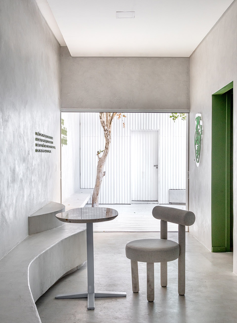
▼室内空间概览
interior view ©Fabio Severo
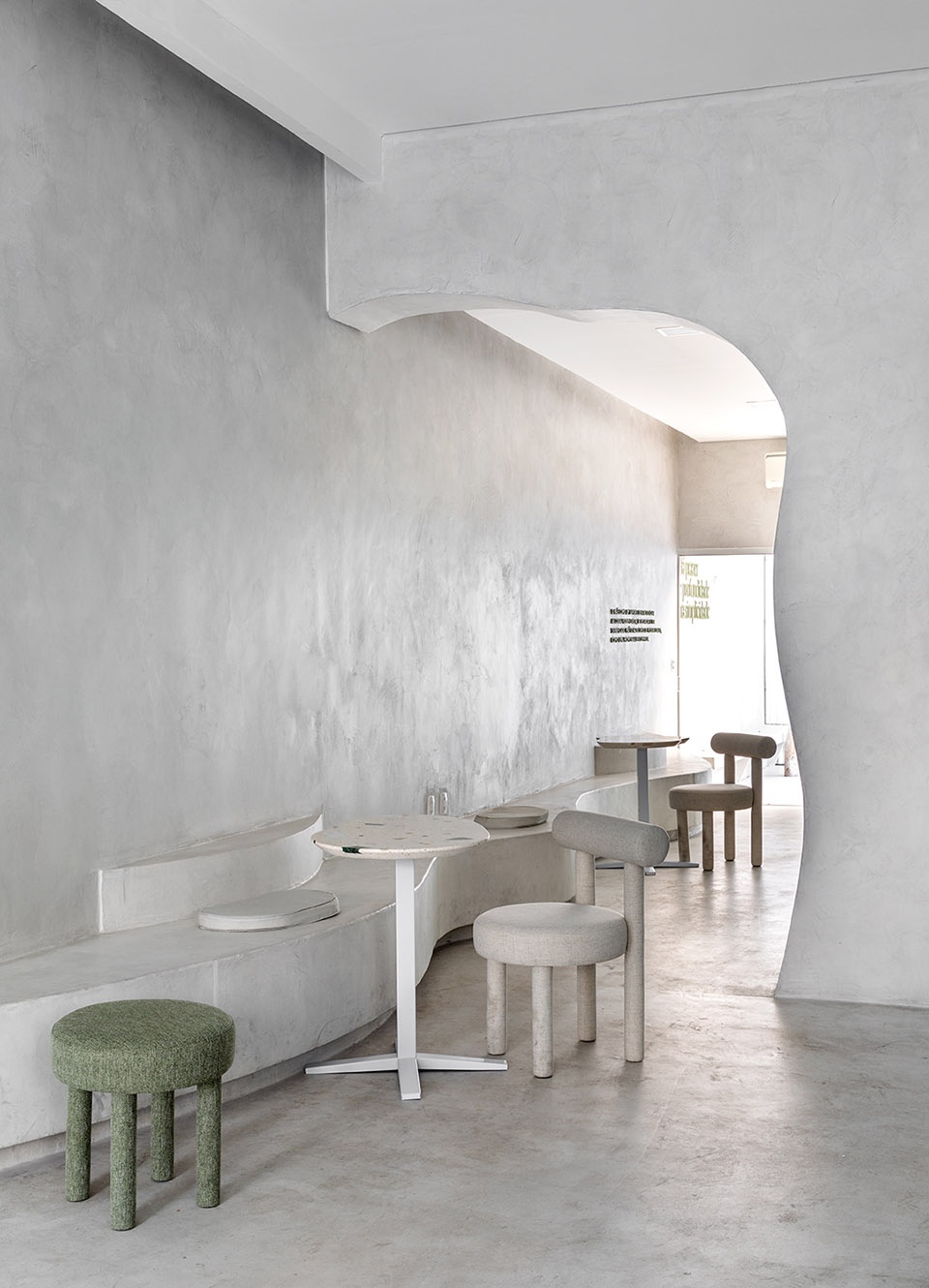
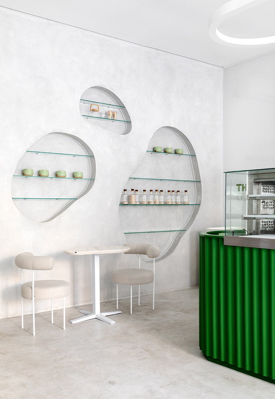
▼室内座位和墙面置物架细节
indoor seating area and wall storage area ©Fabio Severo

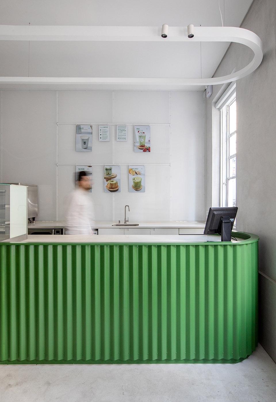
为求赋予空间内部更为鲜明的个性,服务台设计采用一种非传统材料——瓦片包覆。地板及墙壁则使用胶凝材料,打造出中性色调的背景。洗手间内部,设计师运用逃避主义的艺术手法,期望每一位步入的人接收到设计巧思带来的惊喜。
The call center furniture was designed and covered with tile, using a not-so-conventional material to bring a greater personality to the project. The floors and walls were coated with cementitious material, creating a neutral background for the project. In the bathrooms, some elements of escapism were worked on, with the sole objective of surprising whoever enters it.
▼服务台区域一览,overview of the call center of the project ©Fabio Severo
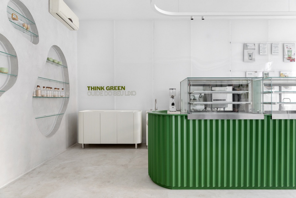
▼服务台和旁边的座位区
the call center and seating area nearby ©Fabio Severo
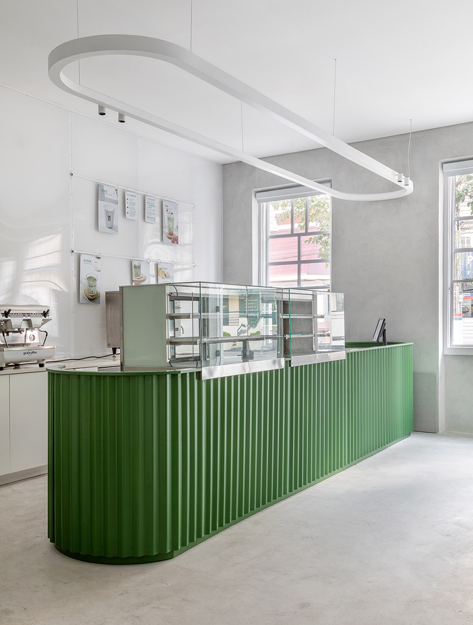
▼被瓦片包覆的服务台
the call center furniture was covered with tile ©Fabio Severo
▼共享办公空间, arrangement of the co-working space ©Fabio Severo
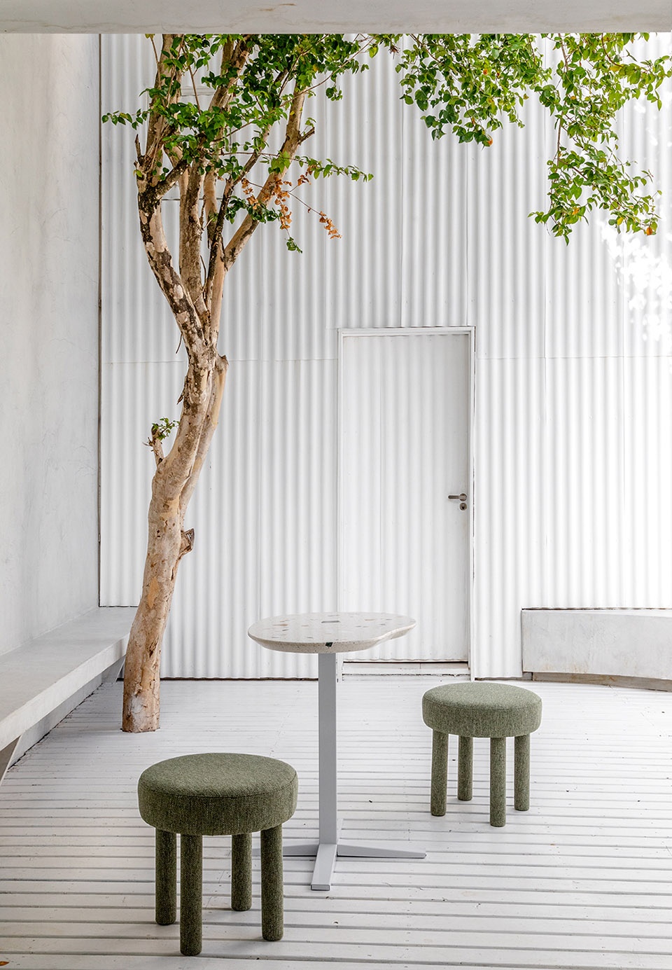
室外空间,立面再次运用瓦片元素,以打造一处内外呼应的背景。在以上各方面协同配合下,一处兼具美学与功能的个性空间呈现于眼前。
In the external area of the project, the tiles were also used, now applied to the facades, creating a rhythmic background. All these aspects worked together with a good project, result in a space that adds aesthetics, functionality and personality.
▼庭院,courtyard of the project ©Fabio Severo
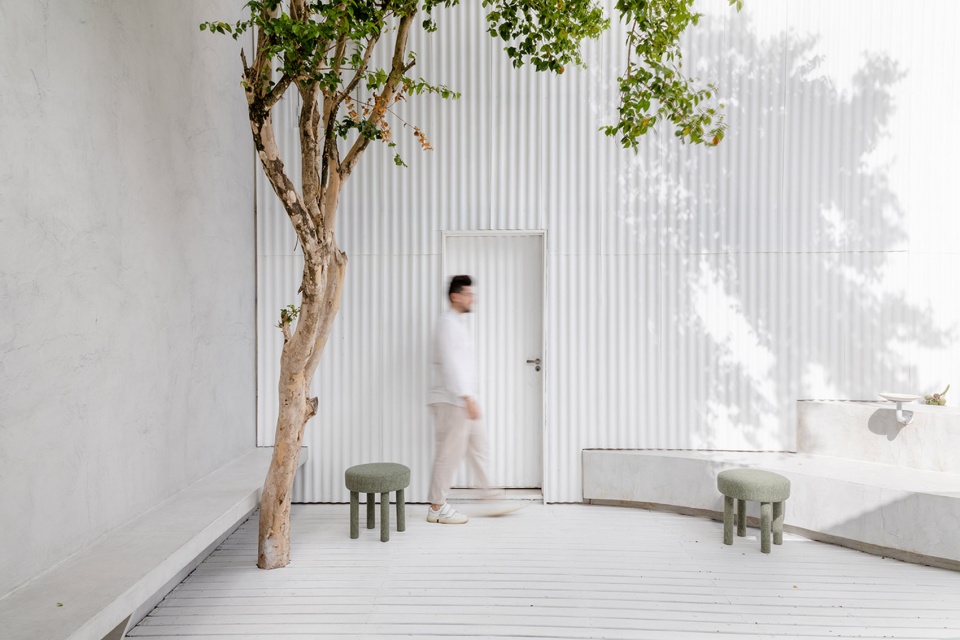
▼光影下的瓦片墙面及庭院座位区,tile-covered facade and courtyard seating area under the light ©Fabio Severo
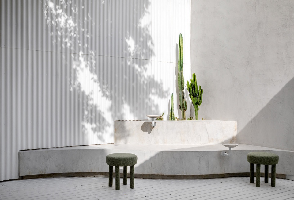
▼庭院座位区与绿植
the greens and seating area of courtyard ©Fabio Severo
▼室内细节,interior detailed view ©Fabio Severo
▼平面图,floor plan ©Studio Guilherme Garcia
