山崎面包于2004年进入上海,其总部位于日本东京,于1948年创立,迄今为止已有70多年的历史,是日本家喻户晓的面包品牌。山崎一直以追求美味健康,高品质的面包为宗旨,吸引了众多中国消费者的喜爱。
Yamazaki Bakery entered Shanghai since 2004, and its headquarter was built up in Tokyo, Japan. It was established in 1948 and has a history that more than 70 years, a well-known bread brand in Japan. Yamazaki pursues delicious and health with the purpose of high-quality bread and attracted more Chinese consumers.
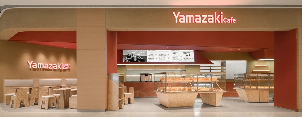
▼门店外观,exterior view ©禾谋制像
此次弹性工作室受邀为山崎打造位于上海久光中心的门店,作为上海的第二家久光,不仅代表了时代发展的风向,引领上海人消费升级的全新项目,也传承了上海人文记忆的“购物标识”。
Tens Atelier was invited to design the store for Yamazaki in Shanghai Jiuguang Center. As the second one in Shanghai, it was not only represent the development trend of era which was brand-new project leading the consumption upgrade of Shanghai consumers , but also inherits the“Shopping Characteristic”of Shanghai’s humanistic memory.
▼入口,entrance ©禾谋制像
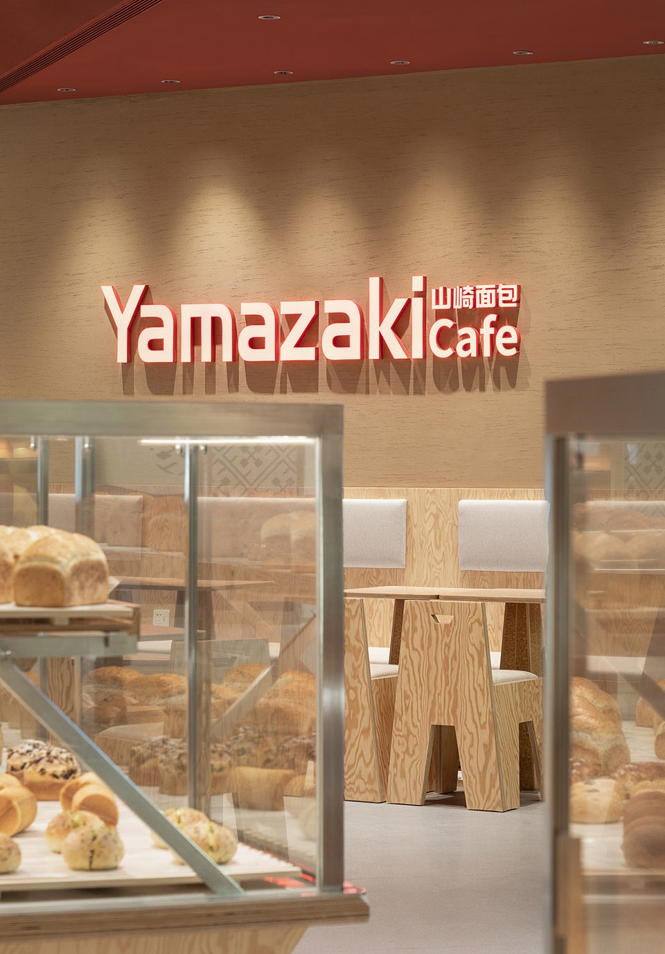
与当下网红烘焙店相比,山崎的门店一直以日式温馨为主,虽然没有搏眼球的网红打卡元素,但一直融入在了顾客的日常生活当中。此次在大宁这样一个年轻活力的板块,希望可以在传达山崎一贯的理念基础上,加入一些新的元素,更贴近现在年轻消费群体。
Compared with the current fancy bakeries, Yamazaki has been dominated by Japanese warmth, although there hasn’t any attached photospots in element, but also it has been integrated into the daily life of customers. This period in a young and dynamic section like Daning, we hope that on the basis of conveying Yamazaki’s consistent concept, add some new elements to be closer to the young consumer group.
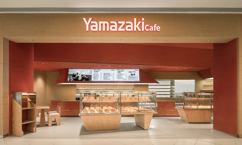
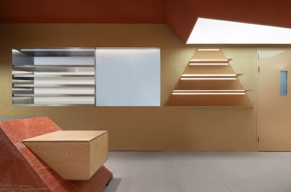
▼室内概览,interior ©禾谋制像
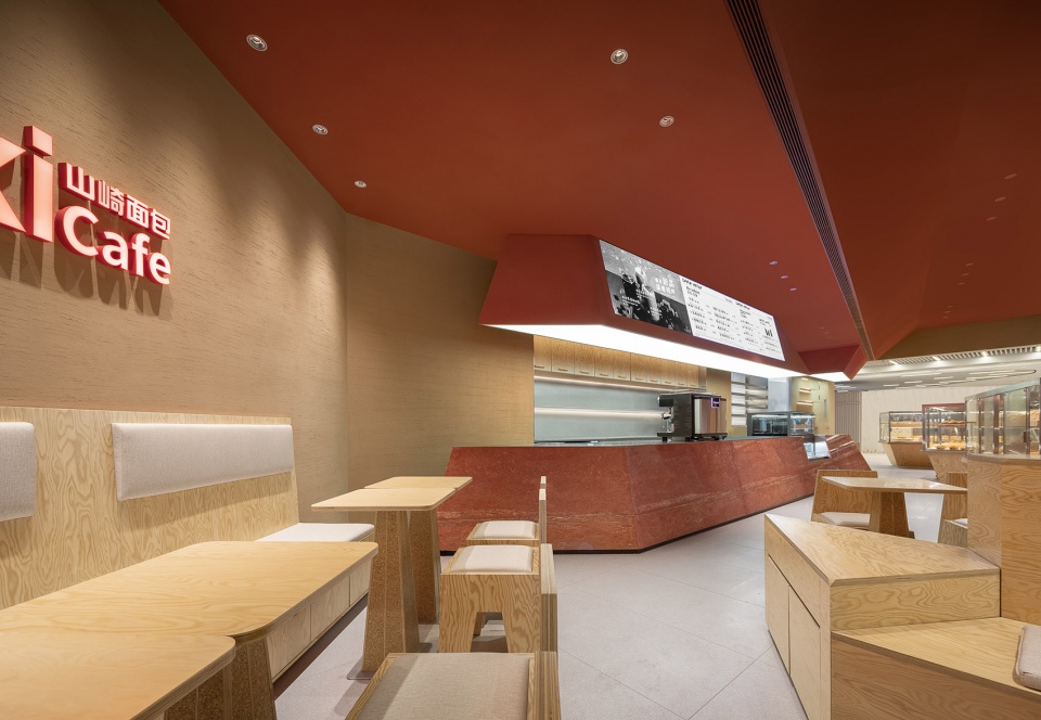
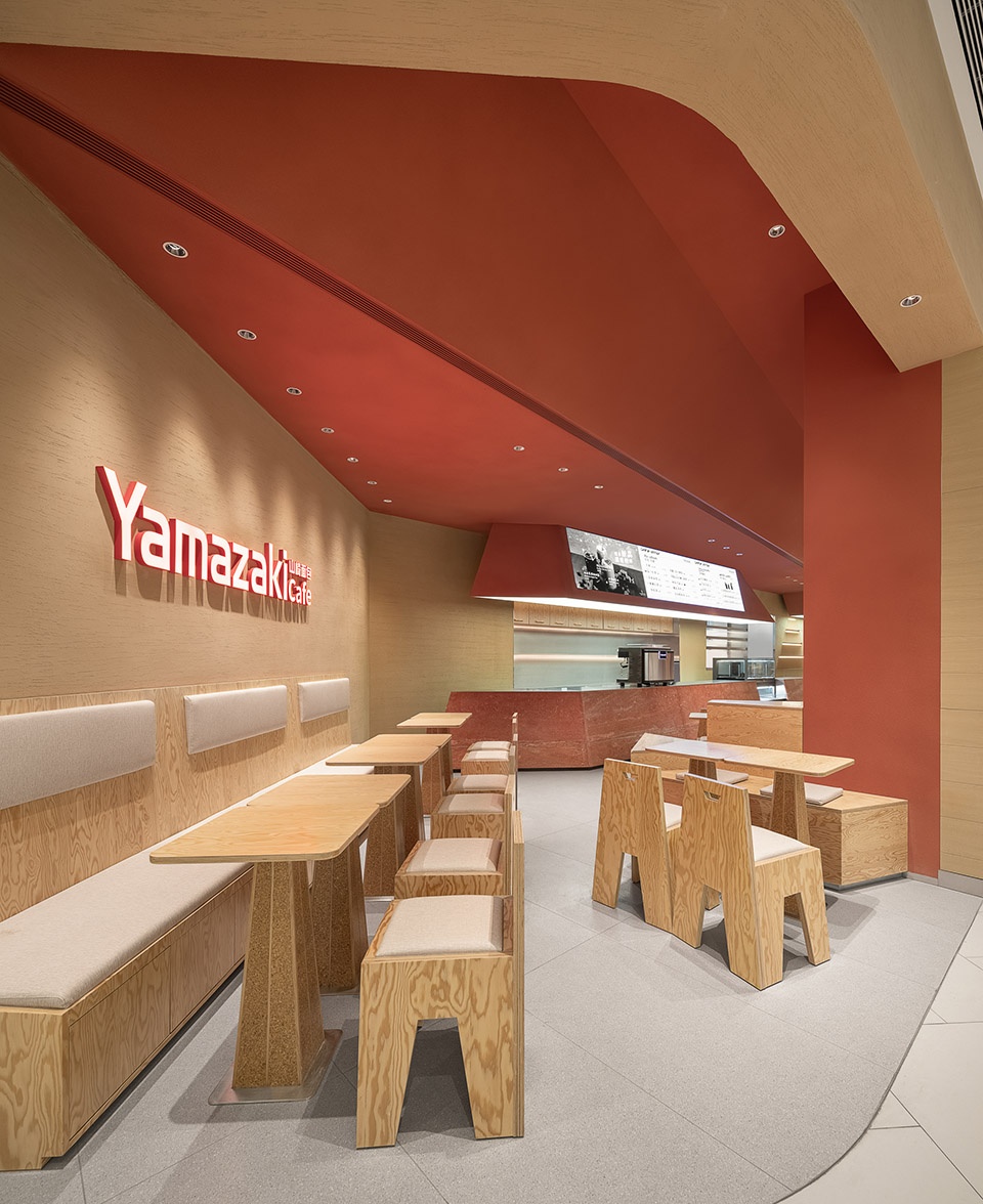
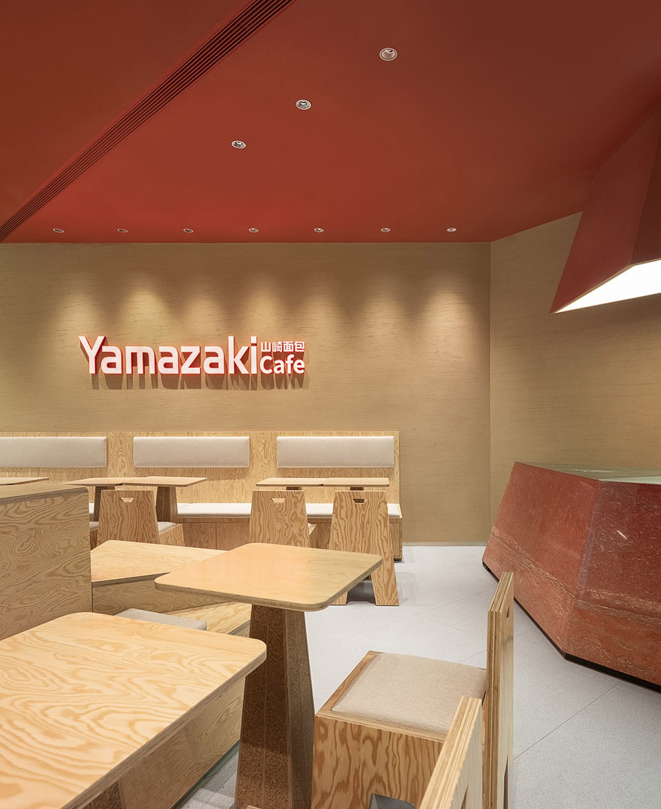
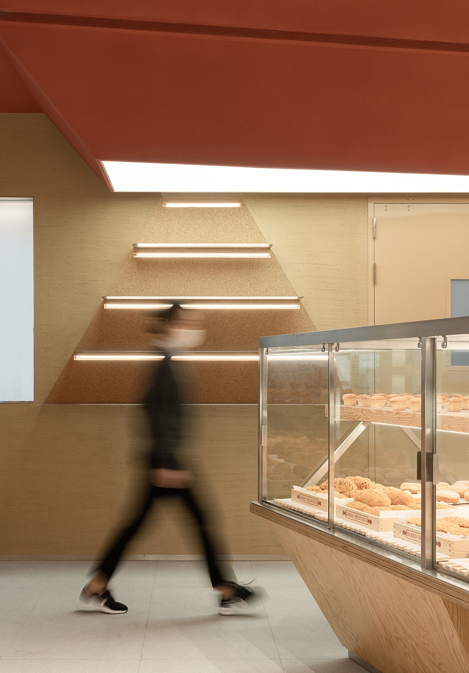
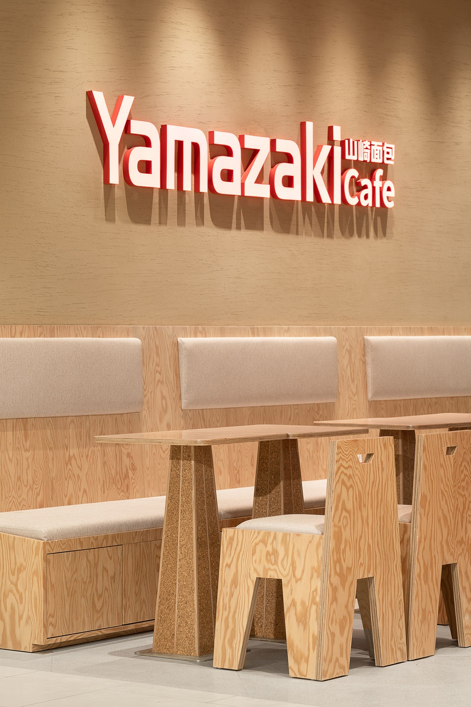
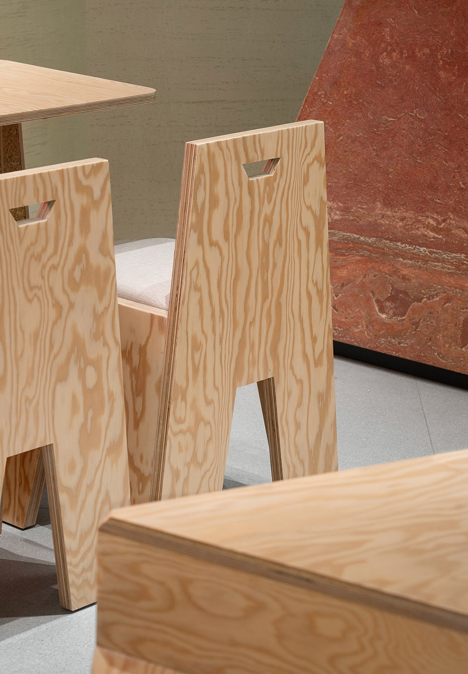
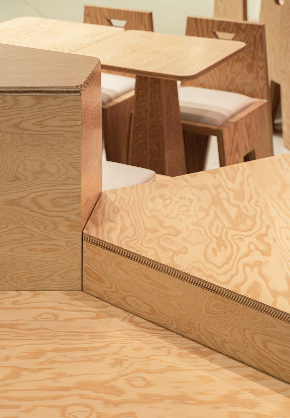
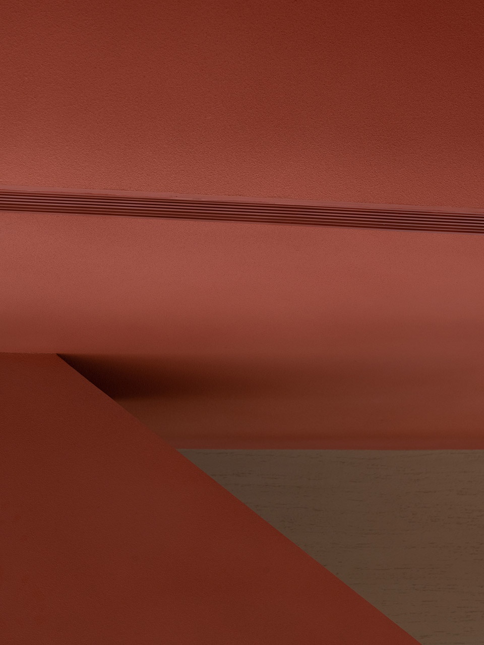
富士山,是日本精神文化的象征,山也代表了力量、坚韧与永恒。由此以“山丘”为空间设计的主题,运用三角形、梯形等几何体块来设计空间。空间主体沿用了logo的红色作为主色调,辅以选用纹路较为夸张的松木纹作为展示柜和桌椅的材质。
Mount Fuji is a symbol of Japanese spiritual culture. Mountain also represent strength, tenacity and eternity. Therefore, with “hill” as the theme, with geometric blocks such as triangles and trapezoids in the space. The space follows the red of the logo as the main color, supplemented by the use of exaggerated pine grains as the material for display cabinets, tables and chairs.
▼收银区概览,cashier counter ©禾谋制像
▼烘焙间,baking room ©禾谋制像
▼展架,display shelves ©禾谋制像
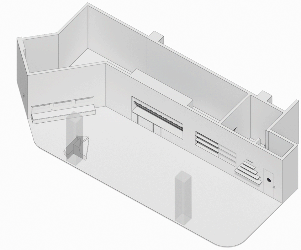
考虑门店位于久光中心地下二层,毗邻日本美食街与未来的地铁出入口,对面就是久光的王牌“久光生鲜馆”,人流量非常大。与品牌方多次探讨后决定适当调整动线,同时将面向商城的立面全部开放,让公区和店铺完全连通来“引导”客人们进店挑选品类丰富的面包,同时也不会过多影响到结账的队伍,让店铺内常常都是人头攒动的景象。在平面布局上,我们将大面包柜旋转15°至30°不等,以增加入口尺寸,通过设计的手法来指引客户的行进方向。
Considering that the store was set up on the second basement floor, adjacent to the Japanese food street and the future subway entrance, opposite is Jiuguang’s ace “The Fresh Mart”, the flow of people is very huge. After many discussions with the client, we decided to adjust the moving line appropriately,and open all the facades facing the mall. Let the public area be fully connected with the store, and “guide” customers into the store to select bread, also without too much impact with the checkout team, so that the store was always crowded. The plane layout, we rotated the large bread cabinet by 15°-30°, in order to increase the size of the entrance, the design method was used to guide the customer’s direction of travel.
▼设计生成,generation diagram ©弹性
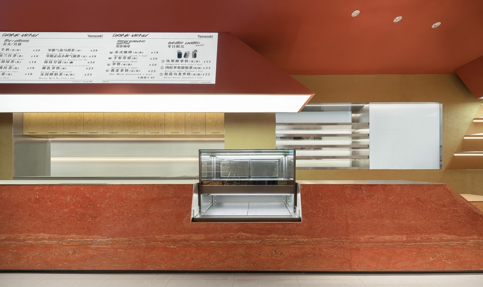
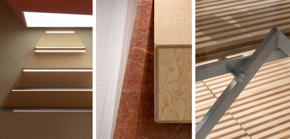
大体块的天花以及线条让整个空间更加干练简洁,中心收银吧台以及桌椅、蛋糕柜的形态均从山丘中获得灵感。吧台由抽象的山形所演化,我们将其从中切开,分别得到上下两个体块,下半部分为红色洞石的收银吧台,上半部分则为海报展示。
The massive volume ceiling and the lines made the whole space more capable and concise, the cashier bar, tables, chairs, and cake cabinets are all inspired by the hills. The bar was evolved from an abstract mountain shape, we cut and got two blocks. The lower one was the cashier bar with red travertine, and the upper one was the poster display.
▼就餐区, dining area ©禾谋制像
▼家具细部,details of the furniture ©禾谋制像
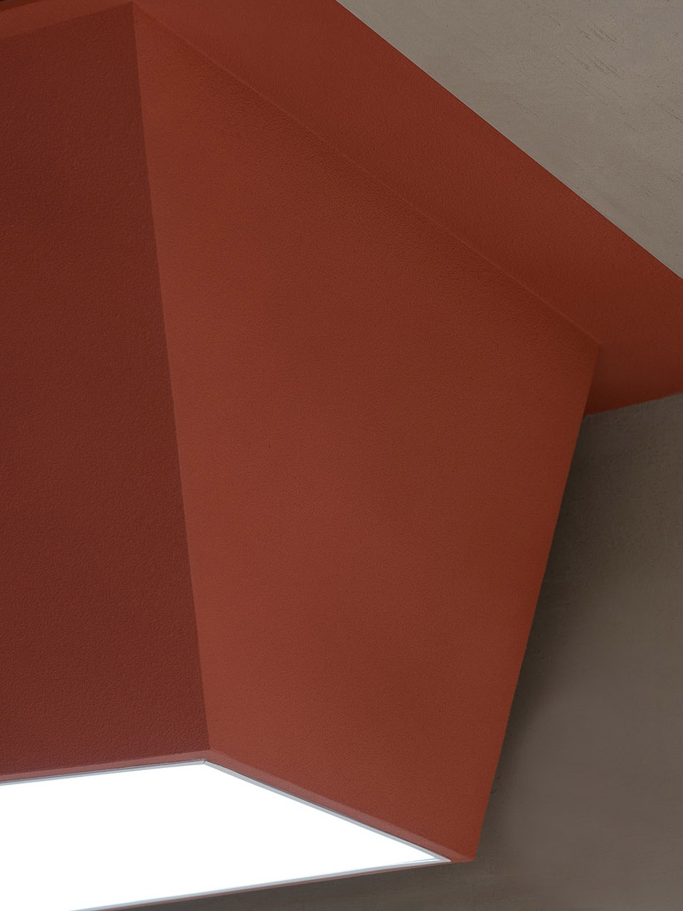
▼天花细部,details of the ceiling ©禾谋制像
▼道具细节,details ©禾谋制像
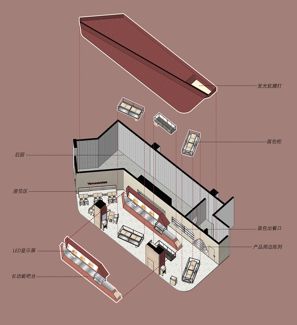
▼轴测图,axonometric ©弹性
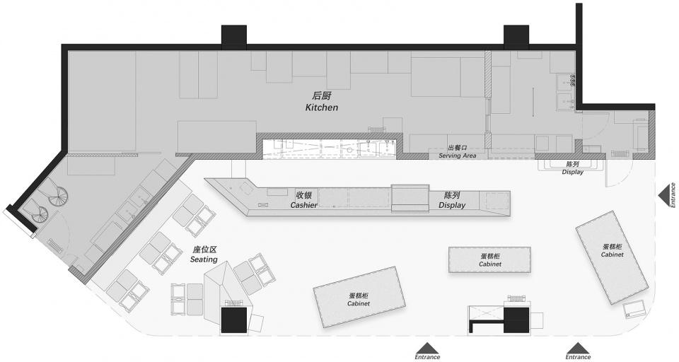
▼平面图,plan ©弹性
项目名称:山崎面包久光中心店
项目地点:中国 上海
项目面积:163㎡
业主单位:上海山崎面包有限公司
设计公司:弹性设计工作室
设计总监:谭晨、张文侃
设计团队:杨育杭、牧之、潘琛杰
施工单位:上海琢善工程管理咨询有限公司
道具制作:南通卓诚道具有限公司
主要材料:洞石、松木多层板、真石漆、硅藻泥、拉丝不锈钢
完工时间:2022.01
项目摄影:禾谋制像
0
0