市集,是一个城市中最有烟火气的生活场所。这里车水马龙,人来人往,透露着生活中最真实的一面,最热闹的一面。也是深深刻在每一代人心里最熟悉的场景。当下品牌都在追寻升级与变化。但往往找不到切入点。廣莲申是一个立足于上海的中点品牌,前两年依靠良好的产品力赢得了消费者的认可,在消费者心里是“地方老字号”的存在,受众大多是有一定年纪的叔叔阿姨。
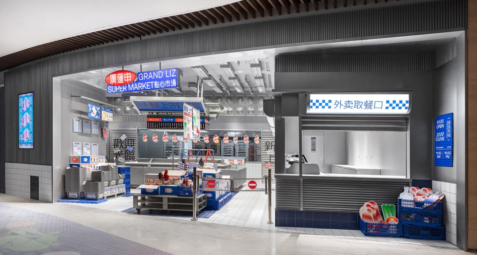
▼店铺外观,Front View ©或者设计
Market is the place where you can appreciate the breath of life most vividly. Vehicles and people shuttle back and forth, presenting the fundamental part of life with great vitality. It is the familiar scene inscribed in the mind of every generation. Currently, brands are pursuing upgrading and changes, but they could not find the starting point. GRAND LIZ is a brand of Chinese dessert based in Shanghai. Being the “local time-honored brand” in consumers’ mind, It had won the recognition from consumers with great product power in recent years, with those middle-aged or even older group serving as the main customers. In terms of the brand upgrading this time, we would like to make GRAND LIZ be a choice for youngsters on the basis of maintaining its original market.
▼分析图,Analysis ©或者设计

这一次品牌升级我们希望廣莲申在不流失原有市场的基础上,能进入年轻人的视野中。最终我们定下的策略是——将上海生活感的场景作为突破口,让它既可以连接品牌身上的上海文化与地域产品优势,又可以通过老场景新尝试来做大胆的突破。做到与年轻人对话,实现品牌年轻化的升级,同时摆脱现在泛滥的“国潮”中点的局面。真正的创造出属于廣莲申自己的文化内容。市集、公园、弄堂…等都是我们抓取的概念场景。
▼入口,Entrance ©或者设计

Our final strategy is as below. We will take the scenes representing Shanghai life as the acting point. On one hand, it could connect the Shanghai culture contained in the brand with the regional product advantages; on the other hand, great breakthroughs could be made through old scenes and new attempts. In this way, the brand rejuvenation could be realized through the dialogue with youngsters and the cut and dried “China chic”would be got rid off. The distinctive cultural content for GRAND LIZ itself would thus be created. Bazaar, park and alley serve as conceptual scenes utilized by us.
▼堆头展示组合,Showcase ©或者设计

▼篮筐+纸箱组合成入口处的货架/陈列台,Shelves/display stands at the entrance composed by baskets and carton ©或者设计
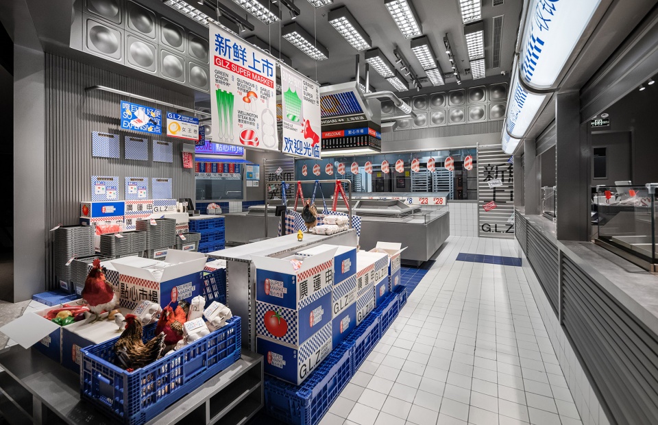
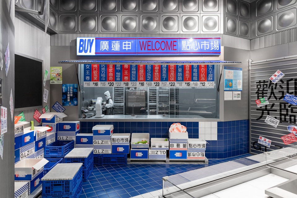
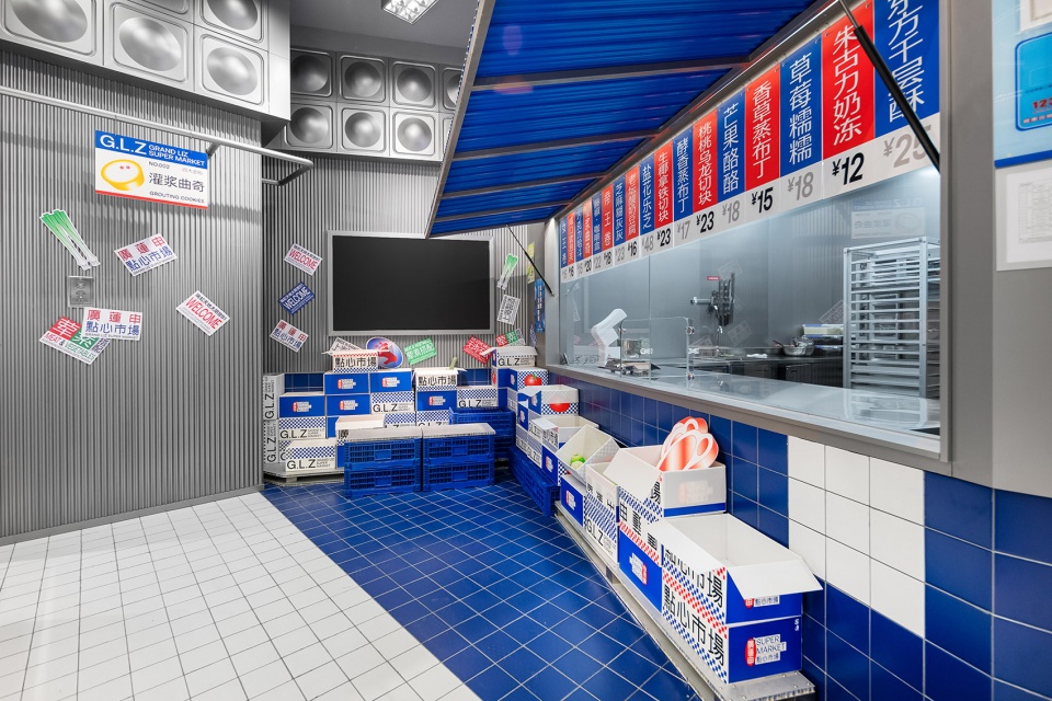
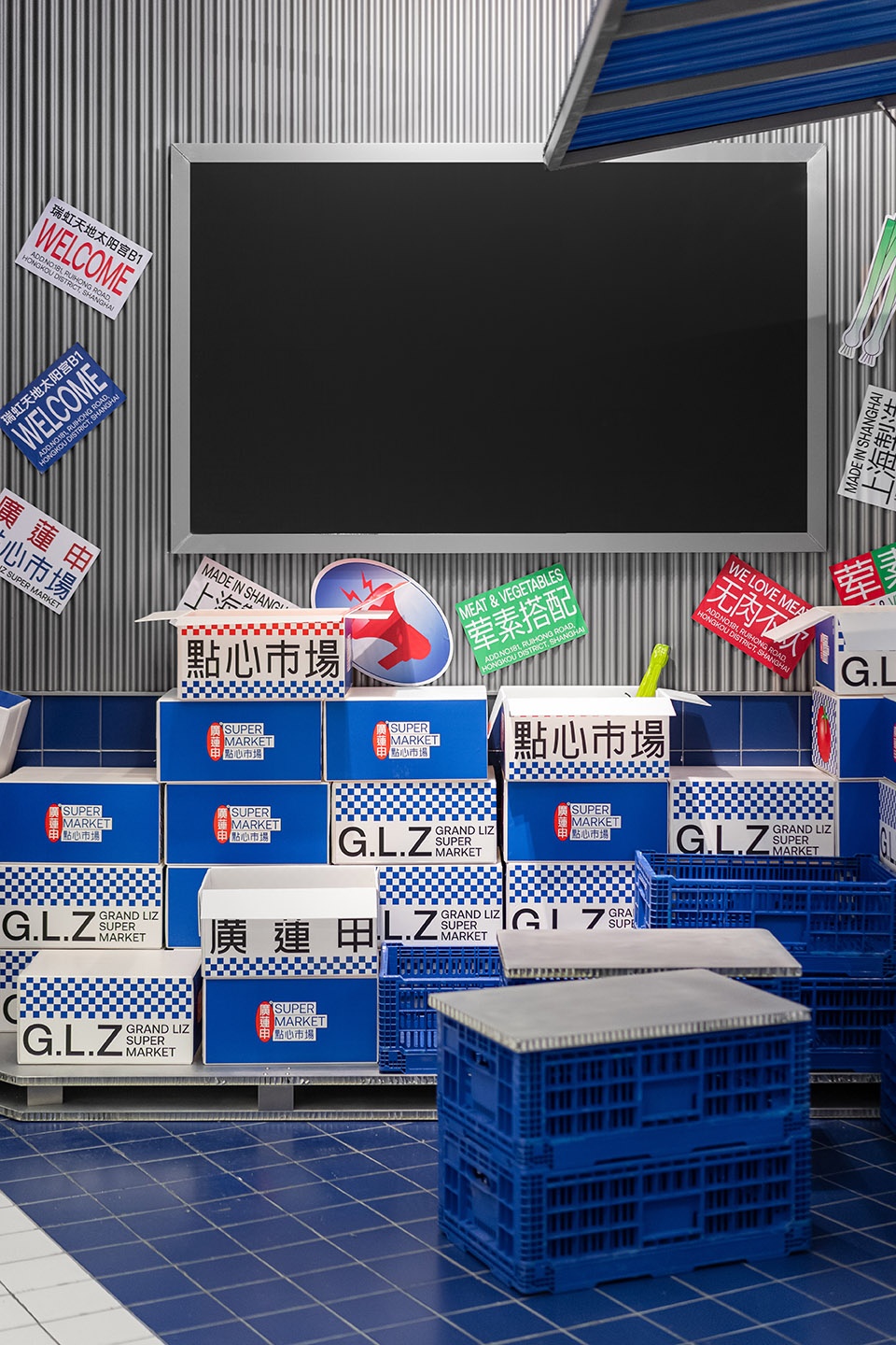
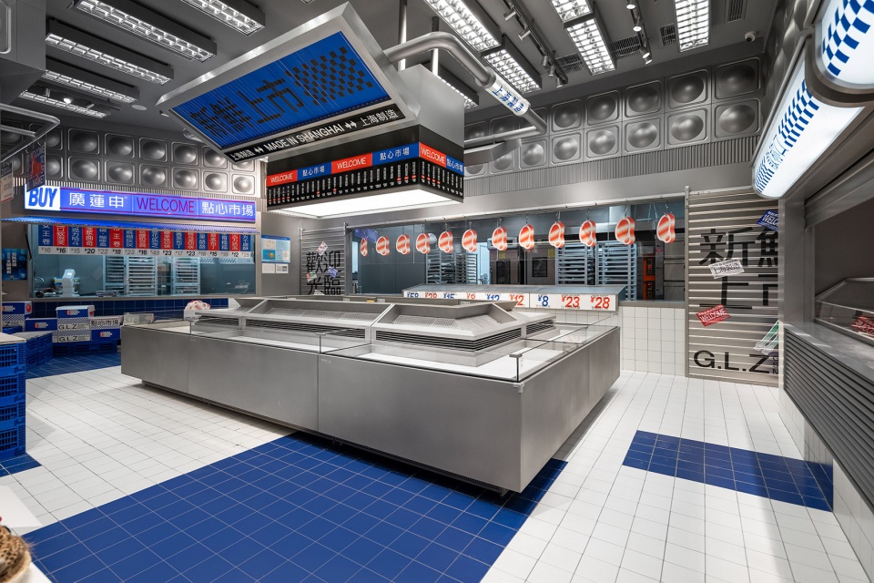
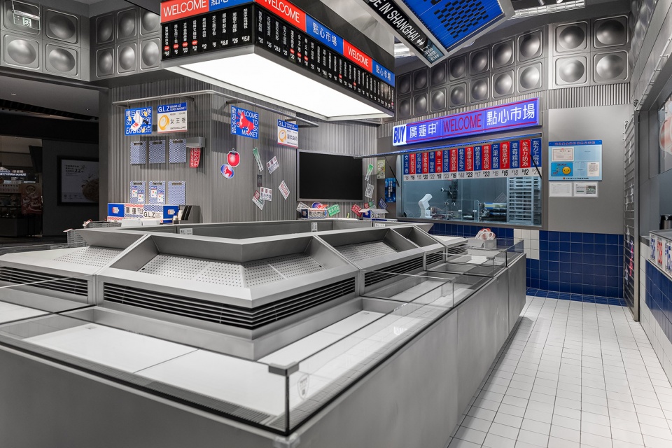
点心市集是廣莲申第一个主题店,我们将产品的销售与生产都贯穿到市集的场所氛围中,空间材料与颜色,也从市场中最有代表性的元素中提取——金属波浪板、白色小瓷砖、塑料感的蓝红配色、随处张贴的“牛皮癣”小广告、堆积如山的货物,凌乱却充满着民间智慧…这一切的细节都在给你“还原”一个市场该有的样子,但又是一个通过巧妙设计和重组升华后的“日常市场场景”,我们希望呈现给消费者的是一个年轻、时尚、有话题性、有分享欲望的新零售空间。市集中的摊主们总会灵活运用手边任何的物件给自己打造一个舒适的休息角落,比如用两个篮筐堆砌起来,再放上一块木板,就是一个小板凳——座位区。
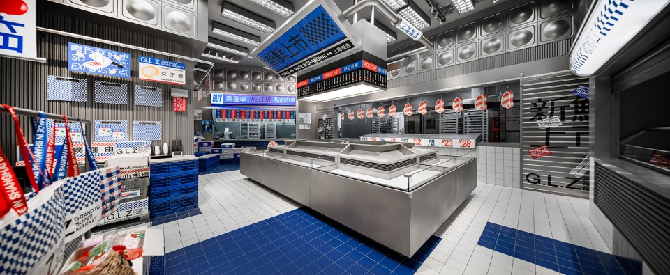
▼内部空间,interior space ©或者设计
GRAND LIZ SUPERMARKET is the first theme store for GRAND LIZ. We will integrate sales and production into the atmosphere of market. Besides, materials and color in the space are extracted from most representative elements of the market, such as the metal clapboard, small white tiles, color matching of blue and red with plastic sense, small advertisements of “psoriasis” posted everywhere, and mountains of goods which are messy but full of folk wisdom. All of the details“restore”the face of a market as what it should be. Meanwhile, a “daily scene in the supermarket” is presented through ingenious design, reorganization and upgrading. We are striving to present a fashionable new retail space which is full of young elements, hot topics and sharing desire. The stall owners in the market will always use whatever objects they have at hand to create a comfortable rest corner for themselves. For example, the following one is stacked with two baskets, and then a piece of wood is placed, which is a small bench – the seating area.
▼后厨窗口,kitchen window ©或者设计
▼打卡区,Check-in zone ©或者设计
▼用篮筐、木板搭建出的座位区,
the seating area built with two baskets and wooden boards ©或者设计
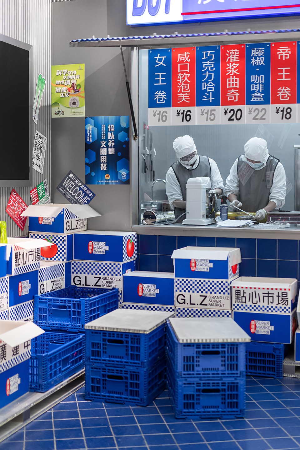
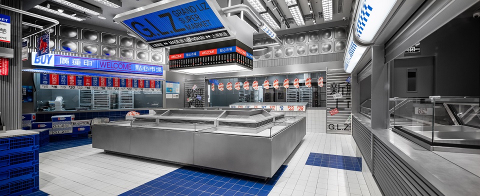
这是廣莲申的一次新尝试与开端,后续我们还会带来廣莲申公园主题店、弄堂主题店等,呈现完全不同的消费场景。我们希望消费升级并不仅仅局限于“装饰”的表面改变。而是从内而外持续性的输出属于当下的内容,通过内容、场所、产等等与消费者保持对话,保持新鲜感。为契合“市集”主题定做的四面围合的产品冷藏柜,产品随柜体的造型从高向下陈列出,店铺员工站在柜体中央一声售卖吆喝,场景仿佛转回到了热闹烟火气的卖菜市场,只是摊主们齐胸高的各种菜肉干货换成了各式海派点心。
▼为契合“市集”主题定做的四面围合的产品冷藏柜,The product refrigerated cabinet is custom-made to fit the theme of “market” ©或者设计
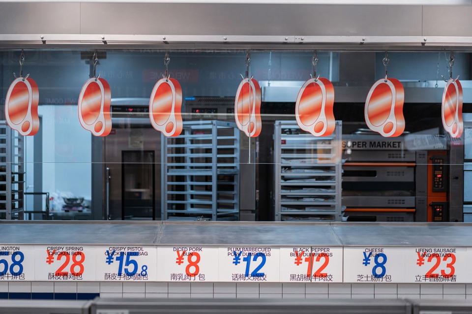
▼模仿肉铺摊的软装饰品,Soft decorations that imitate a butcher’s pavilion ©或者设计
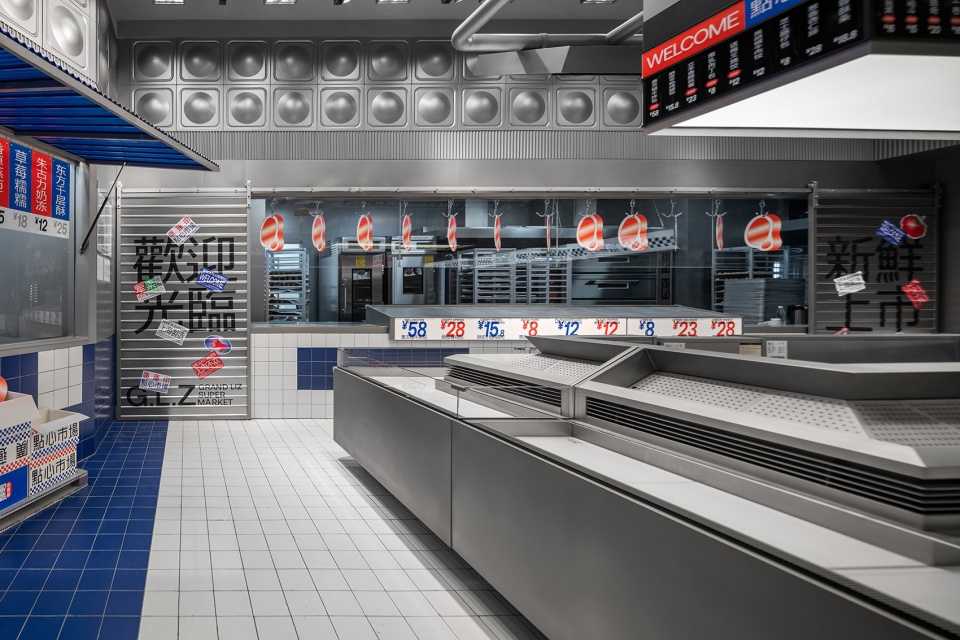
It is a new try for GRAND LIZ, which indicates a new start. We will establish the theme store of GRAND LIZ SUPER PARK and the theme store of GRAND LIZ SUPER ALLEY in the next step to present completely different consumption scenes. In our mind, consumption upgrading is by no means the simple change of “decoration”in the surface. In fact, it implies the output of present content from the inside out, the constant dialogue with consumers through content, site and products and the everlasting freshness. The product refrigerated cabinet is custom-made to fit the theme of “market”. The products are displayed from top to bottom according to the shape of the cabinet. The store staff stands in the center of the cabinet and shouts for sales, and the scene seems to return to the lively market. the stall owners replaced all kinds of dried vegetables and meat with all kinds of Shanghai-style dim sum.
▼称重区和收银区,Weighing area and checkout area ©或者设计

▼局部空间,Partial Space Display ©或者设计


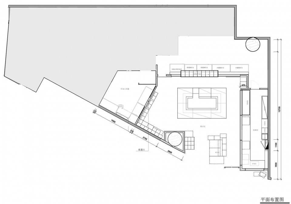
▼平面图,floor plan ©或者设计
项目名称:廣蓮申點心市场
项目地点: 上海市虹口区瑞虹路181号瑞虹天地太阳宫地下一层33室
主持设计师:巫国源
设计团队:奕豪、BOBO、小鱼、小鸣、张浩、吕哥
项目业主:廣蓮申
主要材料:不锈钢、金属烤漆、地坪漆、
室内面积:230m2
完工时间:2022.02
摄影:或者设计
0
0