
神说:“要有光。”就有了光。
神看光是好的,就把光暗分开了。
God said, “Let there be light!”So there was light.
God saw the light was good.So God separated the light from the darkness.
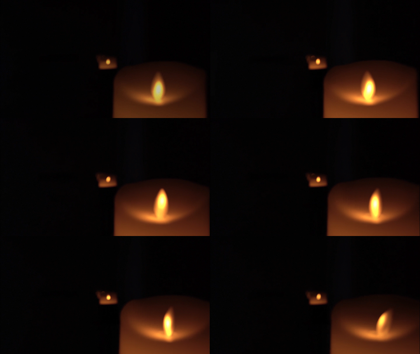
神称光为昼,称暗为夜。
有晚上,有早晨,是一日。
God named the light day,and the darkness he named night.
There was evening,then morning–the first day.
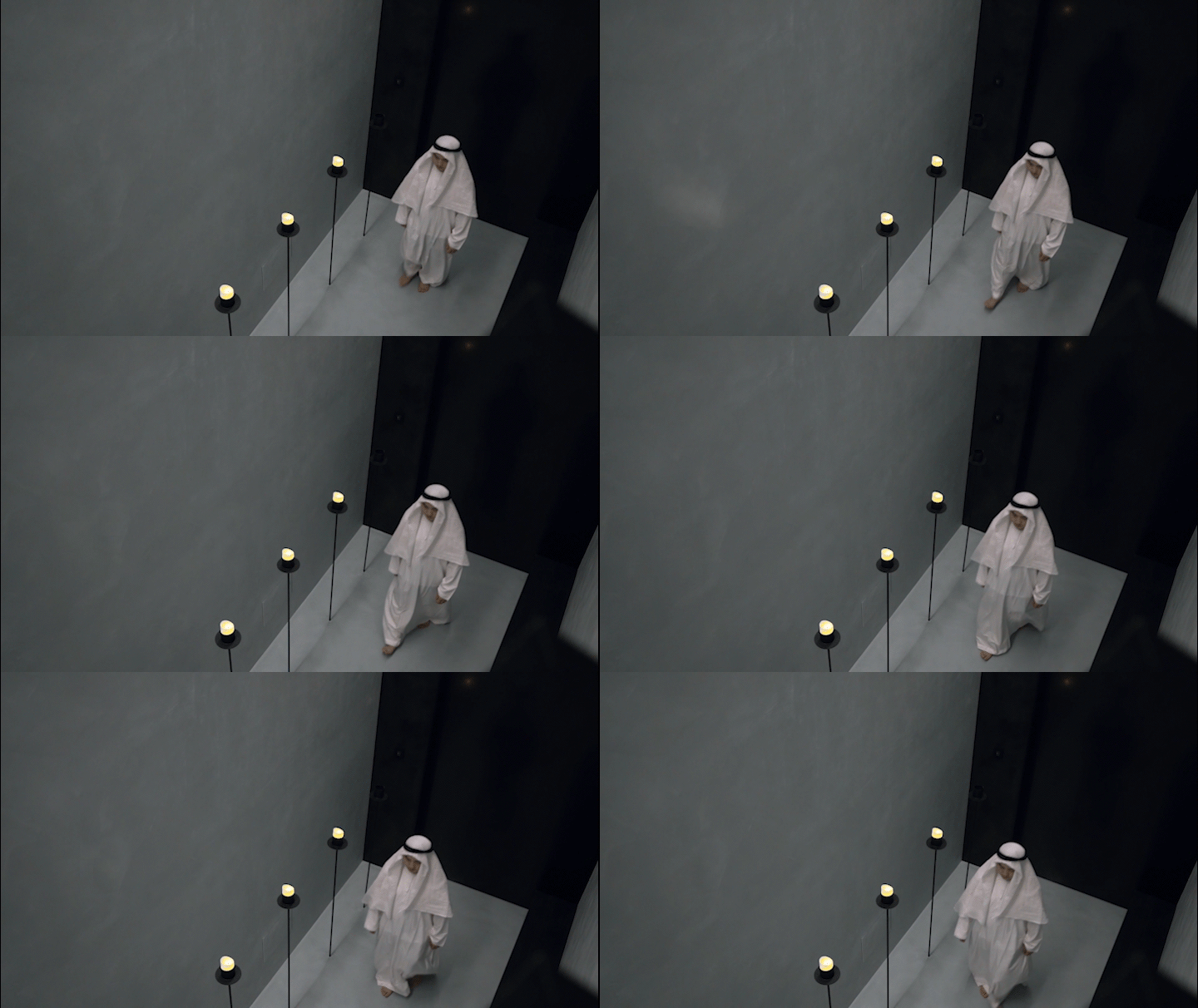
panDOMO
上海panDOMO展厅,是为潘多磨客户提供产品展示的销售空间,占地面积160㎡,挑高6m,这一次,我们摒弃了一切符号性的指向与形式,让光、材质、空间以其本真的属性显现,营造独特的感官体验。
Shanghai panDOMO exhibition hall is designed for products display of our customer, panDOMO. It covers an area of 160 square meters and has a ceiling height of 6 meters. This time, we have abandoned all the forms of symbolic directions presentation, and let light, material, and space show their true nature, creating a unique sensory experience.
入口的节奏把控非常克制,先经由黑色的门洞进到一条走廊,光线被刻意压低,给人一种神秘意境。
The entrance is designed to be very restrained. A corridor follows the black doorway, and the light is deliberately set dim, forming a mysterious atmosphere.
▼入口空间,Entrance area ©费弗空间设计
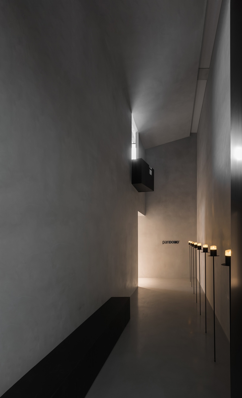
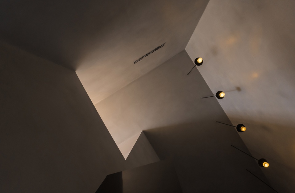
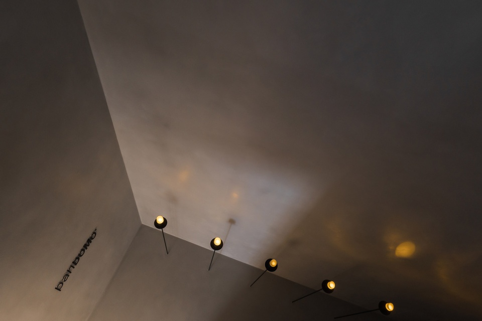
走廊的挑空很高,也没有任何的窗,斜顶的软膜天花对比展厅的光线,调低了几个亮度,呈现出纯净而柔和的光影,让空间散发出一种迷人的情绪。
The corridor has a high ceiling without any windows. The soft film of the sloping ceiling reduces the brightness compared to the light in the exhibition hall, presenting pure and soft light and shadow, making an enchanting space.
▼挑空走廊,The corridor with a high ceiling ©费弗空间设计
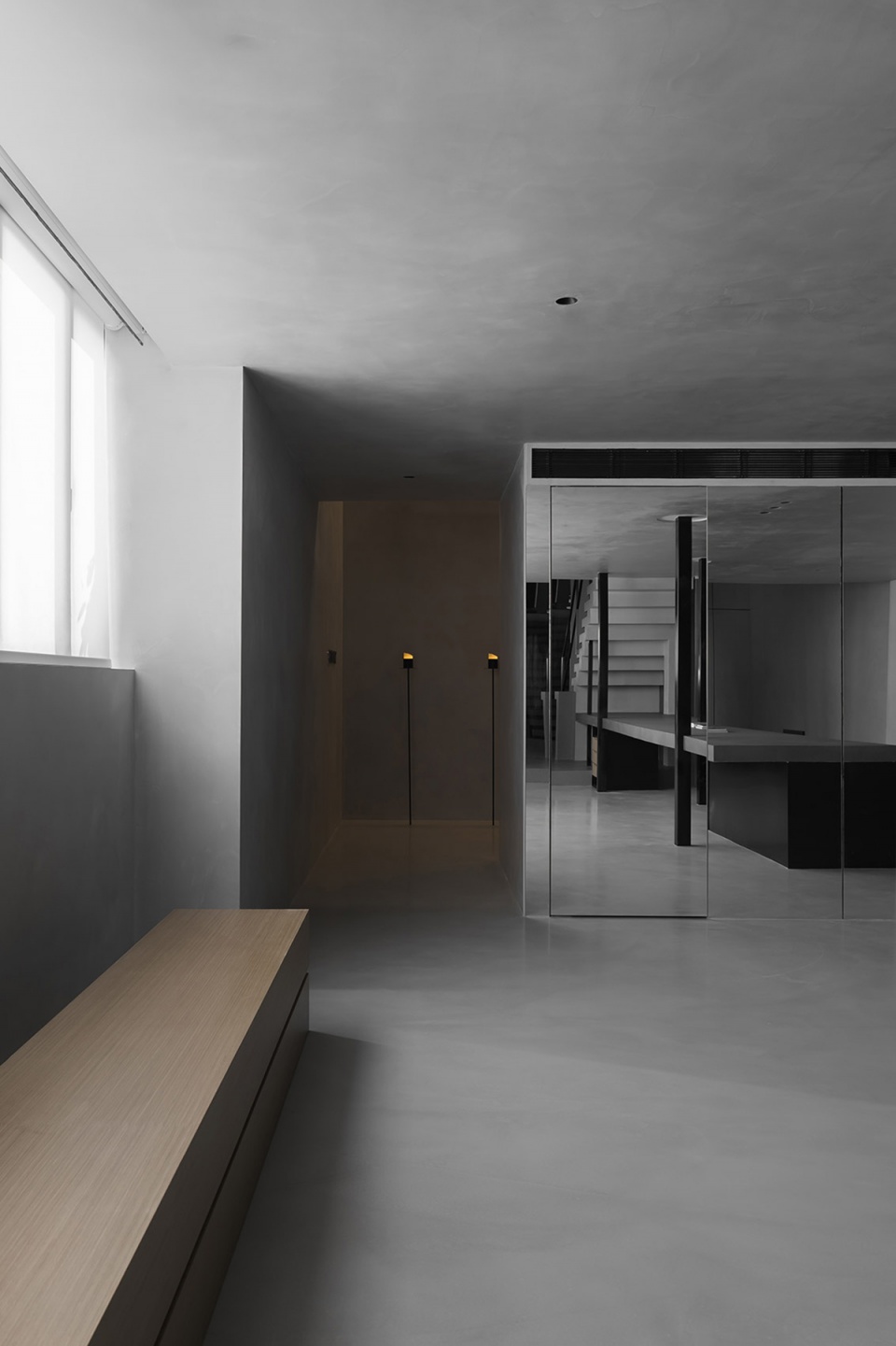
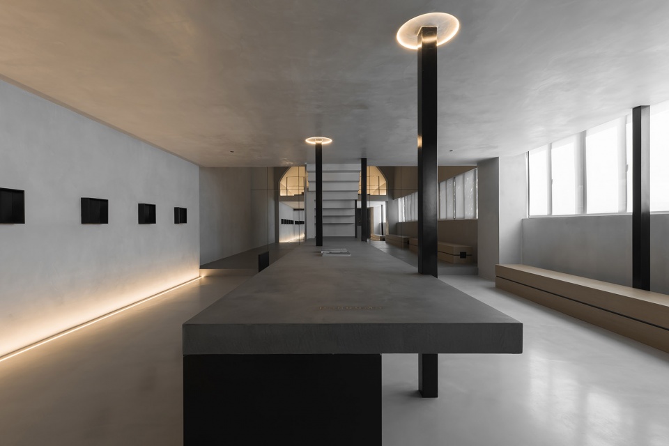
行至展厅内侧,空间豁然开朗,先抑后扬,带给人惊喜的视觉感受。超长岛台贯穿整个洽谈区,在黑色不锈钢体块的支撑中,悬浮于地面似的,使台面恰好位于最佳的视线之内,既是产品的展示台,也给空间带来非凡的仪式感。
Walking into the exhibition hall, one will feel that the space opens up suddenly. The idea of first suppressing and then releasing offers a pleasant visual experience. The ultra-long island runs through the entire negotiation area. Thanks to the support of the black stainless-steel columns, it looks as if it was suspended on the ground, so the island is located within the middle of sight. It is not only a product display stand, but also brings an extraordinary sense of ritual.
▼从展厅望向走廊,View towards the corridor from the exhibition hall ©费弗空间设计
▼超长岛台贯穿整个洽谈区,The ultra-long island runs through the entire negotiation area ©费弗空间设计
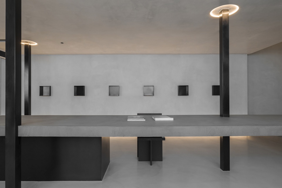
我们在中庭位置搭建出二层空间,支撑部分的黑不锈钢色柱体,与潘多磨台面、地面穿插错落,即凸显个性化,又具有视觉穿透力,完成场地与单体结构融合的同时,又带来功能与形式之间的有机结合。
We have built the second story in the middle of the hall. The black stainless steel, as supporting columns, is displayed randomly between the ceiling and the ground and through panDOMO island, which highlights the individuality and boosts visual impression. It completes the integration between the site and the single structure, and also combines function and form.
▼展厅细节,Detailed view ©费弗空间设计
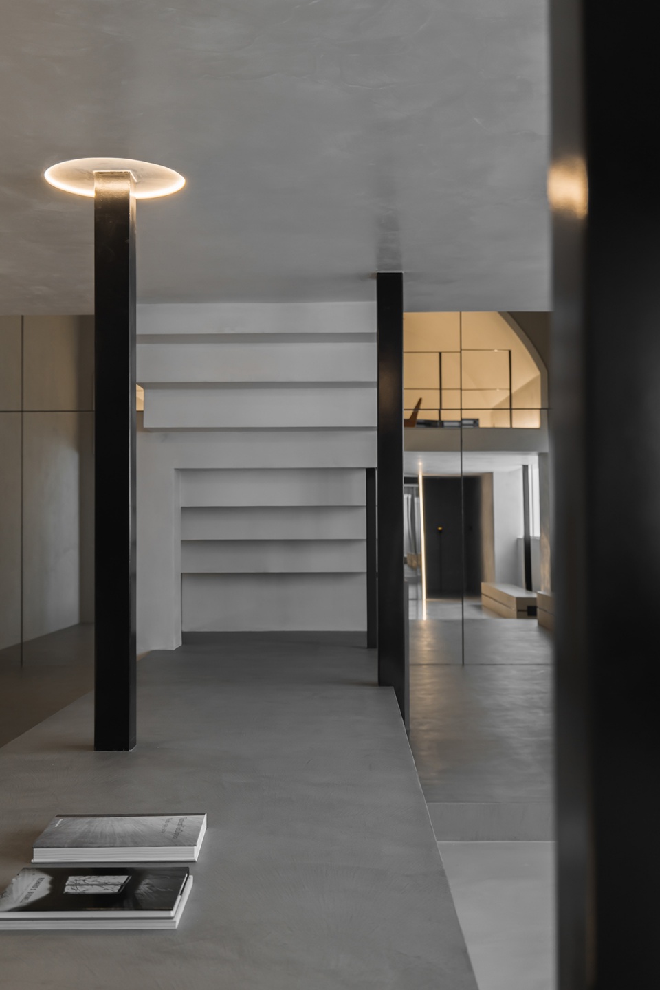
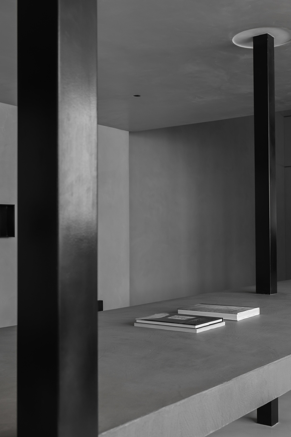
整体布局通透舒展,明与暗和谐共振,一侧的阳光透过玻璃,在休闲区和洽谈区演绎出一场光明和阴翳的暧昧关系。就这样,在一种大多数人都能接受的舒缓气氛中,起身或坐下,站立或走动都随心随意。
The overall layout invites light and is spacious. Light and darkness coexist harmoniously. The sunlight on one side comes in through the glass, creating a show casting light and darkness in the leisure area and the negotiation area. In this way, in a soothing atmosphere where most people feel comfortable, one can stand up or sit down, stand still or walk around at will.
▼休闲区,Leisure area ©费弗空间设计
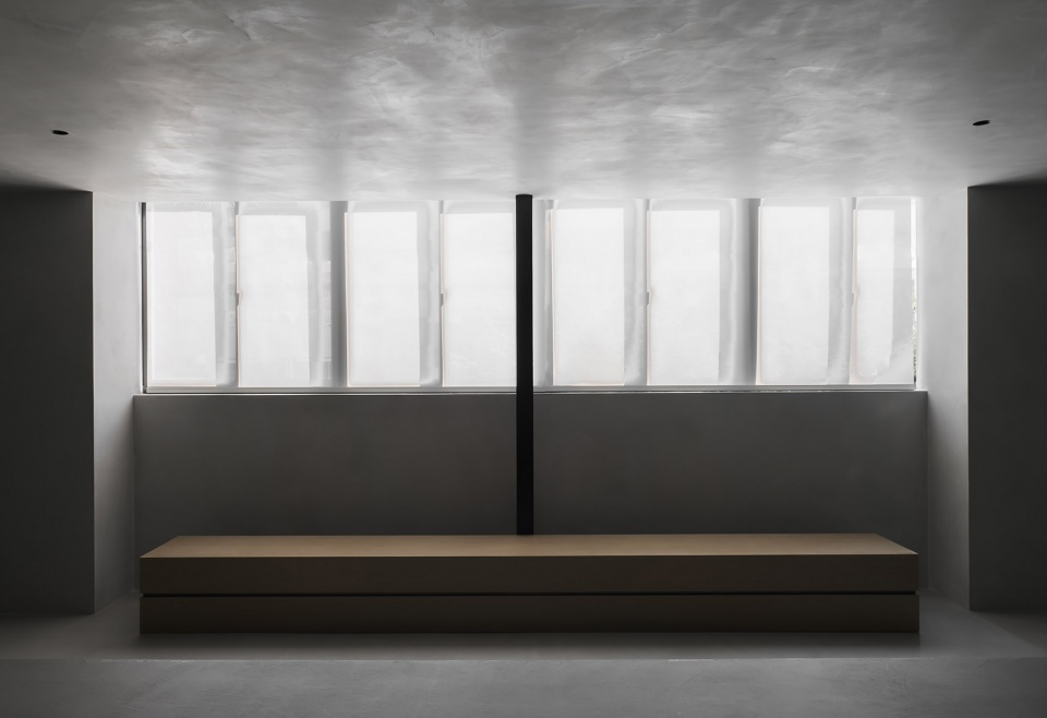
▼光明和阴翳的暧昧关系,A show casting light and darkness ©费弗空间设计
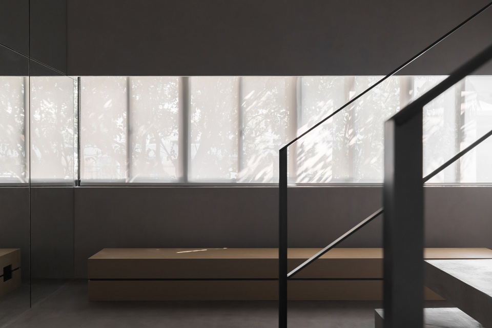
不同型号潘多磨,在体、块、面之间的使用,以贯穿整体的秩序感和完整的块面表现,形成近同的空间质感和肌理,营造出干净素雅的氛围,令人卸下一身烦躁,内心的情绪得以安抚。
The different models of panDOMO are used as the body and block and on the plane, with a sense of order that runs throughout the whole and a complete block and plane arrangement, forming a similar spatial texture and creating a clean, simple and elegant atmosphere, which allows people to release stress and nervousness and soothe the inner emotions.
▼潘多磨被应用在体、块、面之间,Different models of panDOMO are used as the body and block and on the plane ©费弗空间设计
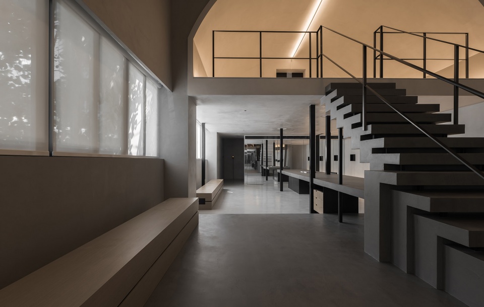
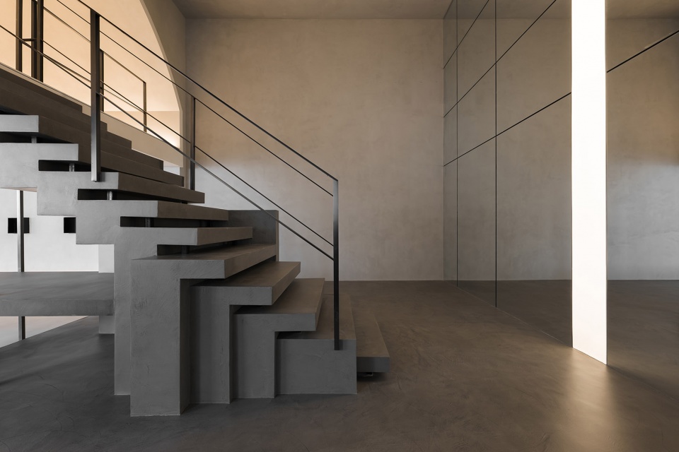
致敬斯帕卡的楼梯设计,以它诗意的断片与节点,成为展厅后部的视觉中心。
The staircase, as a tribute to Scarpa’s design, with its poetic fragments and nodes, becomes the visual center in the back of the exhibition hall.
▼楼梯,Staircase ©费弗空间设计
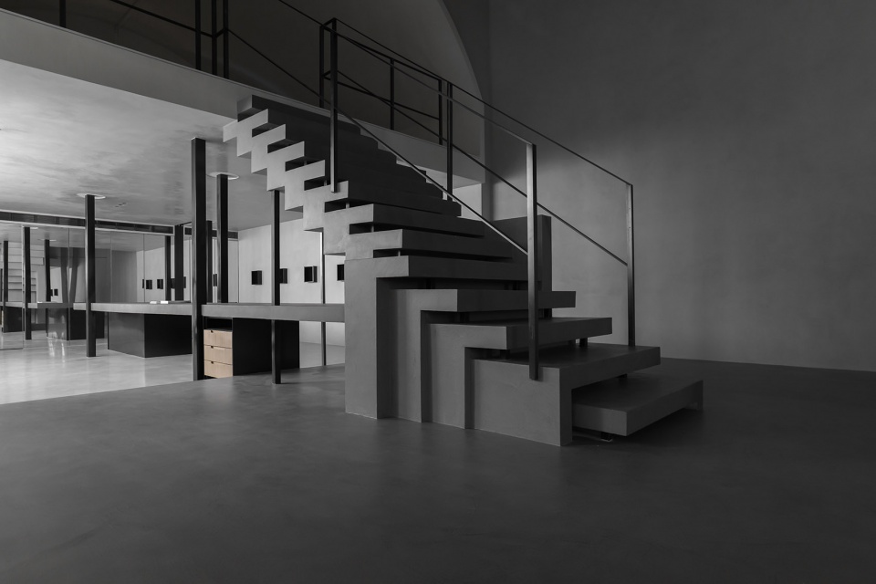
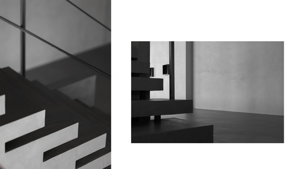
踏步也用了潘多磨,长短不一地向水平两侧延伸,不同于斯帕卡严格的形式分离,这里的每一级踏步后侧都做了常规封闭,栏杆设计也更加实用主义,整体呈现更有秩序,也更安全。
PanDOMO is also used on the stair steps, which extends to both sides in different lengths. It is different from Scarpa’s strict formal separation. The back side of each step here is conventionally closed, and the railing design is more pragmatic and the overall presentation is more orderly and safer.
▼踏步细节,Steps detailed view ©费弗空间设计
路过楼梯,行至二层区域,关于光影、材质与空间的故事,才进入正题。
Up the stairs on the second floor, the story about light and shadow, material and space actually begins.
▼楼梯通往二层,The stairs leading to the second floor ©费弗空间设计
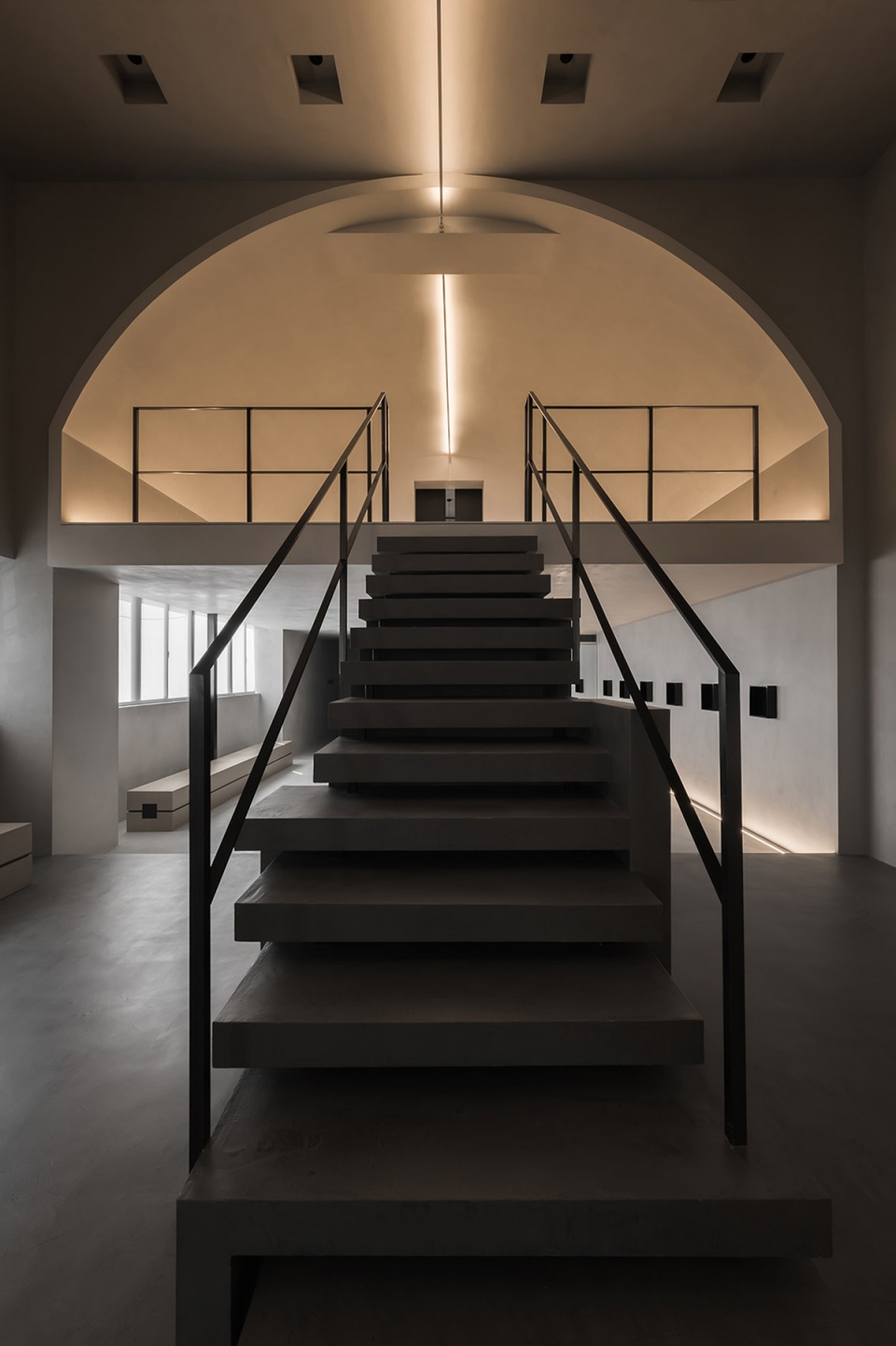
一侧墙上的镜面,将二层的拱顶映射其中,隐匿边界,让空间趋于无限。中轴的软膜灯拔地而起,烛火般点亮整个空间。
即使如此,二层展厅的光线仍然是偏暗的,但并不压抑。拱顶设计让光的形式变得丰富而浪漫,门后透过的漫射光,在空间形成教堂般庄严的气息。
The mirror on one side of the wall reflects the vault of the second floor, hiding the boundary and making the space seemingly infinite. The soft film lamp on the central axis rises from the ground, lighting up the room like a candle.
Even so, the light on the second floor is still dim, but not depressing. The vault design makes the form of light rich and romantic, and the diffused light passing through the door creates a solemn atmosphere like a church.
▼二层空间,The second floor space ©费弗空间设计
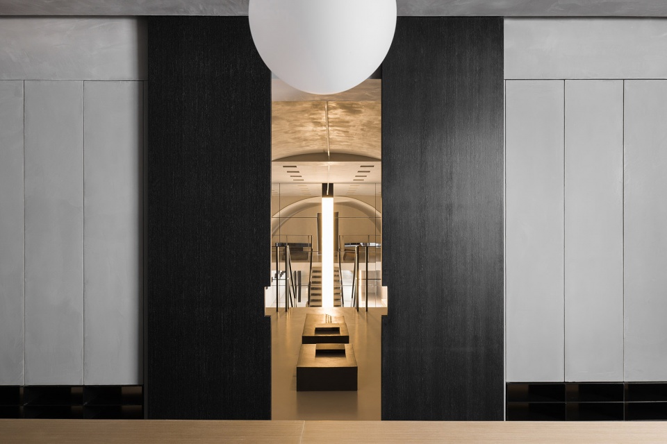
▼拱顶设计让光的形式变得丰富而浪漫,The vault design makes the form of light rich and romantic ©费弗空间设计
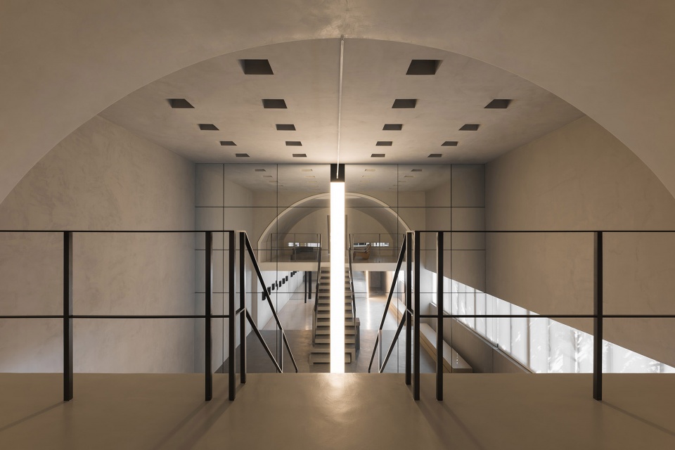
拱顶的线形光源,顺着门缝,引出室内的光束,神圣而又克制,使得人全身心平静下来。
The linear light source on the vault, leads the light beam in the room along the crack of the door. The light, holy and restrained, calms down everyone.
▼拱顶下的展览空间,The exhibition space in the vault ©费弗空间设计
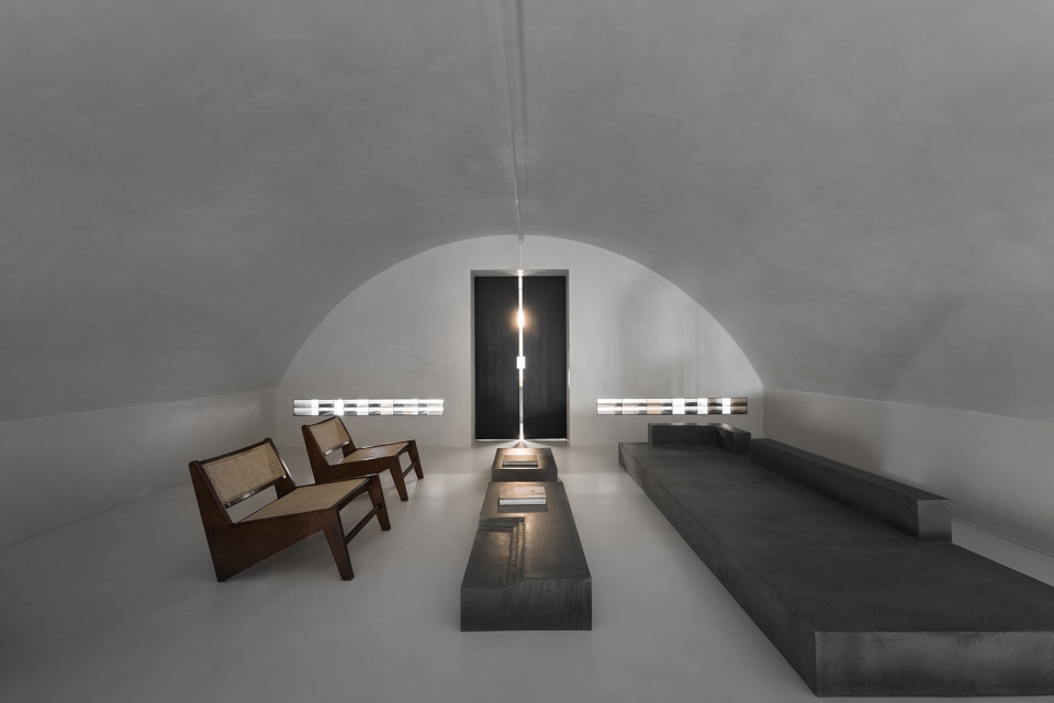
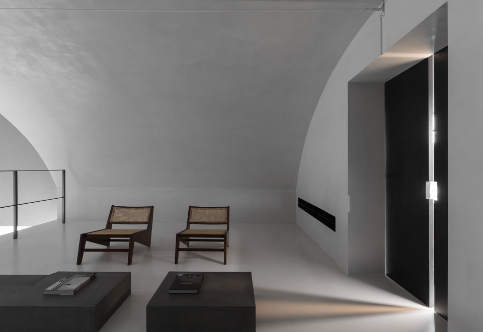
▼室内细节,Interior details ©费弗空间设计
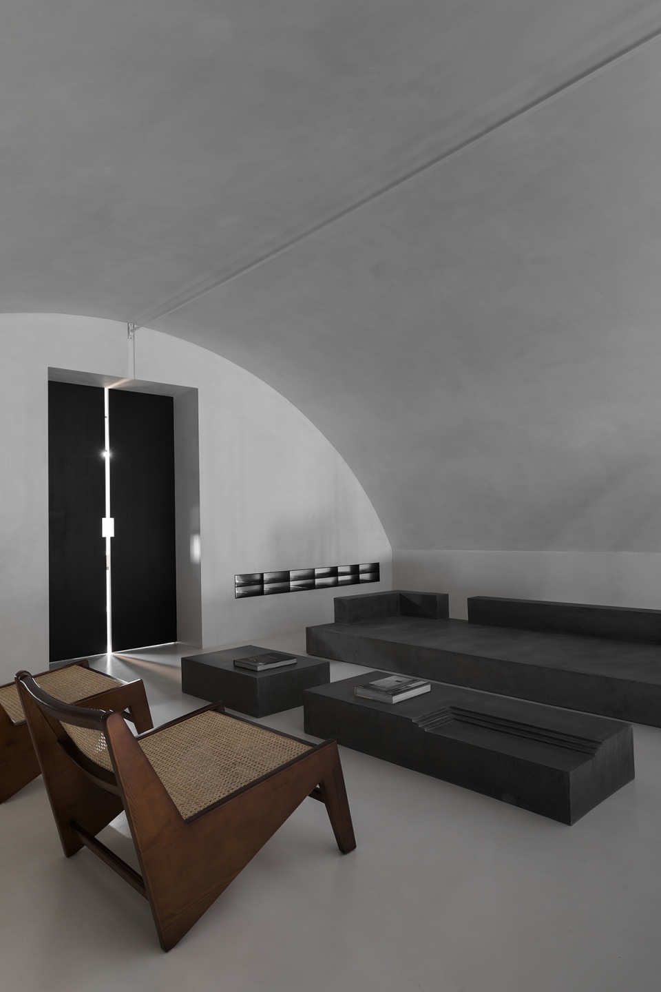
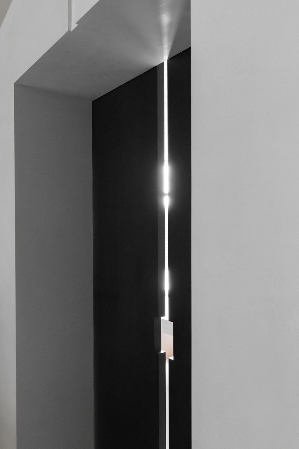
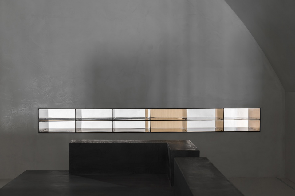
除了大的空间格局,细节和质感也是空间的亮点,区域过渡间角落也不乏巧思。沿着光的方向,玻璃窗格双向打开了隔墙,让空间更加灵动、通透。
In addition to the large layout, details and texture are also the highlights, and there is no lack of ingenuity in the corners of the transition between areas. Along the direction of light, glass panes move in both directions, opening up the partition wall, making the room more flexible and spacious.
▼玻璃窗格双向打开了隔墙,Glass panes move in both directions ©费弗空间设计
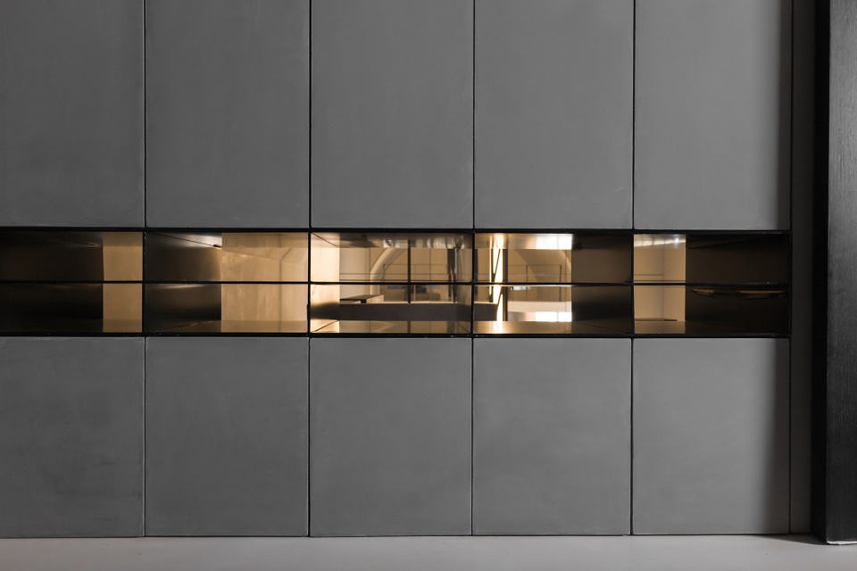
拱顶洒下的柔光,丰富了空间的体验,如同一种有形的建筑材料,以精妙入微的“细部”,填补了时空的裂缝,完成了诗意的抒情。
The soft light sprinkled from the vault enriches one’s experience in the space, filling the cracks in time and space with subtle “details” like a tangible building material, finishing the lyricism.
▼室内细节,Interior detailed view ©费弗空间设计
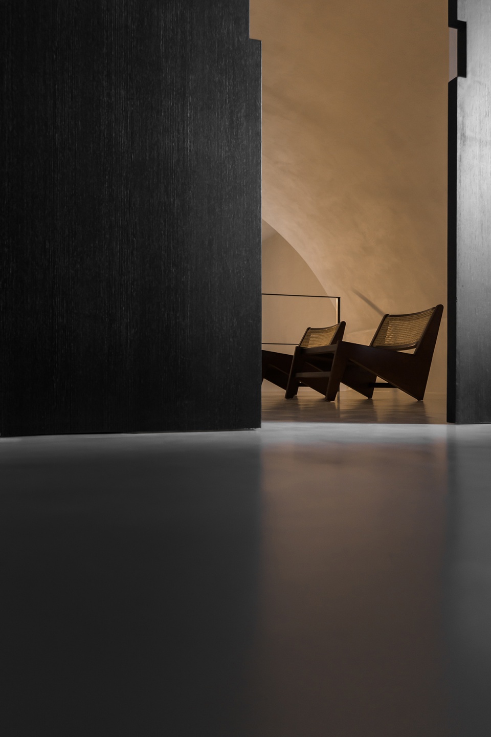
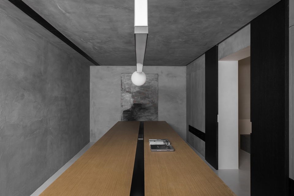
极尽克制的办公区域和展区一门之隔,门閤上时的方孔,方便员工随时关照展厅,提供服务。
The office area designed in an extremely restrained manner is separated from the exhibition area by a door, and the square hole on the door allows employees to check the exhibition hall and provide services at any time when the door is closed.
▼办公区,Office area ©费弗空间设计
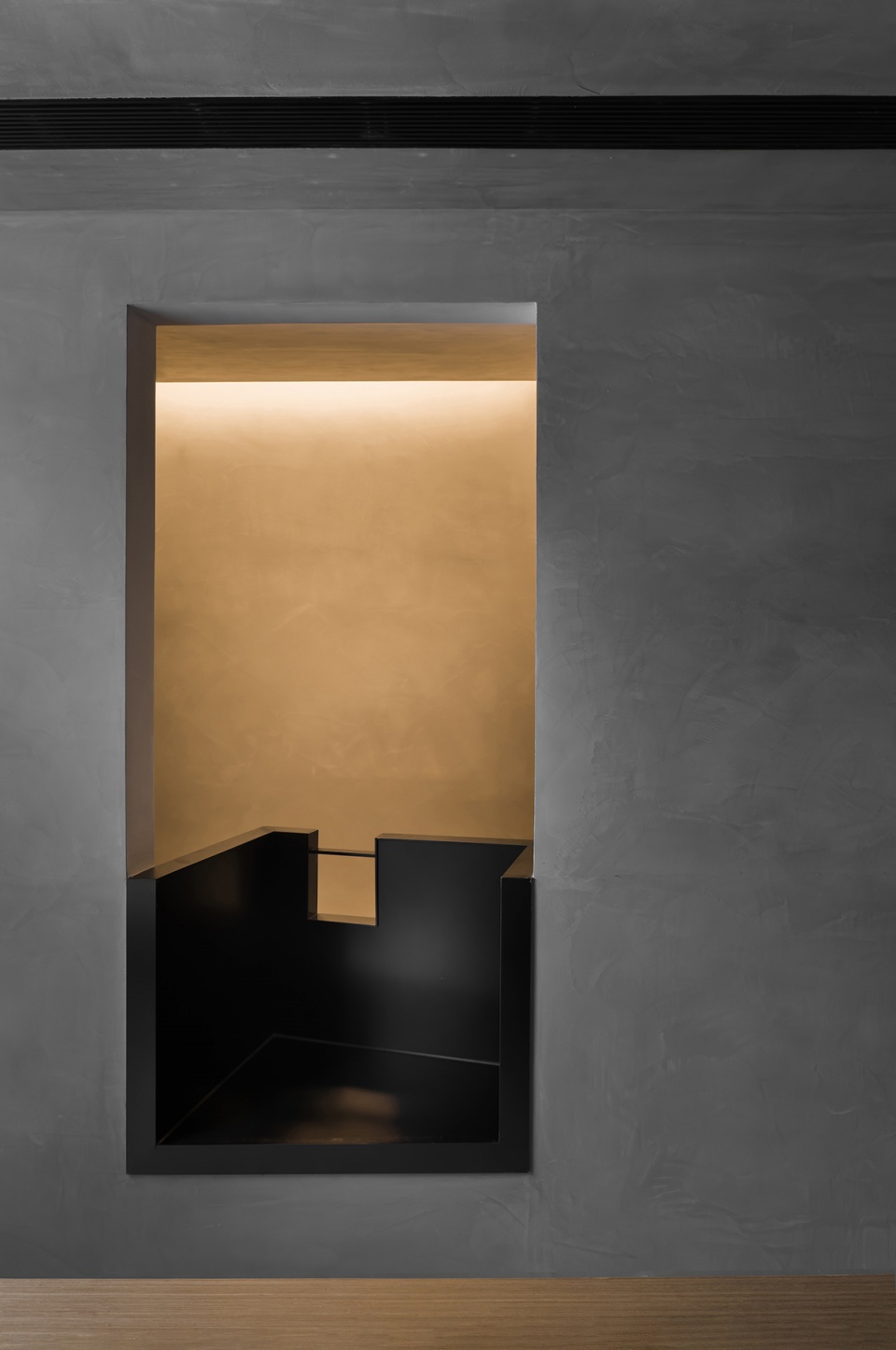
办公区后面,改了朝向的小门,仿佛通往修道院里供人思索的“小室”,不动声色却意外拥有着安静的力量,让空间多了一分神秘与深邃。
Behind the office area, there is a small door whose facing direction is changed, as if it leads to the contemplative room in the monastery. The quiet but unexpectedly powerful design makes the space more mysterious and profound.
▼室内细节,Detailed view ©费弗空间设计
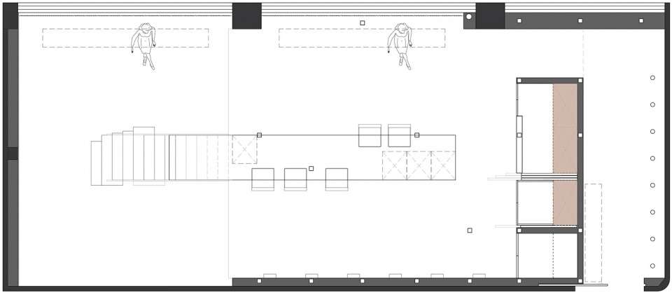
▼一层平面图,Plan 1F ©费弗空间设计
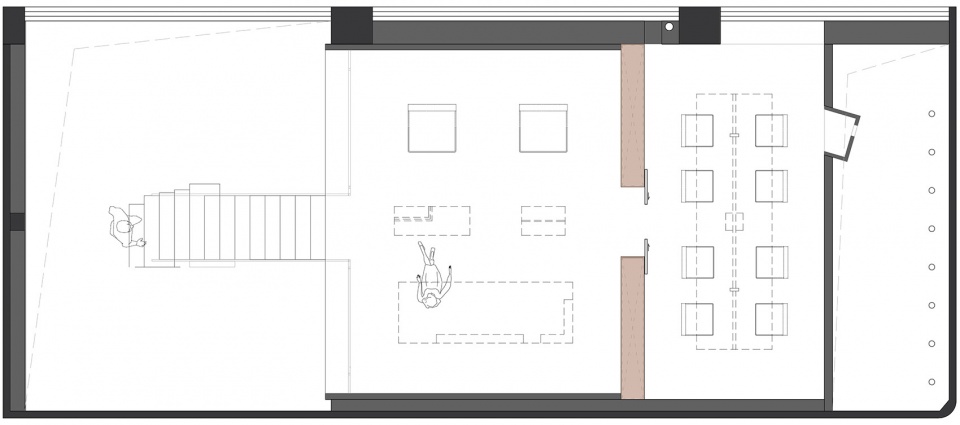
▼二层平面图,Plan 2F ©费弗空间设计
项目名称:panDOMO无界艺术馆
设计方:FF DESIGN
项目设计 & 完成年份:2021.11
主创:费崎峰Fitch
项目地址:上海
使用面积:160㎡
品牌:panDOMO
甲方:简默


