
01
同个品牌的空间美学灵魂,不同灵感的表达
The spatial aesthetics of the same brand is expressed in a differentiated way
万社设计Various Associates 为国内先锋买手店SND打造又一时尚概念店。作为全新购物概念推行者,SND主张独立,在被趋势和潮流所引导的当下另辟蹊径,带来不被普世标准所限的先锋设计,以艺术品的方式呈现服饰,为现代零售注入个性血液。
Various Associates designed another new concept store for the pioneering multi-brand fashion supplier SND. As a promoter of new shopping concept, SND takes an independent road off the beaten track, rather than going with the flow. Its brick-and-mortar stores bring avant-garde design that is not defined by common standards, showcase clothes in an artistic manner, and inject fresh vitality into the retail sector.
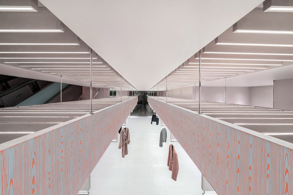
▼空间概览,overall view of the space ©尔见摄影 / 方正、草塘
02
高架桥下的时尚秀场
Fashion show under a viaduct
如果说,桥上是城市在穿梭中快速运转的体现,那么,桥下就是一座城市本土生活艺术的投射。此次SND坐落于重庆最繁华的商业中心-环球金融中心WFC。重庆,一座因地而生的城市,错综复杂的交通系统景观和高低起伏的城市面貌生活形成了这座城市独特魅力。高架桥,对于生活在重庆的人们来讲是必要的存在,不仅是城市经济发展的驱动,也是空间跨域式的连通媒介,更是垂直空间的上下高效利用。在重庆的桥下总是有故事发生,有人相聚饮茶、闲暇钓鱼,栈道漫步和其他美妙的事物。城市的建设,生活方式与崎岖的地形高度融合,形成了别具特色的“山城生活”。此次万社设计将目光投向了围绕混凝土结构之下所发生的一切。
原场地分为上下两层狭长的空间,结合重庆的地势特色及山城的趣味生活,设计团队以高架桥下的时尚为概念,通过悬索、秩序、层叠的多层次空间关系来传达独属重庆的“桥下的时尚秀场”。
▼收银台,counter ©尔见摄影 / 方正、草塘
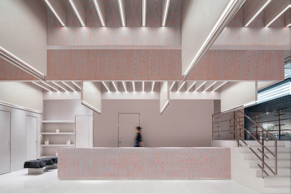
The traffic above viaducts embodies the fast pace of the city, while the art of local life is reflected underneath. The new premise of SND is situated in the World Financial Center, the most prosperous commercial hub in Chongqing. As the city is built on mountains, it had been nicknamed a “mountain city”. The complex transportation system and undulating topography endow this city with a unique charm. Viaduct plays an indispensible role in locals’ lives, which not only drives economic development and facilitates connection across areas, but also enhances the efficient utilization of vertical space. Various stories occur under viaducts, where Chongqing people enjoy drinking tea, fishing, strolling and other activities. The fusion of urban construction, lifestyle and rugged terrain formed the unique life in the mountain city. As approaching the project, Various Associates set the eyes on the site beneath the concrete viaduct.
The existing site is a long, narrow two-storey space. Taking into account the terrain features and interesting lifestyle of Chongqing, the design team took “the fashion under viaduct” as the design concept, and made use of the spatial relationships formed by suspension cable, order and overlapping layers to perform “a fashion show under viaduct” unique to Chongqing.
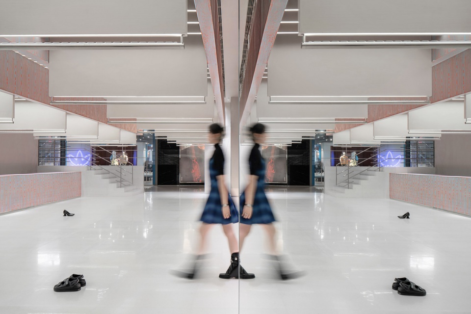
▼秀场一般的空间,a fashion show space ©尔见摄影 / 方正、草塘
03
悬挑
Suspension
桥式的悬挑结构语言是整个空间的核心设计表达。原本长而窄的空间对于常规品牌零售店并不是一种友好的营销方式,为了能让步履匆匆的顾客第一时间全方位快速捕捉到店内的展示全貌,设计团队选择直接释放整个空间-动线上20多米直线贯穿无任何遮挡。以展示方式极致如一的秩序感创造出在通长桥下的漫步感。一眼望去,尽入眼帘。
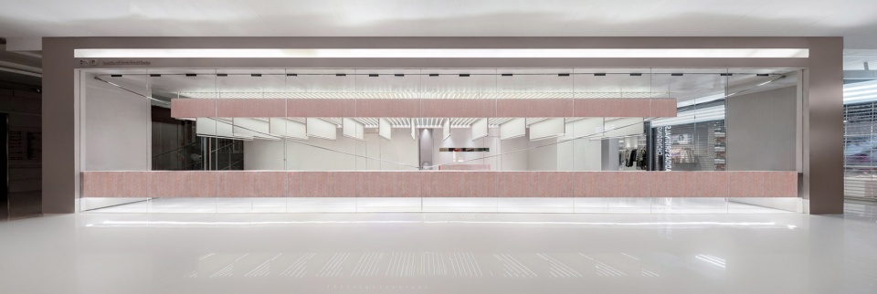
Viaduct-style suspending structural language is the core design expression of the overall space. The original long and narrow space was not friendly to retail activities. To let passers-by capture a full view of the store in a glance, the design team chose to directly release the whole space, with a 20 meter-long, straight, unblocked circulation route running through it. The ways of commodity display reveal a sense of openness and order, creating an experience of strolling under a long viaduct and meanwhile offering people a panoramic view of the store.
▼店铺外观,external view of the store ©尔见摄影 / 方正、草塘
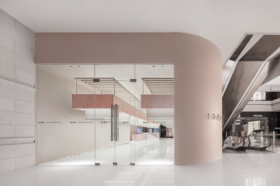
▼店铺入口,entrance ©尔见摄影 / 方正、草塘
▼一层空间概览,20米的悬挑长桥
overall view of the first floor, 20 meter-long bridge suspended in the space ©尔见摄影 / 方正、草塘
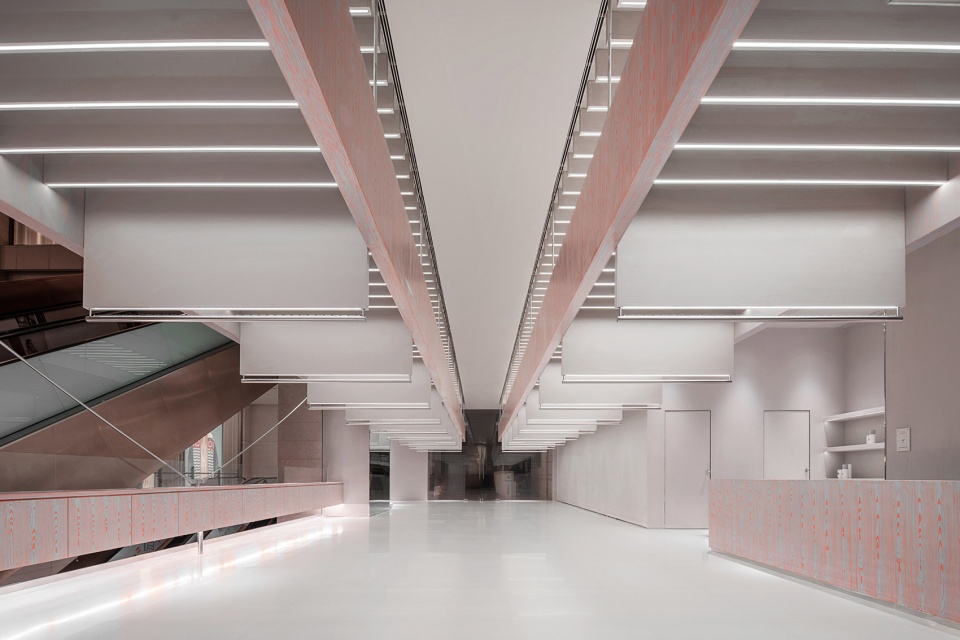
▼二层空间概览,也设有超长的悬挑层板
overall view of the second floor also with long suspended panel ©尔见摄影 / 方正、草塘
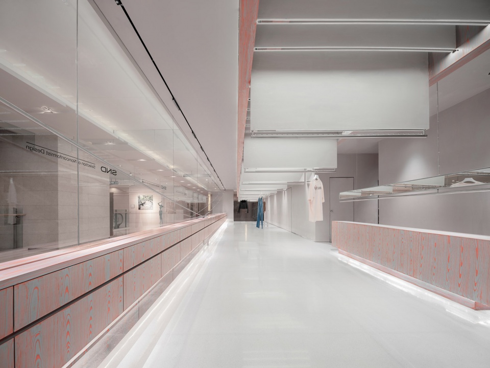
看似极致简单的平面布局,面临的实际问题就是:悬吊层板有着二十余米的超长跨度和近十吨的悬吊结构重量。如何让如此尺度的展示台以轻盈的姿态悬浮起来,达到力量与轻盈之间的平衡,是此次项目核心结构的突破与挑战。借鉴桥式悬索结构精髓,仅靠悬台中间单根结构立柱,三角斜撑牵引起超长的跨度支撑,是此次空间中又一处结构之美的表达与突破。
The spatial layout is simple, but the suspended panel posed a practical problem, as it has a length of more than 20 meters, weighing nearly 10 tons. How to make the long, heavy display platform float in the air and achieve a subtle balance between strength and lightness was a key challenge yet a breakthrough of the core structural design. The designers took cues from the cable-stayed structure of suspension bridge, which relies on one single structural column in the middle, with a long-span cable supported and obliquely pulled in a triangular way. This is another breakthrough, expressing a distinctive structural aesthetic.
▼以悬索的拉力方式受力,the suspension cable is under tension force ©尔见摄影 / 方正、草塘
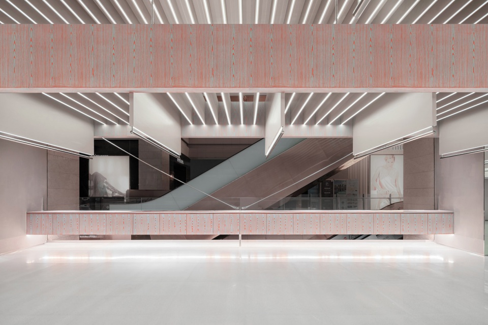
悬挂吊索采用锚件牵引固定,稳固的三角形在诉说着角度力学之美。极细的吊索并未影响从外至内的视线,穿过精致的悬索,服务前台、休息区的位置清晰可见。保证客人置身于店内任何角度,在需要服务帮助的时候都能在最快的时间内找到店员。
The suspension cable is pulled and fixed by anchors, and the stable triangle tells the beauty of angles and mechanics. The thin suspension cable does not block sightlines from the outside to the interior, through which the service & reception desk and the rest area can be clearly seen. Thus, it ensures that wherever customers stay, they can quickly find shop assistants and ask for help.
▼极细的吊索,thin cable ©尔见摄影 / 方正、草塘
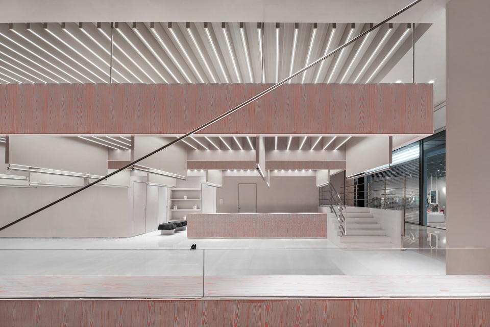
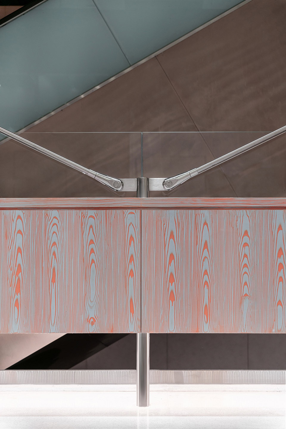
▼吊索和节点细部,details of the cable and the joint ©尔见摄影 / 方正、草塘
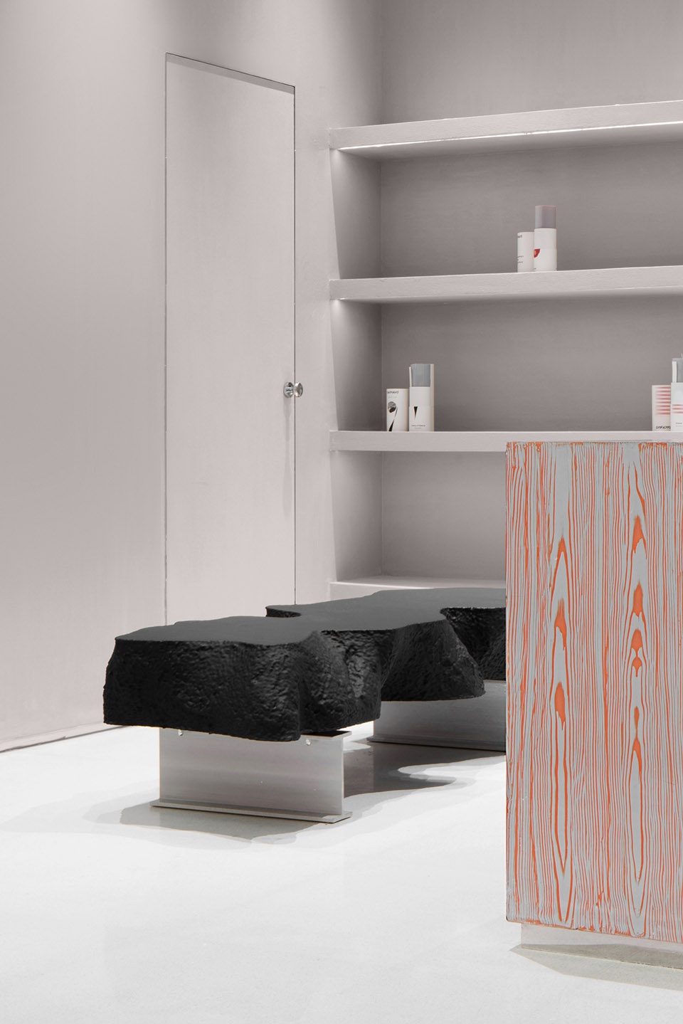
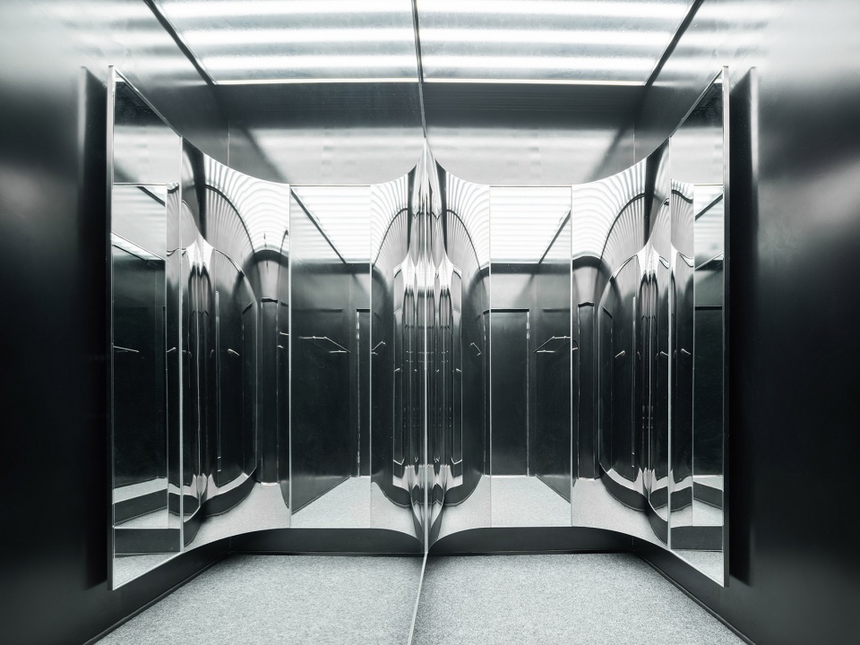
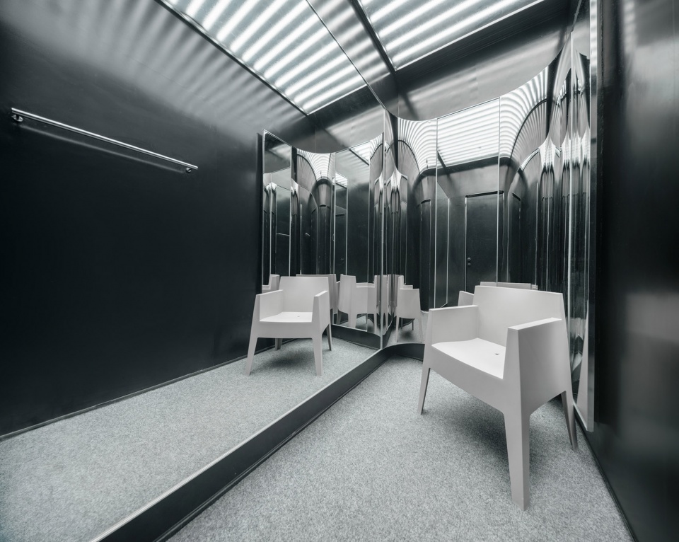
休息区不规则形态的椅子形式,如同路上偶遇的自然石头。试衣间与墙同色的门略显低调,打开后的空间与外部空间形成强大的反差感,如同你置身至于桥下某处桥洞里。深色光亮材质褪去空间的棱角,镜面反射使得空间成为可呼吸的神秘,在最具有话语权的光引领下,即便是小而简的空间,设计上仍然可以进行洒脱的表达。
The irregular-shaped seat placed at the rest area is like a natural stone on the road. The doors of fitting rooms are finished in the same color with walls around, keeping a relatively low profile. The space behind the doors strongly contrasts with the outside, making customers feel like they’re walking into a hole under bridge. The dark-hued, smooth material textures soften the space, and the mirror reflection generates a sense of mystery. Complemented by lighting, the small, simplistic space fully expresses the freedom and artistry of the design.
▼休息区,rest area ©尔见摄影 / 方正、草塘
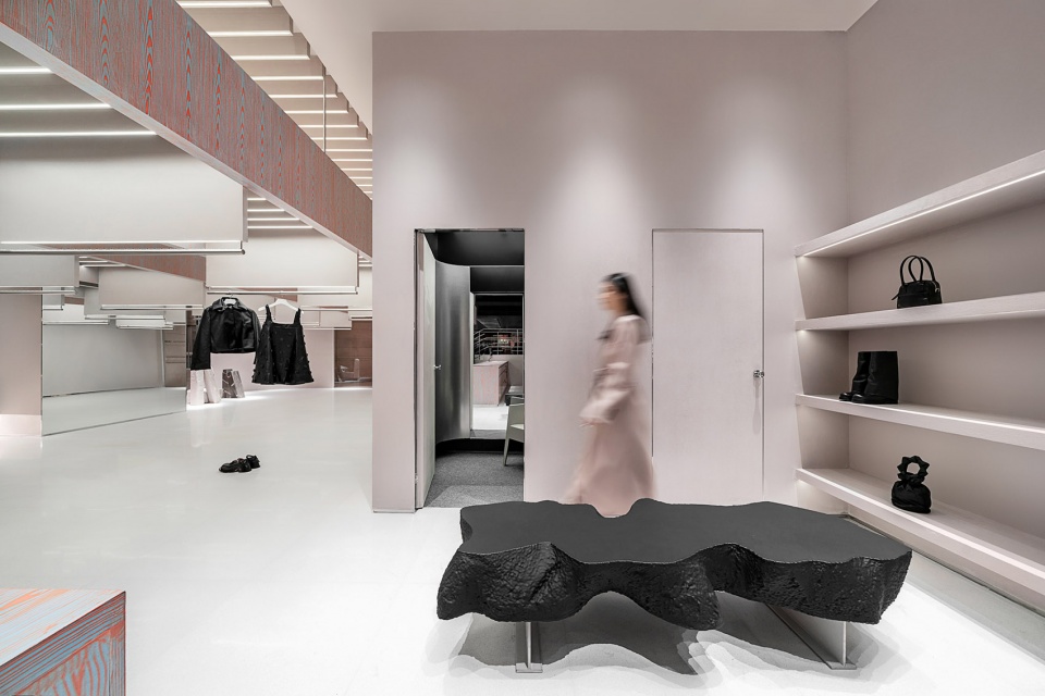
▼不规则形状的座椅,irregular-shaped seat ©尔见摄影 / 方正、草塘
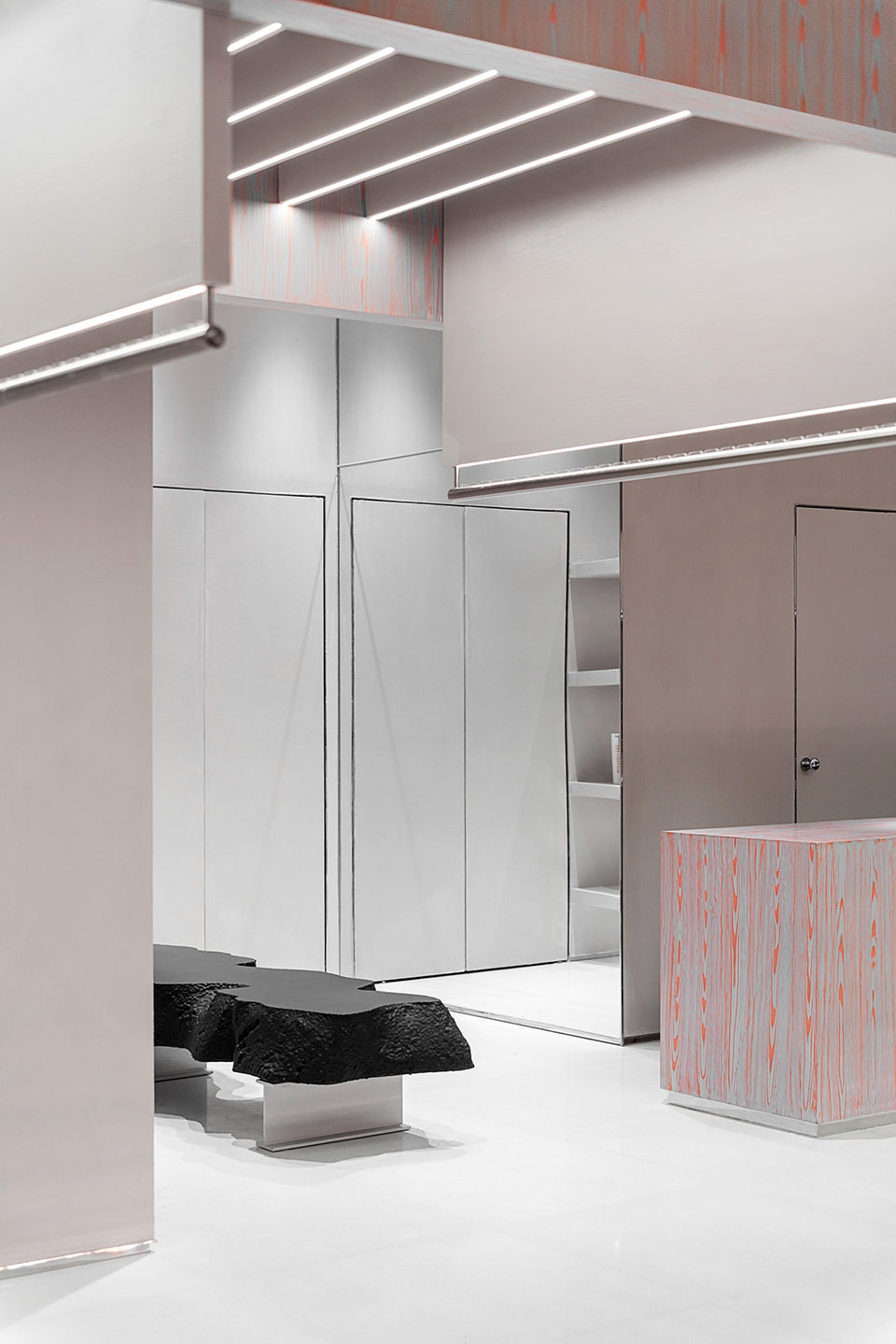
▼试衣间,fitting room ©尔见摄影 / 方正、草塘
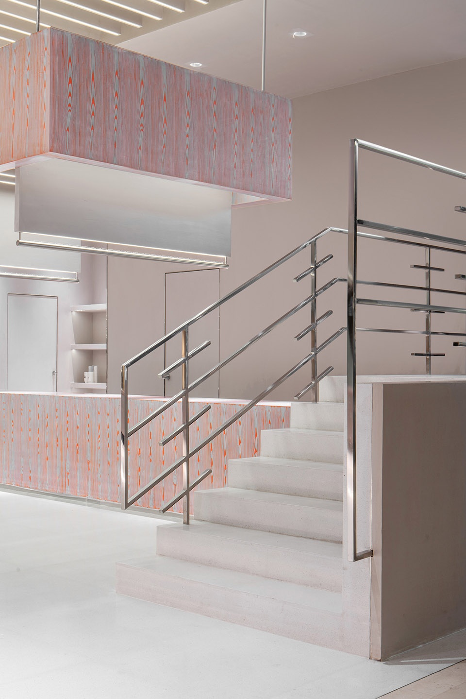
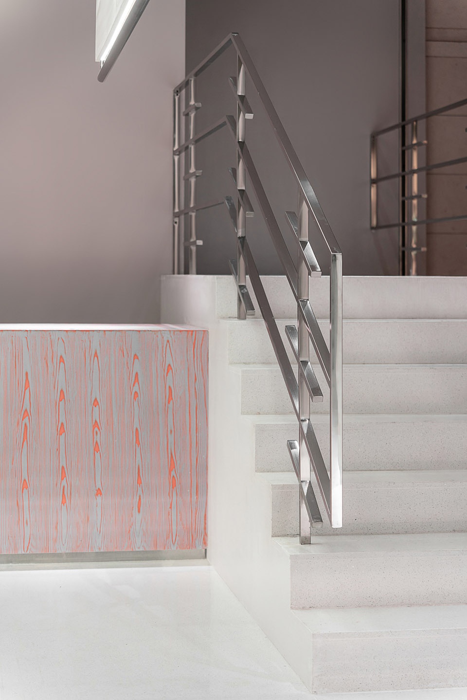
向上行走,楼梯的扶手从山路上的栏杆提取灵感,以线条的设计语言搭配不锈钢材质展示随性之态。
The handrails of the staircase draw inspiration from railings on mountain roads. The combination of linear form and stainless steel shows a natural, free posture.
▼楼梯和细部
stairs and details ©尔见摄影 / 方正、草塘
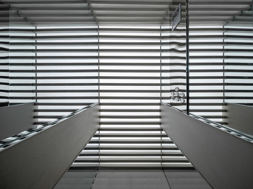
原本的轿厢内空间极其狭小,仅有约1米的宽度,设计上通过采用镜面材质及光物质的层叠的结合方式,增加了空间视觉上无限奇幻的纵深穿越感。
The original space inside the elevator is particularly cramped, only 1 meter wide. The designers utilized mirrored materials and the layering of light to visually enhance the spatial depth and add a fantastic touch to it.
▼镜面增加轿厢纵深,mirror enhancing the spatial depth of the elevator ©尔见摄影 / 方正、草塘
04
秩序
Order
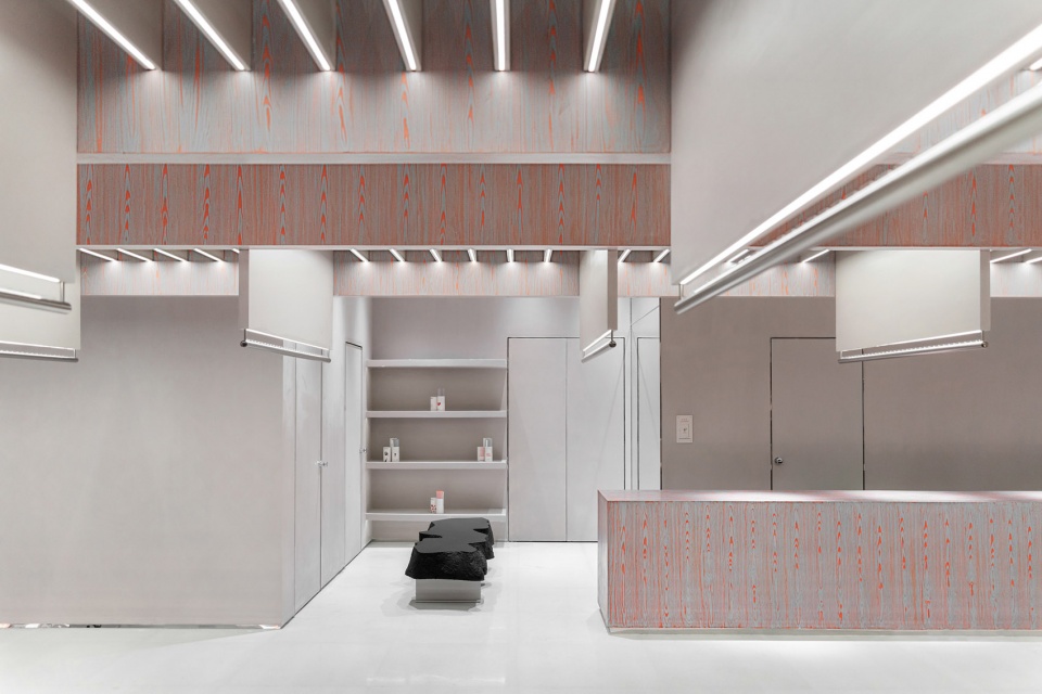
秩序感不是为了空间重复美学而出现,而是为了满足功能顺势而生;几百个品牌的系列组合决定了展示货品的丰富性。集合美观及功能一体的层板系统,在相等距离的层板下方以不锈钢杆以悬挂服饰,自然重力下垂挂的服饰在灯光下随着气流微微晃动,彰显灵动之感。
The sense of order is created to suit functional needs, rather than for a repeated aesthetic. Product collections of about one hundred fashion brands are introduced into the store, which requires diversified ways of display. Suspended panels combine aesthetics and functionality. Clothes are hung on stainless steel rails under the display panels at an equal distance. Illuminated by lighting, the garments slightly swing with airflow, showing a dynamic rhythm.
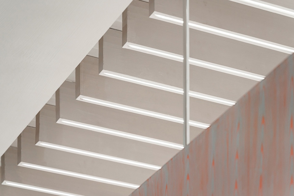
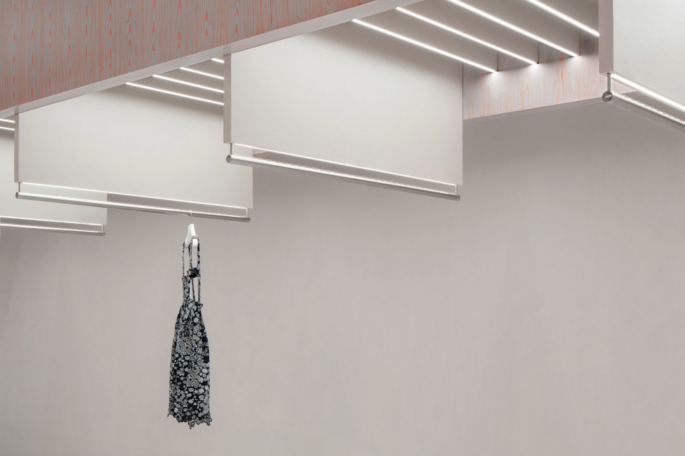
▼秩序感的天花,sequenced ceiling ©尔见摄影 / 方正、草塘
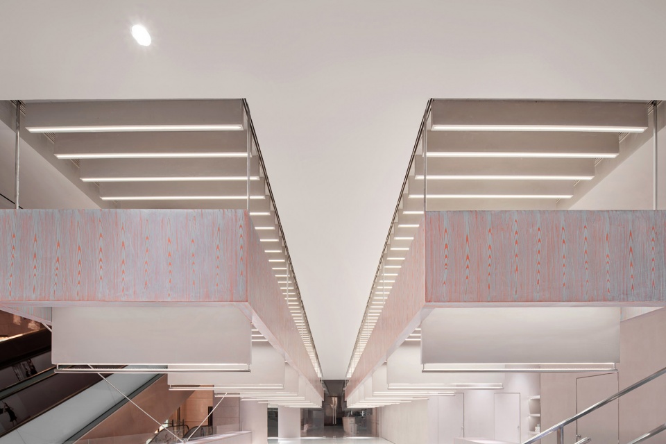
以秩序感阵列布置的悬吊层板,悬吊层板每组内置多达近二百片垂板。每一片垂板都可以上下发光,给于双向空间光源上的辅助。光描绘了结构,结构支撑了功能,功能反哺了这一切,层层依托,犹如机械齿轮一样互相咬合运作。
Suspended panels are arrayed in an orderly manner, each group of which is installed with nearly 200 vertical plates. The upper and lower edges of every plate emit light, bi-directionally brightening the space. Lighting outlines structures; structures support functions; and functions supplement light and structure in turn. They complement one another just like working mechanical gears.
▼天花细节,details of the ceiling ©尔见摄影 / 方正、草塘
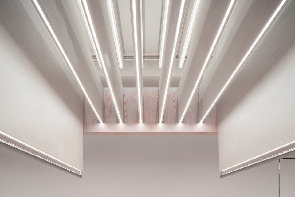
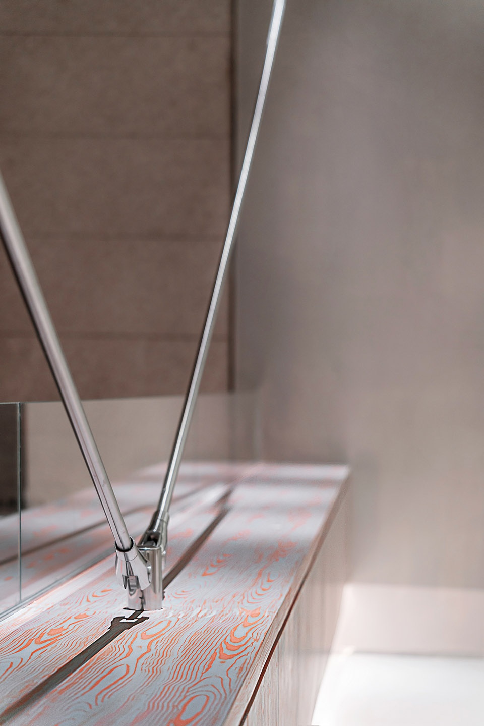
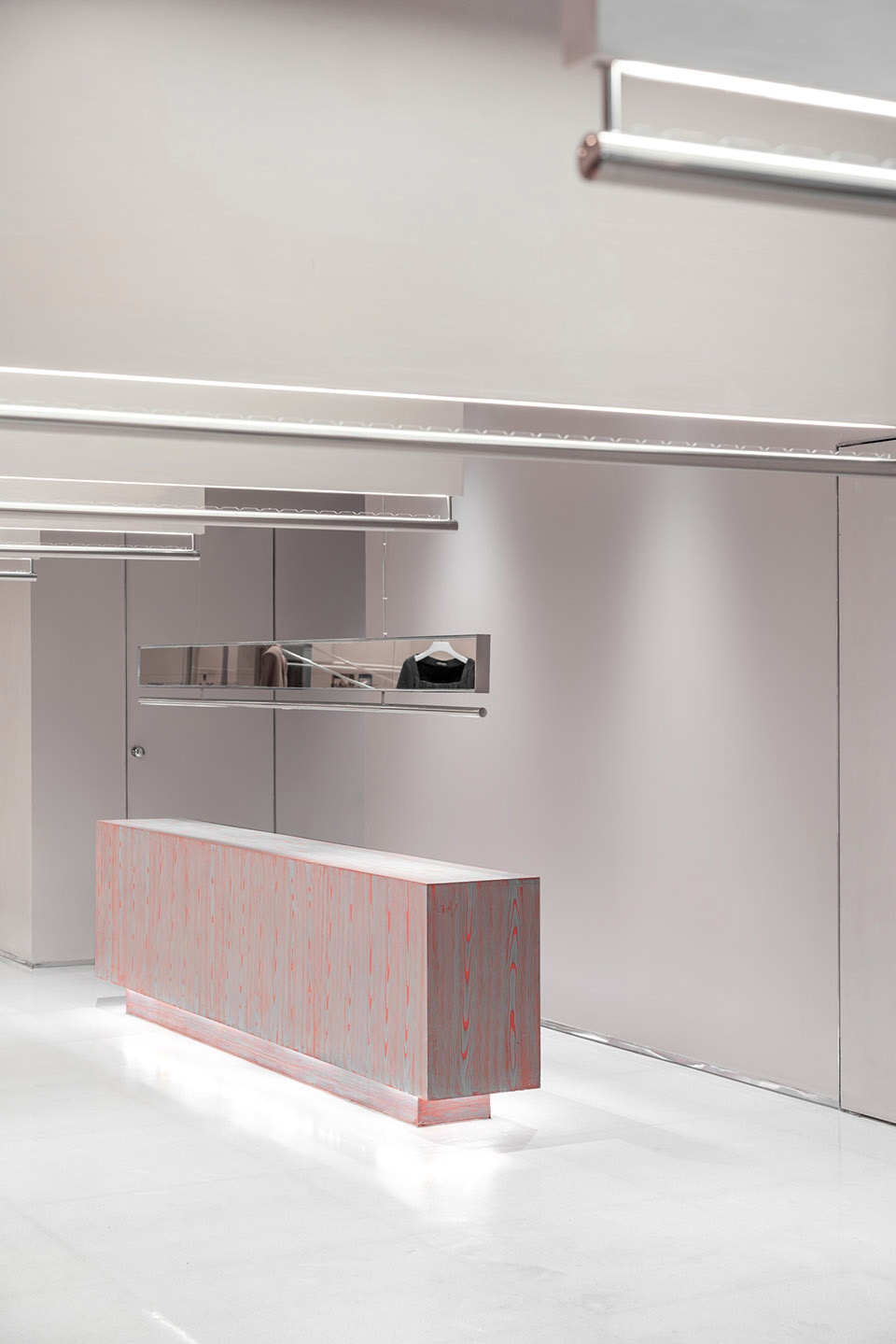
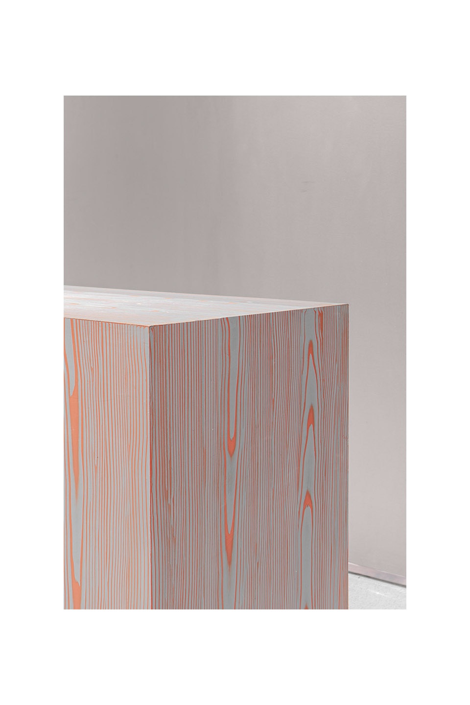
定制的染色木纹饰品台自然划分了动线,饰品台上方的定制悬吊杆可满足灯光照明和镜面需求。
The bespoke, dyed accessories display stand featuring wood grains naturally divides circulation routes. The suspended installation above it combines the functions of illumination and mirror.
▼饰品台和染色木板细部,accessories display stand and details of the wood grains ©尔见摄影 / 方正、草塘
万社设计此次透过品牌文化,空间性质,逐步深入到地理特性,将这一层层元素特性串联组合新的零售空间的排列方式。由点至面,从大至小都清晰的诉说着概念核心,贯穿整个空间形成一脉相承的空间逻辑性。空间的语言,诉说着的情绪,想表达的事物都是万社从一而终在努力做的设计方向。在此次空间创作中,将品牌文化,功能至上,结构突破,艺术气质集于一体,使得空间通过简约纯粹的手法表达,得到更多的自由与释放。
Based on the brand’s culture, the spatial attribute and local geographical characteristics, Various Associates extracted and combined different elements to create a brand new retail space. The point, line and plane of the space tell the core of the design concept, which runs through the overall space with a unified logic. Spatial languages, emotions and expressions are what Various Associates has been always focusing on in design practice. For this project, the team integrated the client’s brand philosophy, functionality, structures and artistry into a whole, and eventually released the space through simplistic, pure design languages.
▼一层平面图,first floor plan
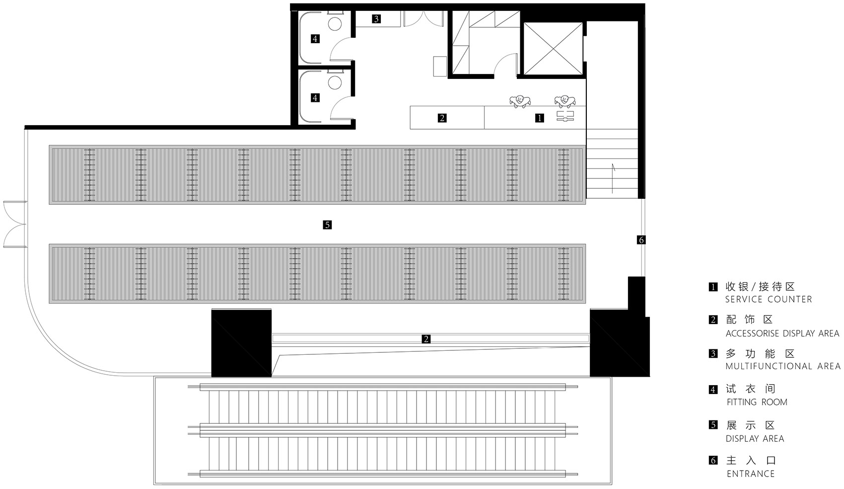
▼二层平面图,second floor plan

项目名称:SND重庆环球金融中心WFC概念店
委托方:SND
项目地址:中国 重庆环球金融中心WFC
面积:296㎡
完工时间:2021年9月
设计公司:万社设计 Various Associates
项目负责人:林倩怡、杨东子
设计团队:黄博、张峻瑞
摄影师:尔见摄影 / 方正、草塘


