
西方的服装强调贴身合体。他们的着装理念认为,只有体现人体曲线的合体剪裁才是完美的设计。而我与此一直背道而驰。服装制作工艺另当别论,只就设计来讲,我的设计一定会让空气在身体和衣服之间微妙地流动。也就是说,在我设计的服装中,有“间”。——山本耀司
Western clothing emphasizes fitting. They believe that only well-fitting tailoring that reflects the human body curve is a perfect design. But I have been going against this all the time. The clothing craftsmanship is another matter. As far as the design is concerned, my design will surely allow the air to flow delicately between the body and the clothes. In other words, there are “spaces” in the clothes.— Yohji Yamamoto
▼项目概览,Preview ©夏同
间 | Space
我们每天穿脱衣服,但很少知觉自己的身体,正如我们每天进出建筑,却很少能真正感知空间。如室希望创造一个空间,让人们能重新感知到自己和空间的关系和连接,唤醒人们对自己身体的知觉,唤醒人们对彼此关系的知觉,和一种由觉醒带来的舒服和自信,一如里所的slogan “feel alive”。
We wear and take off our clothes every day, but we rarely perceive our bodies. Just as we walk in and out of a building every day, but we rarely perceive space. Ruhaus studio hopes to create a space where people can re-perceive the relationship and connection between themselves and the space; awaken people’s awareness of their bodies and their relationships with each other, and a sense of comfort and confidence brought about by awakening. Just like Livso’s slogan “feel alive” in here.
▼入口路径,Entry way ©夏同
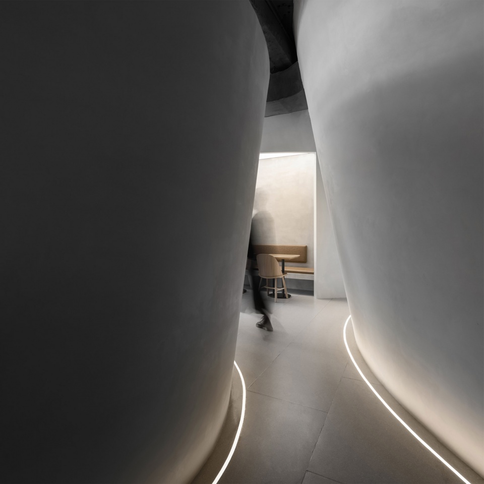
片 | Piece
透明性意味着创造关系,并不一定要完全通透。用片的语言去裁剪和划分空间,创造人与空间的关系,“间”便产生了。在片与片之间穿行,互视,声音和视觉在空间中的流动,是一种让人安心的社交距离感。
Transparency means creating relationships. It doesn’t have to be looked through. Using the language of the pieces to cut and divide the space creates the relationship between people and space. Subsequently, “space” is produced. Traveling between these pieces, seeing each other, sound and vision flowing surround in the space, is a reassuring sense of social distance.
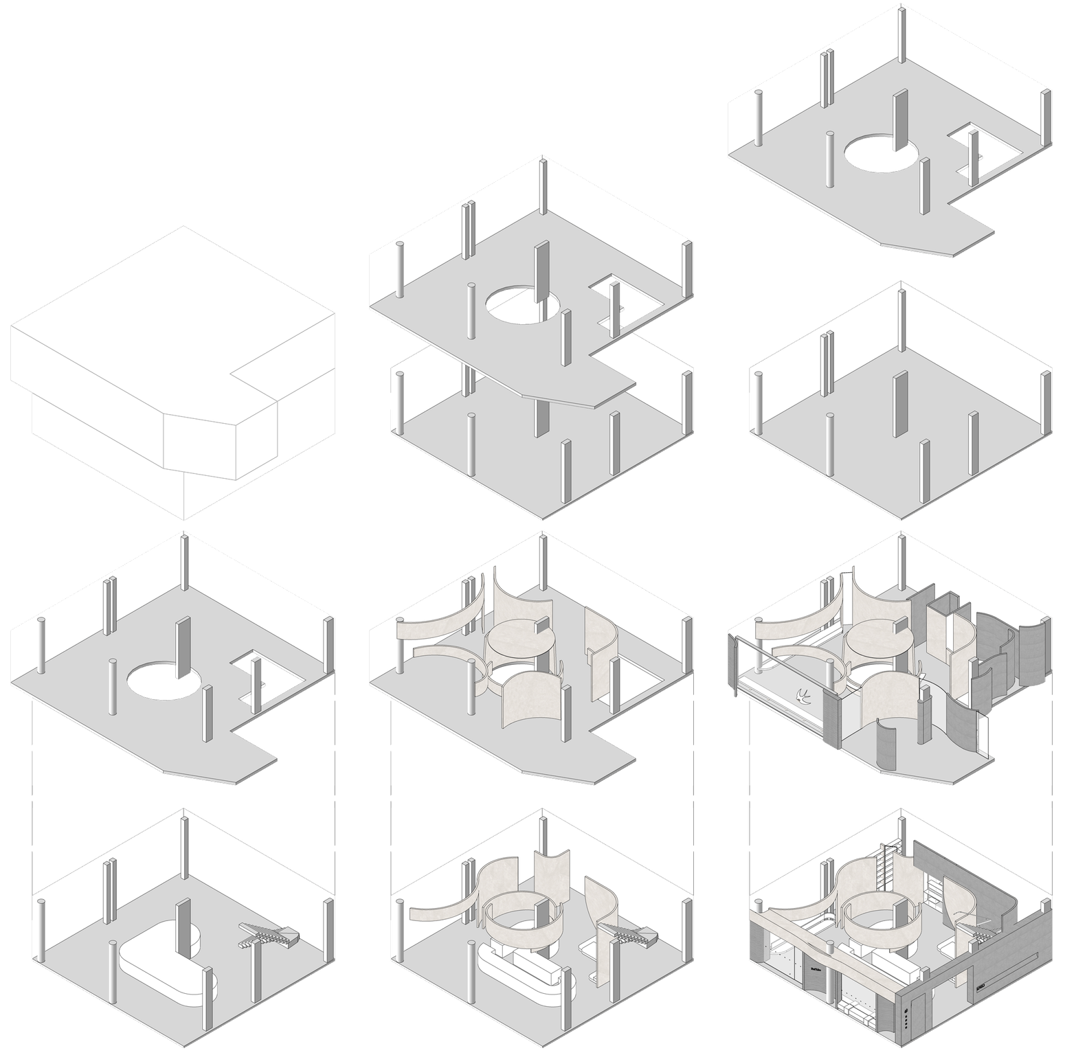
▼设计示意,Diagram ©如室建筑设计事务所

人少时不显得空旷,空间自洽;人多时也不显得拥挤,人得自在。
When there are few people, it doesn’t appear empty, and the space itself-consistent.When there are too many people, it doesn’t crowd, and people feel comfortable.
▼用“片”的语言裁剪和划分空间 ©夏同Using the language of the pieces to cut and divide the space

空 | Hollow
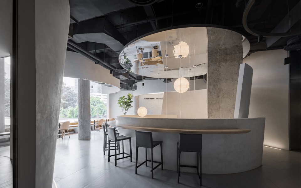
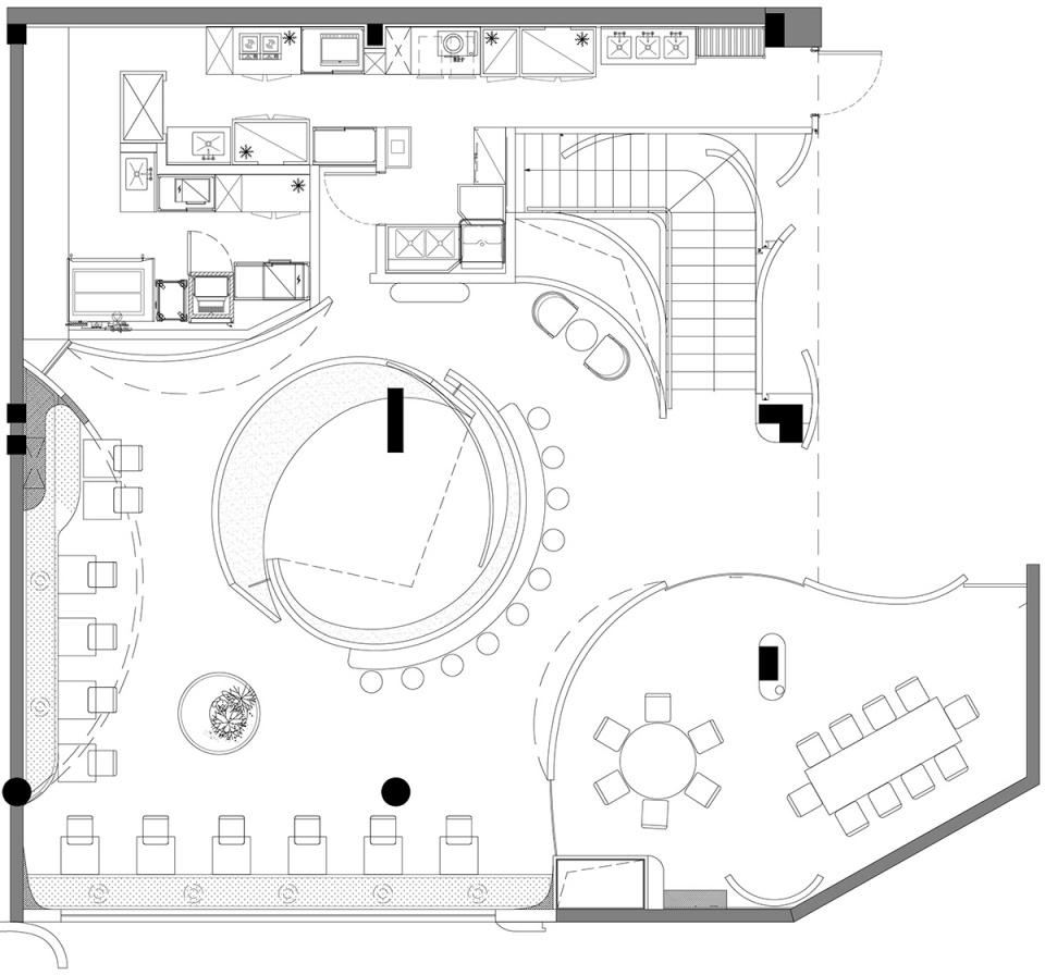
打开中岛吧台上方的楼板,使一二层贯通;一楼咖啡的香气和声音徐徐传到二楼,二楼的灯光随着“片”漫射扩散到一楼;站在一楼点单区抬眼向上往便是“片”映衬下的月球灯带来的温度,坐在二楼中空沿边卡座往下看可以观察到咖啡师在岛台忙碌穿行的身姿以及窥探咖啡制作的全过程。
▼轴测示意,Axon diagram©如室建筑设计事务所
Open the floor plate above the island bar to let the first and second floors communicate. The aroma and sound of the coffee on the first floor slowly spread to the upper level, and the lights on the second floor diffused to the lower level with the pieces. Standing by the order area and raising your eyes upwards, which is the warmth brought from the moon lamp against the pieces. You can observe the barista operating by the island bar and spy on the whole process of coffee-making while sitting by the booth of hollow edge on the second floor.
▼从二楼俯瞰一楼的中岛吧台 ©夏同Overlook to the island bar from the upper level
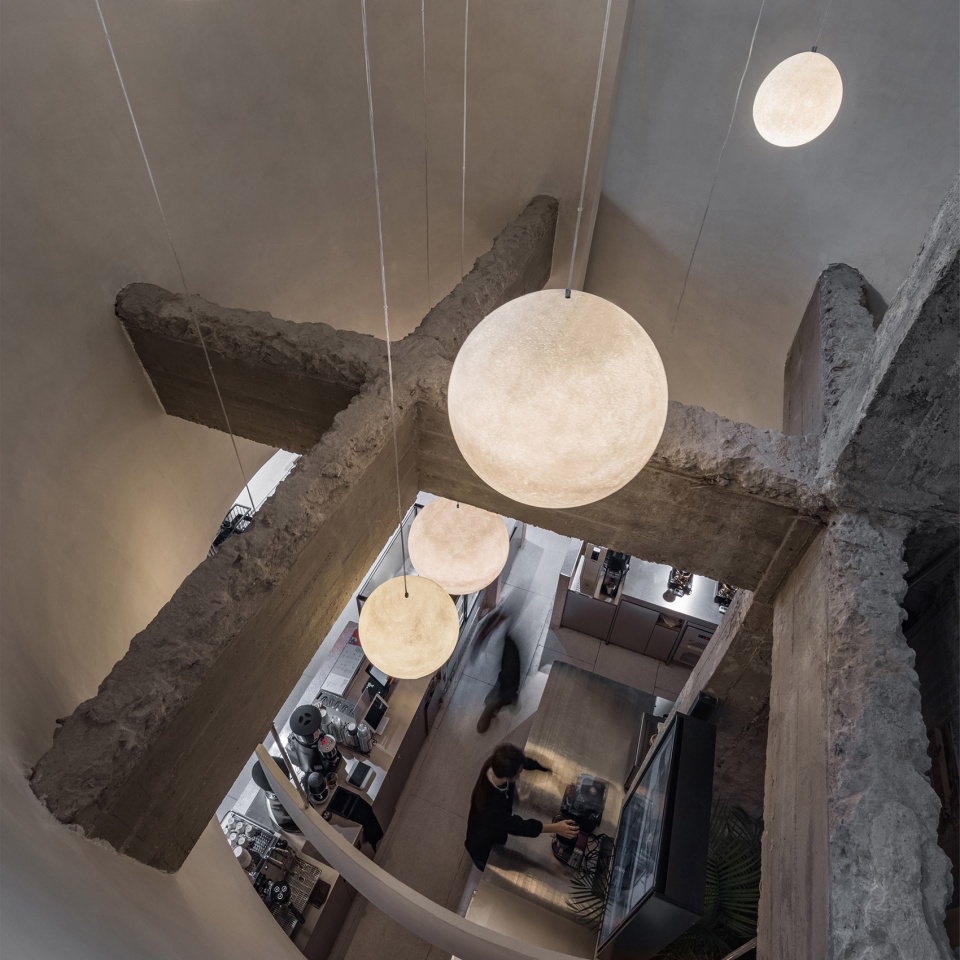
光 | Light
人们在远处就会被这座镶嵌在老牌商场里的微光小独栋所吸引,待走近,发现两层空间还有不一样的气质和氛围。
From a distance, people will be attracted by this small building with dim lights inlaid in the old shopping mall. Getting closer, they will find that the two floors have different moods and atmospheres.
▼吧台灯光,Bar light©如室建筑设计事务所
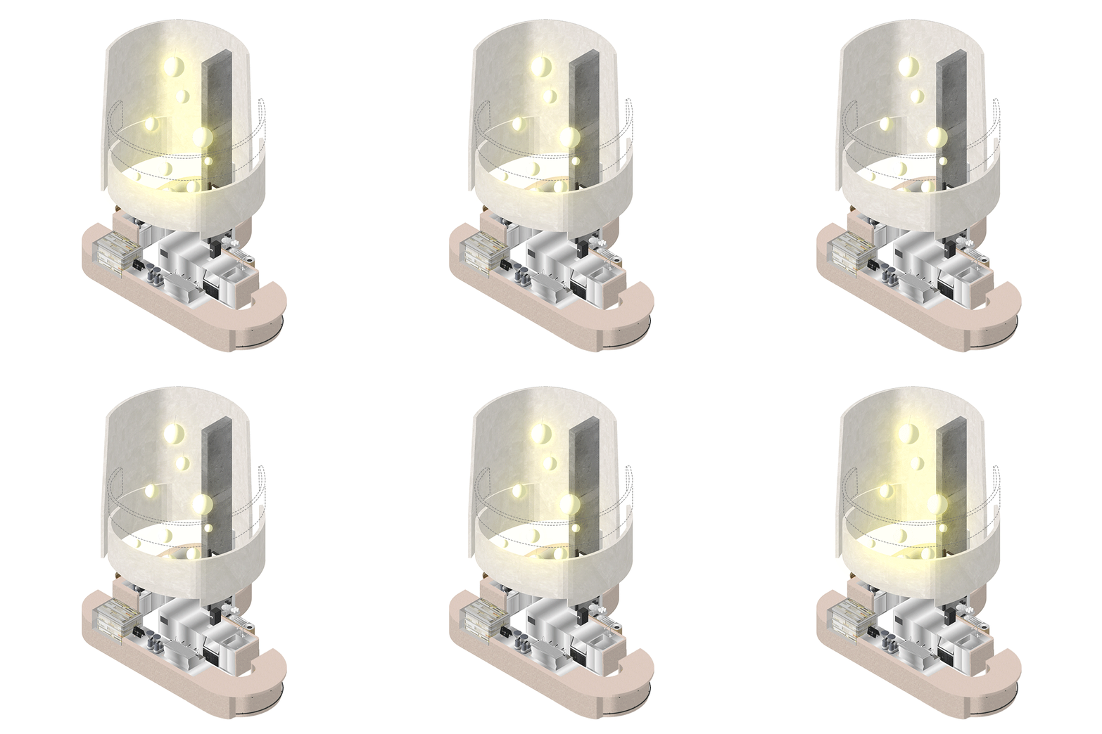
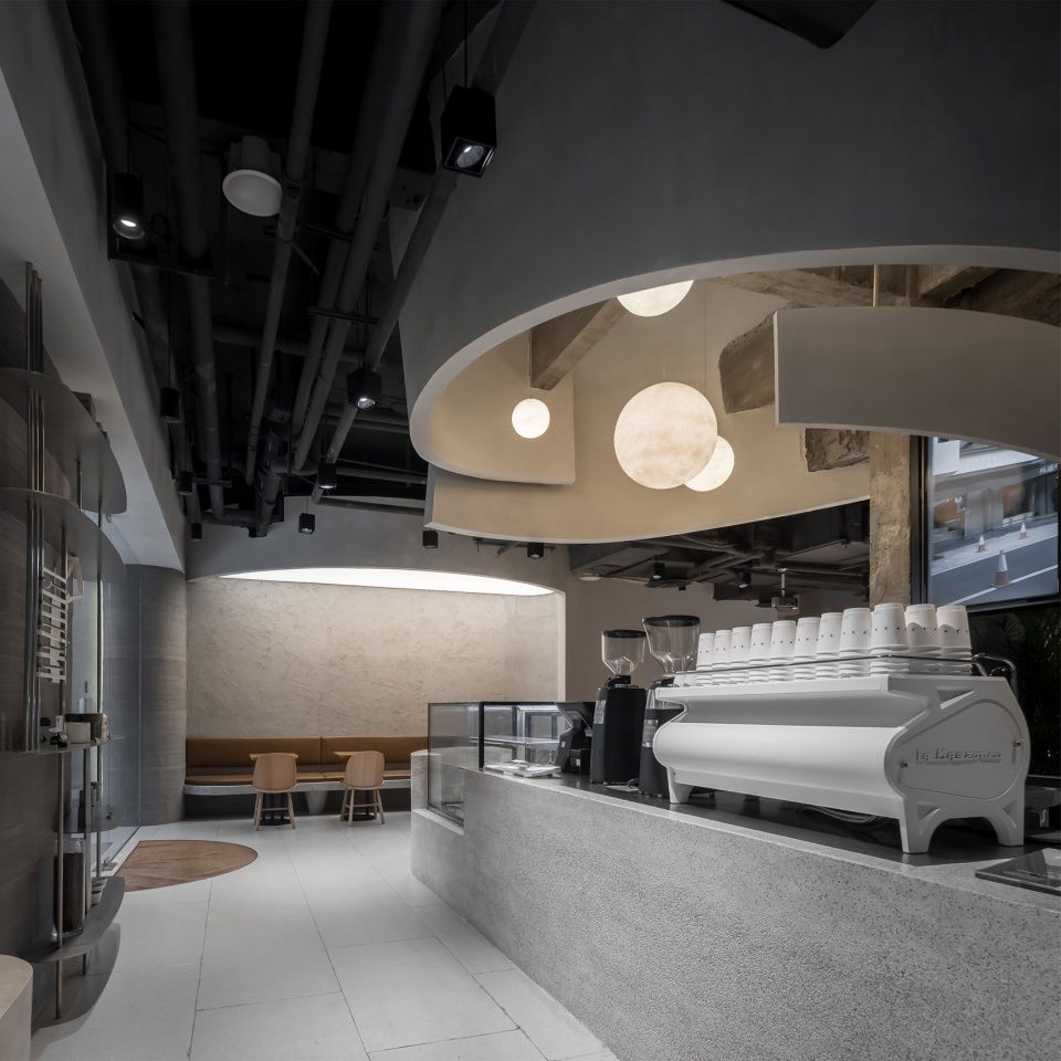
一层主营咖啡,明亮而不失温暖的照明是要诣,刚好匹配店员们酷酷的服装以及亲切的笑脸。
The first floor is the coffee shop, bright and warm lighting is necessary to match the cool clothes and friendly smiling faces of the shop assistants.
▼一层咖啡区Coffee area on the first floor ©夏同
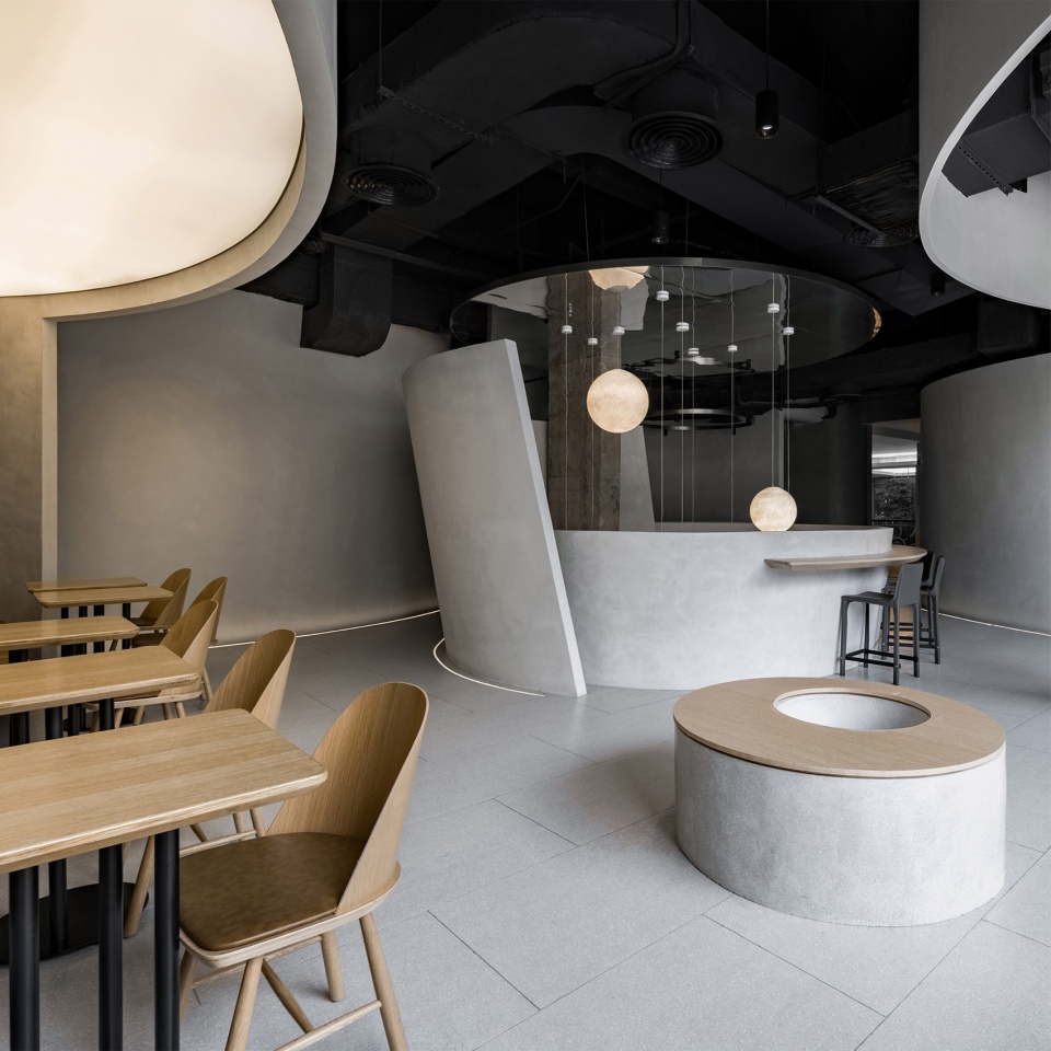
二层主营简餐,九点后会化身威士忌吧,灯光慢慢调暗,被包裹在微醺暧昧的昏暗氛围中,褪去一天的疲倦与烦恼,是一天中属于自己的最好时光。
The second floor is mainly for simple meals. After nine o’clock, it will turn into a whiskey bar. The lights are slowly dimmed and wrapped in a slightly ambiguous dim atmosphere. It is the best time of the day to fade away the tiredness and worries of the day.
▼二层用餐区Dining area on the second floor ©夏同
质 | Texture
日剧《协奏曲》里的一个场景——走在刚建好仍空无一人的建筑空间里,木村拓哉所演的年轻建筑师发出设计会不会略显空旷的疑问,田村正和所演的知名建筑师轻轻地回答,“等有人了你再来看看。”
▼设计示意,Diagram©如室建筑设计事务所

A scene in the Japanese drama “Concerto”-walking in an empty building that has just been built. The young architect played by Takuya Kimura asked whether the design will be slightly empty. The famous architect performed by Masakazu Murata replied, “You’ll have a look when someone else is there.”
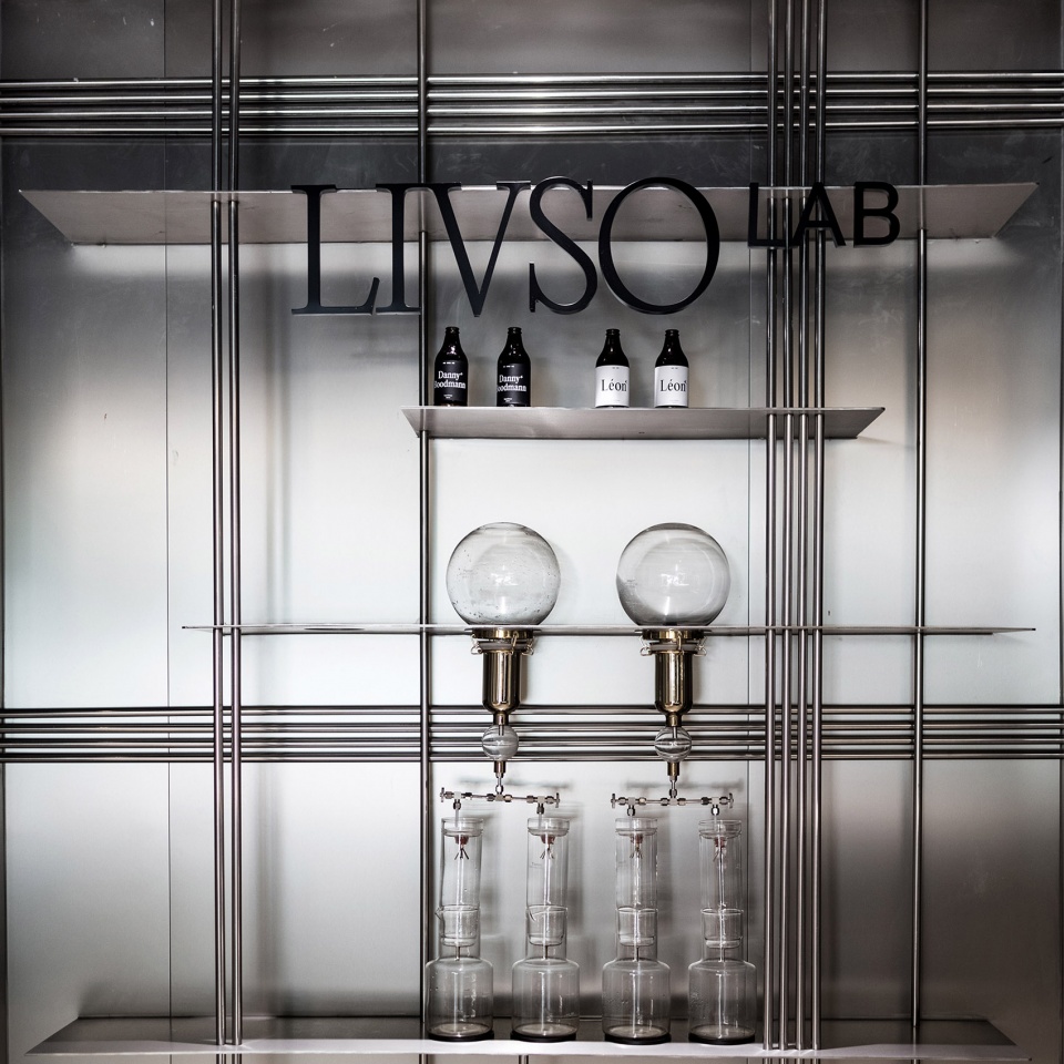
▼金属元素与灰色墙面形成对比 ©夏同The metal elements contrast with the grey wall surface
▼陈列架细节,Shelve detail ©夏同
空间需要留白,因为人和声音、气味的融入才最终使其完整。
The space needs the blank because people, sounds, and smells complete it eventually.
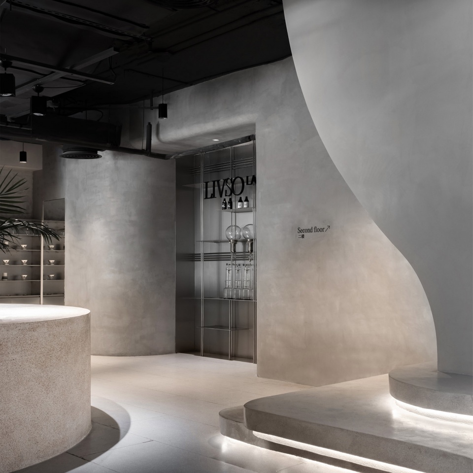
▼楼梯,Staircase ©夏同
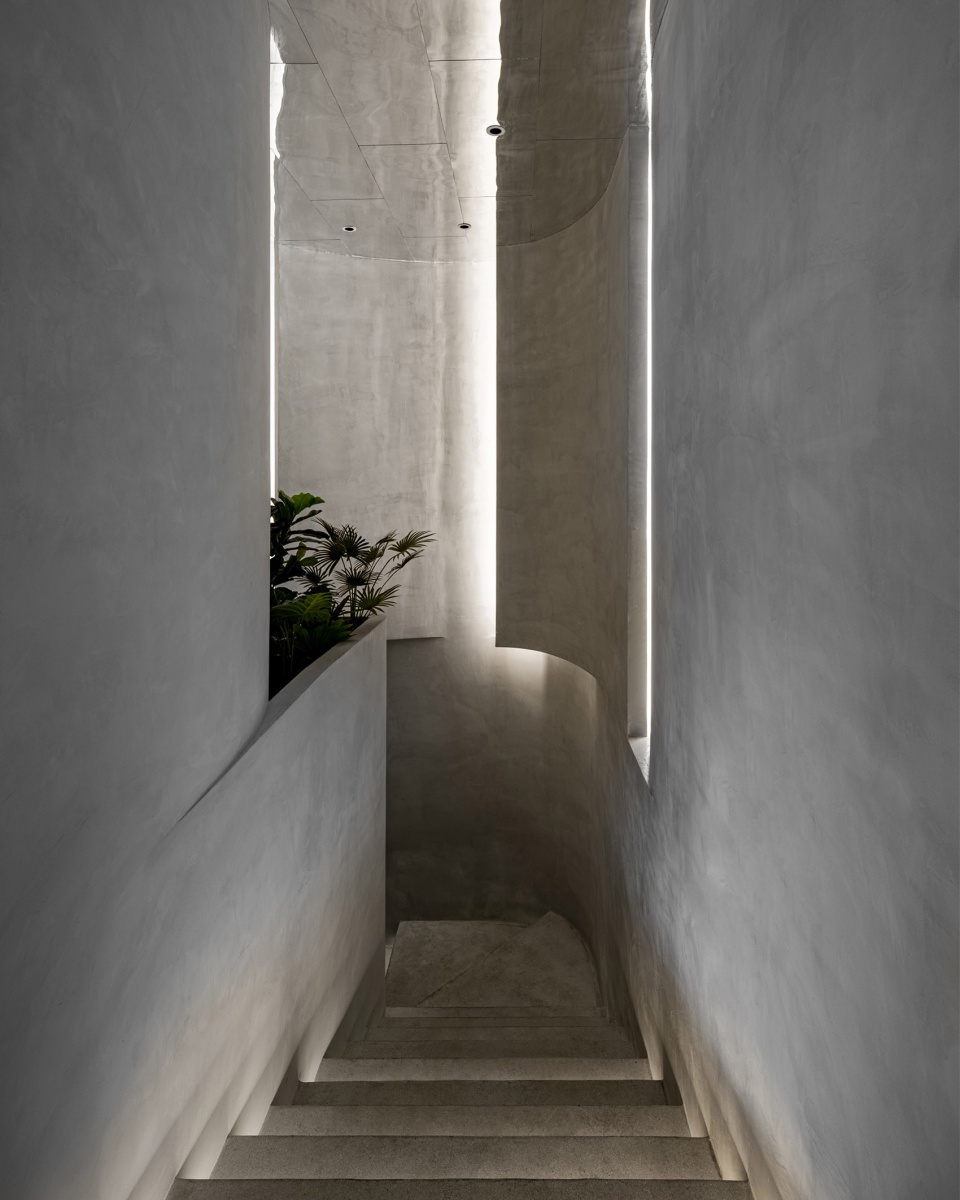

保留了原始的水泥裸梁柱,作为空间的原始骨骼;米色肌理灰泥片墙则是其新生的优雅皮肤,与地面的灰色细颗粒水磨石一起传递出一种恰到好处的冷暖。
The original bare cement beams and columns are retained as the original bones of the space. The beige-textured piece wall is its new and elegant skin, which delivers an appropriate warmth and coldness with the gray fine-grained terrazzo on the ground.
▼原始水泥裸梁柱作为空间的原始骨骼 ©夏同The original bare cement beams and columns are retained as the original bones of the space
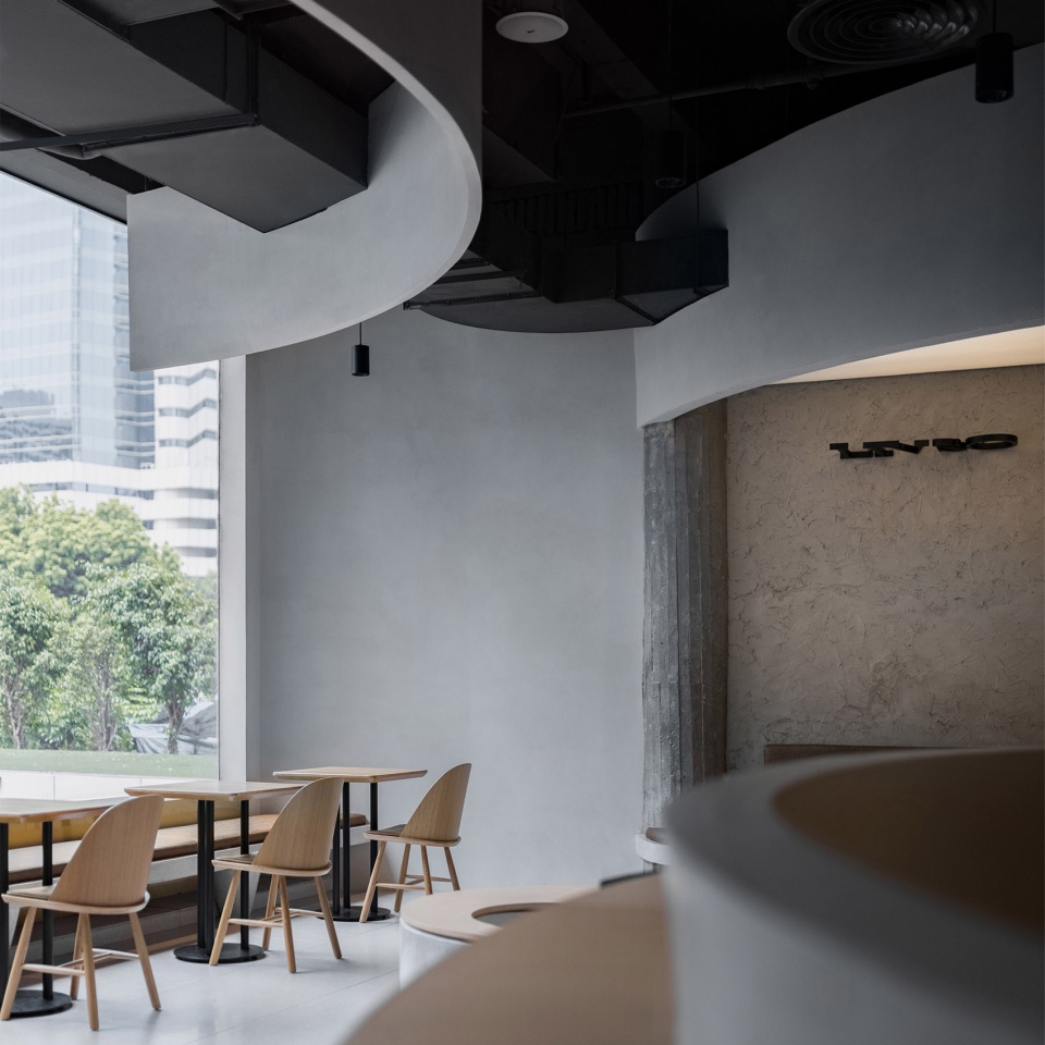
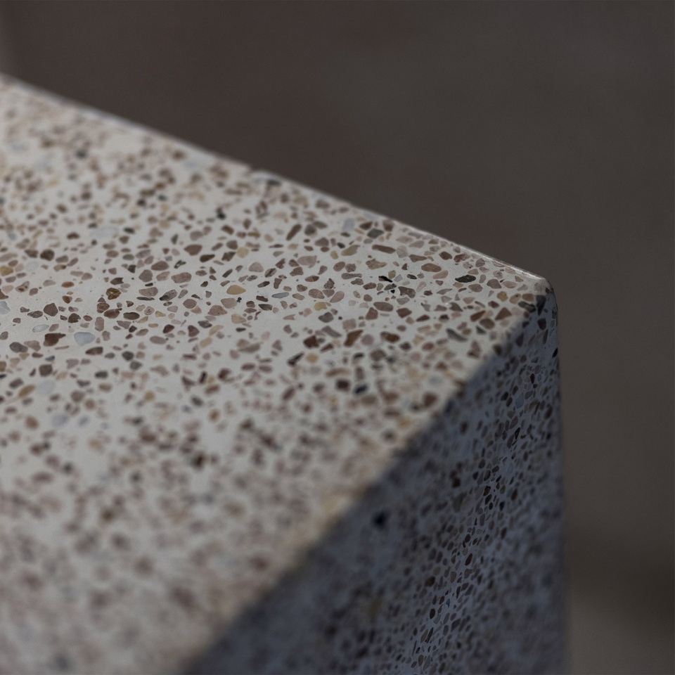
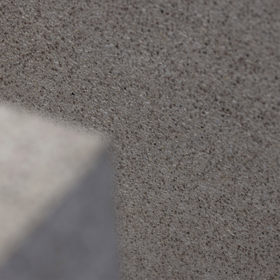
主吧台从水刷石的颗粒质感过渡到水磨石的温润再到不锈钢台面的精致,除此之外的精彩都给予人。
The island bar transitions from the granular texture of the brushed stone to the warmth of the terrazzo then the exquisiteness of the stainless-steel countertop.
▼材质细节,Material ©夏同
用 | Quality
吧台不是去占据,而是去贴合、去制造“间”。保证吧台高效的同时,让客人能感知到适度的亲切,又不至于被太多的人打扰。
The island bar is not to occupy, but to fit and create a “space”. While ensuring the high efficiency of the island bar, guests can perceive a moderate intimacy without being disturbed by too many people.
▼主吧台,The main bar ©夏同
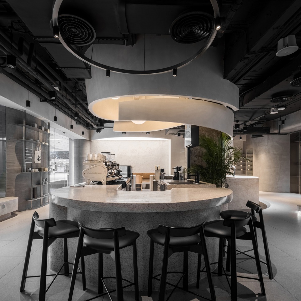
虹吸区域和意式操作区在高效的路径下,作了相对脱离的处理。以满足虹吸及手冲的交流需要。意式的操作动线与客户的排队动线也就变得顺滑而高效。
The siphon area and the Italian operation area are relatively separated from each other under an efficient path.
▼操作区域,Coffee -making area ©夏同


原传菜梯的保留与翻新,让厨房可以隐藏在二楼。充分释放了一层的营运面积,也提高了员工的送餐效率。
The preservation and renovation of the kitchen ladder allowed the kitchen to be hidden on the second floor. It fully releases the operating area on the first floor and improves delivery efficiency as well.
▼从二层望向室内 ©夏同View to the internal space from the upper floor

▼灯光,Light ©夏同
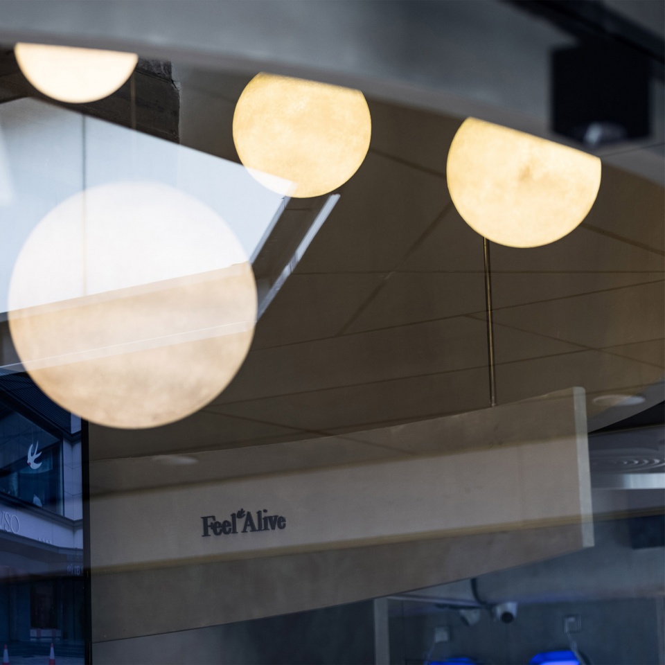
▼店铺立面,Facade of the store ©夏同

▼一层平面图,Plan level 1 © 如室建筑设计事务所
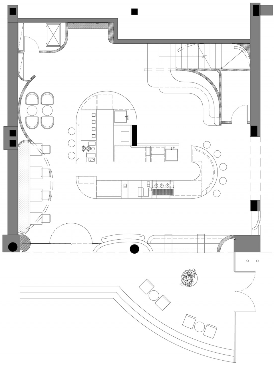
▼二层平面图,Plan level 2 © 如室建筑设计事务所
▼立面图1,Elevation 1 © 如室建筑设计事务所
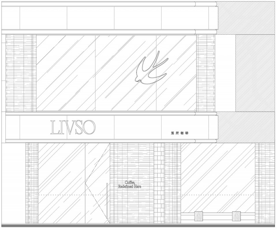
▼立面图2,Elevation 2 © 如室建筑设计事务所

▼剖面图1,Section 1 © 如室建筑设计事务所

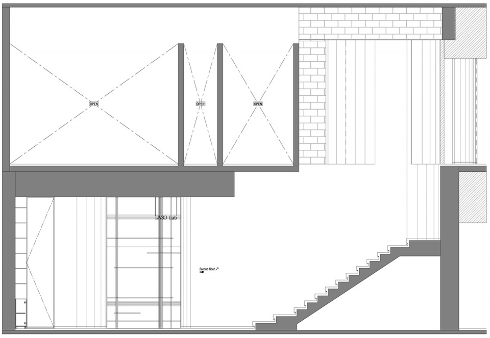
▼剖面图2,Section 2 © 如室建筑设计事务所
项目名称:里所咖啡设计方:Ruhaus Studio微信公众号:如室建筑设计事务所项目设计 & 完成年份:2021主创及设计团队:朱丹丹,王艺儒,梁晓东,陈开亮。苏玉梅,高帆,赵玉立,谢千娇项目地址:环市东路367号丽柏广场1F-119、2F-208号商铺(白云宾馆大堂旁)建筑面积:260m²摄影版权:夏同客户:里所咖啡


