
反流量的零售空间
A retail space that follows no trend
美妆集合品牌steps的第一家线下店铺由say architects负责设计,落地于杭州湖滨步行街。这是一次对于steps品牌的共同探索,同时也是对于整个零售行业浮躁氛围的反思。
The first offline store of the beauty collection brand Steps, was designed by Say Architects and landed in Hangzhou Hubin Pedestrian Street. This project is a joint exploration of Steps, and a reflection on the reckless atmosphere of the entire retail industry.
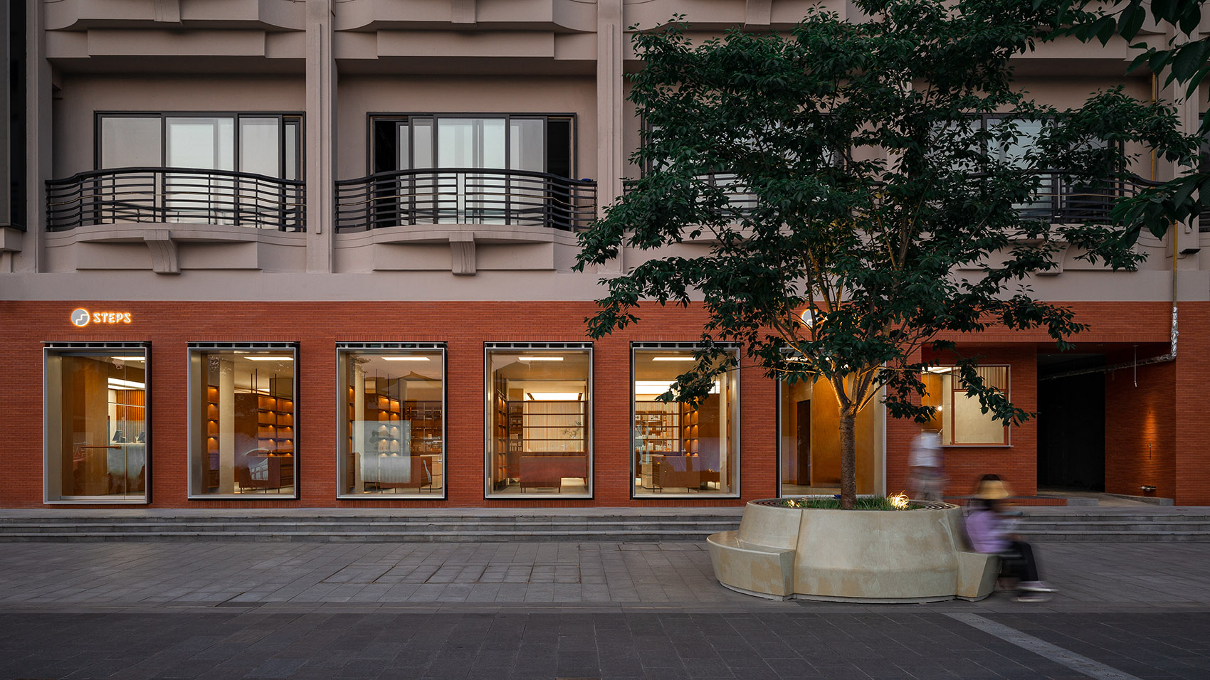
▼项目外观,Exterior view ©汪敏杰
目前零售市场美妆集合店铺对外多营造出一种快消感,强调品牌的年轻化,时尚感,其店铺从设计之初就强调店铺的可达性,以增加入店人流。Steps的创始团队希望首家线下门店能不同于其他品牌,强调自己特有的优雅,柔和以及舒适的品牌感受。美妆产品的消费场景为何一定要处在喧闹且网红感十足的零售店铺中,而不能如同购买图书一样在安静柔和的空间中,享受挑选过程和购买体验呢?回想十几年前电商还没有兴起的时候,逛街购物是一种优雅休闲的生活方式,而现在由于社交媒体的快速发展,逛街很多时候成了打卡新店铺的一种快速消费方式,顾客进店后并不能很好的享受购物体验,快进快出打卡消费方式消解了零售空间本身存在的意义。因此say希望通过steps的店铺设计,让大家回归以前舒适优雅的购物体验,让空间回归空间本身,而不是嫁接于社交网络存在的短暂消费载体。
At present, the beauty collection stores in the retail market create a sense of FMCG, emphasizing the youth and fashion sense of the brand. The stores emphasize the accessibility of the store from the beginning of the design to increase the flow of people entering the store. The founding team of Steps would like the first offline store to be different from other brands, emphasizing its own elegant, soft and comfortable brand feeling. Why must the consumption scene of beauty products be in noisy and full web celebrity conscious retail stores, rather than enjoy the selection process and purchase experience in the quiet and soft space as buying books? Recalling that more than ten years ago, shopping was an elegant and leisure lifestyle when e-commerce did not rise. Now, due to the rapid development of social media, shopping has often become a fast way of immediate consumption to check in new stores, and customers can not enjoy the shopping experience well after entering the store. The fast in and out consumption method eliminates the meaning of the existence of the retail space itself. Therefore, Say hopes to let people return to the comfortable and elegant shopping experience of the past and let the space back to the space itself through the store design of Steps, rather than the temporary consumption carrier grafted on the social network’s existence.
▼门头,Storefront ©汪敏杰
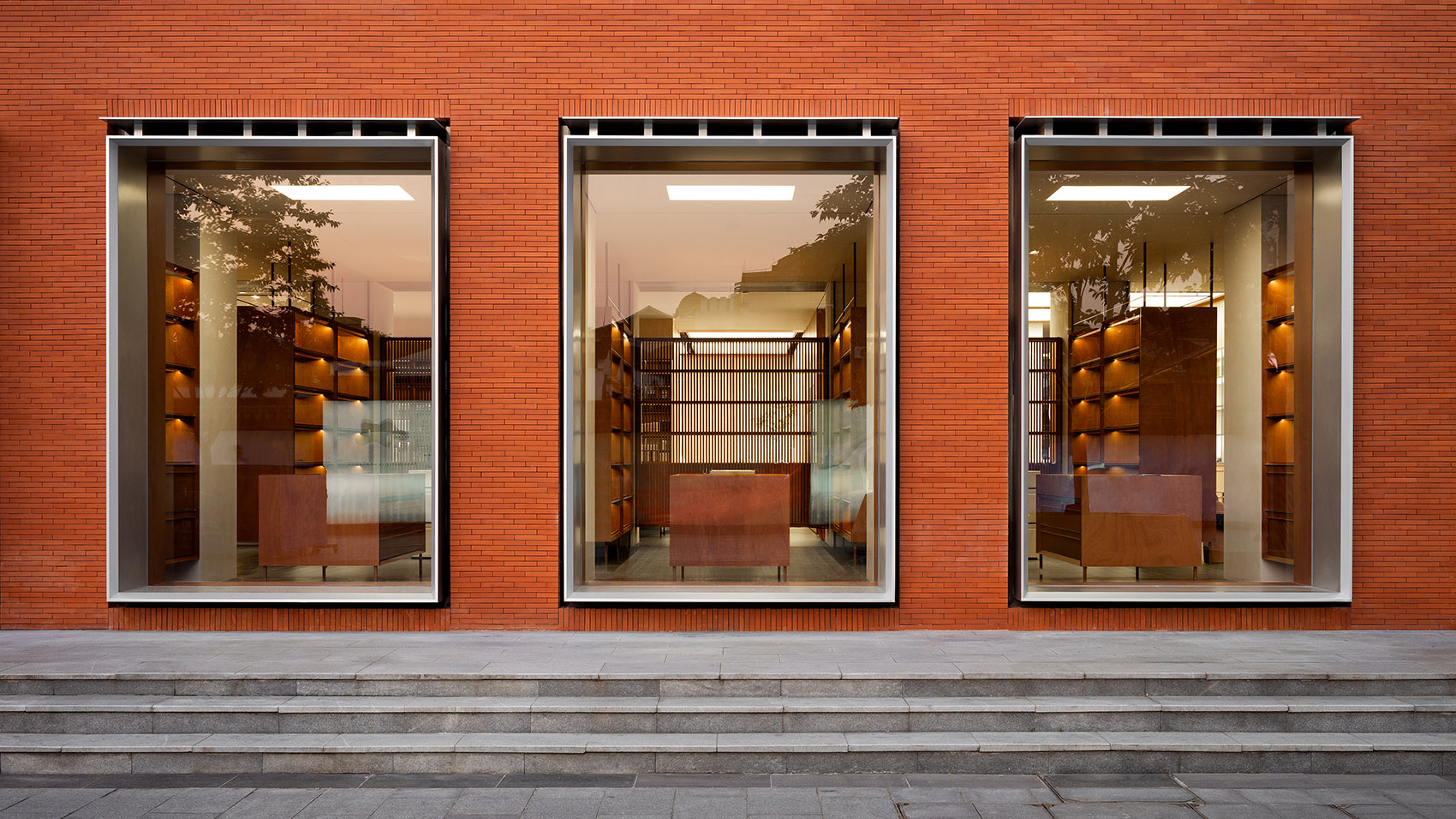
say希望顾客穿过琳琅满目的步行街来到steps时可以有一种脱离于步行街之外的沉静感,设计中,say融入了“美妆书局”这一设计概念。舒适,柔和,优雅以及缓慢是steps店铺设计的核心词汇。降低客人购物的速度,提高空间体验,购物本就是一种舒适的生活方式。
Say would like customers to have a sense of stillness away from the pedestrian street when they walk through the dazzling pedestrian street to the Steps. In the design, Say incorporates the design concept of “Beauty Book Layout”. Comfortableness, softness, elegance and slowness are the central vocabulary of the store design of Steps to reduce the speed of guests shopping, improve the space experience. Furthermore, shopping is originally a comfortable lifestyle.
▼门头窗口展示,Storefront window display ©汪敏杰
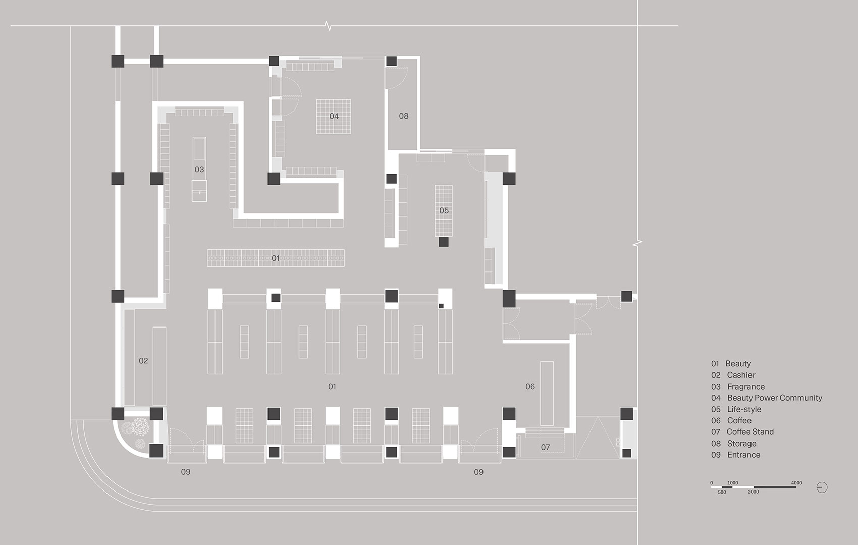
一个品牌的塑造虽然对外输出最直观的是产品和店铺外观,但其品牌形象和特点则是贯穿全部。不仅从店铺形象上,从业态上steps也区别于其他美妆集合品牌,更强调用户粘性及用户社区,这也是steps将顾客拉回传统购物体验的一种尝试。在空间中,steps希望能植入“美力社区”这一功能空间,将社区融入品牌,入店人数并不能说明品牌价值,而用户粘性以及口碑才是零售核心。Say将店内主要功能划分为六大板块:产品展示,收银,香氛区,美力社区,生活方式区以及咖啡区。其中后五个区域作为空间中的五个盒子,围绕着产品展示区顺时针排布。
Although the most intuitive output of building a brand is the appearance of the product and the store, its brand image and characteristics are through the whole. Not only from the store image but the business format of Steps is also different from other beauty collection brands, emphasizing user stickiness and user community; it’s also an attempt by Steps to pull customers back to the traditional shopping experience. Steps hope to implant the functional area of “Beauty power Community” and integrate the community into the brand in the space. The number of people entering the stores does not explain the brand value, while the user stickiness and the public praise are the core of retail. Say divides the main functions in the store into six segments: product display, cashier area, fragrance area, Beauty power community, lifestyle area and coffee area. The last five regions serving as the five boxes in the space are arranged clockwise around the product display area.
▼功能布局概念,Layout diagram ©Say Architects
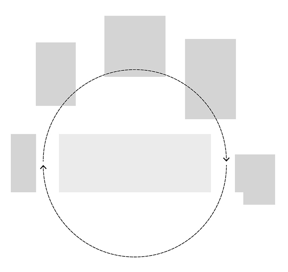
环绕式的空间布局
Clockwise arrangement
Steps门头设计没有一味去增加门头露出面积,而是在原有建筑的柱网关系上提取模数,增加部分柱子,形成了比例舒适且与原有建筑相呼应的外立面节奏。立面材料选择与杭州湖滨步行街特有的灰砖同样尺寸的陶砖,陶砖色差和成品尺寸误差小,减少了砖砌立面难以解决的拼贴不规则问题。红色的门头从整条街道零售业态中脱颖而出,但同时又与整条街的灰砖饰面协调共存。
The storefront design of Steps does not blindly increase the exposed area of the store, but extracts the modulus on the column network of the original building, adds part of the columns to form a facade rhythm with comfortable proportion, and echoes the original structure layout. The facade ceramic tile selected is the same size as the grey brick unique to Hangzhou Lakeside Pedestrian Street. The colour difference of the ceramic brick and the size error of the finished product are ignorable, reducing the irregular collage problem challenging to solve on the brick facade. The red storefront stands out from the retail format of the whole street but is also in harmony with the grey brick veneer of the entire pedestrian street.
▼店铺入口,The entrance ©汪敏杰
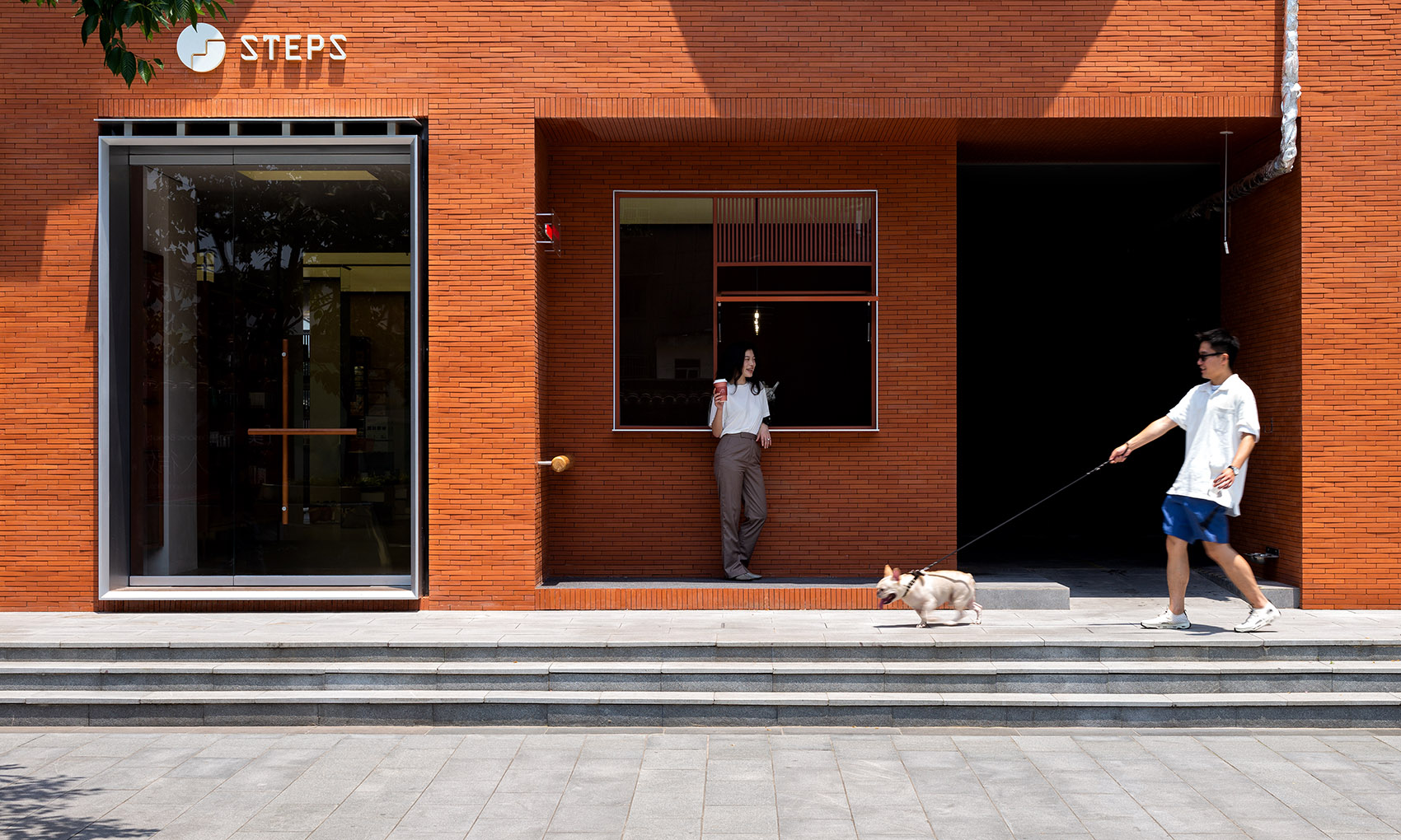
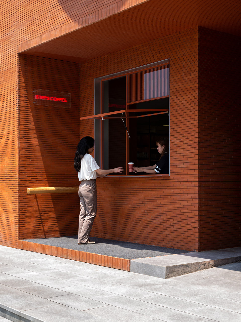
门头右侧是咖啡档口steps coffee,不仅供店内客人使用,同时也是一个独立对外开放的咖啡厅。向内凹进的steps coffee给店外购买咖啡的客人以及客人宠物提供了一个休息的灰空间。从湖滨步行街看向steps店铺方向首先看到的是steps coffee而不是店铺展示面,让人更有亲切感,这也是柔化快速购物体验的一种手段。
On the right side of the storefront is the coffee stall Steps Coffee, not only for guests in the store but also for an independent cafe open to the public. The recessed Steps Coffee provides a resting grey space for guests who buy coffee outside the shop and guests’ pets. From the lakeside pedestrian street to the Steps store, the first thing you see is the Steps Coffee instead of the store display surface, which makes people feel more intimate and is also a means to soften the fast shopping experience.
▼咖啡售卖,Steps coffee ©汪敏杰
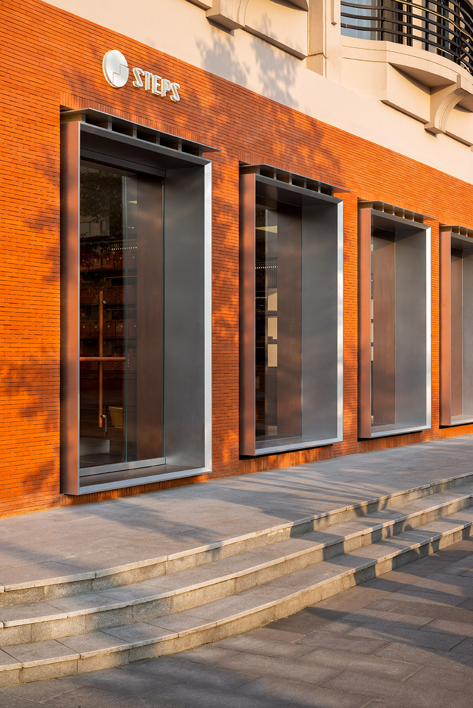
▼街角橱窗,Windows open to street corner ©汪敏杰
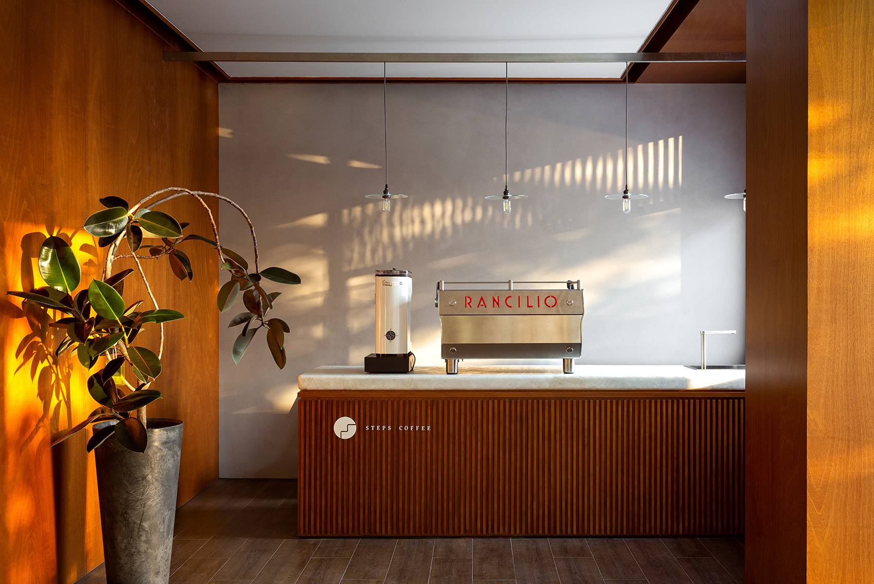
店内咖啡吧台由一整块玉石作为台面,温润柔和,侧面由柚木格栅构成,柜子各构件之间设计留缝,整体吧台简洁干净。
The coffee bar in the shop is a warm and soft whole piece of jade that serves as a countertop, whose side is composed of the teak grille, whose design between the cabinet components leaves a seam, with the clean and straightforward overall coffee bar.
▼入口吧台,Bar at the entrance ©汪敏杰
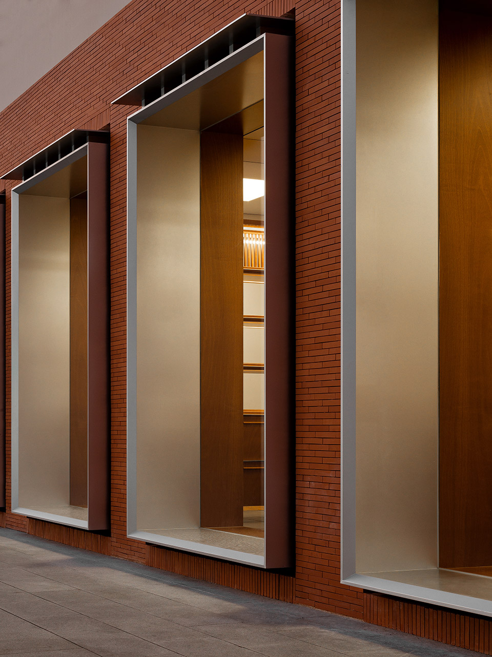
在steps coffee档口左侧,是六个阵列的窗口,其中最左和最右为两个店铺出入口。窗口由突出的金属窗框和檐口组成,檐口与窗框之间仿佛木结构屋面一般由六个金属构件连接,结合大尺寸超白玻璃,渗透出一种优雅古典的气质的同时又传达出一种现代感。
On the left side of the Steps Coffee port is a window of six arrays, among which, the left and right are the two shop entrances and exits; the window consists of prominent metal window frames and cornice; between the cornice and the window frame are connected by six metal components just like a wooden roof. It permeates an elegant and classical temperament with sizeable super-white glass while also conveying a modern feeling.
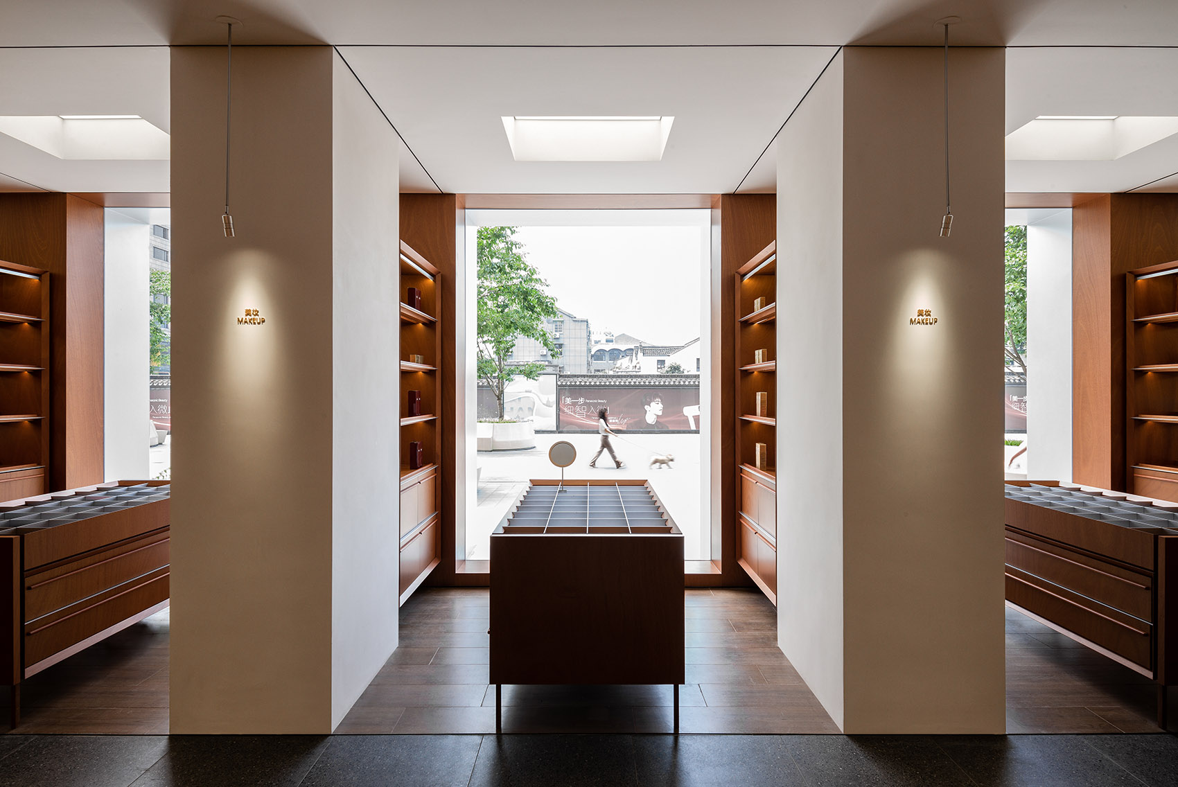
▼从美妆展示区看窗口,View of the windows from the beauty product display area ©汪敏杰
内外联系的展品陈列
In&out Display
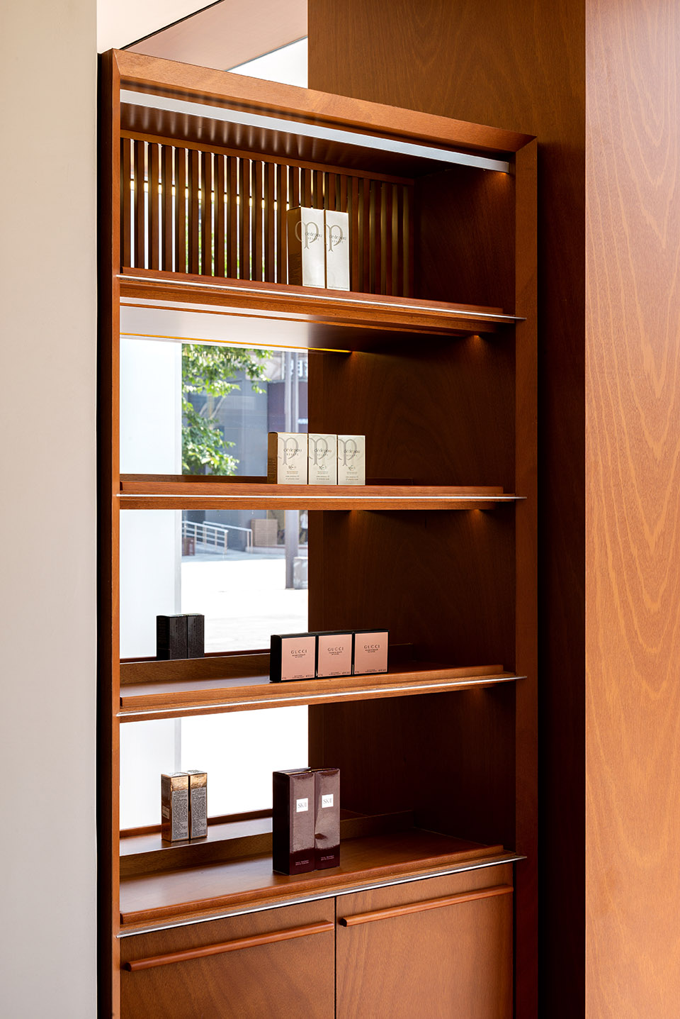
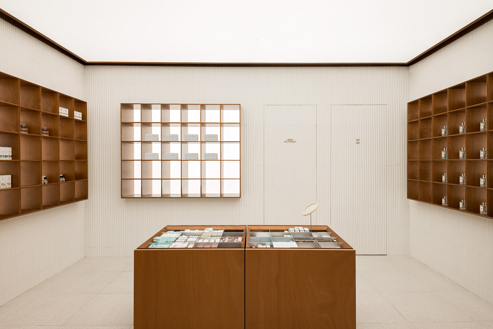
透过一个个窗框,看入室内,仿佛室内购物场景变成一幅画,购物体验也就这样直接的展示给店外的路人。自紧邻steps coffee的西南角入口进入店铺,首先抵达的是美妆展示区,产品展示柜如书架一样陈列开,柚木色的货架结合米色空间基调,形成一种舒适的空间氛围。柔和的色彩让客人更容易停留,能将注意力更集中于产品。
Look into the room through the window frame as if the indoor shopping scene becomes a painting. The shopping experience is also directly displayed to the passers-by outside the shop. Enter the store from the southwest corner entrance adjacent to Steps Coffee, and the first arrival is the beauty product display area. The product display cabinets are shelves displaying teak frames combined with beige space tone, forming a comfortable atmosphere. The soft colours make it easier for guests to stay and focus more on the product.
▼美妆展示区,Beauty product display ©汪敏杰
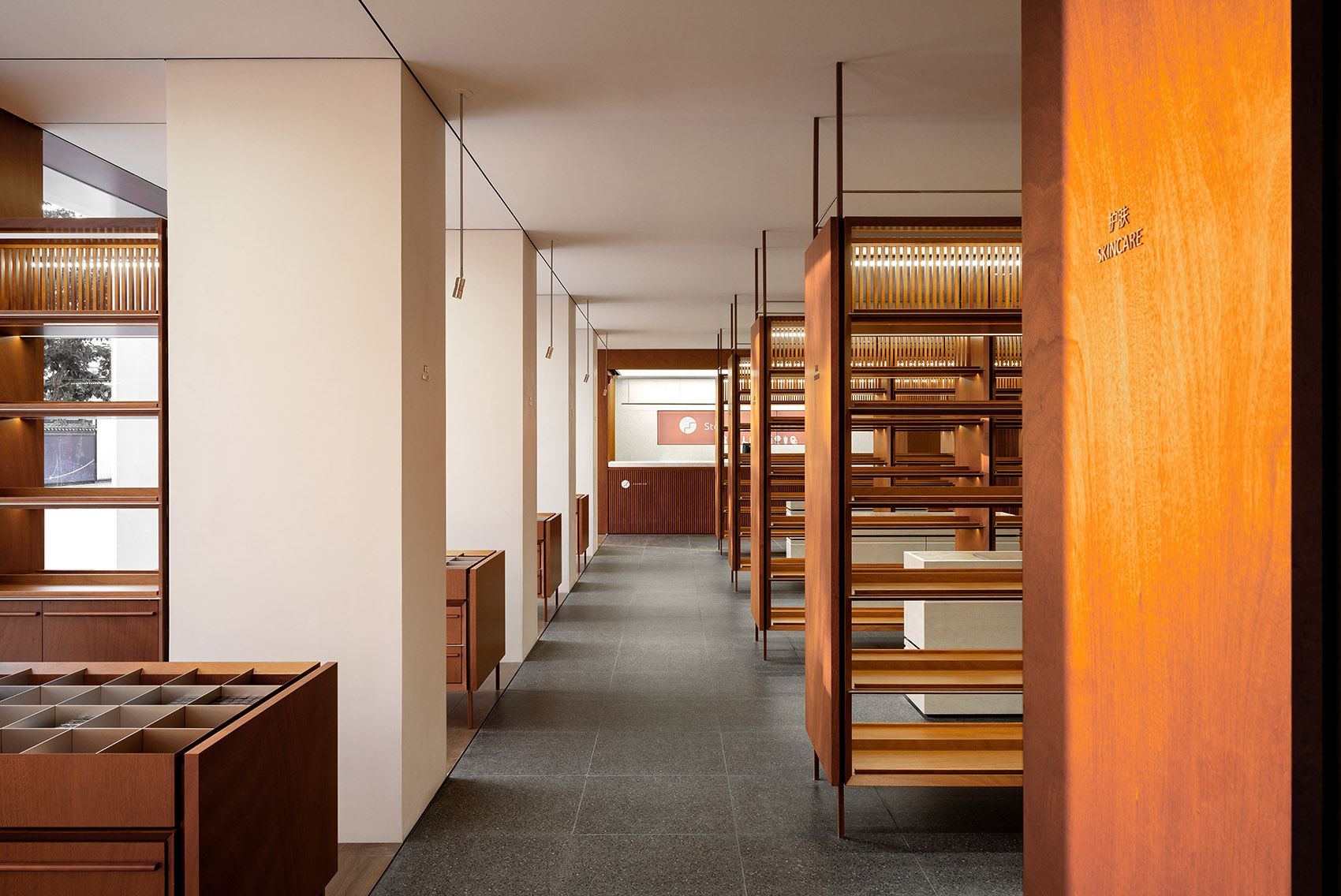
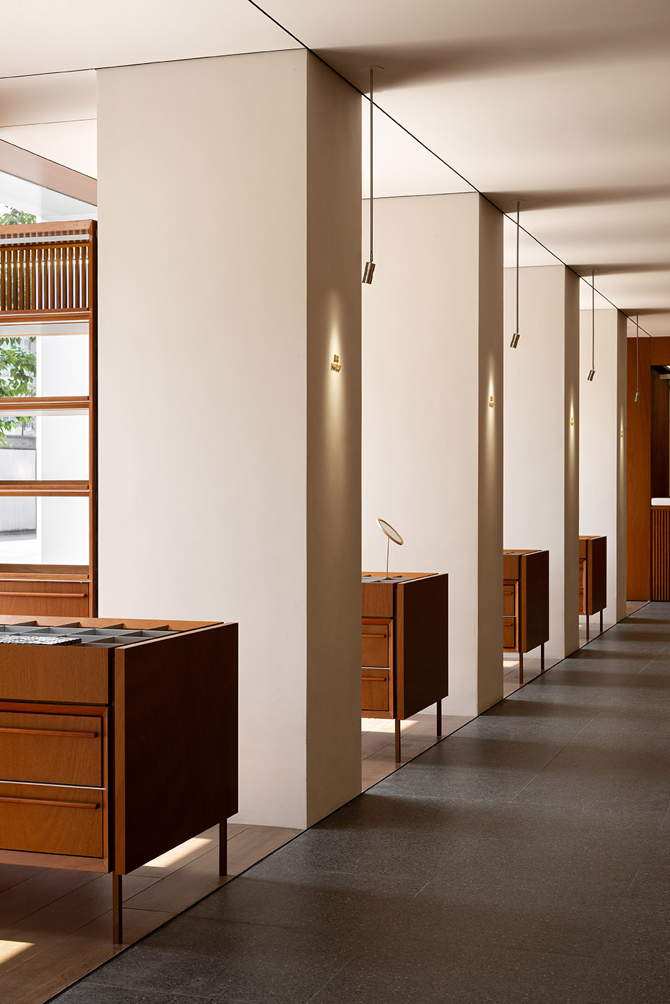
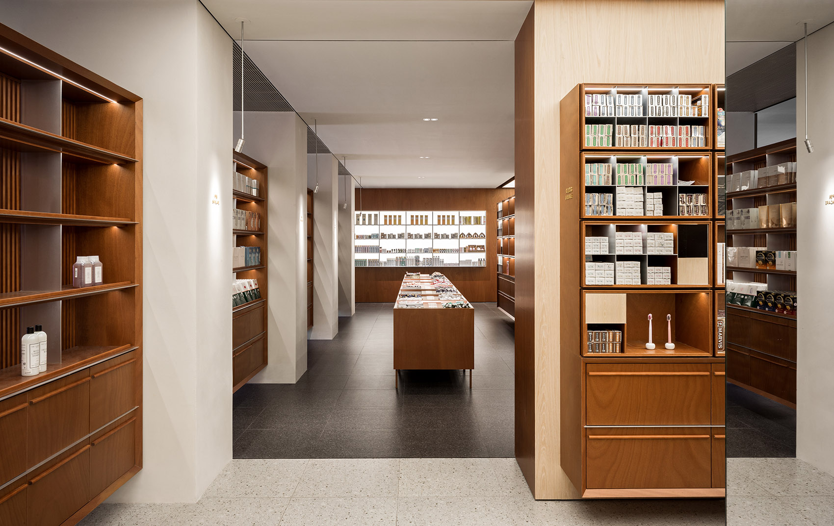
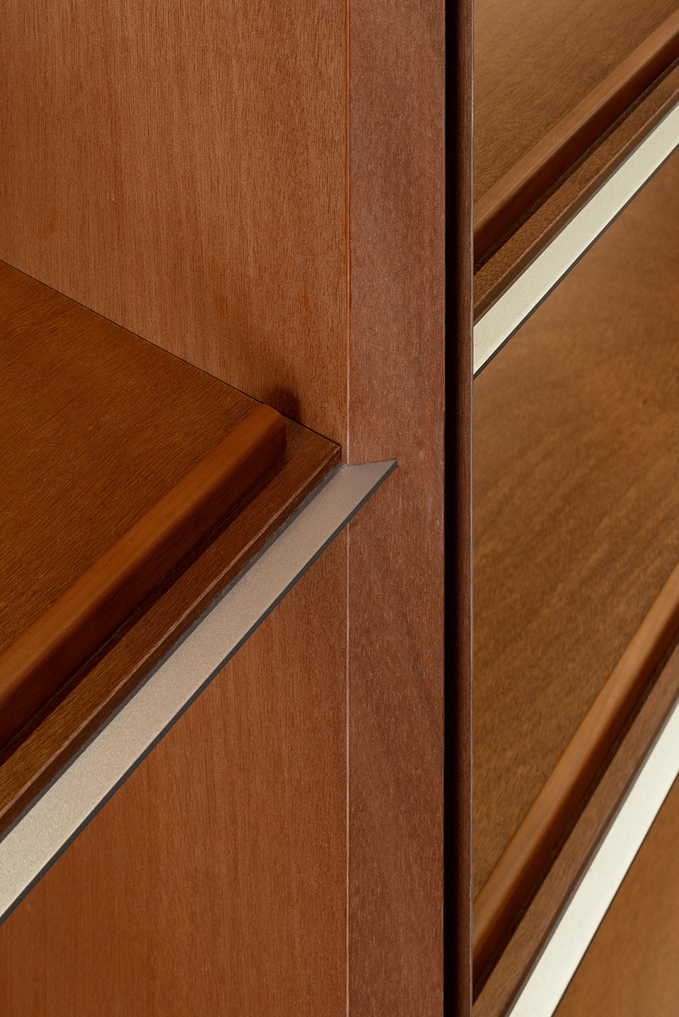
室内柱子与立面柱子间距一致,相互对应,透过每跨柱子之间窗户可以看到窗外步行街街景。柱间货架均与两侧墙体和柱子脱离开,柜子仿佛悬浮于柱子之间。展柜每层由实心不锈钢收口,木隔板收口位置也进行了切角处理,整个柜子显得轻盈干净。
Indoor columns and elevation columns spacing is consistent, corresponding to each other. And you can see the pedestrian street outside through the window between each column. Shelves between columns are separated from walls on both sides as if the cabinet is suspended in the air. Each floor of the showcase is enclosed with solid stainless steel, and the closing position of the wood partition plate is also angle-cutting treatment, which makes the entire cabinet look light and clean.
▼展示柜围合空间,Display shelf enclosed the space ©汪敏杰
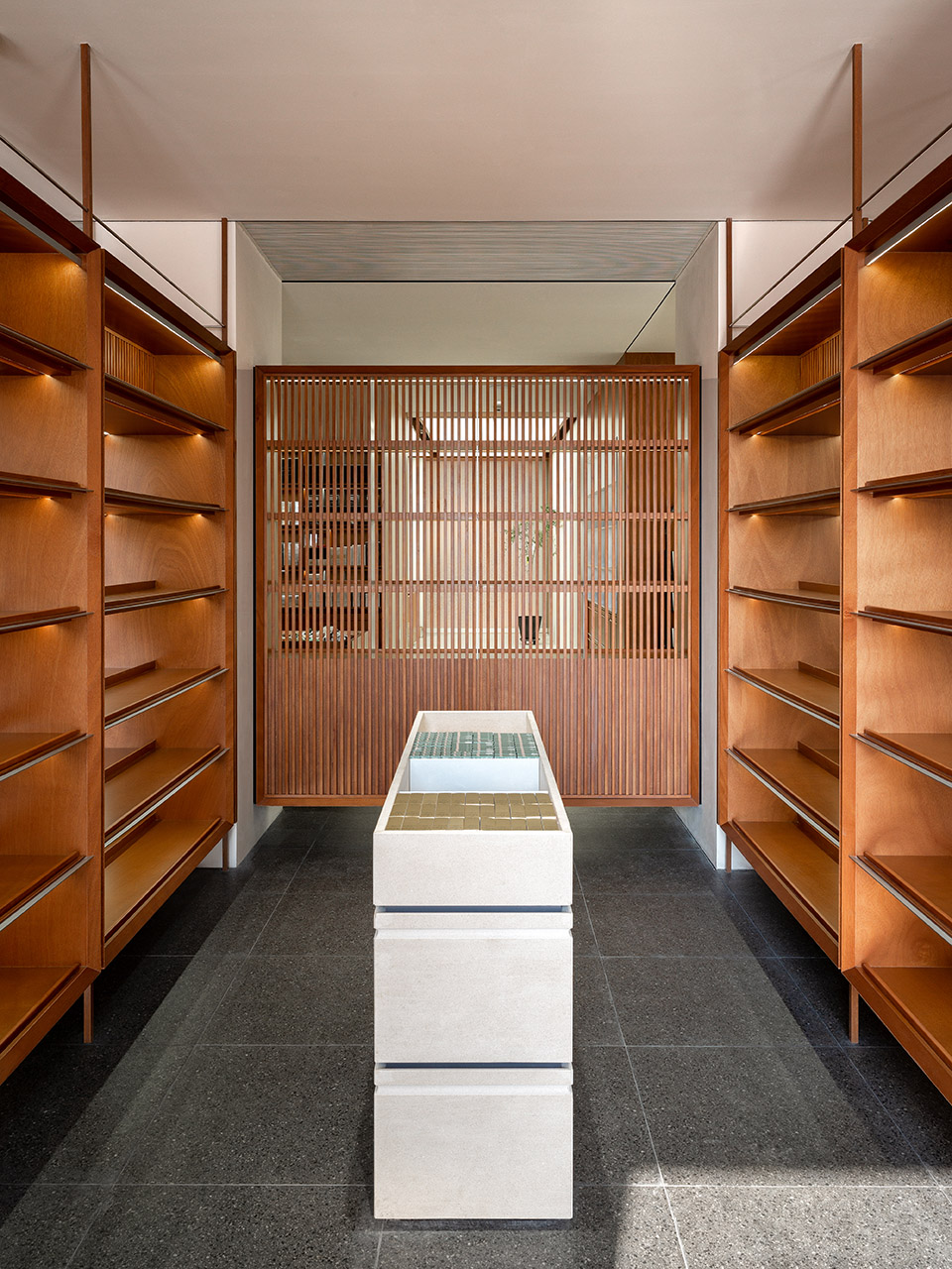
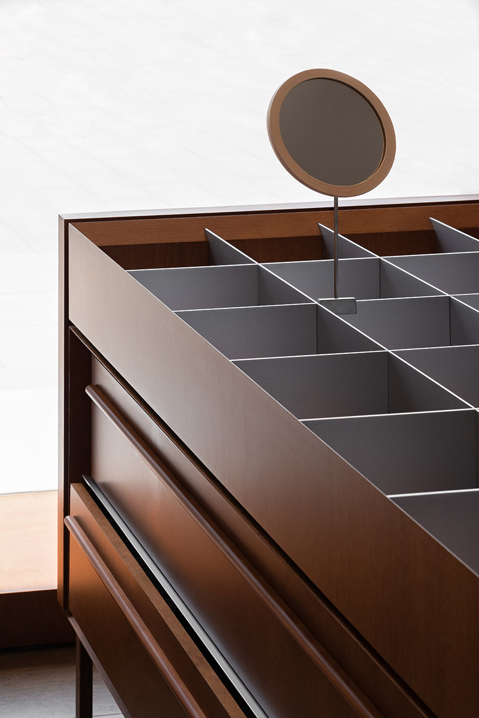
竖向展柜之间为落地的样品展柜,主要展示各类化妆品的小样产品,这类展示产品类目多,且需要拿取方便,并且还要适应不同尺寸的产品放置。因此say设计了模块化后期可调整的展示柜,展示区域由实心喷砂铝板分割成一个个方格,便于在其中放置产品,同时未来展示产品大小变化时,可以通过抽取铝板改变方格大小从而满足不同尺寸需求。
Between the vertical showcase is the landing sample showcase, mainly showing the small sample products of all kinds of cosmetics. This kind of display product categories are many, needs to be taken and fetched conveniently, and accommodate different product placement sizes. So, Say designed modular late-adjustable display cabinets, and the display area consists of solid sandblasted aluminium panels divided into squares for easy placement of products. You can change the size of the grid by extracting the aluminium plate to meet the needs of different sizes when displaying the product size change in the future.
▼悬浮展示柜,Display shelf ©汪敏杰
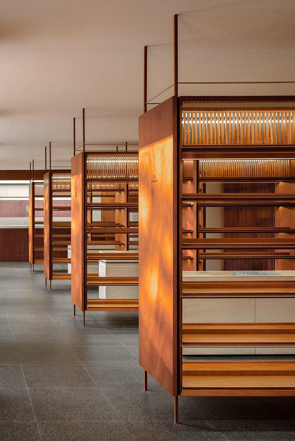
延流线向内进入了第二部分的美妆展示区,这一部分空间联通了香氛区,美力社区以及生活方式区,空间尺度在这里也更舒适。
Along the streamline is into the beauty product display area in the inner part, where the space connects the fragrance area, Beautypower community and lifestyle area with the more comfortable space scale here.
▼视线穿过展柜,View through the shelves ©汪敏杰
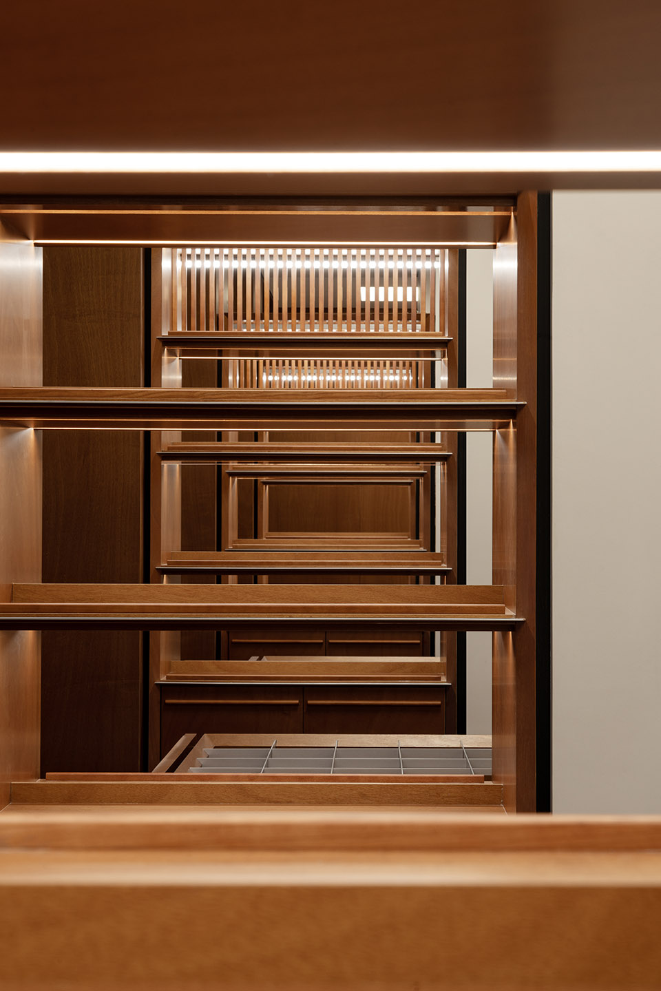
▼展柜细节,Shelf detail ©汪敏杰
清晰明确的功能划分
Clear program allocation
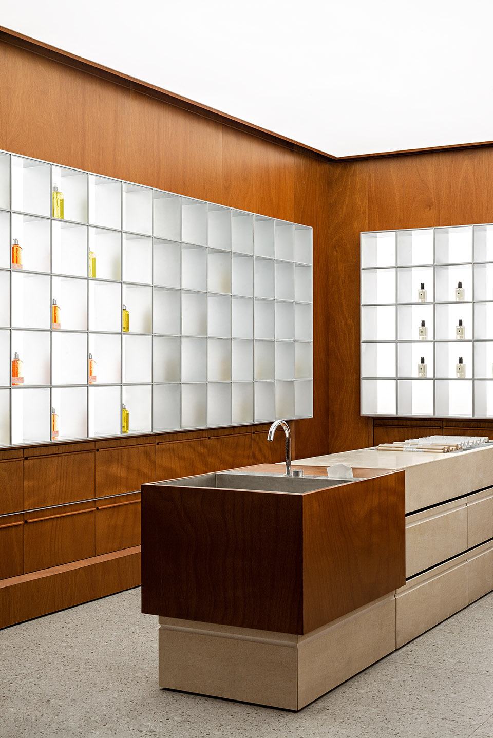
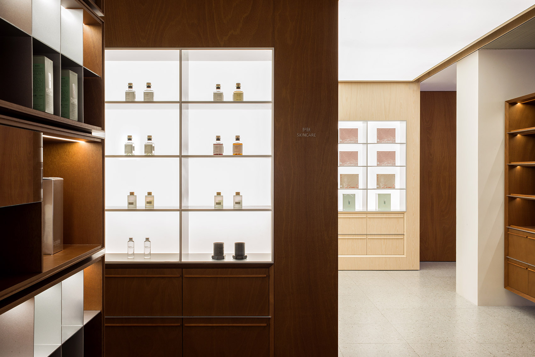
咖啡,收银,香氛,美力社区和生活方式,这五大体块分别由整块发光吊顶打亮,地面也由深色地砖变为浅色地砖,空间材料使用和设计手法与其他空间统一但又不同。客人处在店内任何一处可以很方便根据空间照明方式判断自己所处位置,让整个购物体验更清晰简单。进入每一个区域时,明确的空间划分感暗示了展品的不同,因此不用通过大面积标识大声的告诉顾客区域功能,顾客自己便可以感知到。同时进入每个空间香氛区域墙面为柚木饰面,背发光金属展柜嵌入墙内,产品被从背面打亮,空间中央为试用台。
These five large pieces of coffee, cashier, fragrance, Beautypower community and lifestyle are lit up by the whole luminous ceiling respectively, the ground is also changed from dark colour floor tile to light colour floor tile using the space material and the design techniques are unified but different from other space. It is very convenient for guests anywhere in the store to judge their location according to the space lighting method, making the whole shopping experience clearer and simple. Upon entering each area, a clear sense of spatial division suggests different exhibits, so customers can perceive it themselves without telling the customer area function. Meanwhile, the wall of the fragrance area entering each space is a teak veneer embedded in the wall by the luminous metal showcase, products are lit from the back, and the centre of the space is a trial table.
▼香氛区,Fragrance ©汪敏杰
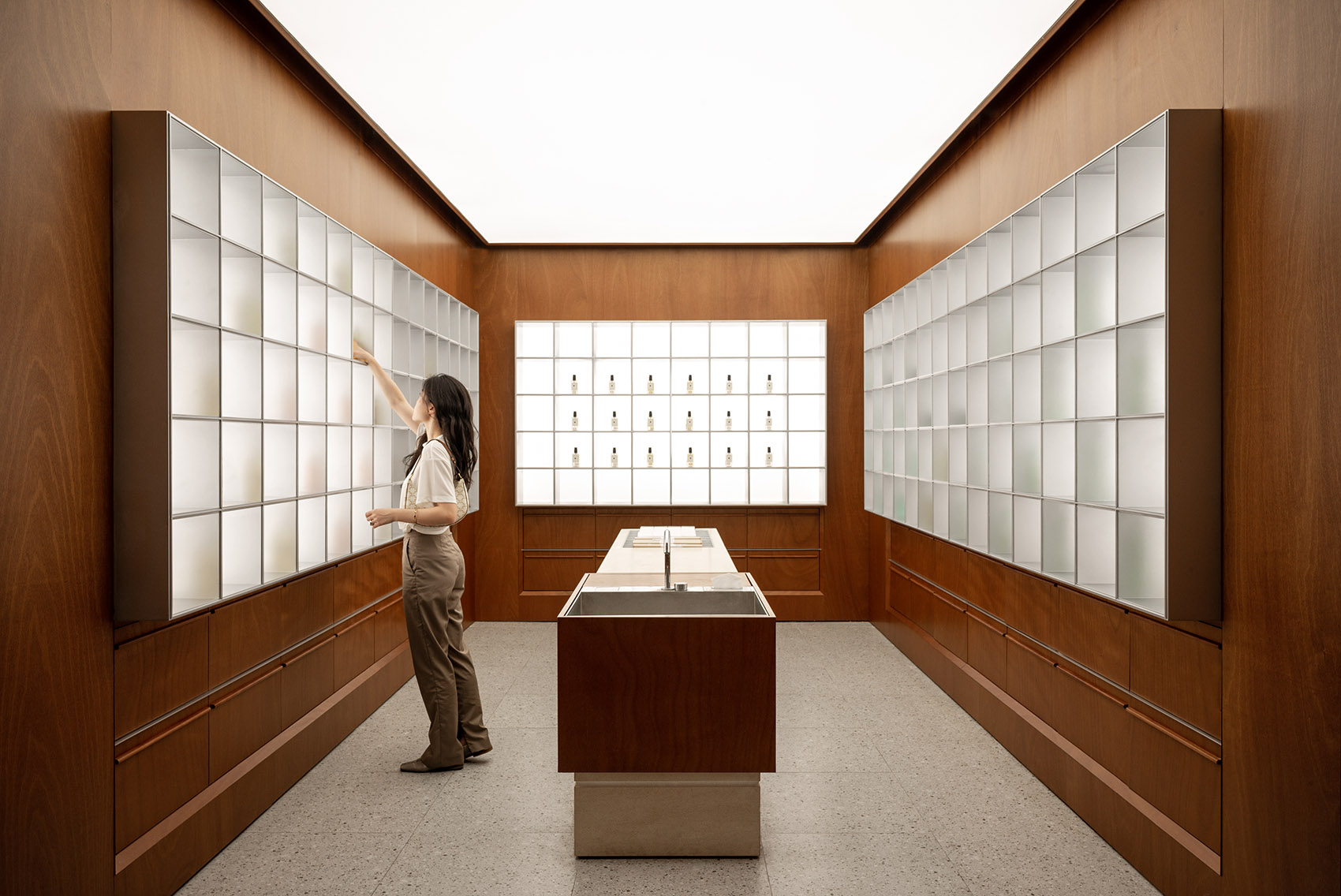
墙面展柜上,展品的色彩通过灯光照射反映在金属表面,令空间视觉上更丰富。中央试用台由砂岩制成。
On the wall showcase, the colour of the exhibits is reflected on the metal surface through light, making the space visually richer. The central trial table is made of sandstone.
▼柚木墙体与砂岩试用台,Teak wall and sandstone trial table ©汪敏杰
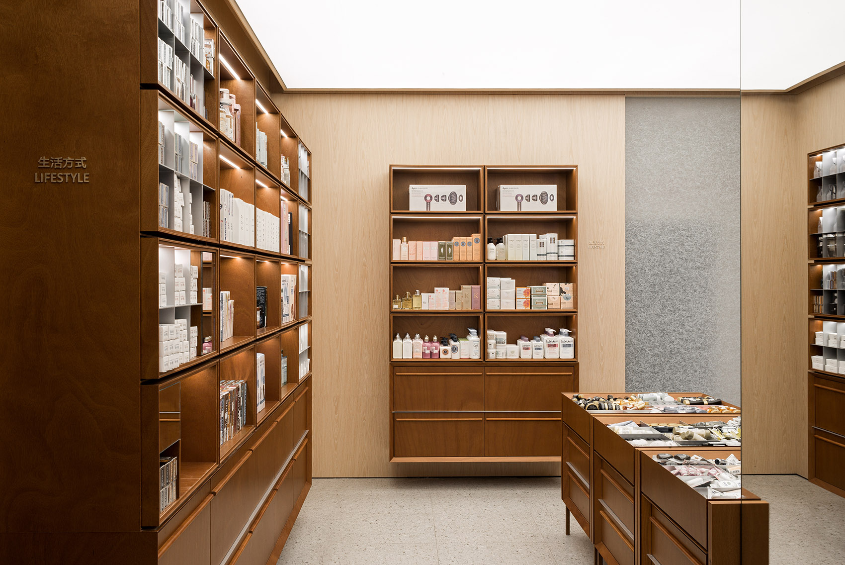
生活方式区域为浅色木饰面墙体,结合柚木悬空展柜,浅色木饰面更具生活气息,贴合区域展示的产品类目,且由于墙面色调更浅,该区域灯光感受也更明亮。展柜均为模块化设计,适应未来不同展示方式。
The lifestyle area is the wall with light colour wood veneer combined with the dangling teak showcase, and the light colour wood veneer is with a more lively atmosphere, fitting the product categories displayed in the area. And because the wall tone is more carefully chosen, the space also feels brighter. Moreover, showcases are modular designs to adapt to the different display ways in the future.
▼生活方式区,Lifestyle ©汪敏杰
▼模块化设计的展柜,Modular designed showcases ©汪敏杰
▼浅色木饰面墙体,Light colour wood veneer ©汪敏杰
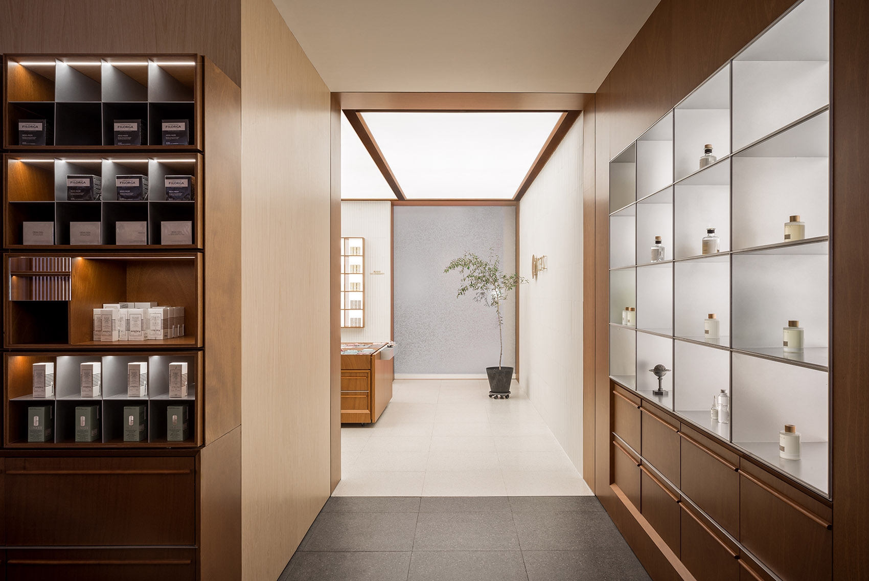
自生活方式区域旁边的通道可以进入steps业态核心的美力社区,该区域未来将作为一个灵活使用的空间,可作为产品发布,美妆课堂,直播间以及产品拍摄使用。空间墙面由白色釉面瓷砖拼贴而成,墙面有嵌入的背发光木制展柜,空间中央放置了四个可移动的样品展台,同样是模块化设计,适应不同尺寸产品拜访。在需要进行发布会或美妆课堂等空间使用时,中央的展台会撤出放置于储物空间,这样房间内放置座椅后就可进行其他功能使用。
From the channel next to the lifestyle area, you can enter the Beautypower community, the core of the Steps business format, and this area will be a multi-function space in the future, which can be used as product release, beauty makeup class, broadcast room as well as product shooting. The wall of the area is collages of the white glazed tile, backlit wooden showcase embedded in the wall, and four movable sample display stands are placed in the centre of the space, which is also modular design to accommodate different sizes of products. When a press conference or a beauty makeup class is needed, the central exhibition booth will be withdrawn and placed in the storage space.
▼美力社区,Beauty Power community ©汪敏杰
▼白色釉面瓷砖拼贴成墙面,The wall made of the white glazed tile ©汪敏杰
Say希望通过steps的店铺可以让经典传统的购物体验留存于当代快速无意义的零售行业中,零售品牌由于越来越大的市场竞争压力,每间店铺都尖叫着想要吸引更多顾客的注意力。Say希望顾客能够通过steps感受到零售店铺不是单纯的嫁接于社交媒体而生存,其存在是强调一种无需打卡也可以享受空间的生活方式,购物原来是一种这样舒适轻松的体验;而一个零售品牌也可以与顾客像朋友一样联系在一起。这种柔和舒适缓慢的购物体验原来不仅仅留存于奢侈品品牌中,大众品牌也可以让我们回归最初那种优雅的购物体验。
Say hopes that retail brands, due to increasing market competitive pressure, are screaming to attract more customer attention. In Steps, we want to keep the classic and elegant traditional shopping experience in this modern but meaningless retail industry. Say hopes that the customers can feel that Steps are not relying on social media exposure, whose existence emphasises a lifestyle where you can enjoy space without taking photos and posting online. Shopping is a comfortable and relaxed experience, and retail brand like steps can be associated with customers like friends. This kind of smooth, comfortable and slow shopping experience is not only retained in luxury brands. The mass-market brands can also bring us back to the original elegant shopping experience.
▼细部,Details ©汪敏杰
▼平面图,Plan ©Say Architects
Steps杭州湖滨步行街旗舰店
业主:Steps lifestyle
状况:完成
年份:2021
地址:中国杭州湖滨步行街
项目类型:商业
设计公司:say architects
主持设计:张岩、单嘉男
团队:孙紫益,谢冰妍,杭升,范雅雯
空间影像:汪敏杰
施工方:上海中耕装饰


