
这是ARCHIEE事务所为“% Arabica”品牌设计的新项目,位于成都新购物广场“成都Regular源野”。“% Arabica”是一家日本咖啡品牌,以极简的店铺为全世界提供高品质咖啡。这些咖啡店具有显著特点,在城市中创造新的流动并尊重当地文化。“% Arabica”顾客可以拿走带有%标识的咖啡杯,轻松地穿行于室内外空间。
This is a new project of ARCHIEE for “% Arabica” store, located in Chengdu, China, open on the plaza of a new shopping center called “Chengdu Regular”. “% Arabica” is a Japanese coffee shop brand that provides high-quality coffee all over the world in minimalist design stores. Their value lies in highlighting nodes creating new flows in the city and respecting the local culture. The “% Arabica” consumers take away their % logo coffee cup and enjoy circulating easily between indoor and outdoor spaces.
▼项目外观,appearance ©Kobe
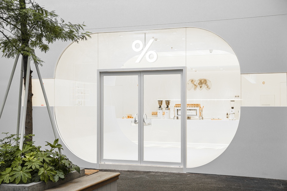
该项目需要融合法国、日本和中国文化。对于总部位于巴黎的事务所ARCHIEE来说,在中国设计一个日本品牌店铺极具挑战。整个项目引领了全球咖啡文化的设计。店铺的活跃氛围以巴黎咖啡文化为灵感,空间是对中国园林的诠释与解读,结构设计则基于日本设计的细节感。
This project required a cosmopolitan mix of French, Japanese and Chinese Culture. Il was a great challenge for the Paris-based agency ARCHIEE to design a project of a Japanese brand in a Chinese site. The overall project leads to the design of a global culture of coffee. The shop’s activity is inspired by the Parisian coffee culture, the space is an interpretation of the Chinese landscape and its reading, and the structural design is based on the Japanese design sense of detail.
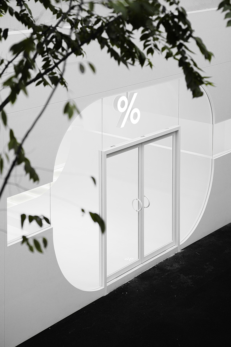
▼入口立面,facade ©Kobe
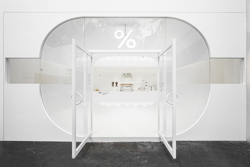
▼透过玻璃望向室内,interior through glasses ©Kobe
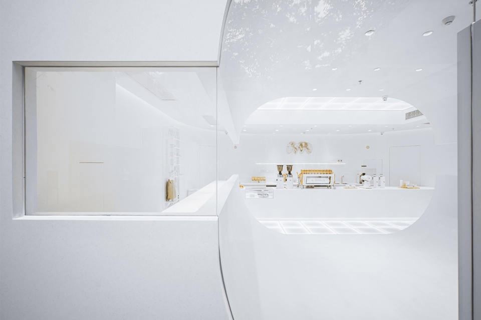
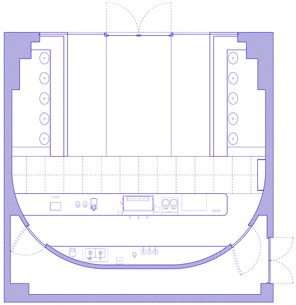
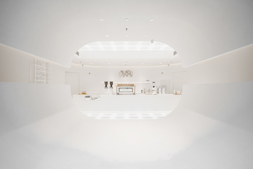
挑战在于设计出能够丰富消费者各阶段体验的空间:进入店铺、在柜台点咖啡、然后拿着咖啡杯离开庭院。其目的是提供创新风格的咖啡店:引导顾客舒适地走到室外,享受自然循环的空气。为了实现这个想法,设计团队在入口和柜台之间设计了巨大的缓冲区,缓冲空间的构成类似于隧道、桥梁甚至滑板坡道等室外空间,它既是使用空间,也是店铺空间的精髓。设计团队遵循% Arabica的挑战精神,即三分之一的空间应服务于游客体验,而非工作效率。隧道形式还通过顾客在室内外的流动创造独特的空间,从而使店铺和庭院之间产生连续感。该设计借鉴了巴黎咖啡店的活跃氛围,自然地连接了室内与室外。
▼缓冲区剖透视,sectional perspective of buffer zone ©ARCHIEE
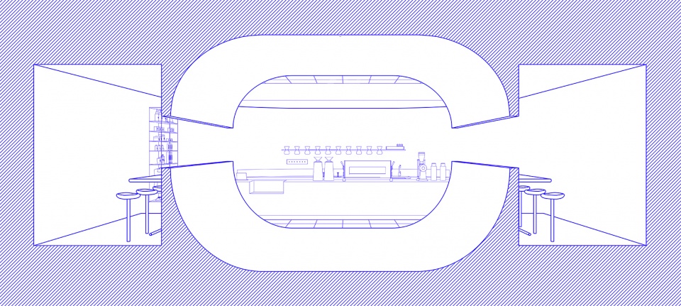
The challenge was to design a space that would enrich all stages of the consumers’ experience: entering the shop, ordering coffee at the counter, and leaving to the courtyard with a coffee cup. The aim was to offer an innovative style of cafe; to guide customers comfortably to the outside to enjoy the natural circulating air. To achieve this idea, we designed a huge/large buffer zone between the entrance and the counter. The composition of the buffer space resembles an outdoor space, like a tunnel, a bridge and even a skateboard ramp. The buffer space is a useful space and is also the essence of the shop space. We had indeed to respect the spirit of % Arabica’s challenge that one third of the space should be created for the visitor’s experience rather than for efficiency. The tunnel form also gives the impression of continuity between the shop and the courtyard by creating a unique space through the flow of visitors between inside and outside. This design which naturally connects the interior and the exterior is inspired by the lively atmosphere of Parisian café style.
▼由缓冲区望向柜台,counter form buffer zone ©Kobe
▼由缓冲区望向庭院,courtyard form buffer zone ©Kobe
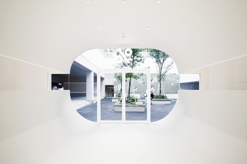
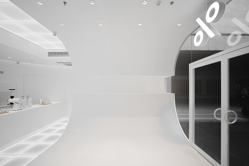
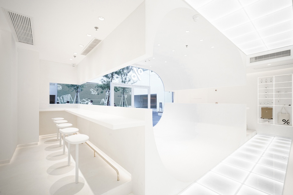
该空间通过顶部和底部的镜面反射形成竖向构图,隧道内设有缝隙,在视觉上连接了缓冲区后方的座位区。镜面构图是对中国传统园林的现代化诠释,使建筑映在水面。在成都,人们可以一边品茶、一边欣赏安顺廊桥及其在锦江上的倒影。而在现代的% Arabica咖啡店,顾客则可以一边喝着咖啡、一边享受这种原始的感觉。
The space has a vertical composition with a play of reflection by mirrors at the top and bottom. This solution allows to create a gap inside the tunnel and connect with the seating aeras in each side behind the buffer zone. The mirrored composition is a modernized reinterpretation of traditional Chinese landscapes where landmarks are reflected on the surface of river water. In Chengdu, people can admire the Anshun bridge and its reflection on the Jin River while sipping tea. In the modernized % Arabica scene, visitors can live this primitive feeling drinking coffee.
▼隧道缝隙,gap inside the tunnel ©Kobe
▼座位区,seating area ©Kobe
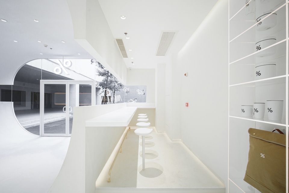
▼柜台区,counter area ©Kobe
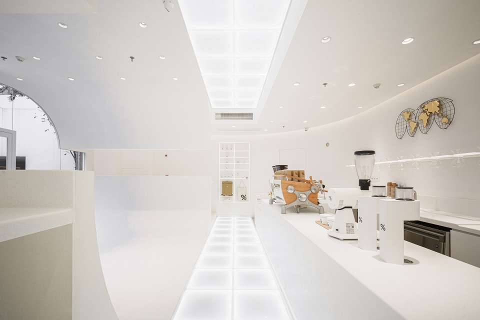
由于缓冲区是特殊的内部固定装置,设计团队需要找到稳定且可行的方案,从而避免光滑的表面随着顾客来往和时间流逝出现裂缝。设计团队最终提出使用焊接钢的想法,由日本工程师计算店铺结构。弧形地面和天花由9毫米焊接钢板制成,具有高弹性的油性石膏漆面。极轻的钢结构最终形成特殊的空间体验。冰冷、轻盈、坚硬,这种在钢铁上行走的感受并非典型的室内体验,而在该项目中,在隧道中穿行的感觉形成原始的体验。柜台和立面的经典可丽耐饰面将入口和服务区域联系起来。玻璃和架子等配件经过精心设计,看不到任何接缝。通过简约和流畅的设计,“% Arabica”的日式极简理念得到了充分体现。
As the form of the buffer is a unique interior fixture, the challenge was to find a solution to create stability and manufacturability. The aim was to avoid cracks on the smooth surface with the passing of visitors and time. We finally came up with the idea of using welded steel. Structural design calculated by Japanese engineer. The curved floor and ceiling are made of 9mm thick welded steel sheets with with highly elastic oil-based plaster paint finish. The steel structure made as light as possible finally creates a special experience of space. The cold, light and hard sound and feel when walking on steel is not a typical inner experience. The sensation of walking through a tunnel turns into an original experience. The iconic Corian finish of the counter and façade connects the customer entrance and service. The design of the fitting of glasses and shelves has been delicately realized so that no joints are visible. The minimalist Japanese philosophy of “% Arabica” results fully expressed through a design of simplicity and fluidity.
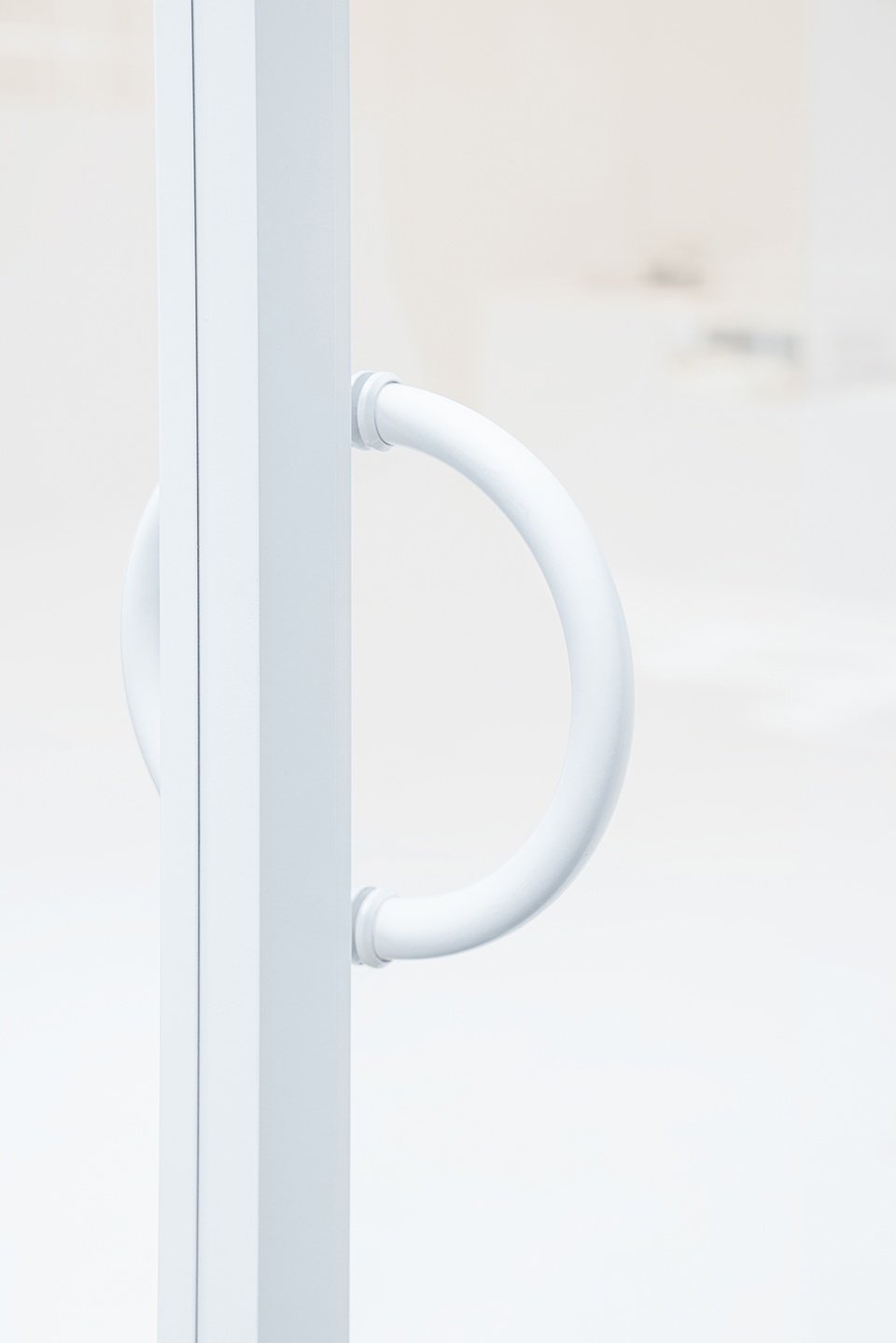
▼把手细部,details of the handle ©Kobe
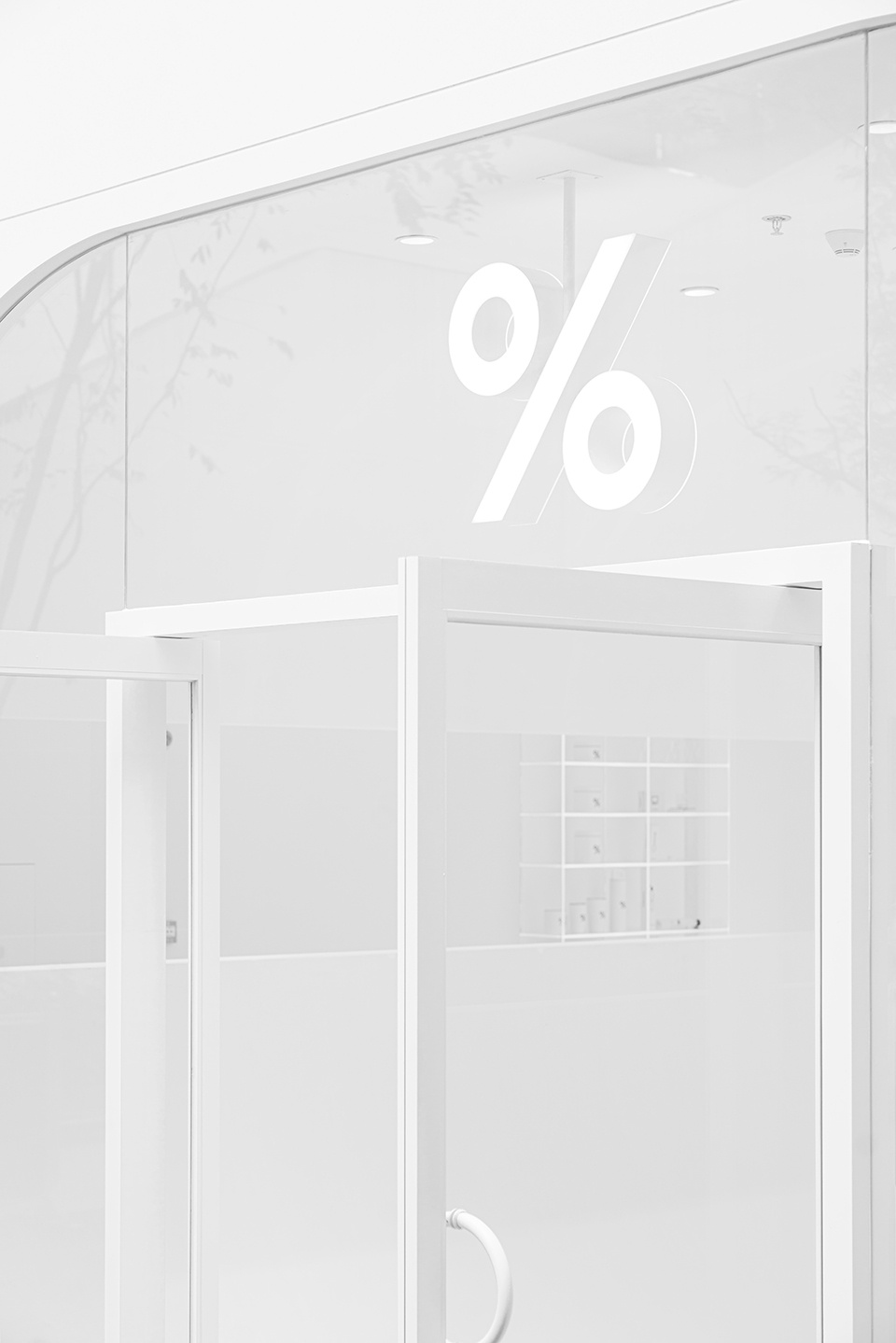
▼门头细部,details of the door ©Kobe
▼店面一瞥,a glance at the store ©Kobe
▼轴测图,axon ©ARCHIEE
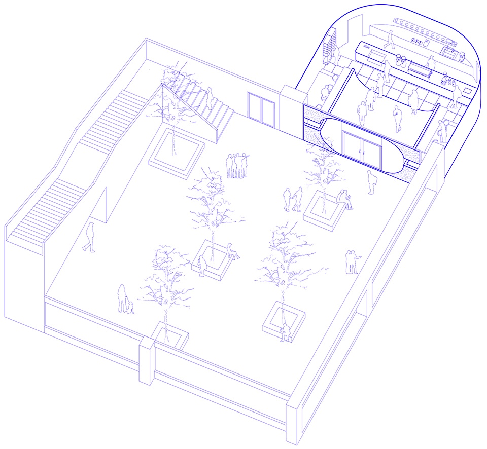
▼平面图,plan ©ARCHIEE
