
SLT受aaddd委托,设计其位于上海BFC外滩金融中心的首家线下店。作为一家美妆生活方式集合店,aaddd始于美妆但不止于美妆,以小众风格品类传递独有生活理念,寓意于物,激发年轻消费者对自我及美感的探索与表达。在本次设计中,SLT取“云端”为整体概念的维度象限,以云的柔和、边界的模糊与不确定性来传递恬静温馨的气质。同时,空间中自由舒展的曲线、淡雅轻快的色调,以具象化的方式和沉浸式的体验诠释美的多元性。
SLT is commissioned by aaddd to design its first offline store in Shanghai BFC Bund financial center. As a collection store of beauty cosmetics lifestyle, aaddd starts from beauty cosmetics but goes beyond it. Aaddd delivers unique life concepts with niche styles, inspiring young consumers to explore beauty and express themselves. In this design, SLT takes “cloud” as the dimension quadrant of the overall concept. The softness and uncertainty of the cloud are extracted as design elements to convey a quiet and warm spatial atmosphere. At the same time, the free stretch curves and elegant colors in the space express the diversity of beauty in a concrete and immersive way.
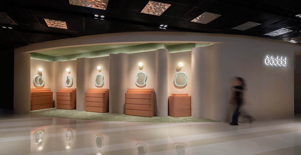
▼店铺外观,Exterior View ©吴鉴泉
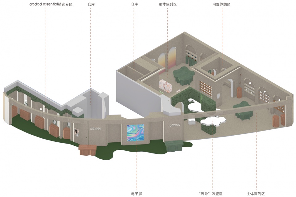
aaddd美妆生活方式集合店位于外滩金融中心南区B1层的腹地。通过对原有空间的规划与整合,店铺在总体上被划分为两个区域:aaddd essential精选专区与主体陈列区,而主体陈列区内部则设有“云朵”装置区及休憩区。集合店的整体配色以温暖的粉米色为基调,辅以暖色调的青石灰绿、赤茶橘及翡翠蓝。从扶梯下来,开放式店面的暖调氛围便与周边的冷光环境拉开视线上的距离,增强了品牌第一眼的审美辨识度。
aaddd is located in the hinterland of B1 floor in the southern district of BFC. Through the planning and integration of the original space, aaddd is divided into two areas as a whole: aaddd Essential Selection Area and Main Selection Area. Inside Main Selection Area there are “Cloud” Installation Area and Rest Area.The overall color scheme of aaddd is based on warm pink beige, with warm tones of lime green, red tea orange and emerald blue. Down from the escalator, the cozy atmosphere of the open store is separated from the surrounding cold and light environment, enhancing the aesthetic recognition of the brand at first sight.
▼轴测图,Axon Drawing ©SLT
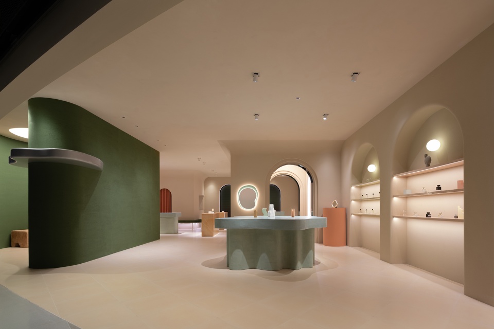
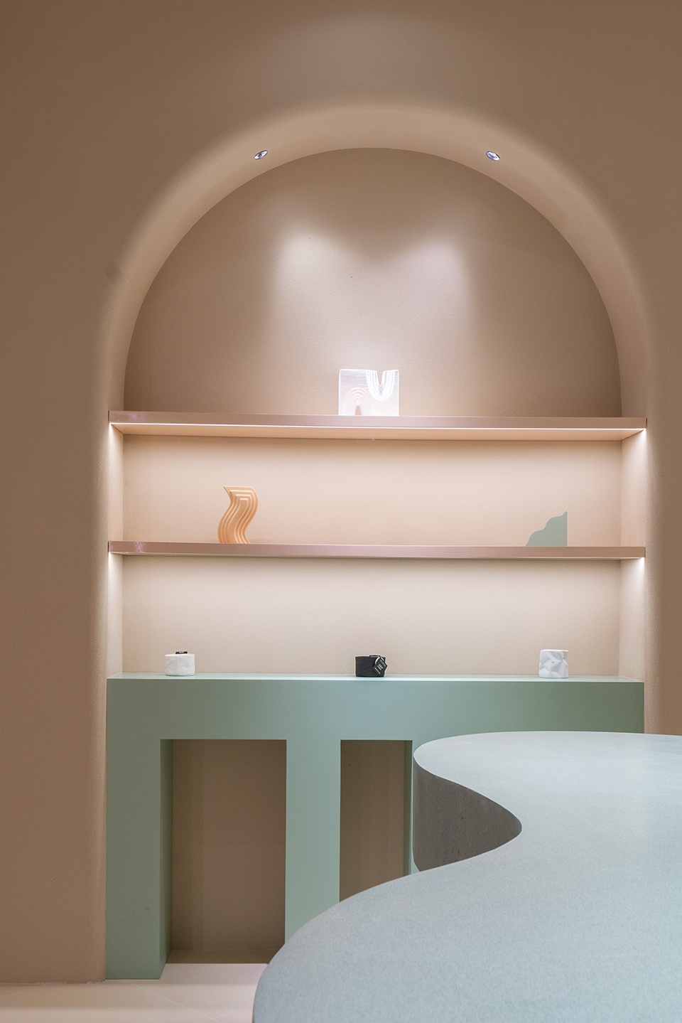
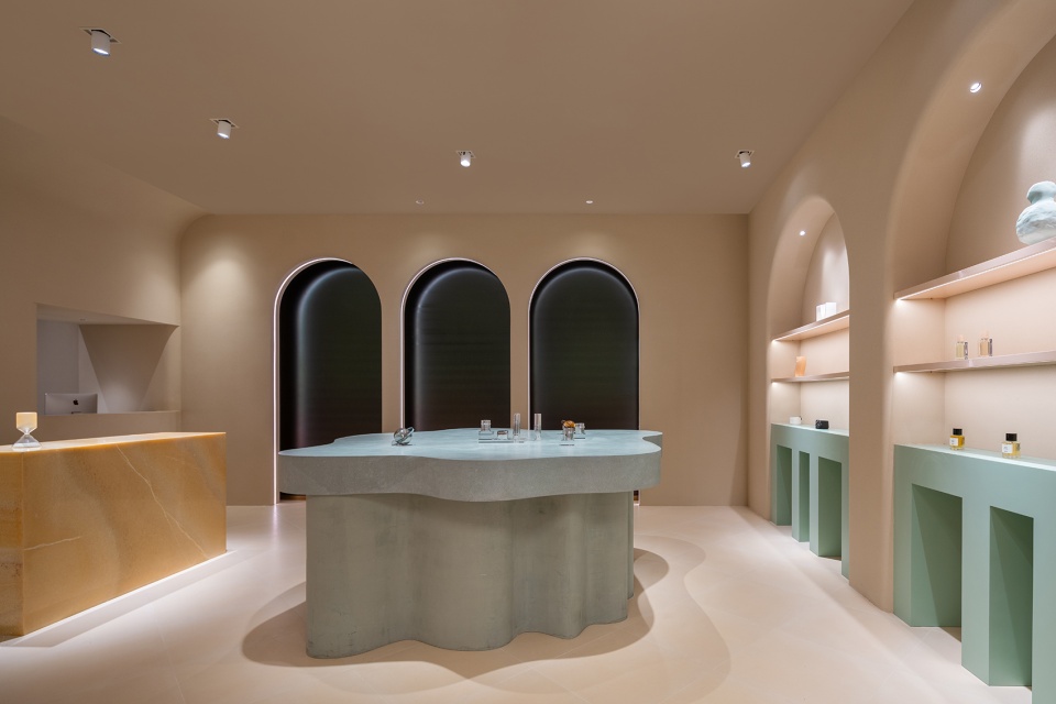
在主体陈列区内,曲线形态设计的展示台零星点缀,弱化了平行方向上空间的纵深体验。艺术漆的差异化使用制造出不同材质的肌理。跳跃的色彩与大理石纹路的碰撞,于微小处传达美的节奏感、层次感。水平方向上灵动的线条牵引来访者的视线至远处墙面对称规则的拱形,曲直相称。在简洁的几何构图语言中,平和轻盈的氛围游走在整个空间。在多角度调试的灯光照明下,中心弧形展示台边缘在地面上产生深浅不一的层叠阴影。空间中虚实结合的轮廓线在灯光的烘托下互相映衬,又因灯光的变化转换形态。“云朵”稍纵即逝、飘忽不定的美学特质通过光影结合的双重维度得以诠释。
Inside the Main Selection Area, the curvy design of main platforms are dotted in the interior zone, weakening the depth experience of the space in the parallel direction. The different use of Faux Finish creates various textures of different materials. The bouncing colors and the collision of marble lines convey the sense of rhythm and hierarchy of beauty in tiny places. The elegant lines on the horizontal direction draw visitors’ attention to the arch of the distant metope with symmetry and regularity. In the simple language of geometric composition, a peaceful and light atmosphere permeates the whole space. Under the multi-angle lighting, the edges of the central curved display table create overlapping shadows of different depths on the ground. In the space, outlines combined with the virtual and the real set off each other under the contrast of the light, and change the form accordingly. The fleeting and erratic aesthetic qualities of “clouds” are interpreted through the dual dimensions of light and shadow.
▼主体陈列区1,Main Selection Area 1 ©吴鉴泉
▼展台外轮廓弧形牵引人的视线,Outline draws the eye ©吴鉴泉
▼两个陈列区之间的过渡空间 ©吴鉴泉
Transition space between two selection areas
▼主体陈列区2,Main Selection Area 2 ©吴鉴泉
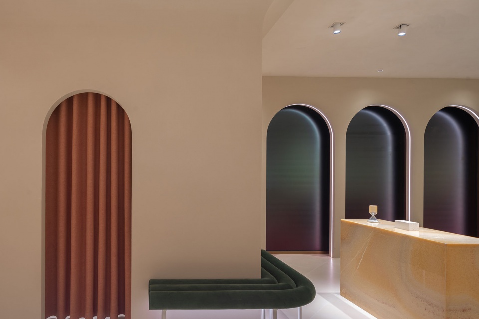
▼柜台,Counter ©吴鉴泉
▼仓库,Storehouse ©吴鉴泉
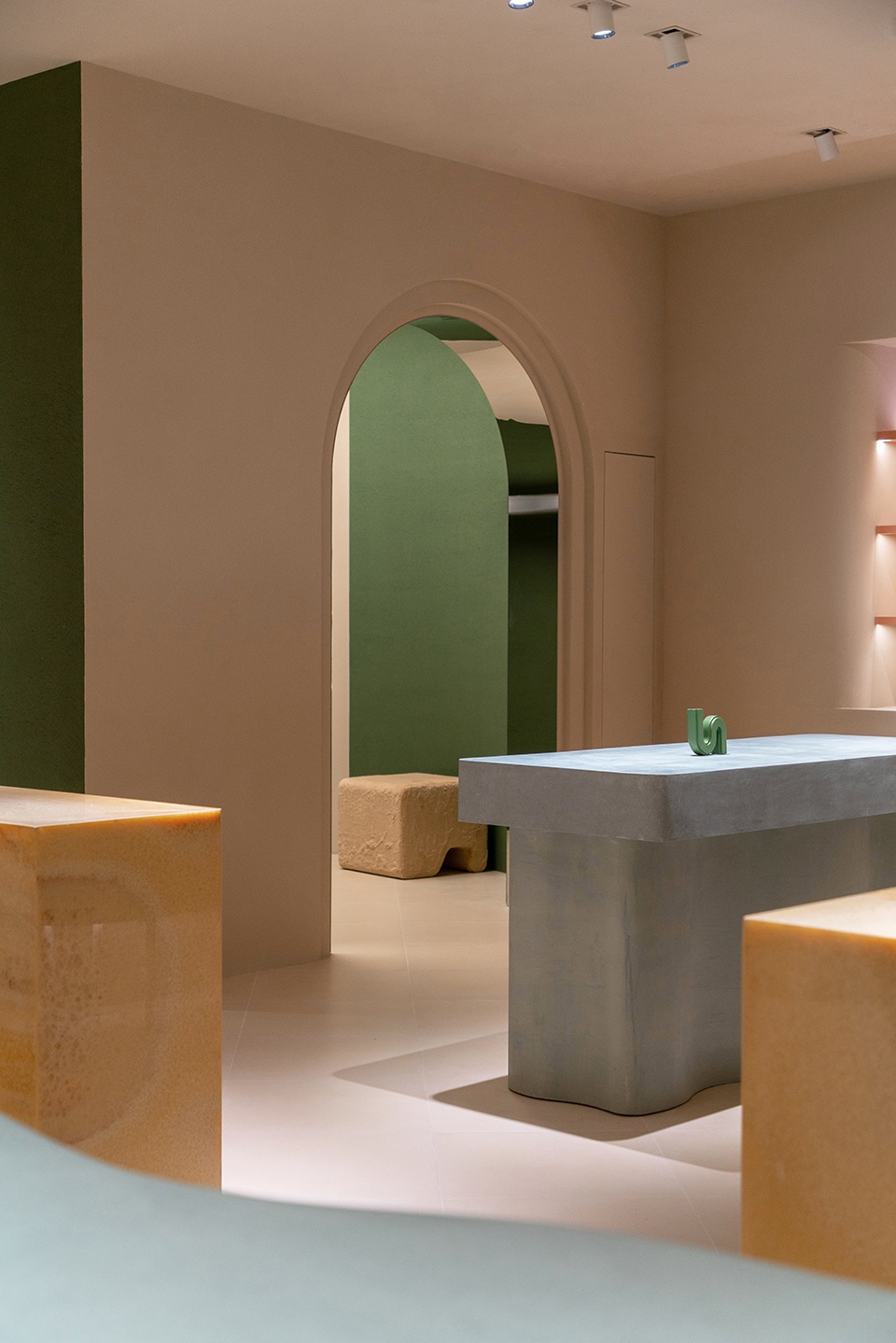
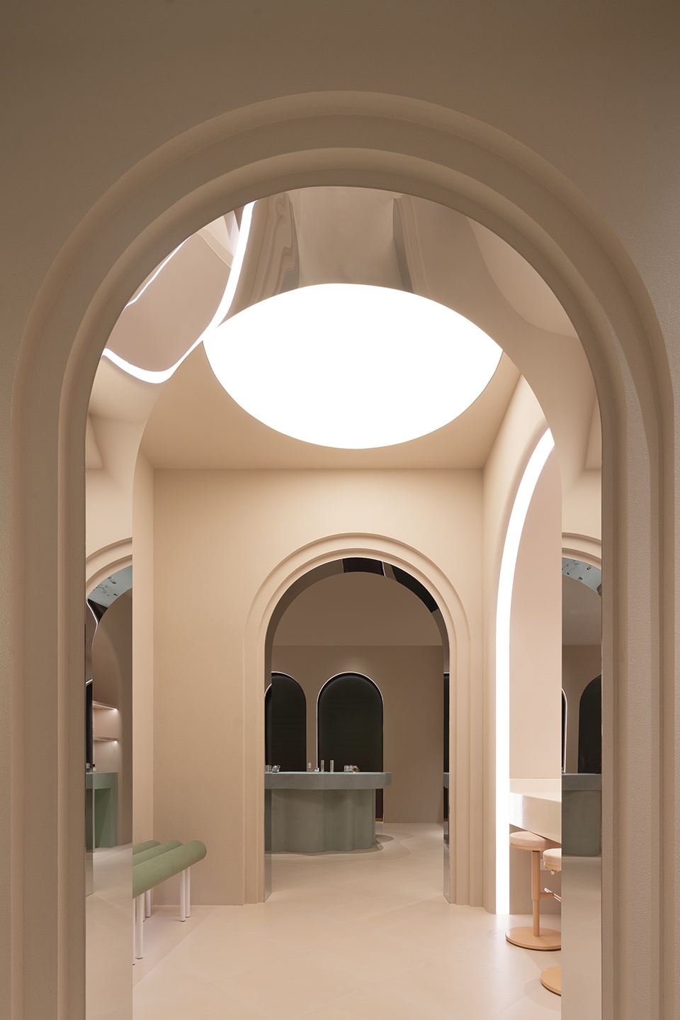
休憩区的隔断仿照西式风格采用拱门形态,相同元素在空间中的重复使用制造出层叠的框景效果。而在休憩空间内,镜面材质的使用模糊了实体空间与虚拟空间的界限,景深无限延展,引人入胜。
The partition of the Rest Area adopts the arch form in western style, and therepeated use of the same elements in the space creates the effect of stackedframe scenes. While in the rest space, the use of mirror material blurred theboundary between physical space and virtual space, the depth of field isinfinite, attractive.
▼休憩区,Rest Area ©吴鉴泉
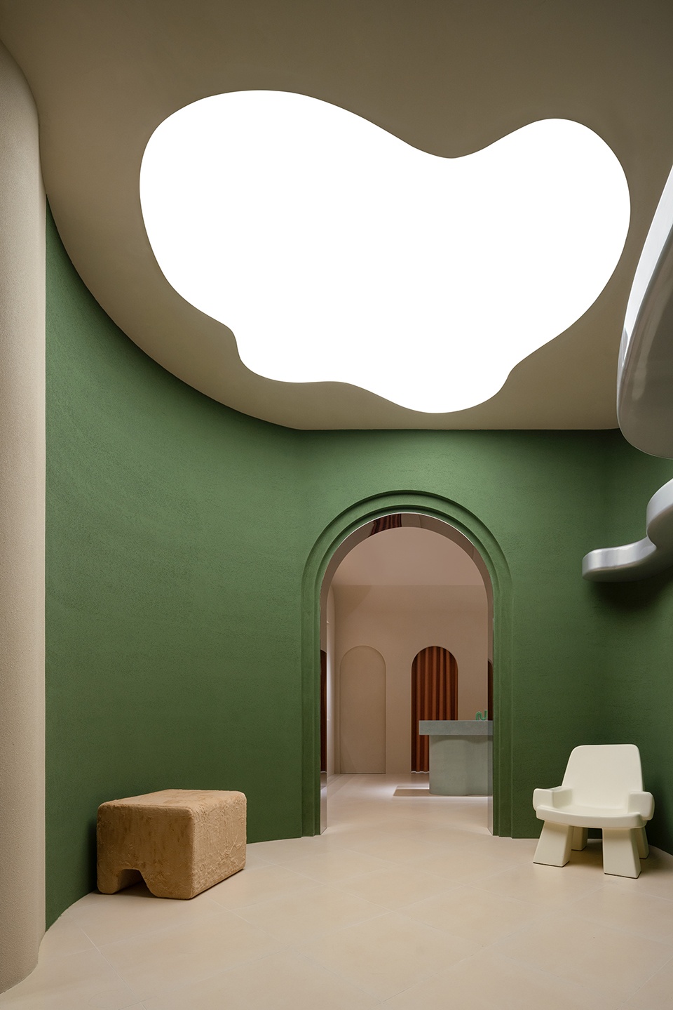
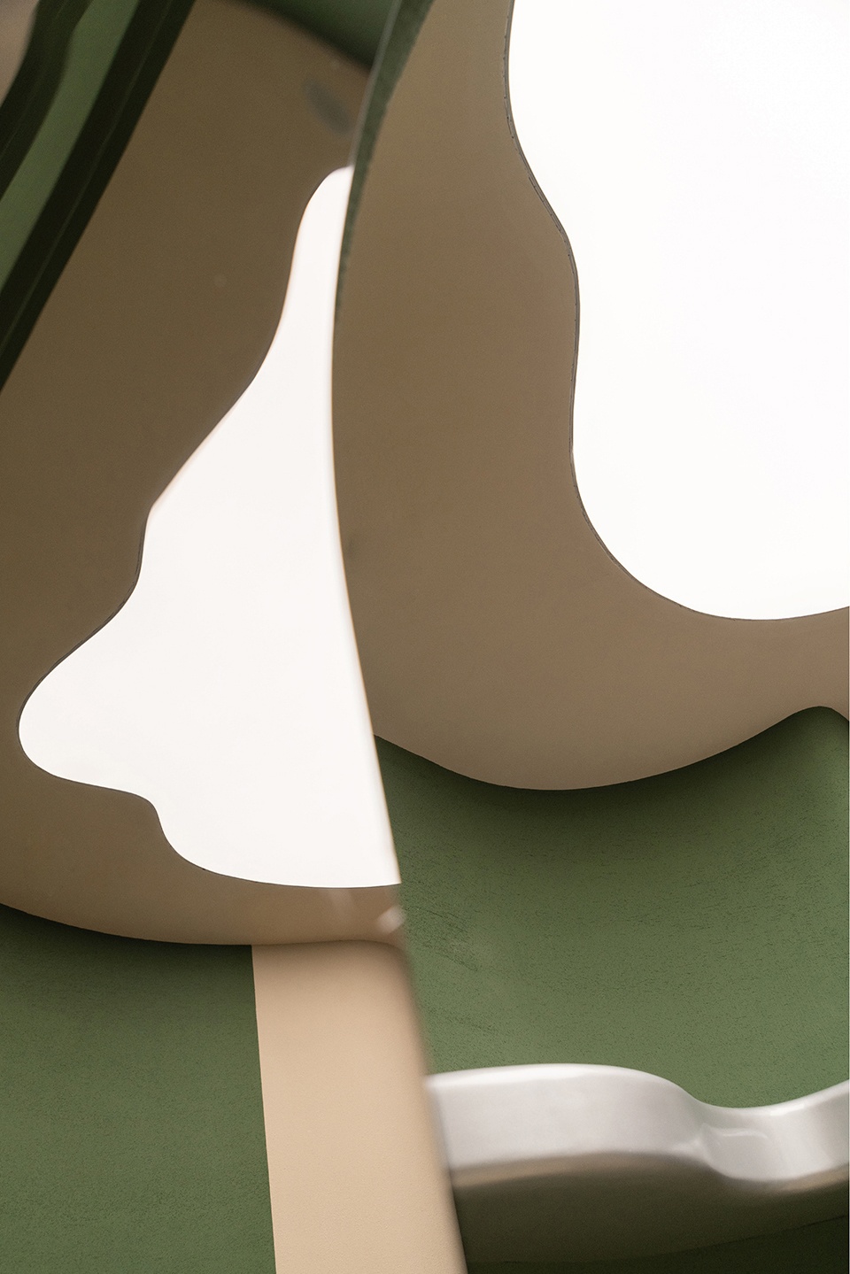
在“云朵”装置区,入口处绿色的弧形围墙首先温柔的将空间包裹。嵌入墙体的“云朵”装置以不规则的凝固造型诠释“云”转瞬即逝的灵动。同时,公区的镜面“云朵”作为视觉焦点串联和引导着空间分区,传递着“舒展”美学。
In the “Cloud” Installation Area, the green curved wall at the entrance gently wraps the space. The “Cloud” installation embedded in the wall interprets the fleeting movement of the “cloud” with irregular solidified shapes. At the same time, the mirror “cloud” in the public area serves as the visual focus and guides the spatial partition, delivering the “stretch” aesthetics.
▼“云朵”装置区,“Cloud” Installation Area ©吴鉴泉
aaddd Essential精选专区作为一个相对独立的区域,它的开辟,一方面是为了适应极大的场地面宽,通过反向开口吸引非主展示区的客流;而另一方面,则是为了打造一个连接线上线下的精选品类专区和未来可以和特定品牌合作的popup快闪店。通过墙面的曲线褶皱,空间被分隔成5个相对独立的美妆台,以取代传统店铺立面的橱窗展示。镜面的设置满足了补妆或试妆时功能性的需求。同时,该区域灵活的照明调节也可辅助品牌多样化的场景需求。
aaddd Essential Selection Area is a relatively independent zore. On the one hand, the opening of aaddd Essential Selection Area is to adapt to the great width of the floor, attract visitors from different directions, and make full use of site conditions; On the other hand, it aims to create an online and offline selection category area and pop-up store that can cooperate with specific brands in the future. Through the curving folds of the wall, the space is divided into 5 relatively independent beauty tables to replace the window display of the traditional shop facade. The mirror settings meet the functional needs of makeup adjust or makeup test. At the same time, the flexible lighting of the area can also assist the diversified scene needs of the brand.
▼Essential精选专区,Essential Selection Area ©吴鉴泉
在灯光的整体选择上,SLT测试了不同的色彩以及色温,最终采用了暖色调光作为aaddd的主光源色调。一反传统美妆店采用冷光光源所制造出的紧张感,aaddd整体空间延伸出温馨可人的气质,在减少与顾客审美距离的同时,烘托出带有故事感的沉浸氛围。
In terms of the overall choice of light, SLT tests different colors and color temperatures, and finally adopts warm tone light as aaddd’s main light tone. Contrary to the tension created by the use of cold light source in traditional beauty shops, the overall space of aaddd extends a warm and pleasant temperament, which reduces the aesthetic distance with customers and sets off an immersive atmosphere with a sense of story.
▼暖调灯光烘托故事感氛围,Warm lighting sets off a sense of storytelling atmosphere ©吴鉴泉
“Cloudy Island”,将脆弱而易变的“云朵”捕捉到都市生活的丛林中,在色彩、线条、灯光的共同作用下,制造出一个柔软而梦幻的岛屿,为快节奏生活下负重的心灵提供短暂的停靠。空间成为一个过渡的容器,将人的心境映射其中;空间同时也成为了一个启发性的场所,以碰撞的美学效应激发个体对审美的追求、对品质生活的向往,这也呼应了aaddd的品牌理念——放下紧张情绪,找到“美”。
Cloudy Island captures the fragile and changeable “cloud” into the jungle of urban life, creating a soft and dreamy “island” with combined effect of colors, lines and lights. Aaddd provides a temporary stop for the mind-burdened urban residents due to the fast pace of life. The space becomes a transitional container, which maps people’s mood; At the same time, the space has also become an inspiring place to stimulate individuals’ pursuit of aesthetics and yearning for quality life, which also echoes the brand concept of aaddd — release tension and find “beauty”.
▼细部,Details ©吴鉴泉
项目名称:aaddd美妆生活方式集合店
设计方:SLT(Studiolite)设计咨询有限公司
公司网站:Studiolite.design
联系邮箱:media@studiolite.design
项目设计 & 完成年份:2021.08
主创及设计团队:凌晨、俞洋洋,牛晨宇,付雨,王川楚
项目地址:上海市黄浦区中山东二路600号,BFC外滩金融中心南区B1层
建筑面积:200㎡
摄影版权:吴鉴泉
灯光顾问:庞磊-LUMIA Lab
施工单位:璟筑建筑装饰工程(上海)有限公司
客户:BFC外滩金融中心(集团旗下)
材料:艺术漆、烤漆、大理石
Project name: Aaddd Beauty lifestyle flagship store
Design: Studiolite(SLT) Design Consultants Ltd
Website: http://studiolite.ch/
Contact e-mail: media@studiolite.design
Design year & Completion Year: 2021.08
Leader designer & Team: Chen Ling, Yangyang Yu, Chenyu Niu, Yu Fu, Chuanchu Wang
Project location: No. 600, Zhong Shan 2nd Road, BFC B1 / F, South Bund Financial Center, Huangpu District, Shanghai
Gross Built Area: 200m²
Photo credits: Jianquan Wu
Lighting Consultant: Pang Lei -LUMIA Lab
Construction unit: Jingzhu Architectural Decoration Engineering (Shanghai) Co., LTD
Clients: BFC Bund Financial Center (affiliated to the Group)
Materials: Faux Finish、Paint, marble


