
设计思考 | Design Concept
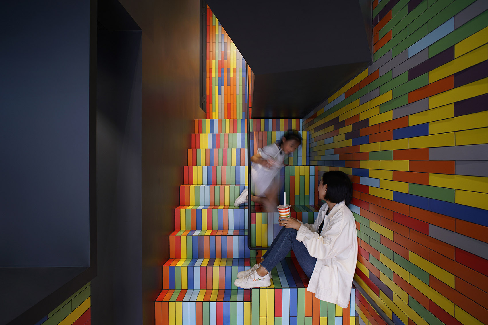
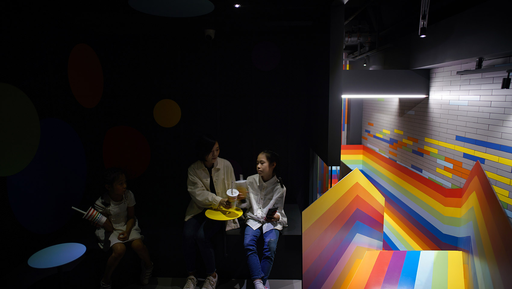
本项目位于成都天府新区一栋普通的沿街商业建筑内,铺面原有建筑面积为28平方米。由于地处新区,基地周围城市氛围尚未完全形成,附近街道显得十分冷清。设计初衷是通过引入大胆的色彩元素,突破常规黑白灰色调的束缚,为新区增添一抹亮色,带来感官的喜悦,提升城市空间的活力。
The project is located in an ordinary commercial building along the street in Tianfu New District, Chengdu, with a floor area of 28 square meters. Because it is located in the new district, the urban atmosphere around the base has not been fully formed, and the streets nearby are very deserted. The original intention of the design is to break through the restrictions of monotonous colors by introducing bold color elements, add a bright color to the new district, bring sensory joy and enhance the vitality of the urban space.
▼项目一角,不同位置的使用者,users in different locations © 阎渊
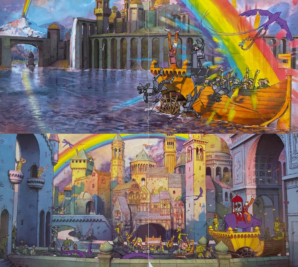
设计的概念源于彩虹意象,从名为《彩虹国度》的儿童读物中得到灵感。《彩虹国度》是艾伦·贝克尔创作的《不可思议的旅程》三部曲中的第二部,小女孩和小伙伴集齐神奇的彩色画笔,在天空中描绘出绚丽的彩虹,拯救了被黑暗占领的城堡。这是一套无字的儿童绘本,展现了无穷的想象空间。尤其故事进行到召唤彩虹的时候,小朋友们总会欢呼雀跃,也给大人带来更多思考:孩子们的快乐,纯粹又美好,而这份纯粹的成色原本就是五彩缤纷的。
▼设计概念——《彩虹国度》,design concept © 凡筑
The concept of the design came from the rainbow image, inspired by the children’s book Rainbow Nation. “Rainbow Nation” is the second book in Alan Becker’s “Incredible Journey” trilogy. The little girl and her friend use magical colored brushes to paint a rainbow in the sky and save the castle from being overrun by darkness. This is a set of children’s picture books without words, showing endless imagination. Especially when the story goes on to call the rainbow, the children always cheer and jump for joy, but also bring more thinking to adults: children’s happiness, pure and beautiful, and this pure color is originally colorful.
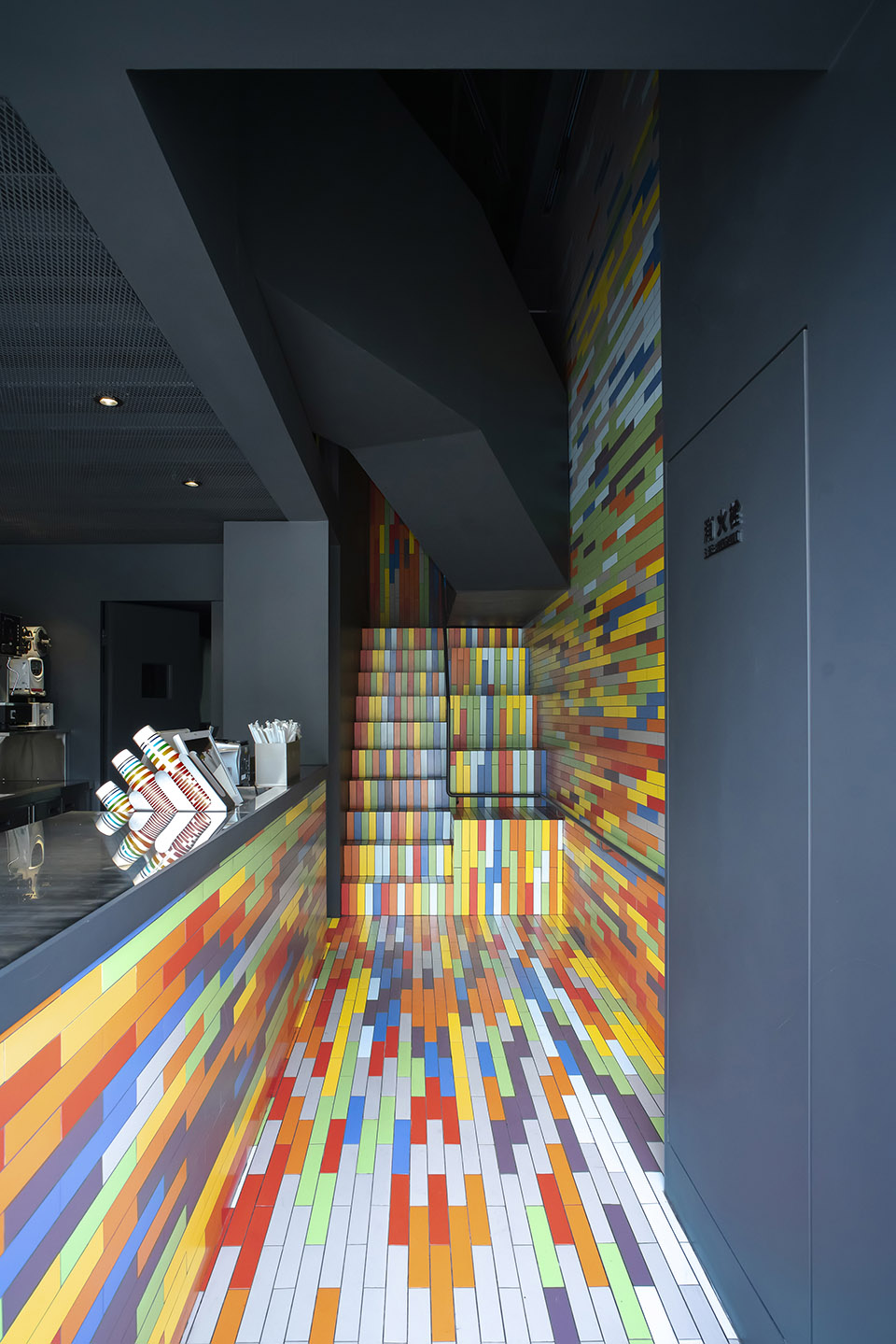
▼首层吧台区,bar at the ground floor © 阎渊
茶饮小店利用鲜亮的色彩从城市的街道吸引人流,为进入者带来纷呈的视觉体验。在这个紧致的空间中,设计创造出一个多彩的世界,隐喻如同彩虹般的花季和童年。
Tea shops use bright colors to draw people from the streets of the city, bringing a colorful visual experience to the visitors. In this compact space, the design creates a colorful world, a metaphor for a rainbow of flowers and childhood.
▼彩色的公共空间,colorful public space © 阎渊
空间构成 | Space Composition
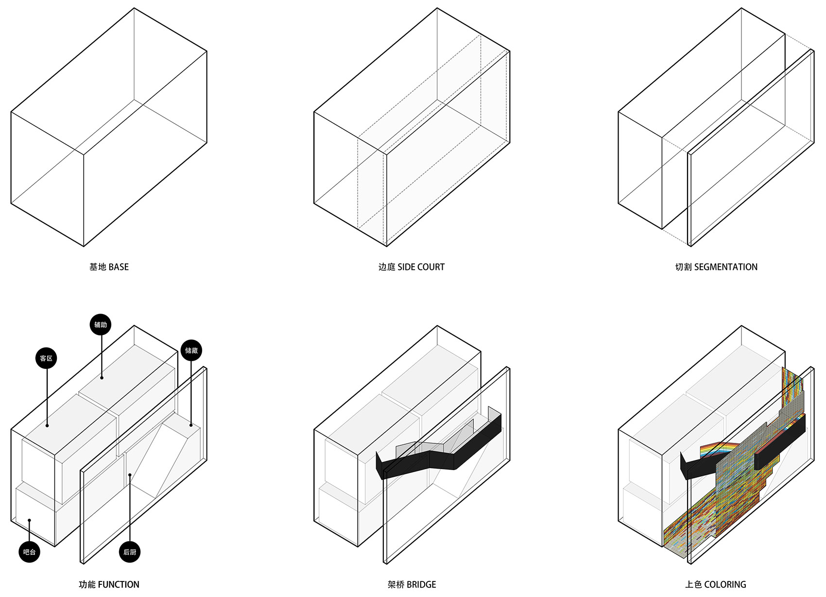
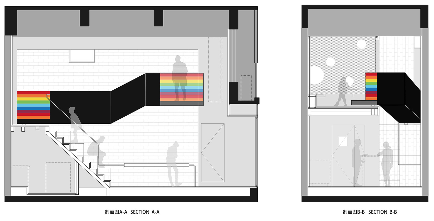
通过体量的切割、连接、搭设,得到小而丰富的空间环境。空间的切割:形成通高的边庭,如同“峡谷”的缝隙,串联起各部分功能,使不同位置的使用者产生视线行为上的交流互动;空间的连接:设计横跨边庭的“窄桥”,从一楼上二楼的交通由走道至楼梯,延伸到窄桥,拉长人行动线,延续行走的体验过程;空间的搭设:利用富余的层高,搭建二楼休闲客区,名为“方亭”,方形的盒子空间小巧精致,是整个空间序列的终点,独立且更加安静,可以在此组织较为私密的小型聚会。
▼空间构成,exterior view ©凡筑
Through the cutting, connecting and setting of the volume, a small and rich spatial environment is obtained. Cutting of space: forming a full-height side court, just like the gap of “canyon”, connecting the functions of all parts, so that users in different locations have communication and interaction in sight and behavior; Spatial connection: The “narrow bridge” across the side court is designed. The traffic from the first floor to the second floor extends from the walkway to the stairs to the narrow bridge, lengthening the line of action and extending the walking experience. Space setup: The leisure area on the second floor, named “square pavilion”, is built by using the spare storey height. The square box space is small and exquisite, which is the end of the whole space sequence. It is independent and quieter, and a small private party can be organized here.
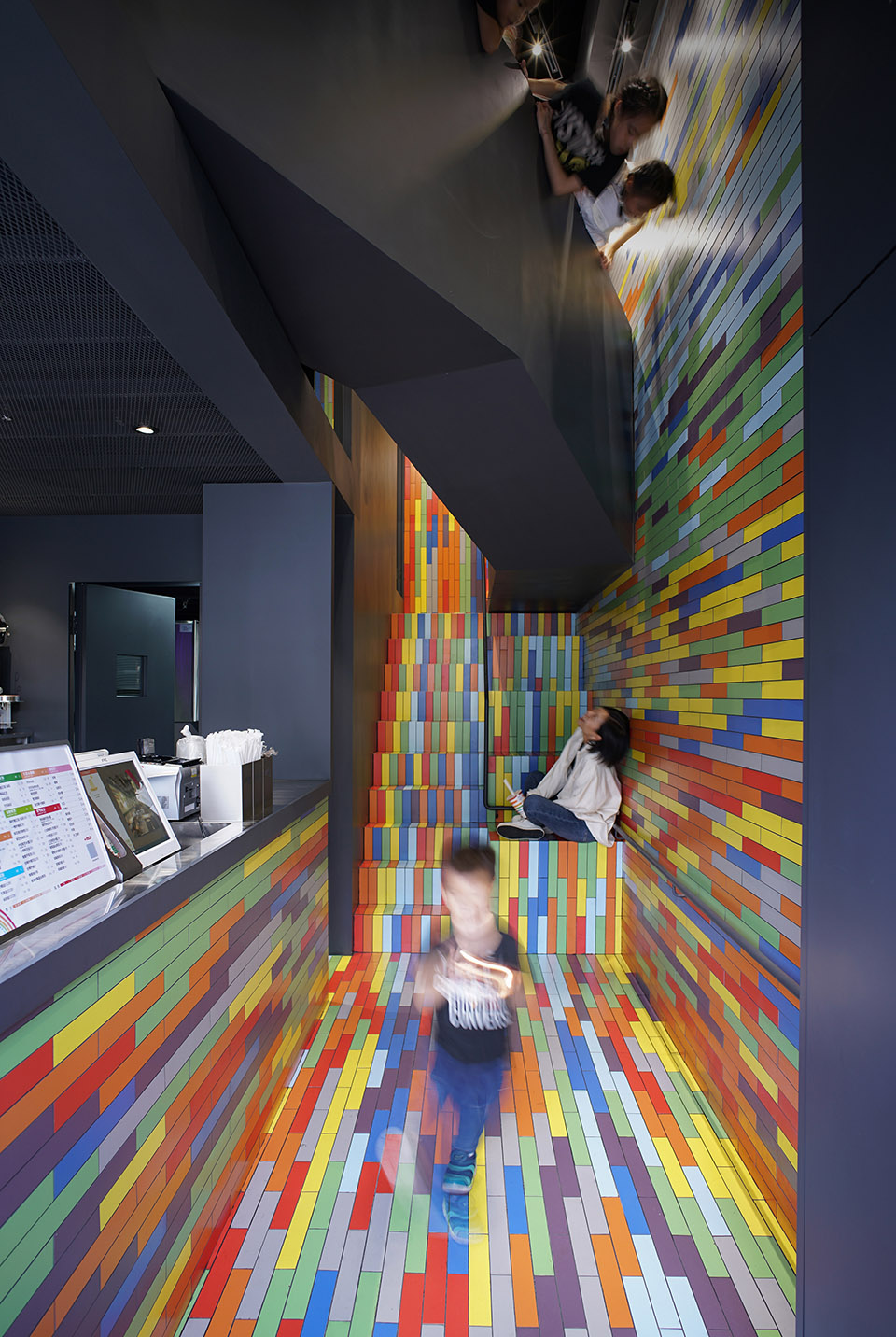
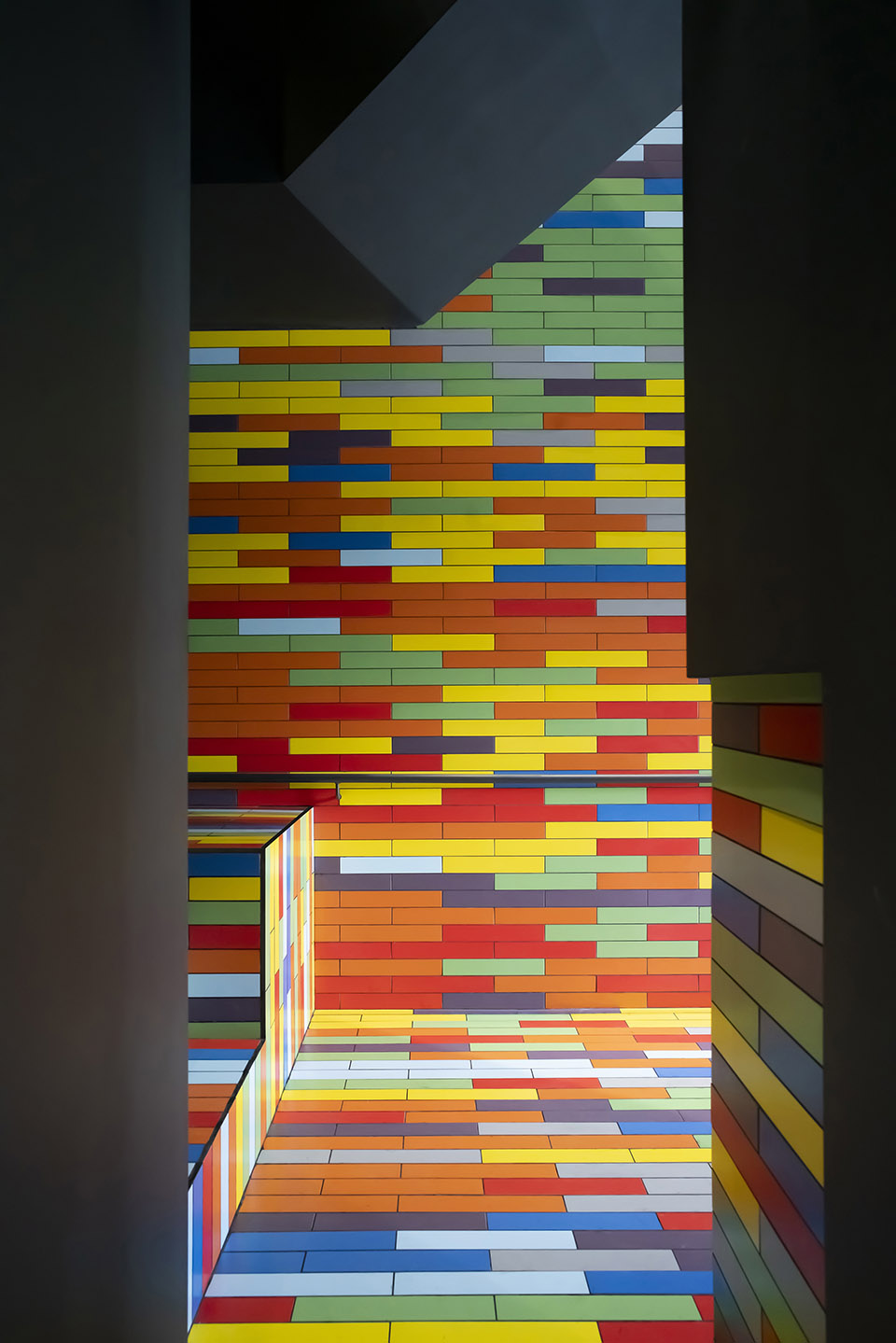
▼彩色碎片的峡谷
canyon with colorful pieces © 阎渊
色彩构成 | Color Composition
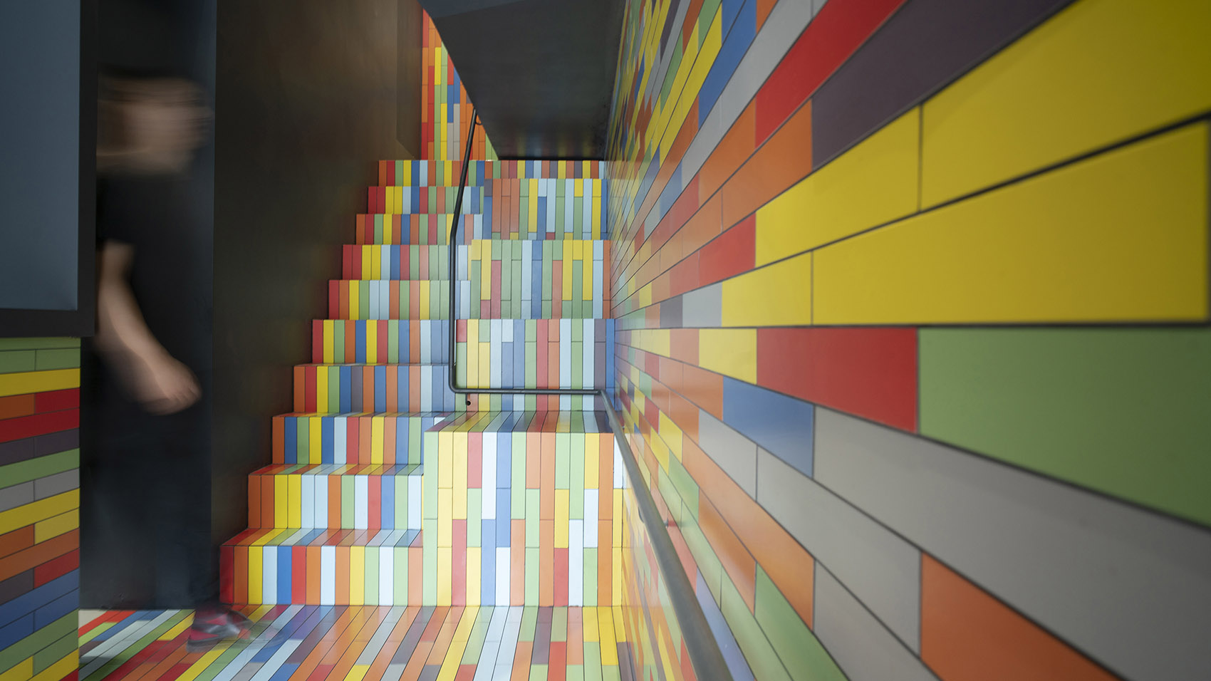
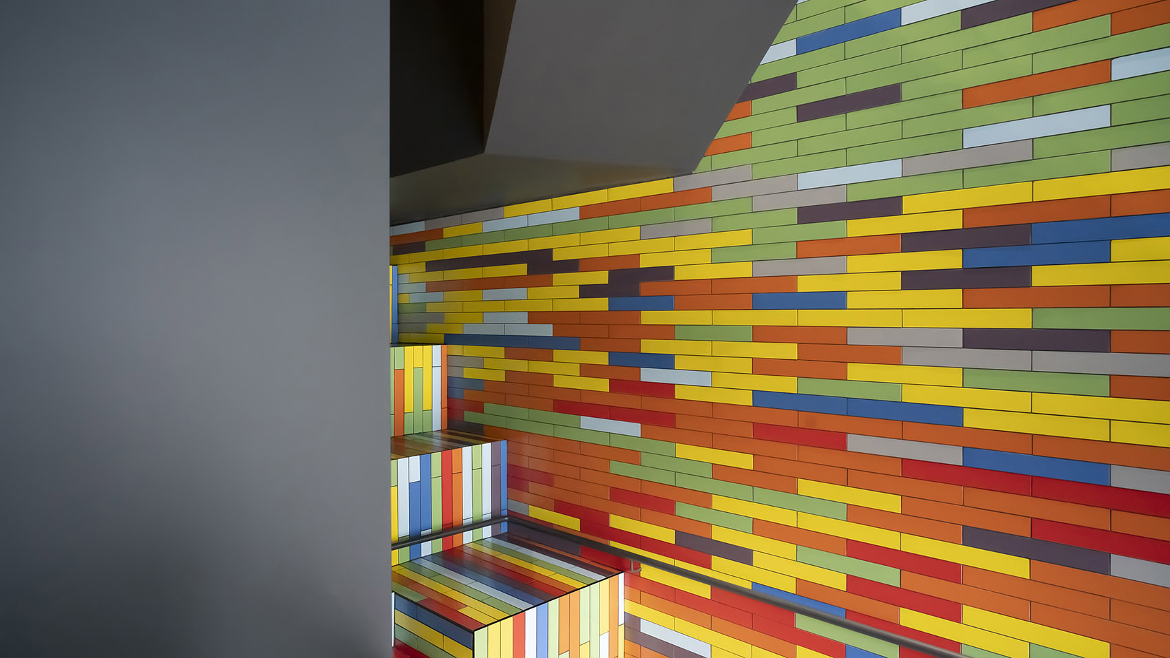
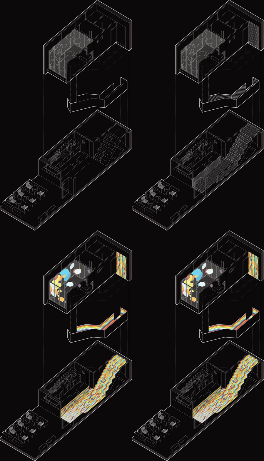
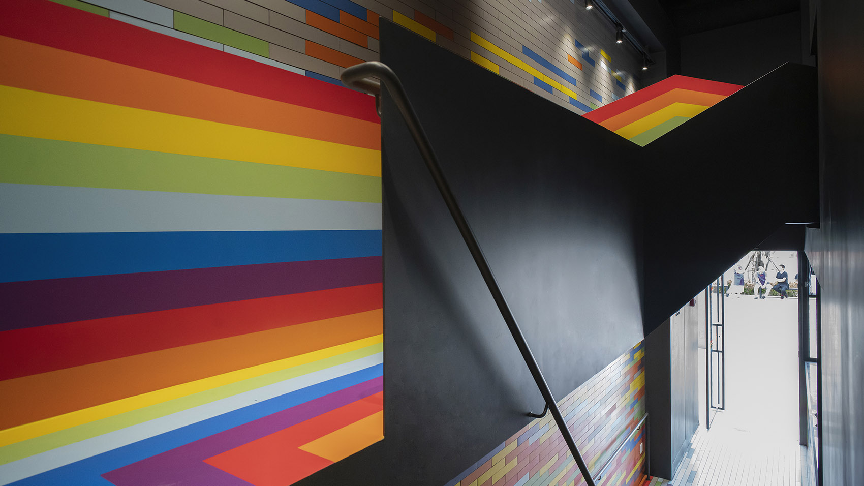
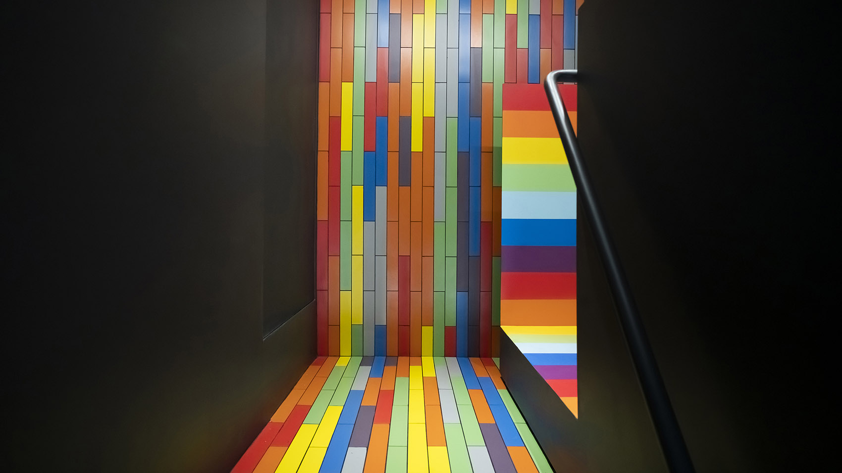
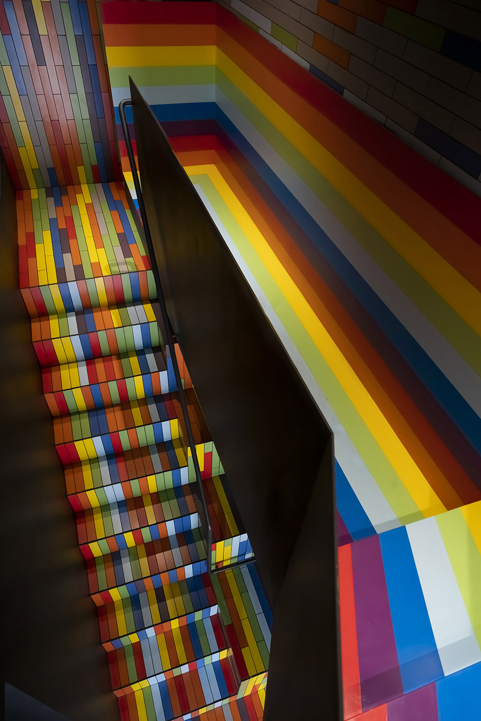
客人能够到达或停留的区域是色彩重点表达的区域,其余部分以深灰色面漆饰面,使高彩度、高亮度的材质在空间中更为凸显。边庭“峡谷”区域,采用七色面砖,裁成长条形铺设。铺贴方式为工字缝错拼,在看似随意的色彩构成中体现从下至上颜色渐变的趋势,使得峡谷空间效果整体中不乏细节变化。
▼色彩构成,Color Composition ©凡筑
The area where the guests can arrive or stay is the area where the color is mainly expressed. The rest is finished with dark gray finish, which makes the high color and high brightness materials more prominent in the space. Side court “canyon” area, using seven colors of glazed tiles, cut long strip laid. The paving method is i-seam misspelling, which reflects the trend of gradual color change from bottom to top in the seemingly random color composition, making the canyon space effect full of details.
▼峡谷与窄桥的衔接,from the canyon to the bridge © 阎渊
▼铺贴方式为工字缝错拼,i-seam misspelling paving method © 阎渊
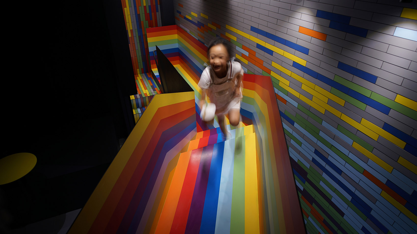
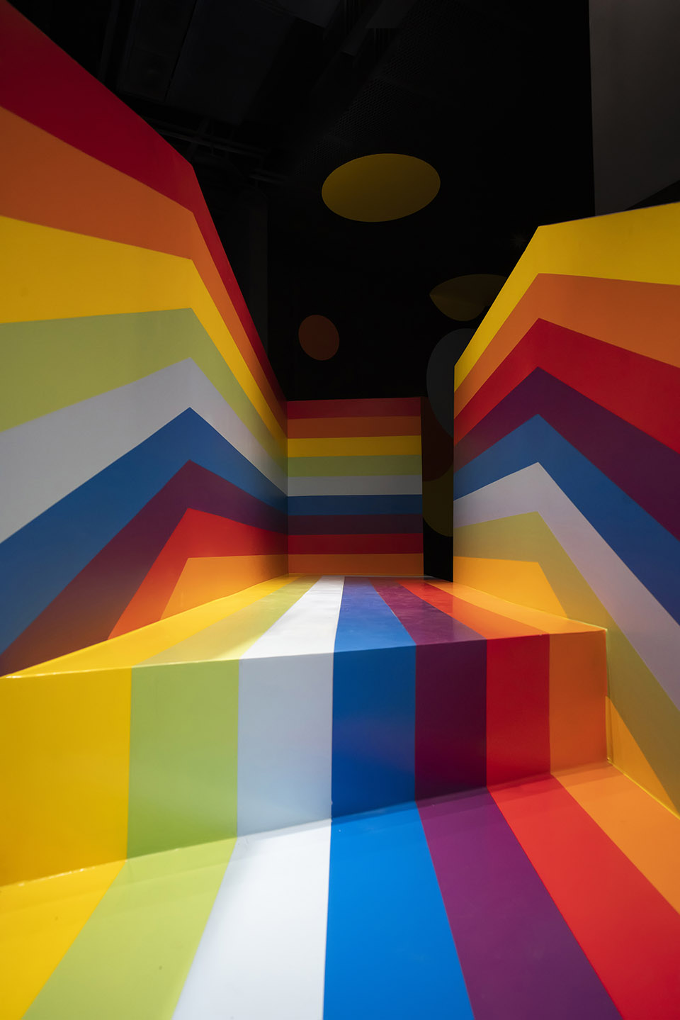
“窄桥”采用七色重复规律组合,以体现窄桥的线性感,使得行走路径得到视觉上的延伸,窄桥沿着人行的方向被拉长,成为连接彼岸的“彩虹桥”。
The “narrow bridge” adopts the seven-color repetitive pattern combination, which is dynamic and makes the walking path get the visual extension, becoming the “rainbow bridge” connecting the “square pavilion”.
▼七色重复规律体现窄桥的线性感
the seven-color repetitive pattern creating the visual extension © 阎渊
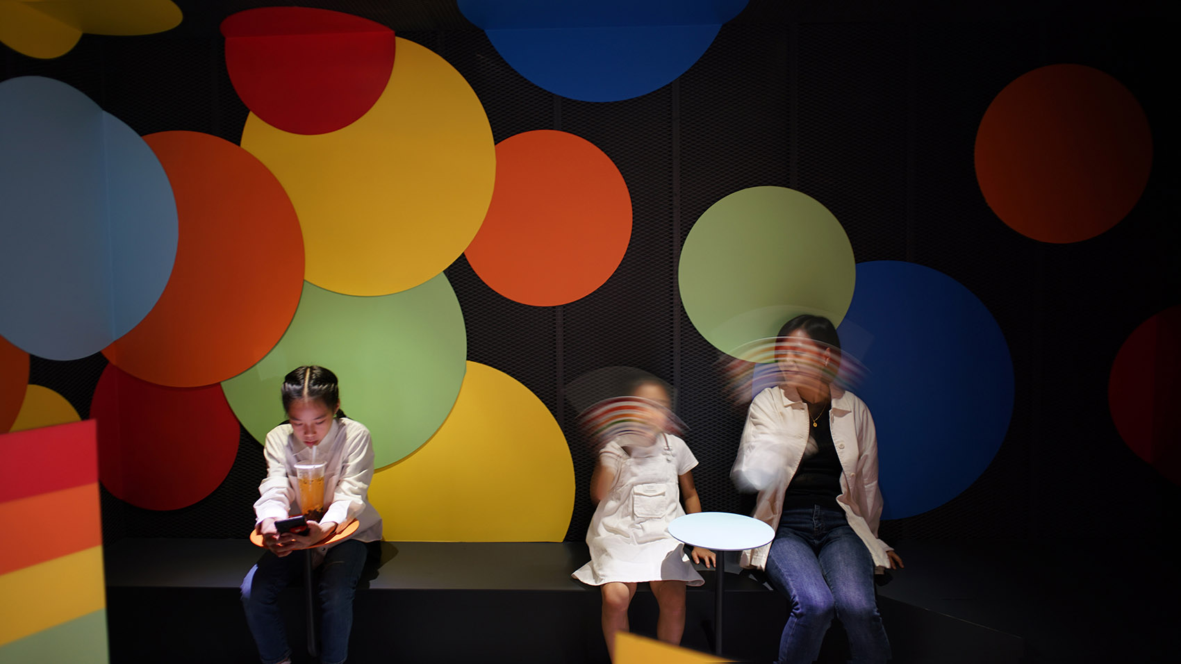
经过彩虹桥,来到小店二楼的客区“方亭”。方亭采用多种规格圆盘作为桌、椅、装饰的母题,色彩同彩虹桥的七色,从冷色至暖色间隔变化,使得数平米的狭小空间整体又别致。
After the rainbow bridge, came to the shop on the second floor of the customer area “square pavilion”. Square pavilion uses a variety of specifications disk as table, chair, decorative motif, color with the rainbow bridge seven colors, from cool to warm color interval change, making a few square meters of narrow space as a whole chic.
▼彩虹窄桥连接休息区,the narrow bridge leading to the relax area © 阎渊
▼彩色气泡填充的方亭,square pavilion with rainbow bubbles © 阎渊
窄桥是整个空间的转换连接体,彩虹桥好似一道七彩光影,横跨在峡谷之间。峡谷的七彩如同彩虹的碎片,散落在峭壁栈道的表面。方亭的彩色圆盘,像是从空气中升腾而起的气泡,在光的作用下,披上了七彩的外衣。
The narrow bridge is the transformation link of the whole space, rainbow bridge like a colorful light, straddling the canyon. The canyon’s colors, like fragments of a rainbow, scatter across the cliff walkway. The colorful disks of the pavilion, like bubbles rising from the air, are covered with colorful clothes under the action of light.
▼细部,details © 阎渊
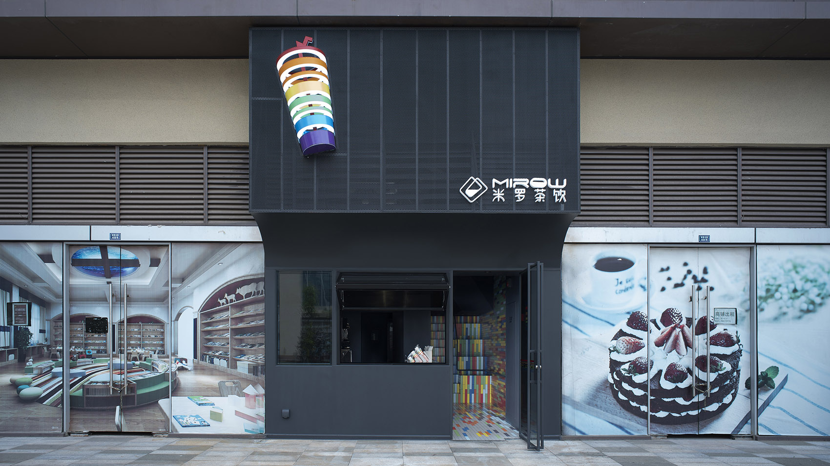
▼项目外观,exterior view © 阎渊
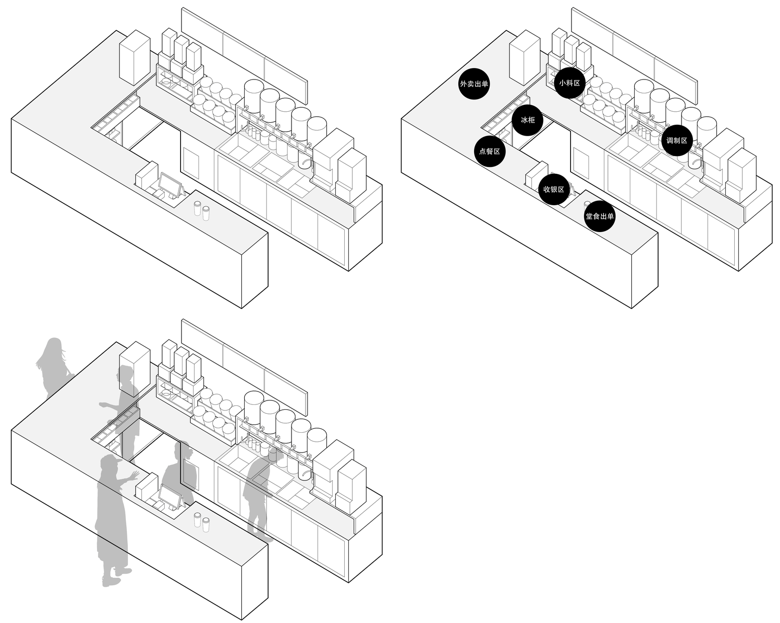
▼工艺流程图,process diagram ©凡筑
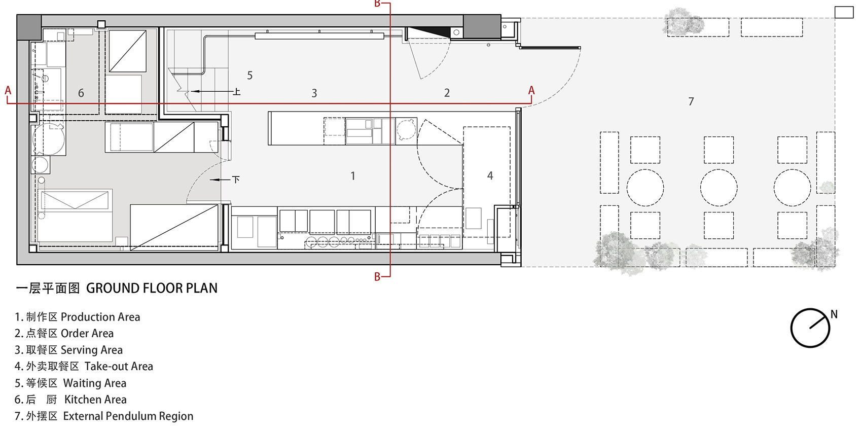
▼一层平面图,ground floor plan ©凡筑
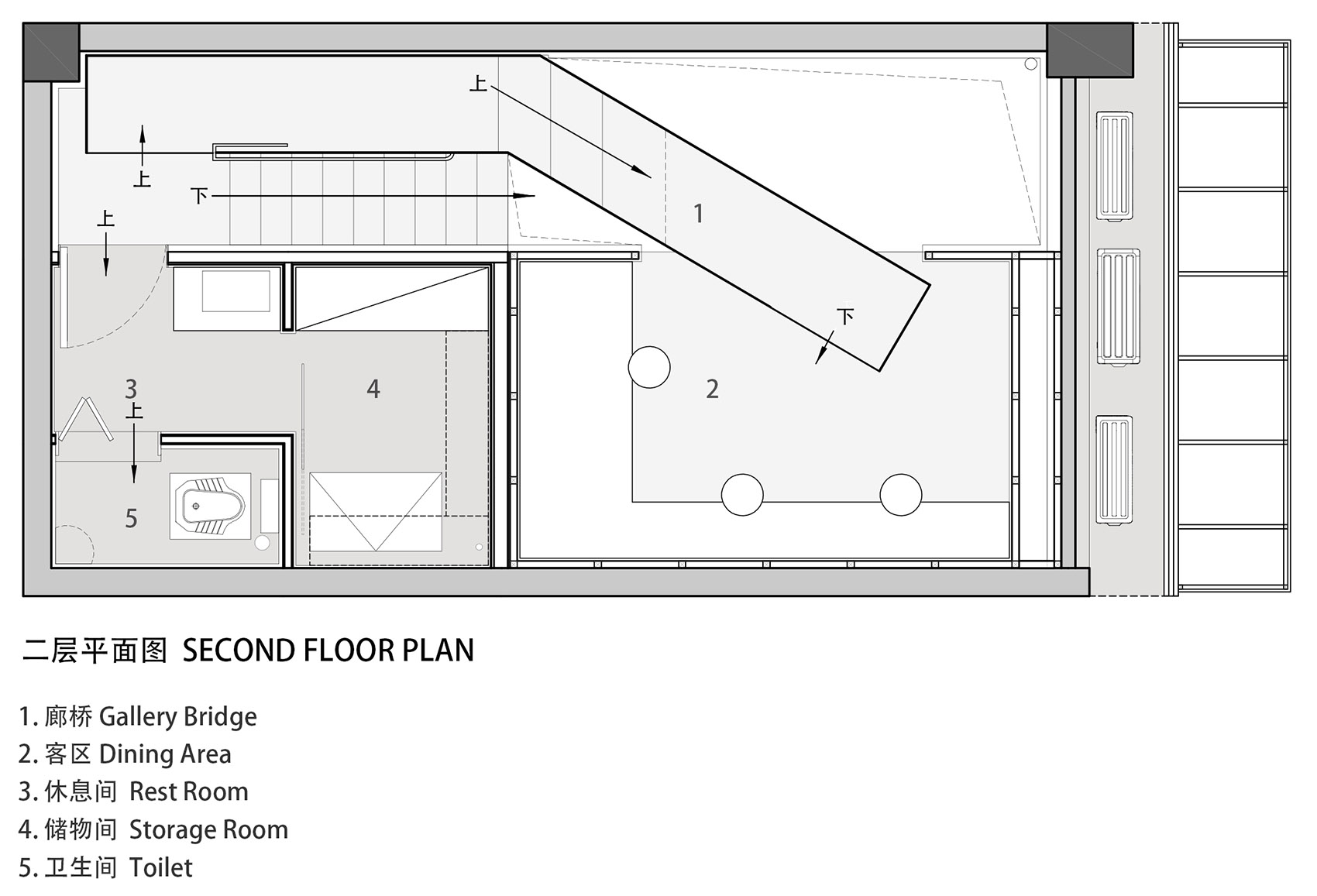
▼二层平面图,second floor plan ©凡筑
▼剖面图,section ©凡筑
项目名称:彩虹国度|茶饮小店
设计方:凡筑设计
公司网站:公众号|凡筑
联系邮箱:cdfzdesign@qq.com
项目设计 & 完成年份:2021
主创及设计团队:钟梓洵(主创)、李玲、阳佳秀、王君、温文喆、劳晓玲
项目地址:成都天府新区兴隆湖创意北路
建筑面积:40平米
摄影版权:阎渊
合作方:机础建设(成都机础建设工程有限公司)
客户:米罗茶饮
Project name: Rainbow Nation —— A Tea Shop
Design: Fanzhu Design
Website: 公众号|凡筑
Contact e-mail: cdfzdesign@qq.com
Design year & Completion Year: 2021
Leader designer & Team: Zhong Zixun(leader),Li Ling,Yang Jiaxiu,Wang Jun,Wen Wenzhe,Lao Xiaoling
Project location: Xinglong Lake Creative North Road, Tianfu New Area, Chengdu
Gross Built Area: 40sqm
Photo credits: Yan Yuan
Partners: Chengdu Jichujianshe Engineering Co., Ltd.
Clients: MIROW Tea shop


