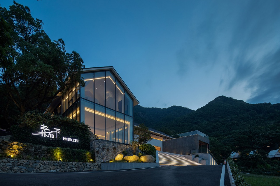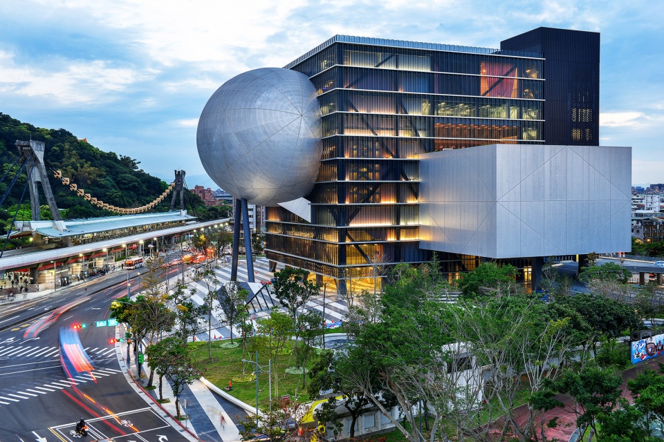

饮食作为一种无法替代的现实体验,由里至外影响着人们的生活,同时也作为重塑商业空间的重要线索之一。不同的餐饮类别、就餐形式与烹饪方法,也构成了不同的餐厅接待体验,在大人儿工作室最新完成的Biiird日式烧鸟店中,设计团队对餐饮形式该如何作用于空间,展开了别出心裁的探索。
Food has always been an irreplaceable reality, influencing people’s daily lives from the inside out and acting as a critical clue to reshaping commercial spaces. The characteristics of the ingredients and cooking methods of each type of food and drink interact with the form of dining, combining many intrinsic factors to create a variety of dining experiences. In this project, bigER club design experimented with how Yakitori as a form of dining can be used to create the space.
▼空间概览
overall view of the space ©吴嗣铭
何谓“烧鸟”Yakitori?
What is “yakitori”?
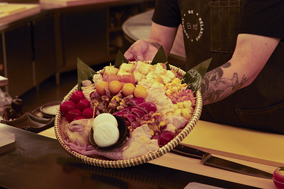
“烧鸟”起源于日本街头的“烧鸟摊”,后因广受欢迎逐渐转变为“烧鸟店”,下班后食客们在炭火前听着烧烤的噼啪响声,在大口喝酒、大口吃肉、与同行友人或料理人的闲聊中,感受市井的温情体验。近年,随着消费升级和细分化,在国内曾作为居酒屋附属品的“烧鸟”,开始逐渐独立出来,单独成店。
The “yakitori stalls” that populated the streets of Japan transformed into “yakitori restaurants”, but what remained unchanged was their relaxing, urban atmosphere – listening to the crackling in front of a charcoal fire after work, and the warmth of the experience of drinking and eating in front of a crackling fire. In recent years, Yakitori, once a subsidiary of Izakaya in China, has gradually become a branch of its own as consumption has escalated and become more segmented.
▼餐厅外观
external view of the restaurant ©吴嗣铭
01
空间的产生
Generation of space
一直以来,饮食作为一种无法替代的现实体验,由里至外影响着人们的生活,同时也作为重塑商业空间的重要线索之一。每种餐饮类别的食材特性、烹饪手法都与就餐形式互相影响着,结合诸多内在因素,形成各式各样的餐饮空间类型,并发展出独特的“仪式感”,甚至形成某种餐饮文化。
例如围合而坐的重庆火锅和东北铁锅炖,餐桌(灶台)与锅本身一定程度上承载了厨房的部分功能,使就餐与烹饪相互交织于食客之间,偶然地互助,你来我往间造就出一种社交方式;又如日本一兰拉面,座位围绕着厨房一字排开,且有隔板将食客分隔开来,同时座位面前的出餐口作为厨房的直接延伸,确保了以“秒”作为烹饪计算单位的高品质与标准化的出品。单人单桌单品的“去社交、去眼神”的用餐方式,让人终于可以安静下来专注享受一碗拉面。
Biiird日式烧鸟店作为Sushi Gin旗下的子品牌,位于深业中城3号楼首层。大人儿工作室对这个不足300平的场地进行了大量分析,此次的设计不仅着眼于空间和材料的研究,同时,对于“烧鸟”作为一种餐饮形式该如何作用于空间,进行了多种尝试。
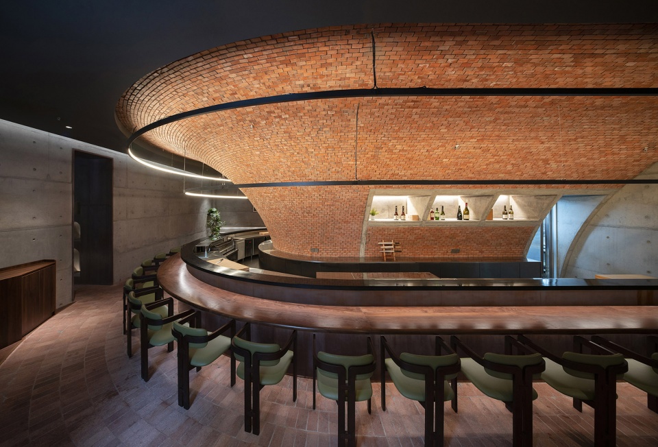
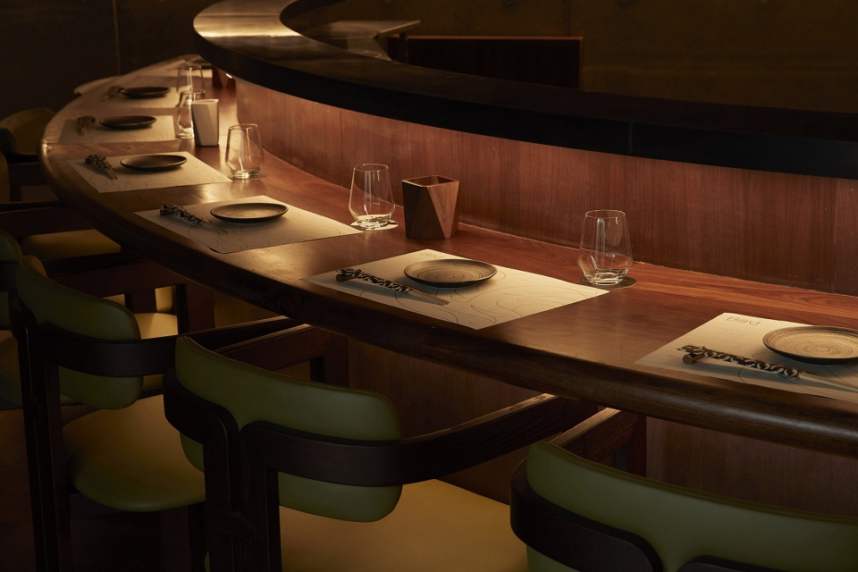
▼就餐氛围
dining atmosphere ©温家亮
Food has always been an irreplaceable reality, influencing people’s daily lives from the inside out and acting as a critical clue to reshaping commercial spaces. The characteristics of the ingredients and cooking methods of each type of food and drink interact with the form of dining, combining many intrinsic factors to create a variety of dining space typologies, developing a unique sense of “ritual” and even a particular dining culture.
For example, in the Chongqing hot pot and the Northeastern iron pot stew, the dining table (stove) and the pot itself take over some of the kitchen functions so that dining and cooking are intertwined between diners, creating a form of social interaction between users. At Ichiran Ramen in Japan, seating is lined around the kitchen, with partitions separating diners. The spout in front of the seats is a direct extension of the kitchen, ensuring high quality and standardised production in “seconds”. The partition can be removed if two people are travelling together, but this is not commonly done. The “no socialising, no eye contact” style of dining at a single table with a single dish allows people to finally settle down and concentrate on enjoying a bowl of ramen.
Biiird Japanese Yakitori, a sub-brand of Sushi Gin, is located on the first floor of Block 3 of SKY PARK. The bigER club design studio analyses the site with less than 300 square meters. The design not only focuses on the space and materials but also experiments with how Yakitori as a form of dining can be used to create the space.
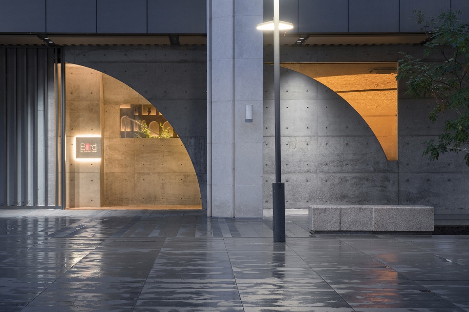
▼餐厅入口
entrance of the restaurant ©吴嗣铭
02
回应城市空间
Responding to urban space
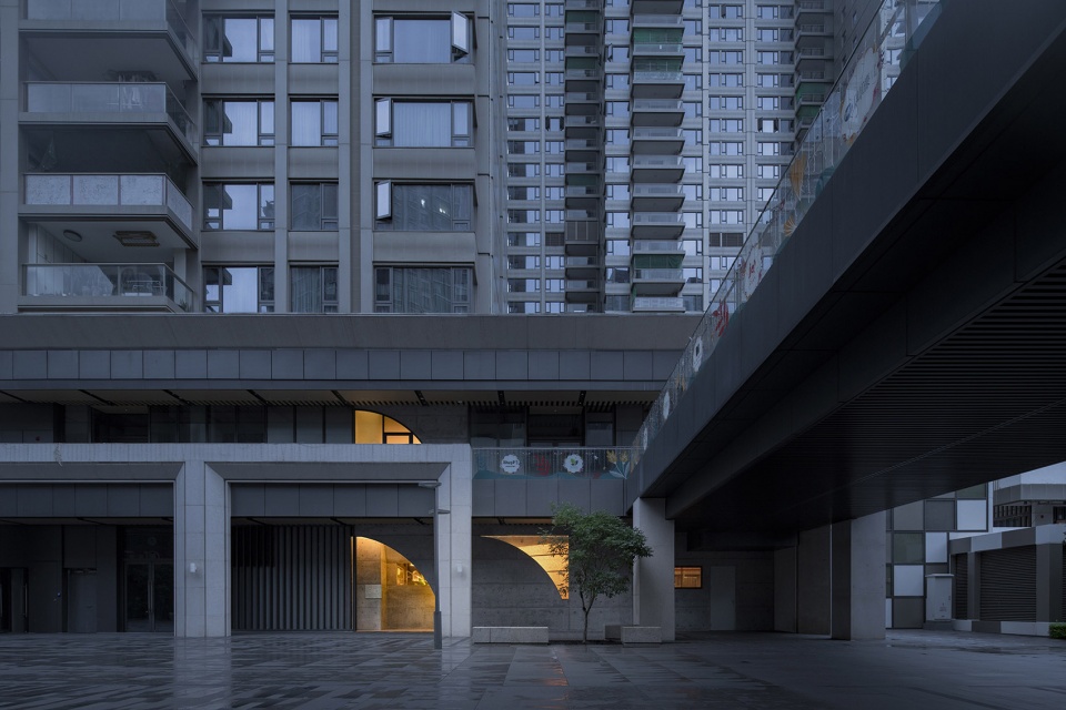
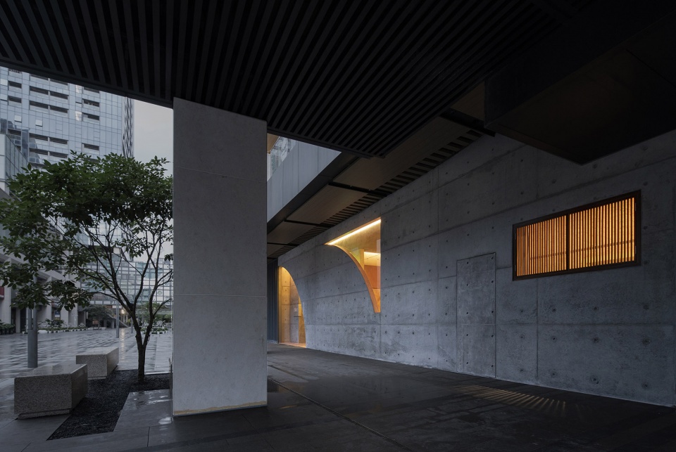
场地所处的商业区拥有统一的店铺立面,玻璃作为统一的立面材料为空间带来了一致的通透感。穿过商业区的中庭,玻璃立面所营造的通透感被一排比例不得当的装饰性廊柱所阻隔。廊柱之下自成空间,各商铺的入口同一朝向,整齐划一,却和廊柱的排列毫无关系。个别入口甚至正对廊柱,导致入口缺乏退让空间,门前作为柱廊与店铺之节点仅有两米宽。
The commercial area where the site is located has a unified glazed façade providing a consistent sense of permeability to the space. The permeability created by the glass façade is interrupted by a row of inappropriately proportioned ornamental columns as one passes through the atrium of the commercial area. Underneath the columns are individual spaces, with the entrances to the shops facing the same direction, neatly aligned but unrelated to the arrangement of the columns. Some of the entries face the corridors, resulting in a lack of space for the entrances, and the front door is only two metres wide as a junction between the halls and the shops.
▼餐厅立面与立柱的关系
relationship between the columns and the restaurant facade ©吴嗣铭
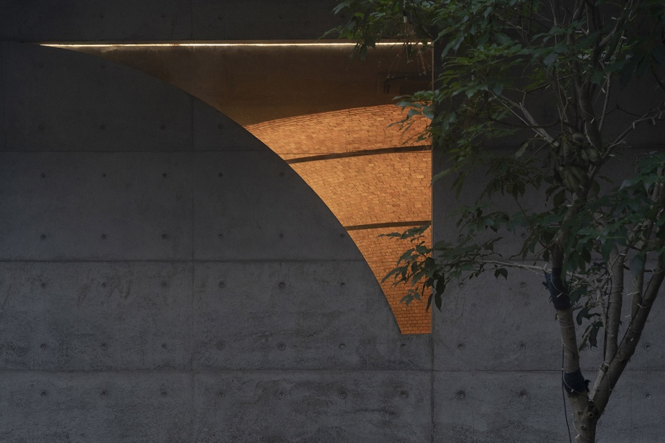
▼可以看到室内的立面开口
opening on the facade providing view of the interior ©吴嗣铭
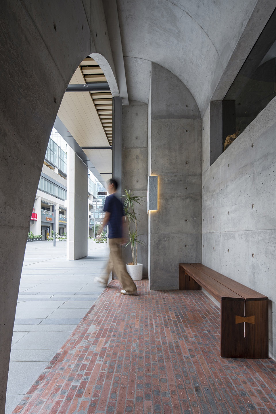
▼等候区
waiting area ©吴嗣铭
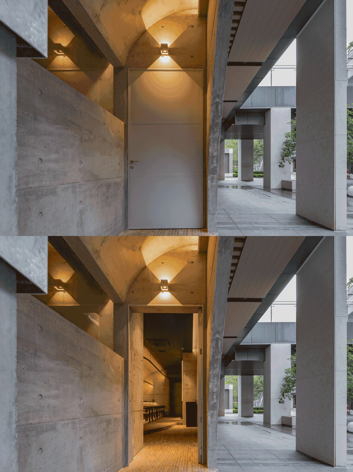
▼低调开启的店门
entrance ©吴嗣铭
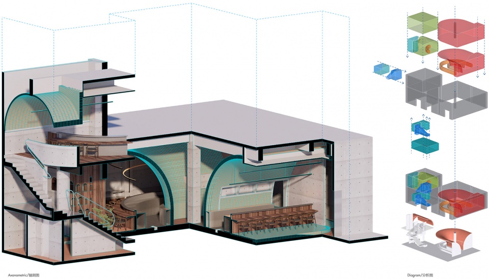
步入项目场地,在10~13号铺尚未打通相连之前,已经可以预见5米的建筑层高将给空间带来更多的设计潜力。空间相连方式并非单纯的串联打通,而是部分横向相连,部分上下相连,既有开阔空间,也有受剪力墙所限,仅由一米宽门洞相连的独立空间,更有局部升高的二层空间。
Step into the site, the design potential of the site (5m height) can be seen before shops 10 to 13 have been interconnected. The spatial connection was not simply by way of rows, but partly horizontally and partly up and down. There are open spaces and relatively separate spaces separated by a shear wall and connected only by a one-metre wide doorway. Even more, some of the spaces are double in height.
▼设计分析图
design analysis ©大人儿工作室
打通两间6m*12m的店铺后能得到一个方整的大空间,然而方正的场地中央有一根500mm*500mm的柱子。作为场地唯一一根独立出来的柱子,不仅分割了空间,还极大程度地影响了整体的功能流线。
After knocking through the two 6m*12m shops, bigER club design was expecting an ample square space, but instead, they found a 500mm*500mm column in the middle of the square space. As the only separate column on the site, it not only divides the space but also dramatically affects the overall functional flow.
▼用餐区
dining area ©吴嗣铭
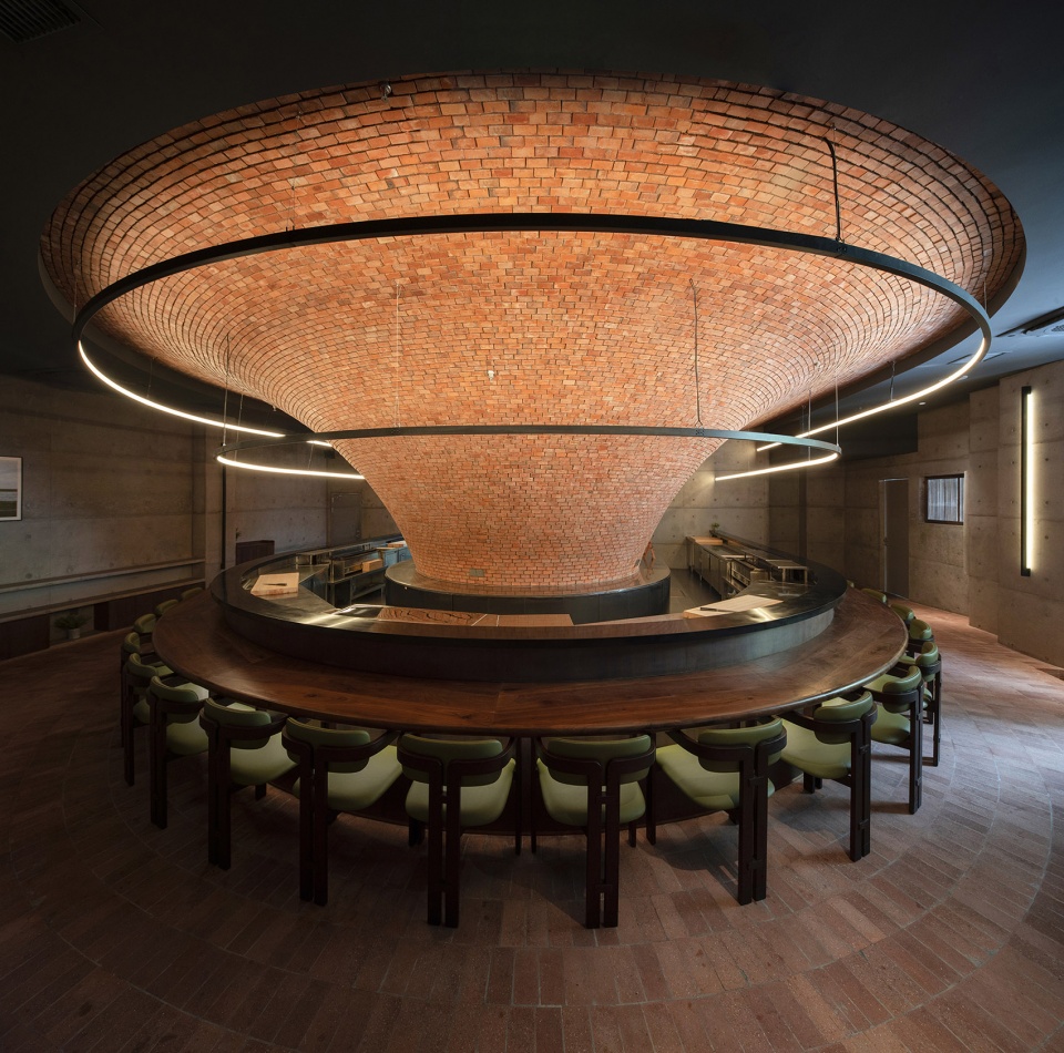
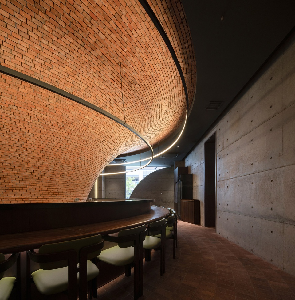
而本次设计任务的其中一项要求是所有的餐位都以吧台形式展开,意味着吧台的长度决定了客席数量,设计团队尝试了各种吧台的形式与可能性,以求得出最优解。
One of the design tasks was to have all the dining spaces in the form of a bar, which meant that the length of the bar determined the number of seats, so the design team experimented with various forms and possibilities of the bar to find the optimal solution.
▼设计团队尝试各种方案的吧台形式与空间可能性
the design team experimented with various forms and possibilities of the bar to find the optimal solution ©大人儿工作室

03
不止于设计
More than design
经过对现场条件和功能需求的分析,设计师决定将用餐区和厨房置于带有柱子的大空间,以用餐区围绕着厨房,将厨房向内包裹,而柱子则收于厨房之中。从而,避免了柱子立在正中央的突兀感,使空间形成一个连续的半环状,以此来增加视觉的连续性。更重要的是,提高了厨房与用餐区之间的效率。
After analyzing the site conditions and functional requirements, bigER club design decided to place the dining area and kitchen in the ample space with the columns, with the dining area surrounding and wrapping the kitchen inwards. In contrast, the columns are tucked away in the kitchen. This avoids the abruptness of a column in the middle of the space and creates a continuous semi-ring space, thus increasing the visual continuity. More importantly, the efficiency between the kitchen and the dining area has been improved.
▼围绕厨房的用餐区
dining area surrounding the kitchen ©吴嗣铭
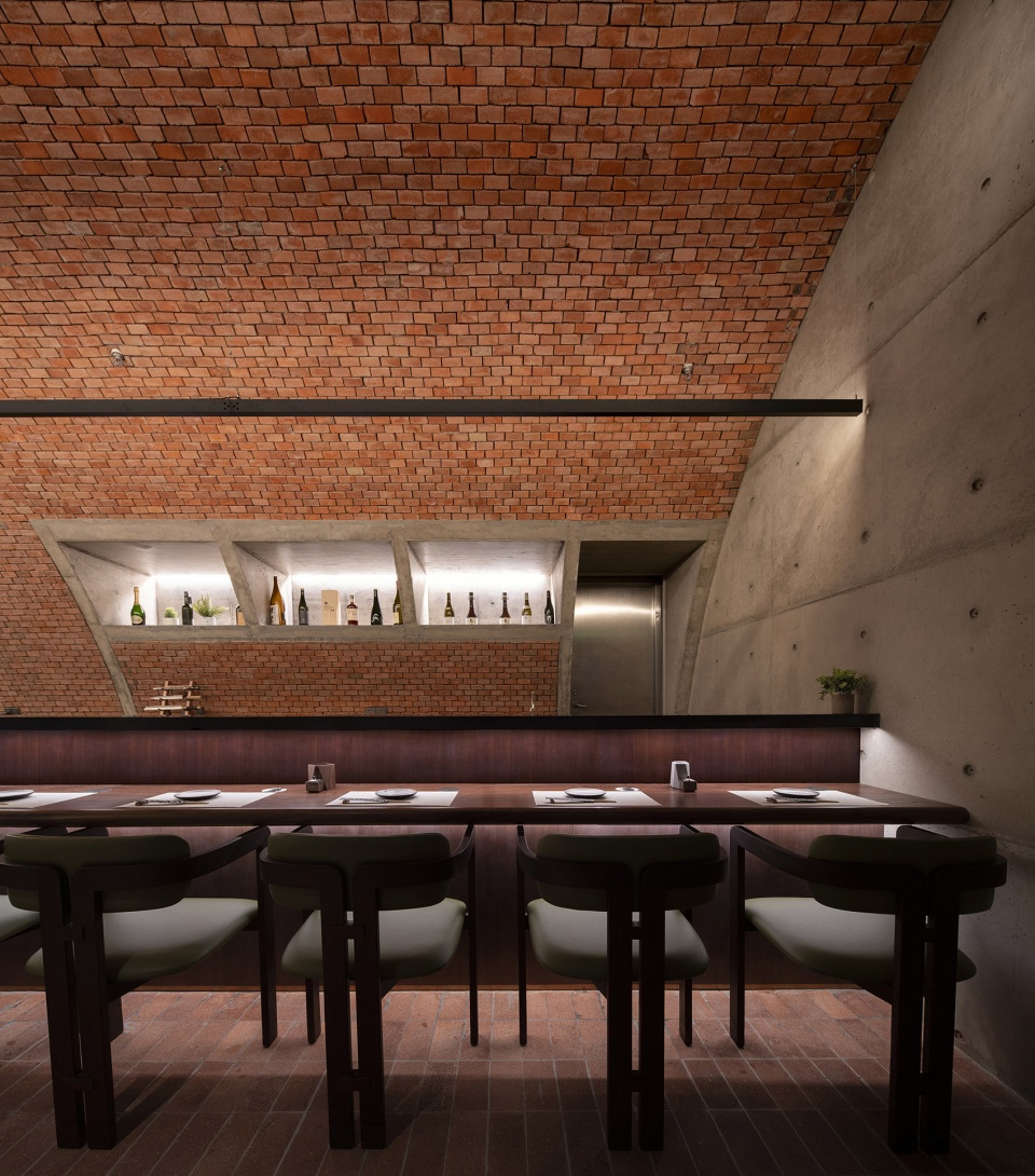
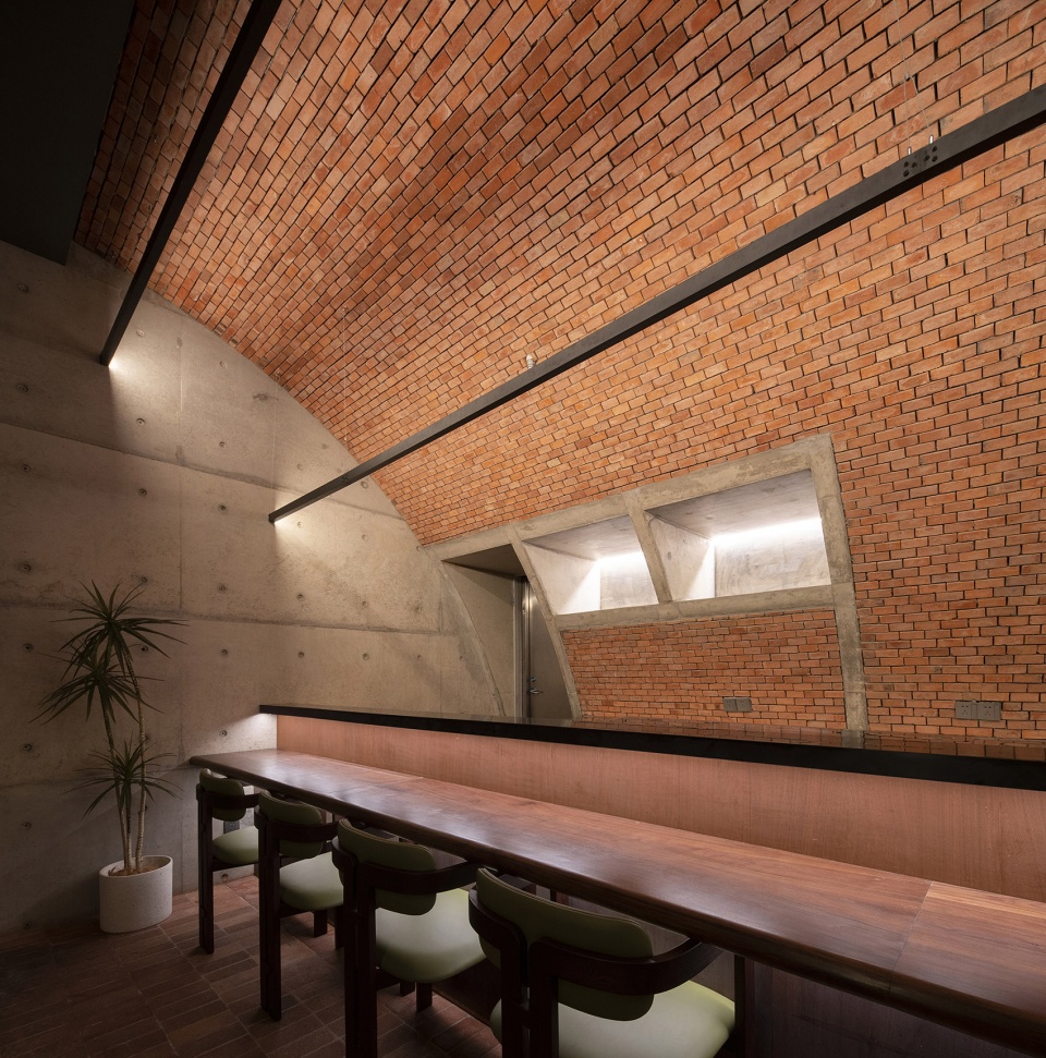
▼空间中部的体量
volume in the center of the space ©吴嗣铭
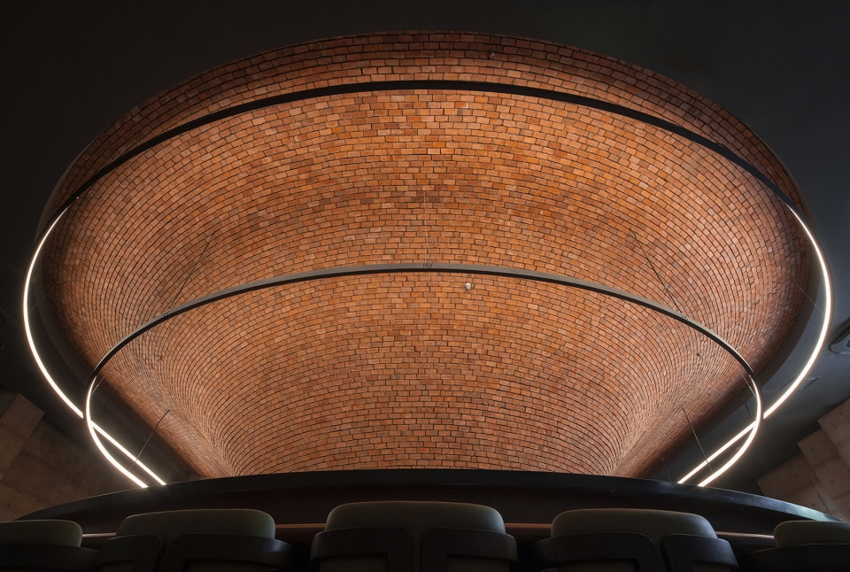
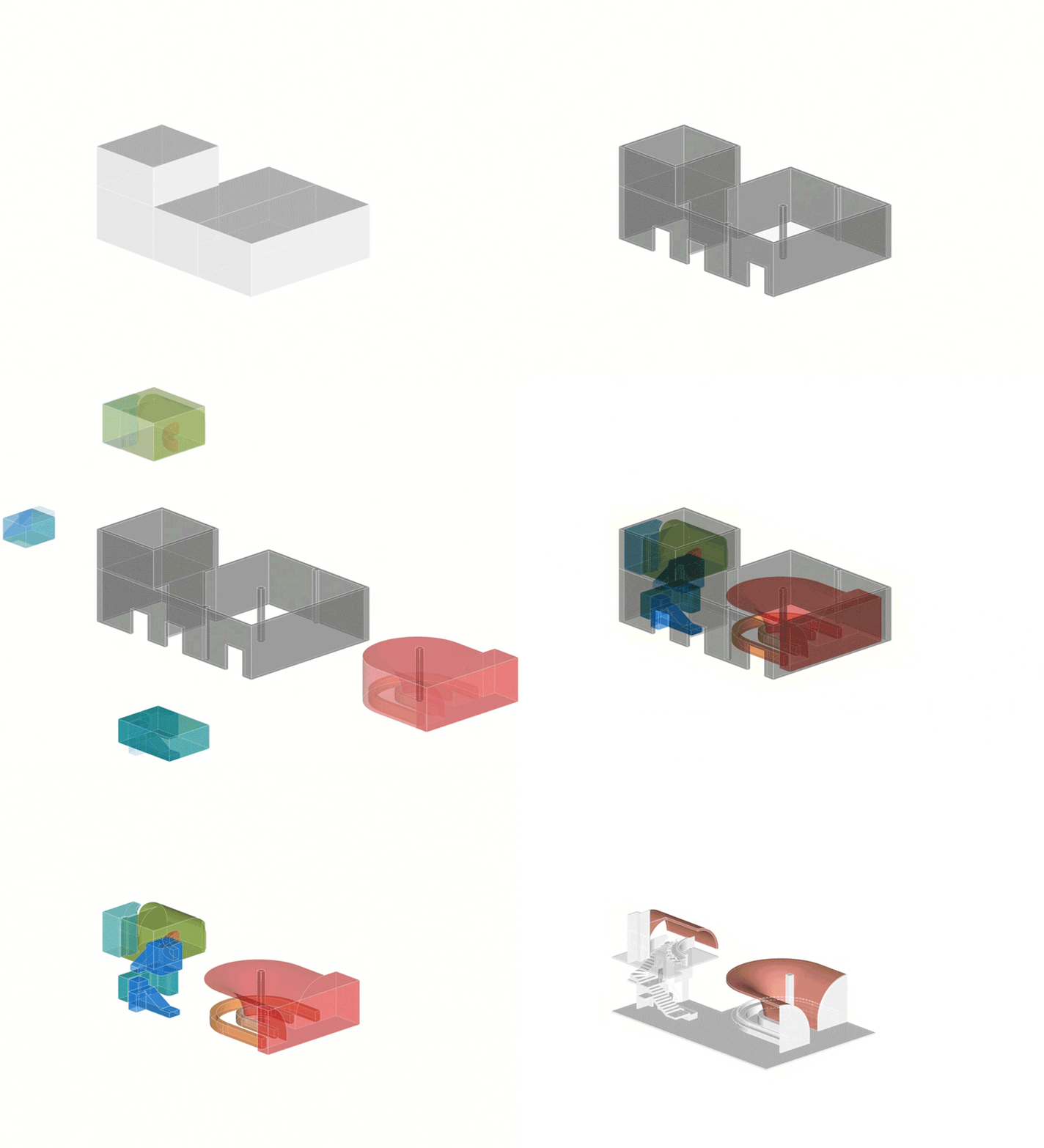
显然,在满足了客容量和主要空间的效率问题后,场地东侧被厨房和用餐区两个较大的功能分区几乎占满,剩下的卫生间、储藏间、员工更衣室等面积较小的服务空间需要巧妙利用现场调解,有机地融合为一个整体,组成一个置于一侧的多功能“核心筒”(基础设施、交通盒)。
While satisfied with the main spaces’ capacity and efficiency, the space’s eastern side is almost completely covered by the two larger functional divisions of the kitchen and dining area. The remaining smaller service spaces such as toilets, storage rooms and staff changing rooms need to be cleverly mediated on-site and organically integrated into one multifunctional ‘core’ (infrastructure and circulation core) placed on one side.
▼空间分析
space analysis ©大人儿工作室
至此,“设计”算是“做完了”。但设计团队不甘心停留在审美和解决问题、提升效率的层面上。私人空间或许能通过某种策略释出一定程度的公共性与社会性。
At this point, the “design” is “done”. bigER club design is not willing to stop at aesthetics, problem-solving and efficiency. Private spaces may be able to release a certain degree of social properties (publicness) through some strategy.
▼操作区
operation area ©吴嗣铭
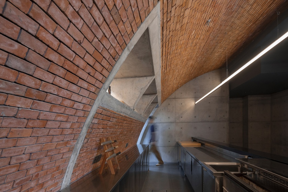
▼看向厨房的开口
openings towards the kitchen ©吴嗣铭
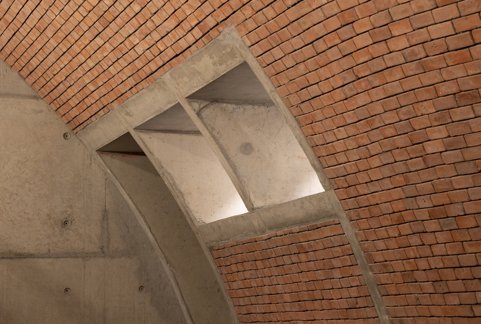
04
“谈些主义”
Talking about some “doctrine”
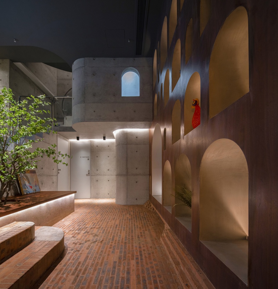
通过对功能空间的大分割,让用餐区和“核心筒”彼此独立但又局部相连,于是有组织地产生了更“有趣”的剩余空间。在对空间可能性上,设计师试图将一部分剩余空间在非用餐时段重新激活,或许能成为新的社交场所和展览空间。
By dividing the central functional spaces, the dining area and the “core” are independent of each other but partially connected, thus creating a more “interesting” residual space in an organised way. Regarding spatial possibilities, bigER club design has attempted to reactivate some of the remaining space during non-dining hours, perhaps as additional social spaces and exhibition spaces.
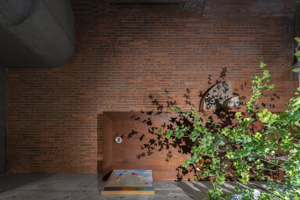
▼休息区
rest area ©吴嗣铭
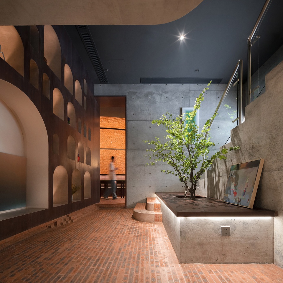
▼休息区细部
details of the rest area ©吴嗣铭
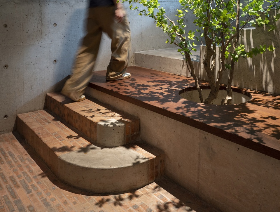
▼通往二层VIP包房的楼梯
staircase to the VIP room ©吴嗣铭
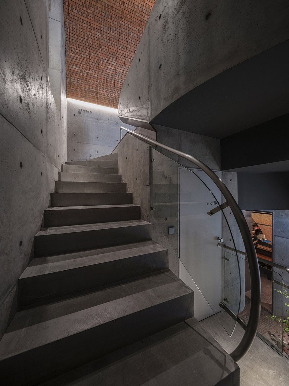
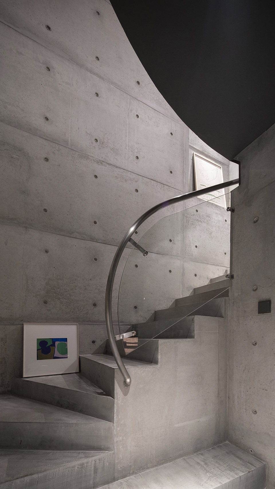
▼从二层俯瞰休息区
overlook the rest area from the second floor ©吴嗣铭
空间形态往往反映着社会形态,也体现出特定阶段的生产关系和底层逻辑。人与空间、人与人、人与物的关系,随着消费和娱乐在互联网的空间赋能下不断被重构,例如“网红”空间在社交裂变的加持下,一定程度上满足了商业空间的利益。
Spatial forms often reflect social forms, as well as the relations of production and underlying logic at a particular stage. The relationship between people and space, people and people, people and things, is constantly being reconfigured with the spatial empowerment of consumption and entertainment through the internet.
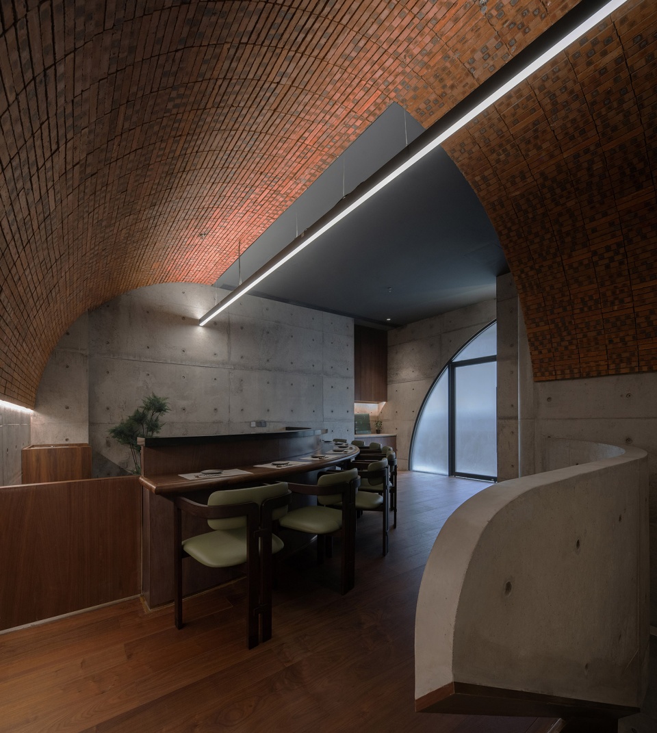
▼二层VIP包房
2F VIP room ©吴嗣铭
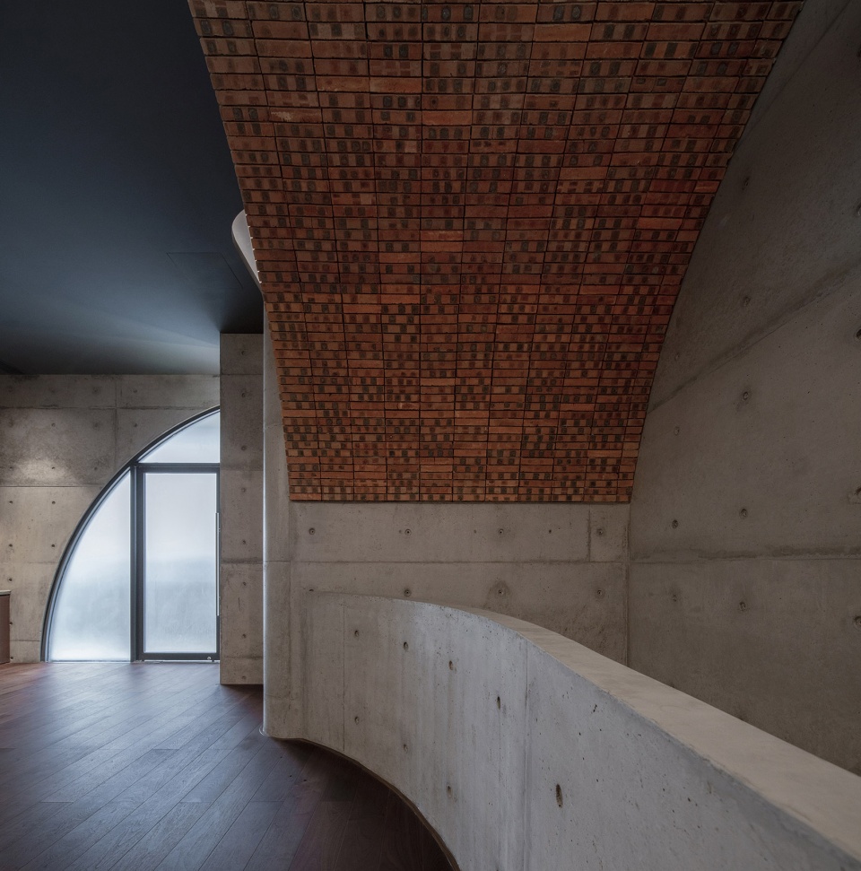
▼墙面细部
closer view to the wall ©吴嗣铭
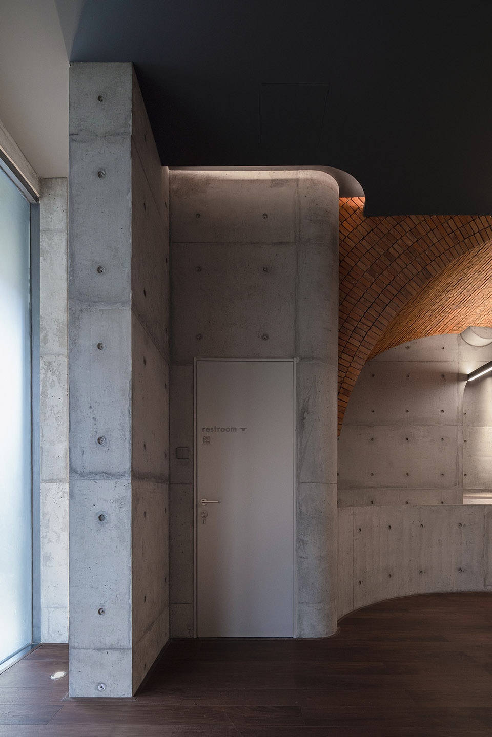
这种满足,在取得某些成效时,就会形成经验,也会导致对“新”的探索被某种流行语境限制住。面对商业空间这一个典型的矛盾体,我们既要尊重商业逻辑,解决问题,同时也要谈些“主义”。
When achieved with some success, this satisfaction can lead to experience and the exploration of the ‘new’ being limited by specific popular contexts. As a typical contradiction in commercial space, we had to respect the commercial logic and solve the problem while discussing some “doctrine”.
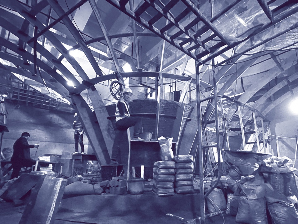
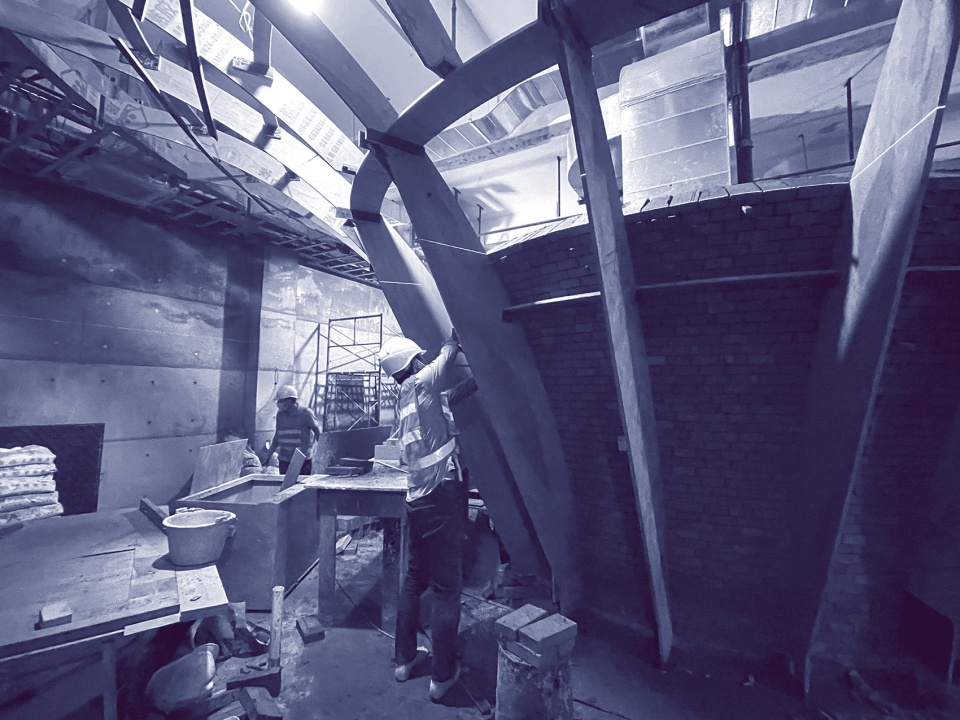
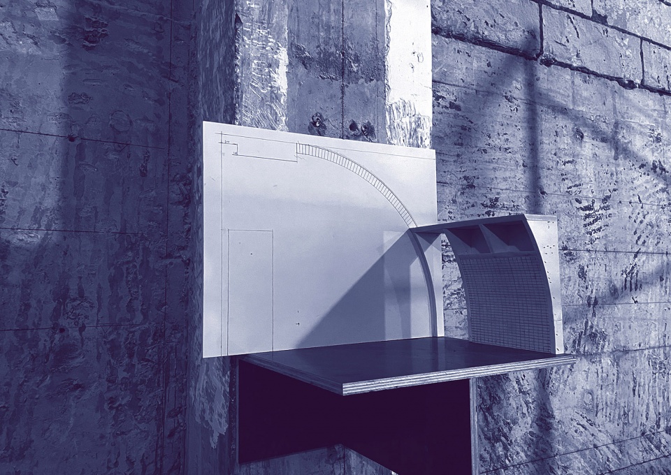
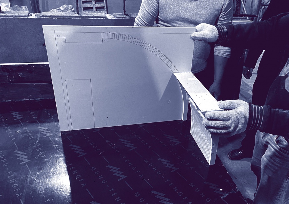
▼施工过程
construction process ©大人儿工作室
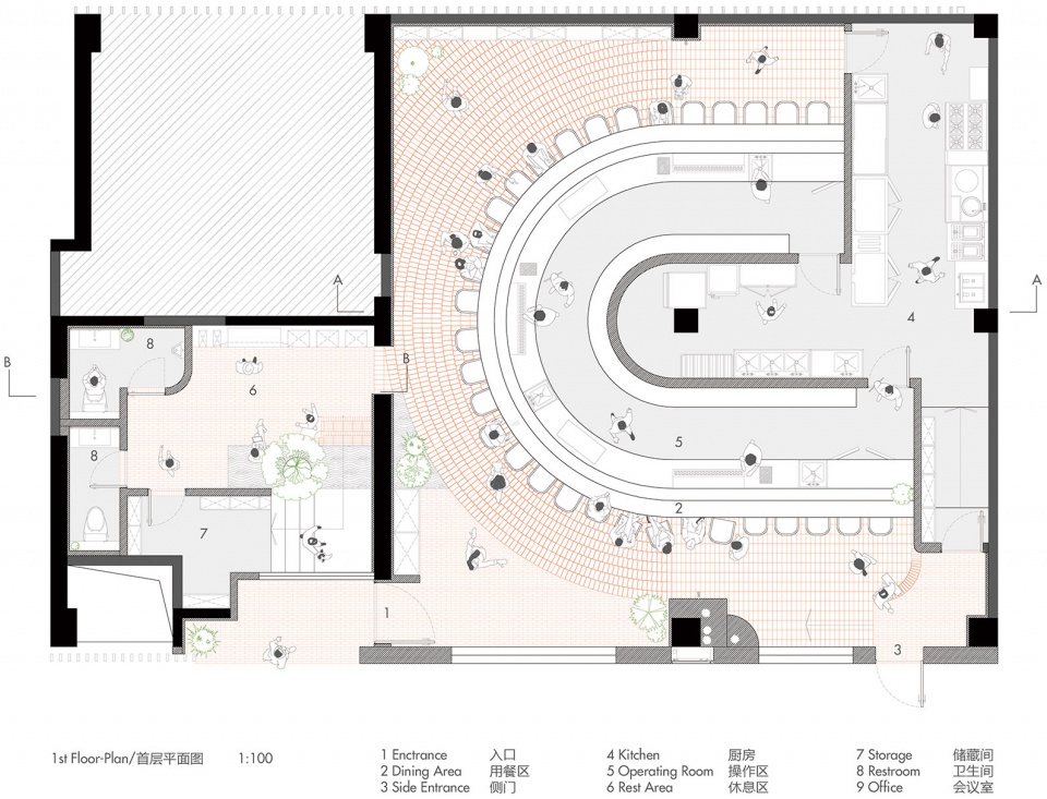
▼平面图
plans ©大人儿工作室
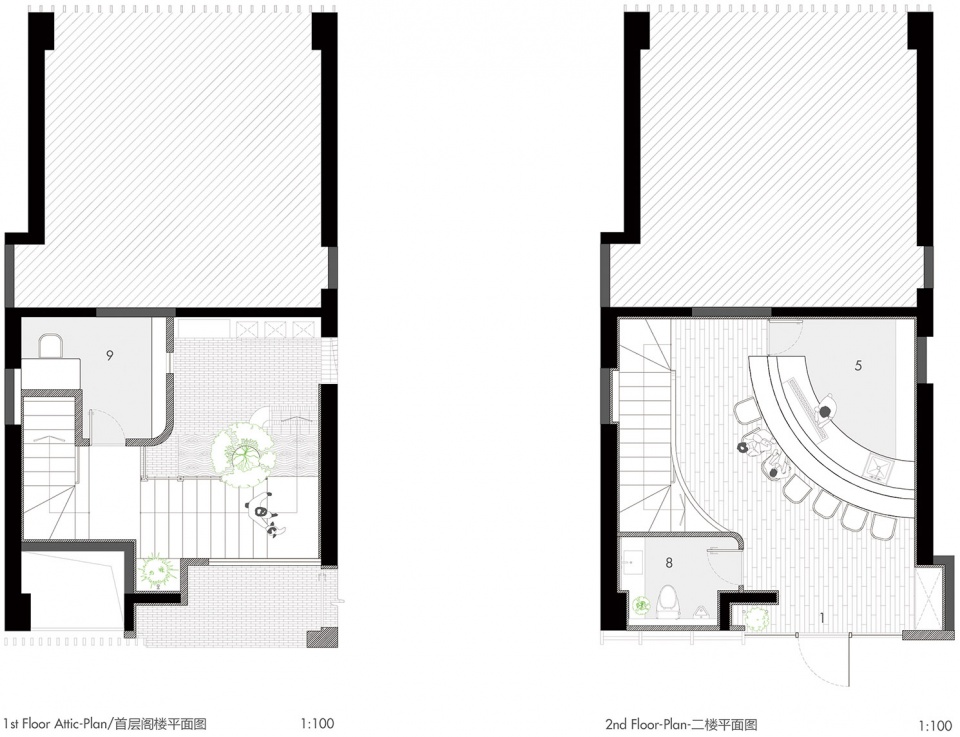
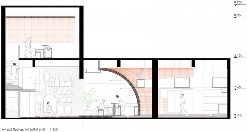
▼剖面图
section ©大人儿工作室
项目名称:Biiird日式烧鸟
项目业主:深圳市木本餐饮管理有限公司
项目地点:广东省深圳市福田区深业中城3号楼一层10-13号
项目面积:274平方米
完工时间:2022年6月1日
设计范围:立面改造、室内设计、灯光、软装
设计公司:大人儿工作室(深圳市大伙儿设计有限公司)
主创设计师:卓俊榕&黄媛
项目摄影:吴嗣铭


