
数理之美,够酷够超逸
The beauty of mathematics
“一切立体图形中最美的是球,一切平面图形中最美的是圆。”——毕达哥拉斯
Pythagoras held that sphere and circle were respectively the most beautiful among all solid figures and plane figures.
有人说,全部两千多年的西方哲学史就是柏拉图的一个注脚而已,但是,柏拉图很可能是毕达哥拉斯的注解。意大利文艺复兴(始于15世纪初,延续3个世纪)继承了古希腊的建筑成就,巩固了数学规律及几何原理作为建筑学的基础,逐渐确立古典建筑美的法则和范式。
Philosopher Alfred North Whitehead quipped once that “the whole of Western philosophy is a footnote of to Plato”. However, Plato is probably a footnote to Pythagoras. The Renaissance began in the early 15thcentury, and lasted for three centuries. It inherited architectural achievements of ancient Greece, strengthened mathematical laws and geometric principles as the foundation of architecture, and gradually established the rules and paradigms of classical architectural aesthetics.
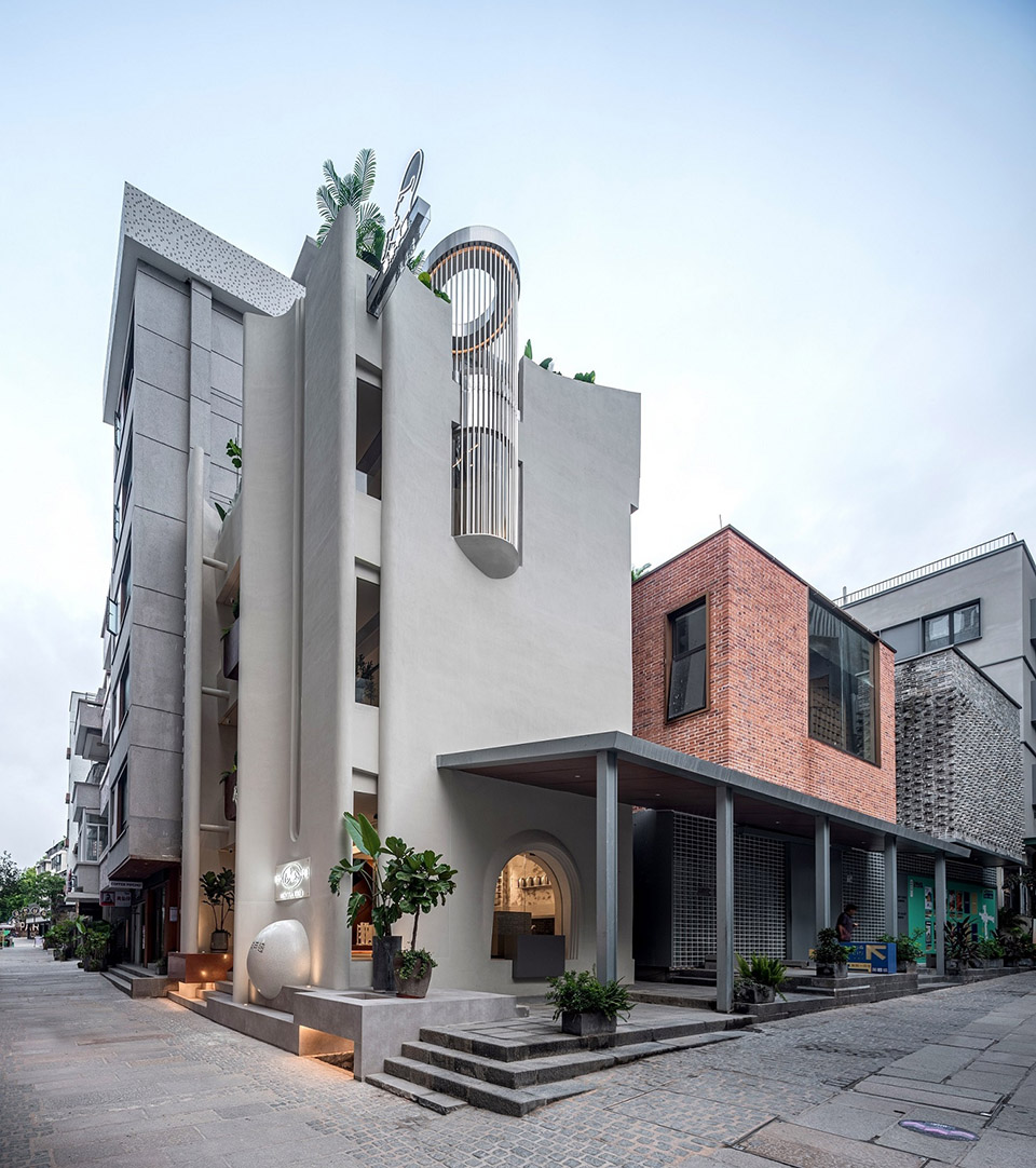
▼项目外观,external view of the project ©Boris
老城墙下讲述新故事
Tell a new story under the old city wall
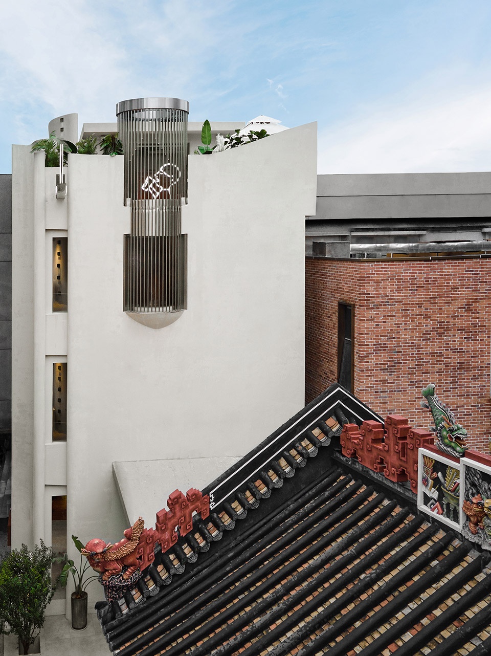
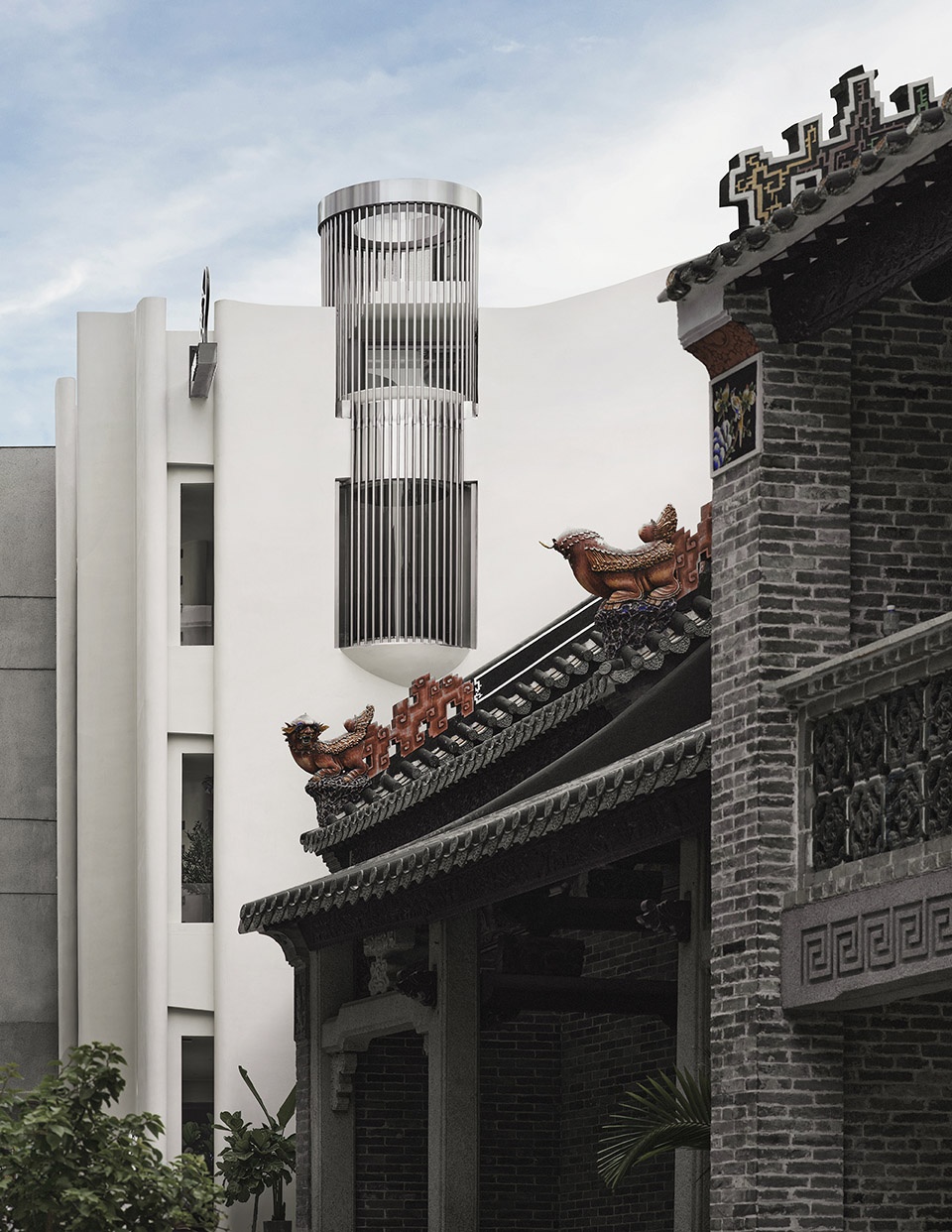
位于深圳中心区域的南头古城有1700余年建城史,是粤港澳的发源地。南头古城改造,旨在打造一个本土文化历久弥新的城市历史文化街区。CCD设计的喜茶南头店,希望将千年文化传承与30余年深圳现代化城市进程并置呈现,成为南头古城重生的一个珍贵的文化样本。
Nantou Ancient Town is located in the central area of Shenzhen, with a history of more than 1,700 years. It is a cultural birthplace of Guangdong, Hong Kong and Macao. Through renovation, this urban historical and cultural neighborhood has been activated and renewed. CCD conceived a Heytea store sited in Nantou. Through integrating the site’s millennia-old cultural heritage and the city’s modernization over the past three decades, CCD team created an example that represents the rebirth of Nantou.
▼建筑与周边的老房子
building and the surrounding old houses ©Boris
不被定义的白色城堡
Undefined white castle
从建筑到室内,CCD以现代手法引入古典的建筑元素,为空间增添永恒的定义。同时结合立体图形中最美的“球”,使空间美学达到极致,打破门店的惯常设计,塑造出“不被定义”的灵感空间。
Based on modern approaches, CCD introduced classical architectural elements to inject timeless charm into the architecture and interior space. The most beautiful “sphere” strengthens the aesthetics of the space, which breaks conventional store design and creates an “undefined” inspiring space.
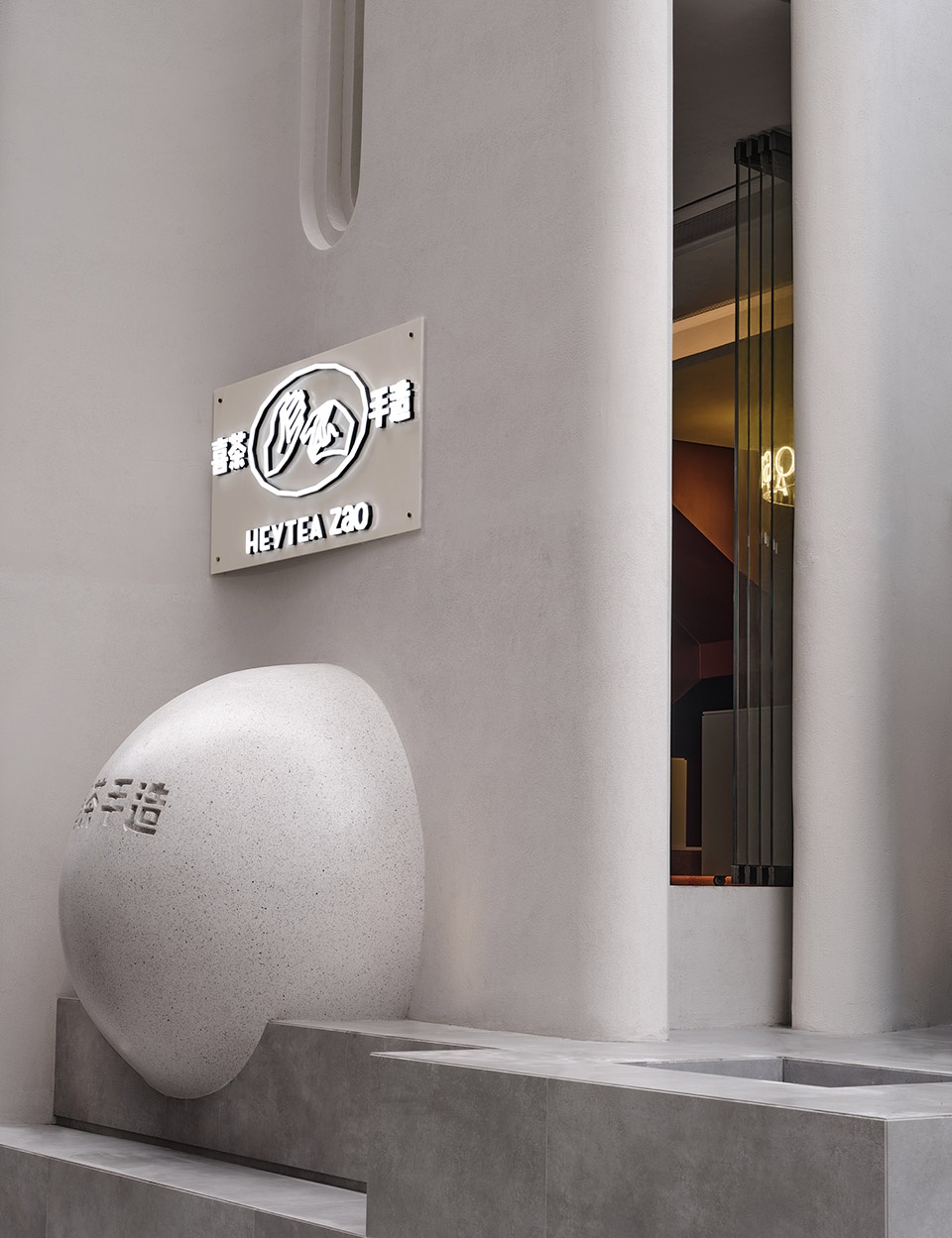
▼立面球体,sphere at the facade ©Boris
维度纵深化
Deepened dimension
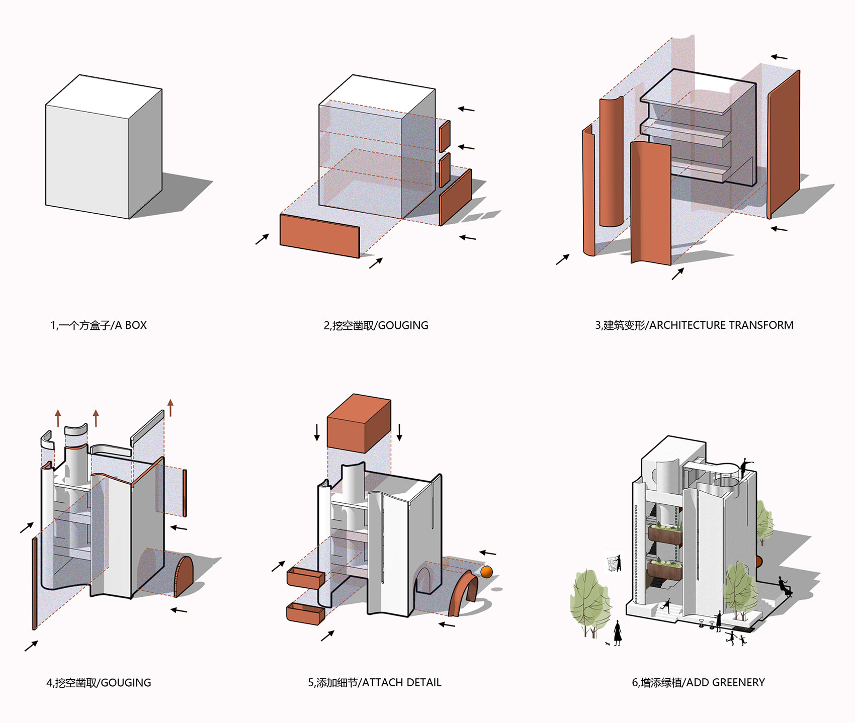
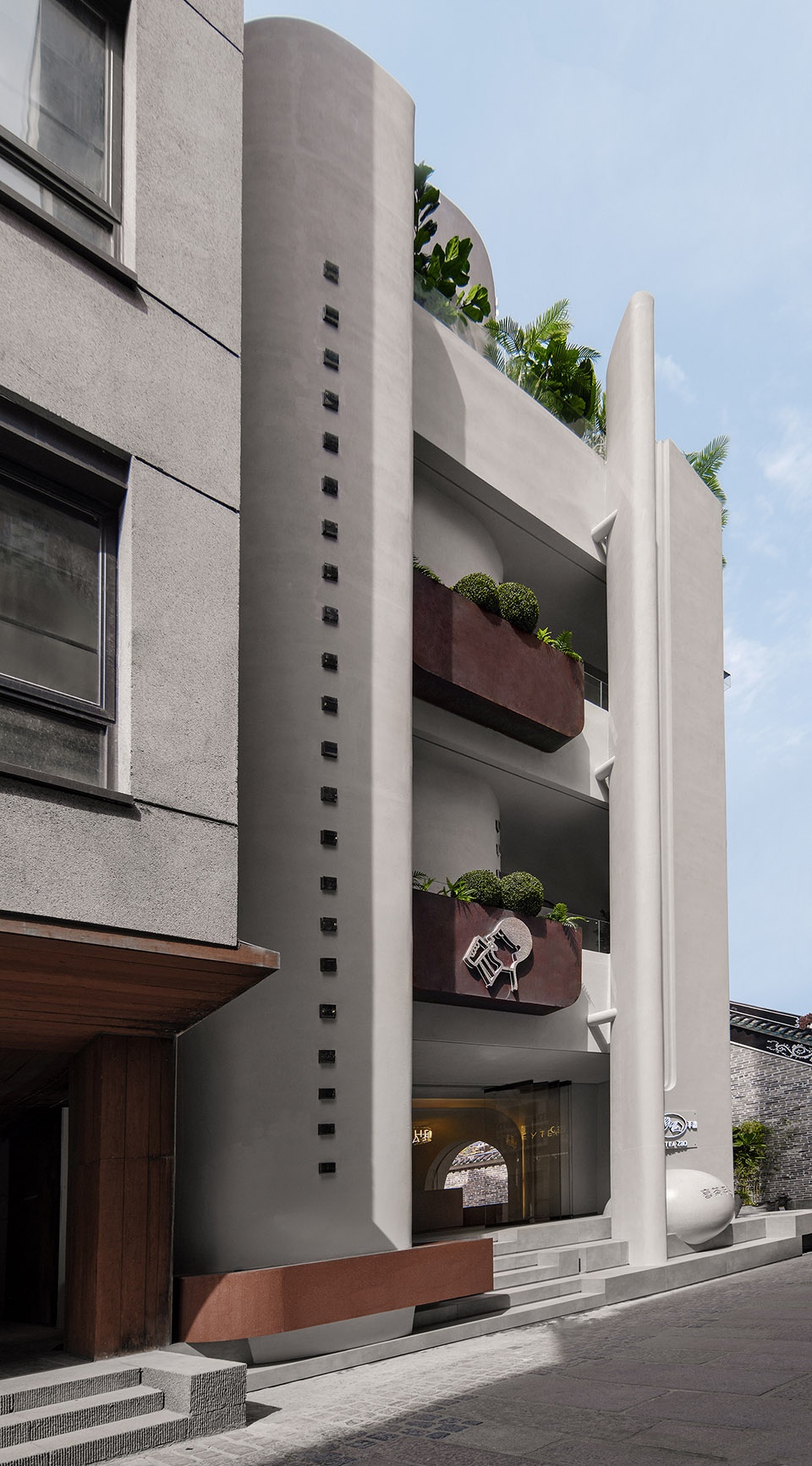
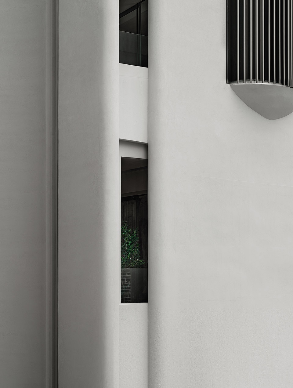
单一的平面体验流线是枯燥的,因此设计师在原来的基础上加入片墙,改变建筑原有的横向形态,强调建筑的纵深感。以圆弧形式去围合外轮廓形成⾼耸的造型墙,通过质感与⾊彩的对比,既界定了空间,又产⽣了空间的视觉冲击。
Considering that single experiential circulation is monotonous, CCD added screen walls to the existing building to change its horizontal form and highlight a sense of depth. The building is enclosed by high, arc-shaped screen walls. The contrast of textures and colors not only differentiates distinct spaces, but also creates a striking visual effect.
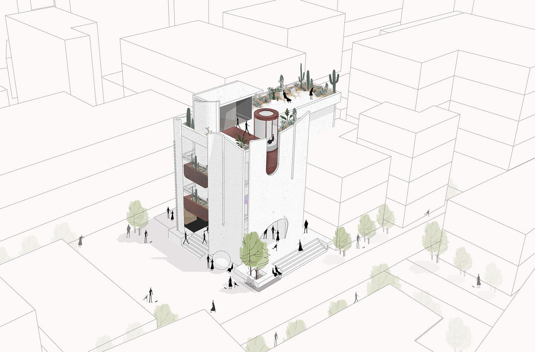
▼建筑演变,architectural generation ©CCD
▼建筑模型图,architectural model ©CCD
建筑社交化
Social architecture
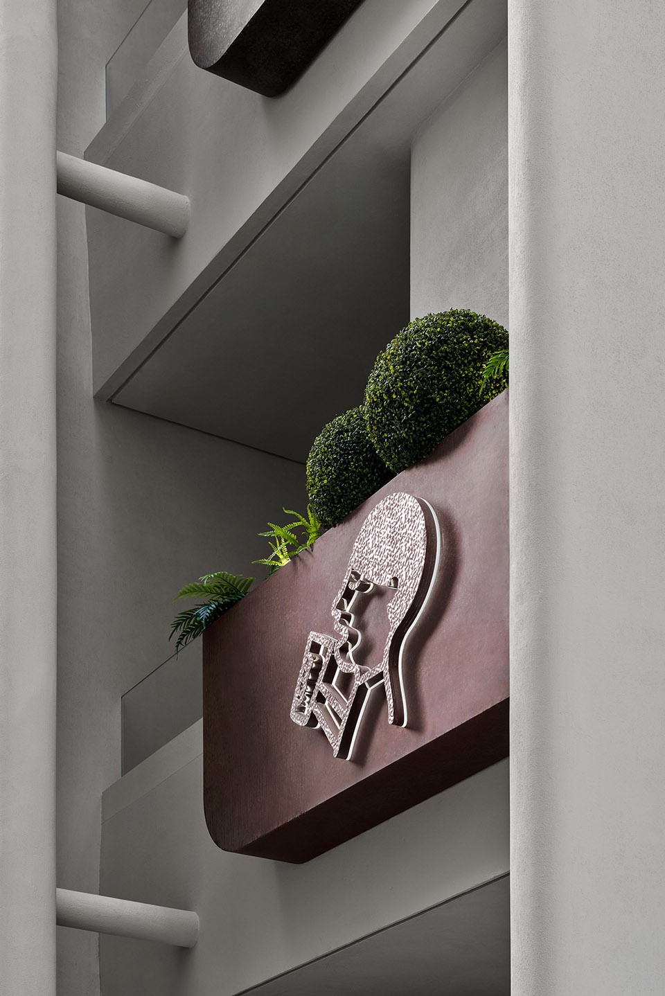
整栋建筑简洁优雅,外立面大面积留白。建筑外立面主要有4面墙,3面墙在外,1面墙在室内,从一楼贯穿至3楼(4楼是屋顶花园)。这片墙从2,3楼的阳台中穿过,使这个空间成为一个可以近距离感受墙体材质、纹理以及造型的地方,年轻人乐于在此拍照打卡。
The whole building reveals a simple, elegant image, with a large area of pure white facades. The facades mainly consist of 4 walls, 3 outside and 1 inside, which run from the first floor to the third floor. A roof garden is set on the fourth floor. The inside screen wall passes through the balcony on 2F and 3F, allowing customers to take a close look at its material textures and form and providing an attractive setting for young people to take photos.
▼建筑外高耸的造型墙
tall arc-shaped screen walls enclosing the building ©Boris
▼墙体与阳台,walls and balconies ©Boris
室内建筑化
Integration of architecture and interior space
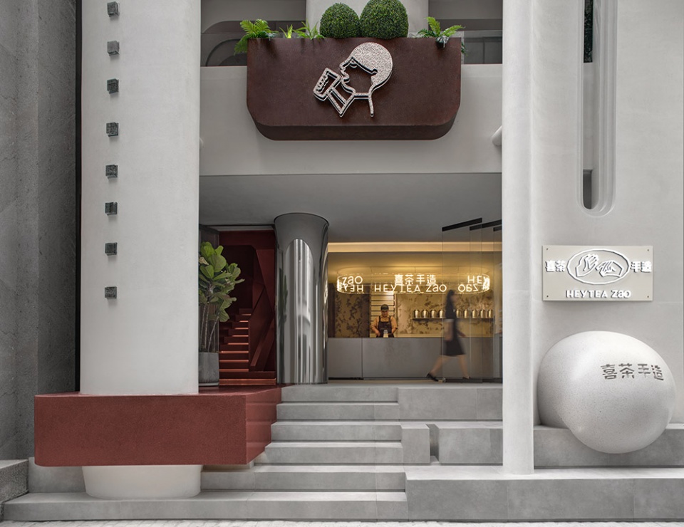
店面一楼入口处向街道延展出一个悬浮的“桌面”,高度与人们在室内用的桌子的高度一致,台阶也设计成为阶梯教室的感觉。人们可以在这里围着“桌子”喝茶聊天,也可以并排坐在阶梯上,边喝茶边看街景,而这些客人也成为了街头的风景。室内与室外,你中有我,我中有你,实践了CCD以一贯之的理念——建筑与室内融为一体。
At the entrance area on the ground floor, a floating “table” protrudes towards the street, which is as high as tables inside. The steps recall the style of lecture hall. Customers can drink tea and chat around this “table”, or sit on the stairs to enjoy tea and streetscape. In this way, they become a part of the street scene. The interiors and outdoor space interpenetrate, which reflects CCD’s consistent design concept of integrating architecture and interior space.
▼入口,悬浮的桌面,entrance with a floating table ©Boris
▼入口细部,closer view to the entrance ©Boris
雨棚下的归来感
The continuation of family warmth
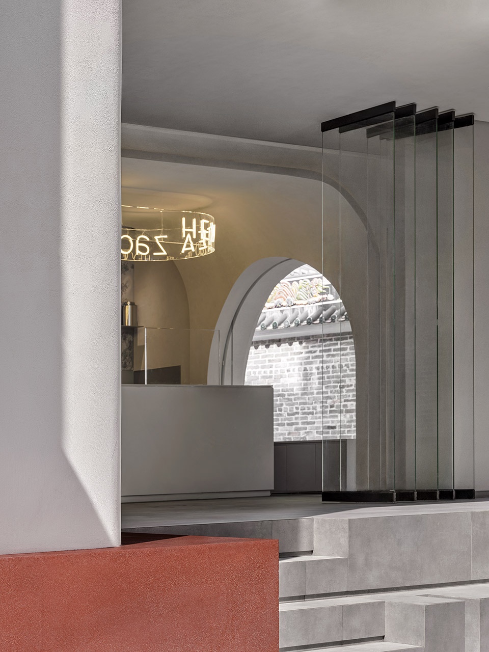
CCD改造和加固了原建筑的外墙体,保留了“屋檐”部分,照顾到原址居民对故居的眷恋之情,让他们觉得祖辈留下的“家”还在,总有一隅天地为你遮风挡雨。这家店没有一个完全封闭的窗户,每扇窗户都是玻璃移动门,通透开放,无论是归家还是过客,总有一盏灯为你守候,让你放下装备,安放内心的真实。
CCD transformed and reinforced the exterior walls of the original building. Considering local people’ attachment to their former residence, the design team retained the eaves, so as to let them feel that their “homeland” left by ancestor is still there and continues to provide a shelter for them. No completely closed window is designed for the store. Instead, transparent, open sliding glass doors are utilized. No matter when local residents return home or pass by, there is always a lamp waiting for them, calming and warming their heart.
▼雨棚下的开放空间,open space under the awning ©Boris
阳台上的邻里间
Neighborly interaction on the balcony
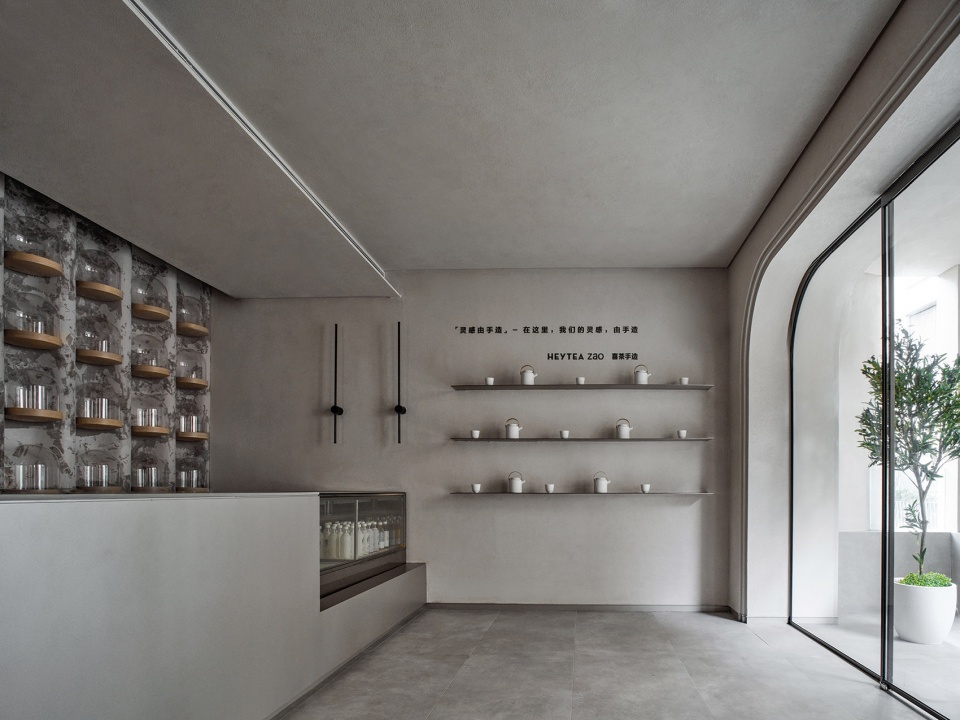
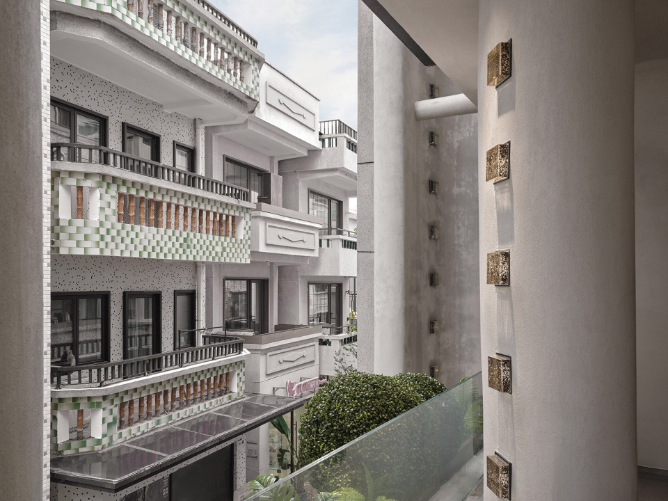
每层仅60多平米的空间,依然推出小阳台,客人可以一边喝着饮料,一边看街上人来人往,还可以和街对面小楼上的“邻居”打招呼、聊天。这些都关照到中国人注重家庭生活、注重邻里关系的传统文化。
Though occupying a limited area of about 60-square-meter, each floor of the store is equipped with a small balcony, where customers can see passers-by on the street and even greet and interact with “neighbors” in buildings across the street while enjoying drinks. The design responds to traditional Chinese culture which stresses family life and the relationship with neighbors.
▼连接阳台的室内空间,interior space continued with a balcony ©Boris
▼阳台,balcony ©Boris
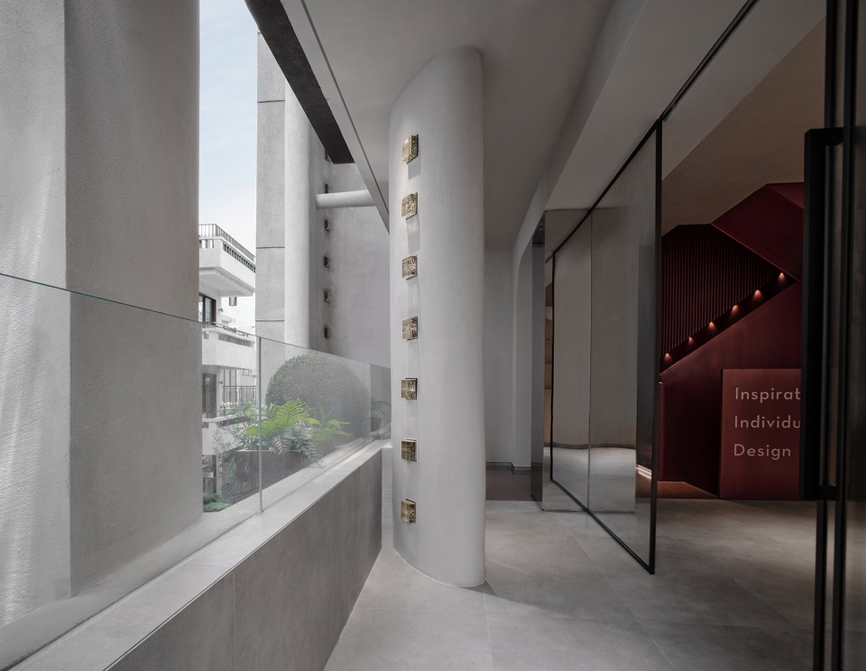
▼从阳台看向室外,view to the outdoor space from the balcony ©Boris
“边界”与“关联”
Create a spatial relationship
斯卡帕曾说:“你需要创造某些关系,来让事物变得生动起来。”
Carlo Scarpa emphasized the necessity of creating certain relationships for architecture.
▼设计分解图,exploded axonometric ©CCD
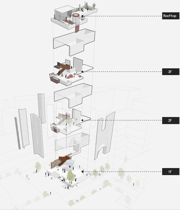
门店内部整体采用岭南复古红与现代极简白搭配,做旧复古肌理漆与现代化金属材质呼应,不仅有效进行功能分区,还体现历史感与现代感的对比、融合。
The interior space adopts a color palette mainly composed of dark red and white hues. The retro textured paint echo modern metal materials, which not only effectively differentiate functional areas, but also showcase the contrast and fusion of history and modernity
▼一层柜台,counter at the first floor ©Boris
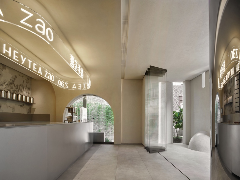
▼柜台细部,details of the counter ©Boris
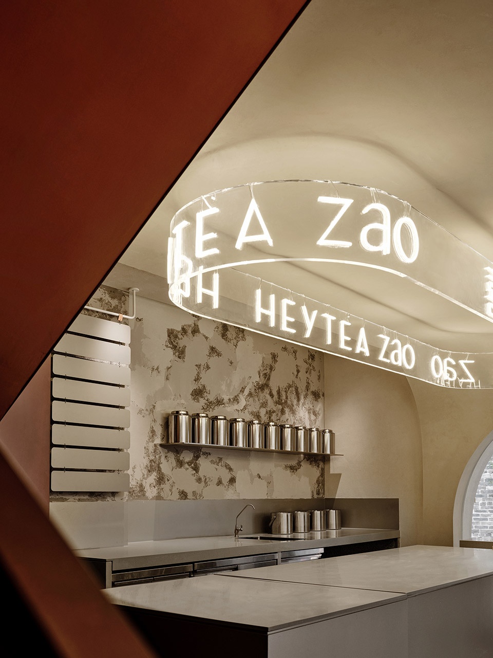
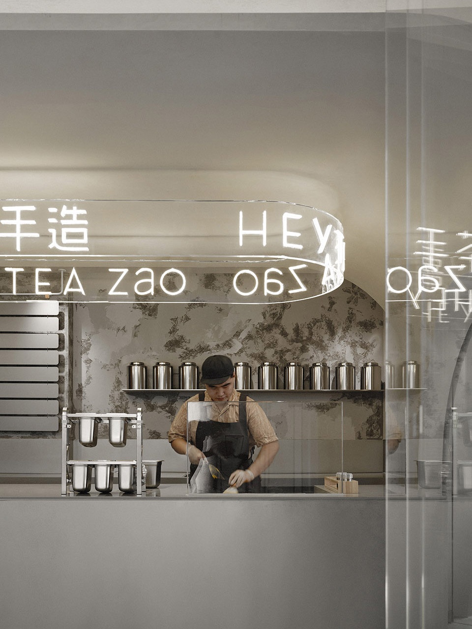
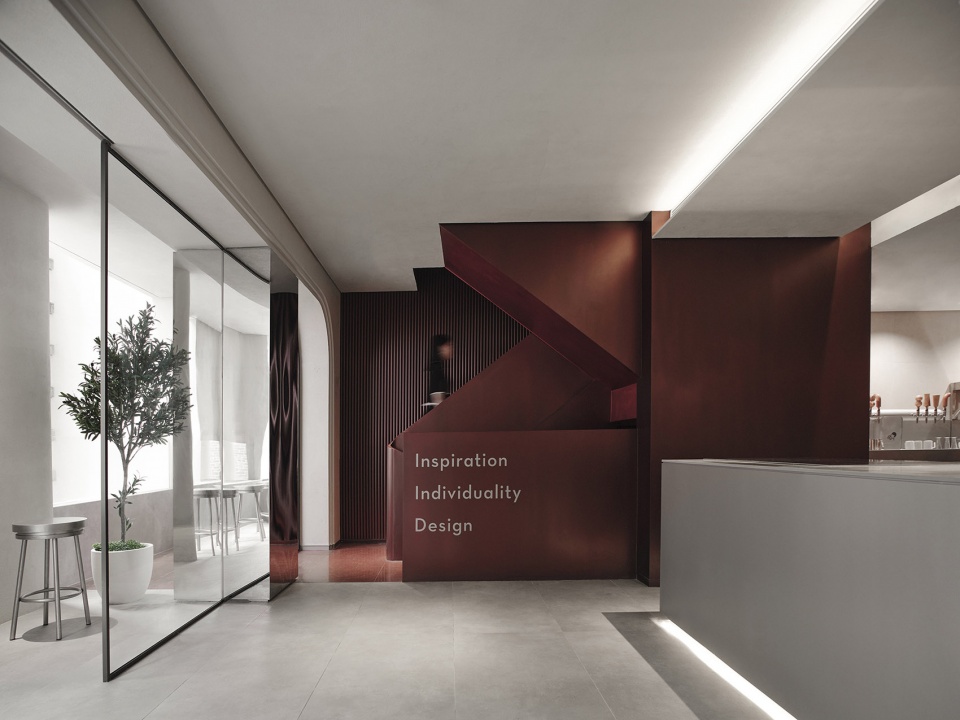
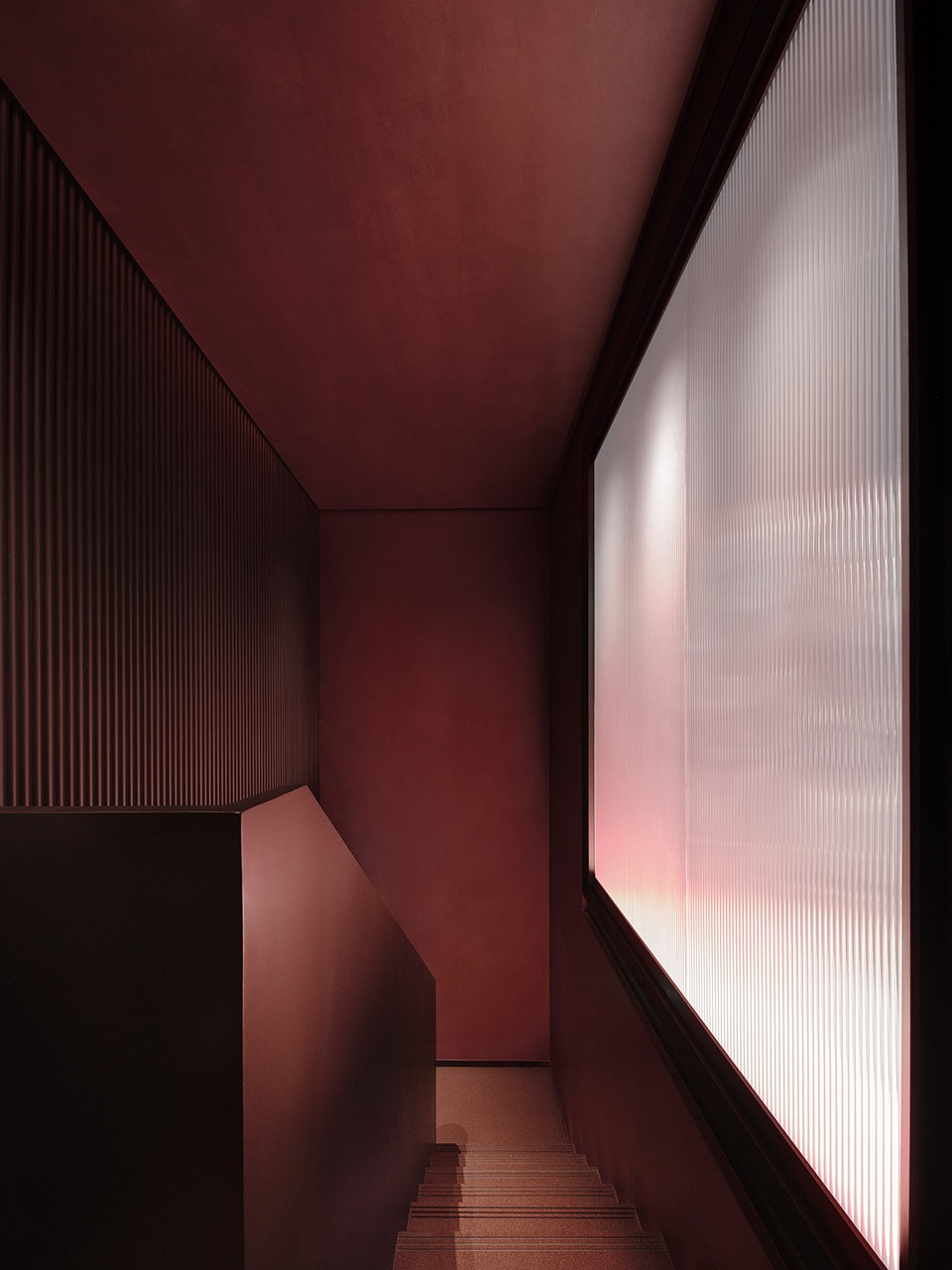
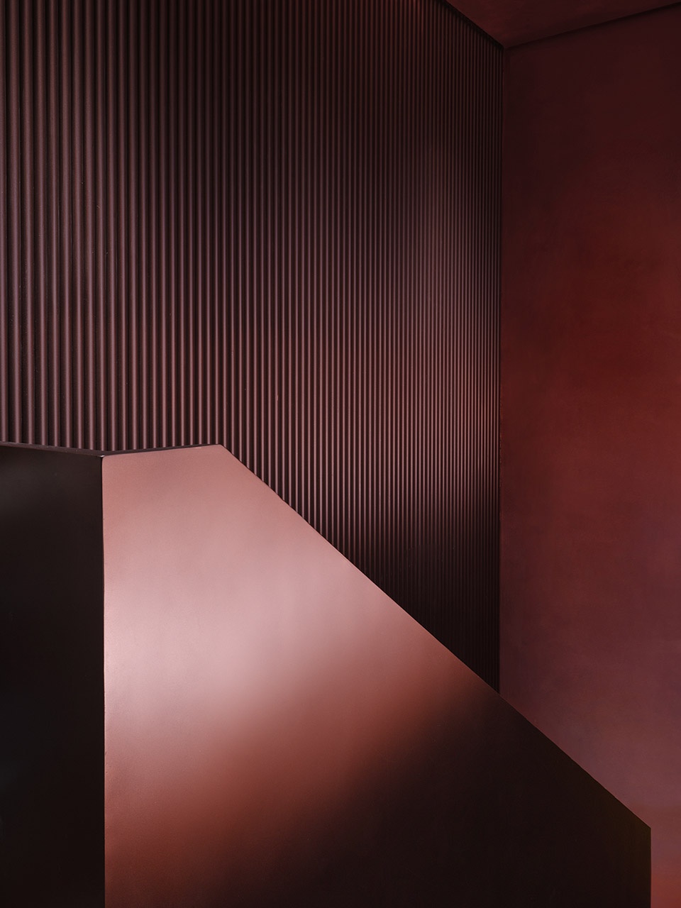
设计师提取属于古城的色彩与纹理,以亮眼的红色楼梯串联起每层的空间关系。高低错落交迭的楼梯结构“边界”,与每层的功能区“之间”的结合,为原始的空间框架内嵌入新的空间关系形成多层次的空间体验。
Through extracting the tones and fabrics of Nantou Ancient Town, CCD built a vibrant red staircase to create a spatial relationship among floors. The “boundaries” of staggered staircase structures are combined with the space “in between” functional areas of each floor, which inserts a new spatial relationship into the existing spatial framework and thus enriches the spatial experience.
▼亮眼的红色楼梯间,vibrant red staircase ©Boris
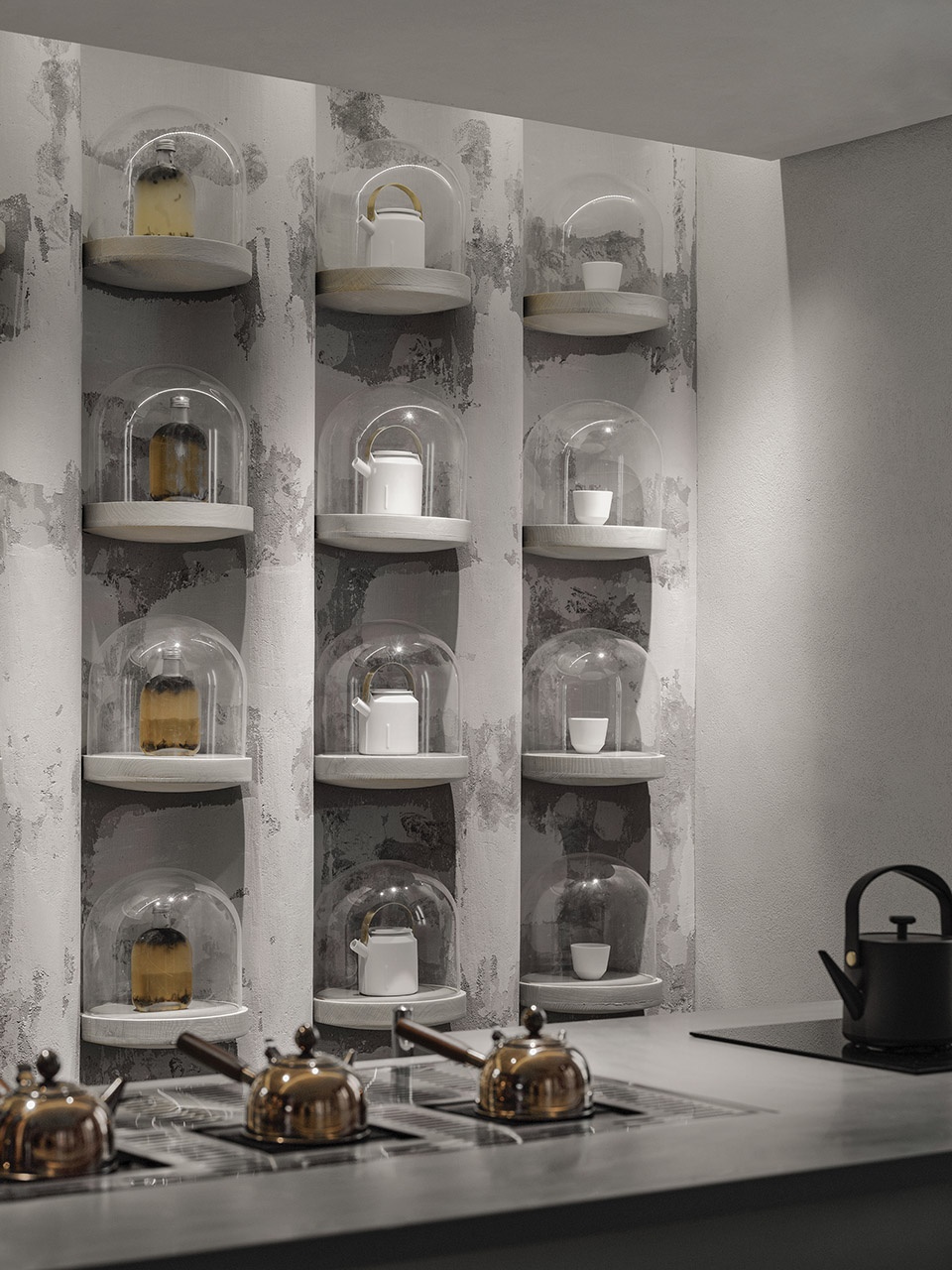
波浪弧形的展示墙让视觉空间逐渐变得广阔,可是本质上始终纯粹。荡漾的「涟漪」、垂坠的「水滴」共同形成丰富的空间接口,弱化了长空间的乏味感。超越理性世界的固有形态,引人置身古城烟雨朦胧的梦幻之境。虚实之间,物我相融,交互通感,回归本真。
The pure curved display wall visually expands the space. The art installation featuring “ripples” and “water droplet” produces rich visual effects, and staves off the boredom of the long space. It goes beyond rational forms, and immerses customers in an artistic, poetic ambience. The installation generates a scene that fuses the real and the virtual, and resonates with customers.
▼上层波浪形的展示墙,corrugated display wall on the upper floor ©Boris
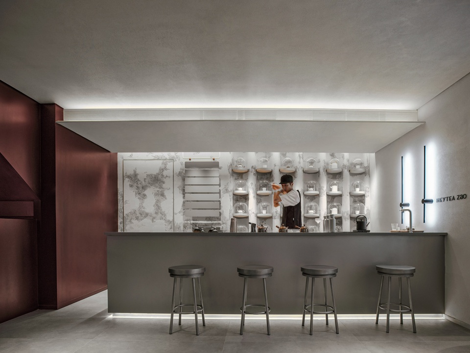
▼展示墙和操作台细部,details of the display wall and the operation table ©Boris
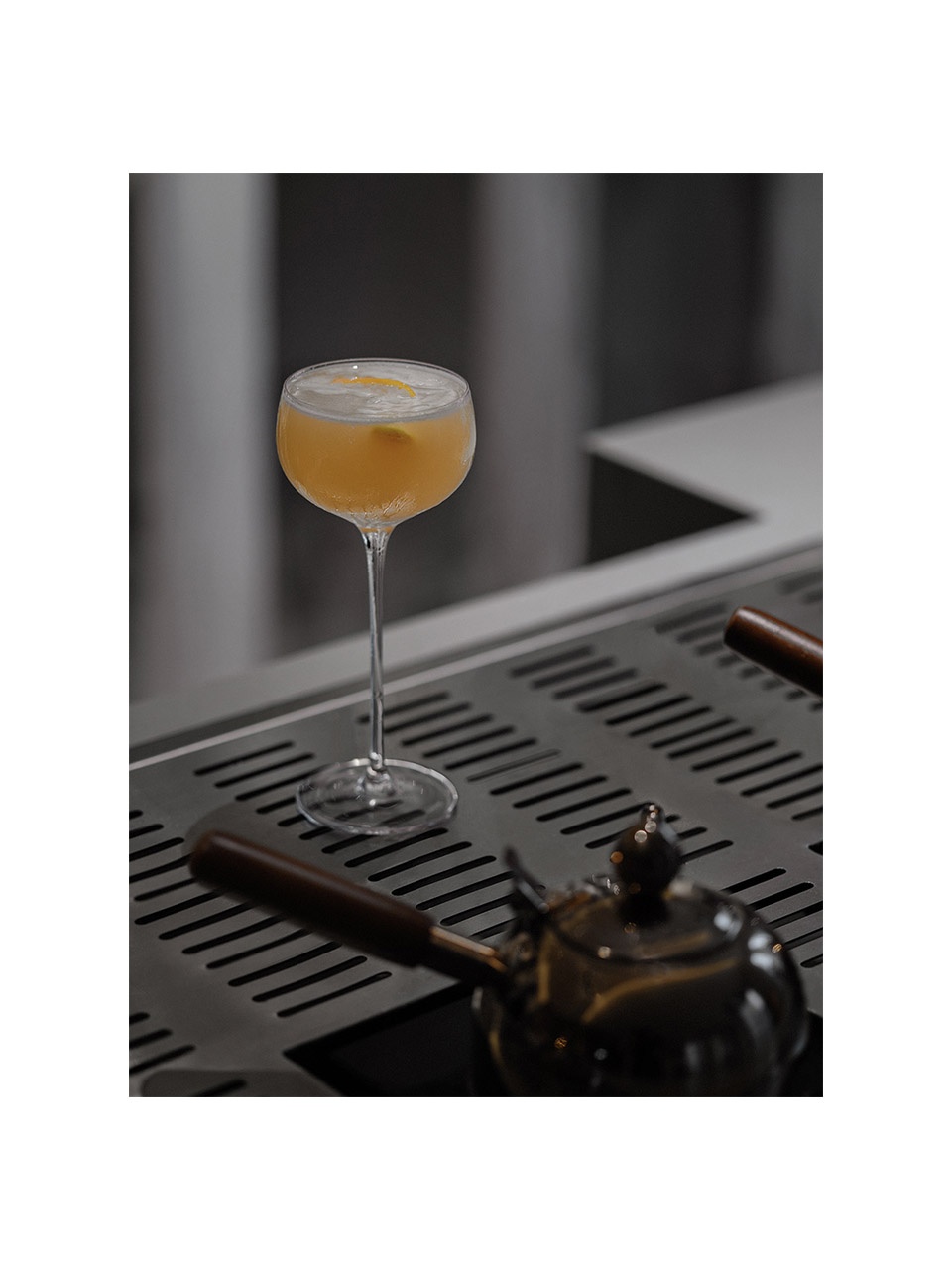
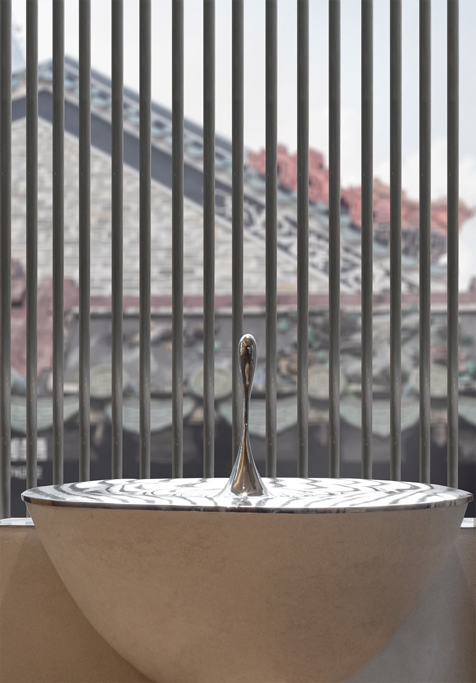
「水滴」犹如空间的精灵,成为完善空间的语言,它镶嵌着历史、象征、符号与隐喻,交织出一套系统的、兼容回忆与希望的「梦境」——方其梦也,不知其梦。
The “water droplet” is a design language that perfects the space. It is also a historic symbol and metaphor, creating a dreamy scene that incorporates memory and hope.
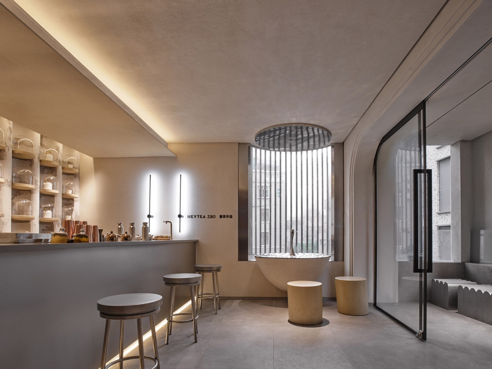
▼窗边的座位区,seating area beside the window ©Boris
▼水滴桌面,table with “water droplet” ©Boris
细部之诗
The details of the space
“细部”是对神(自然)的崇爱。——路易斯·康
“The detail is the adoration of Nature.” — Louis Kahn
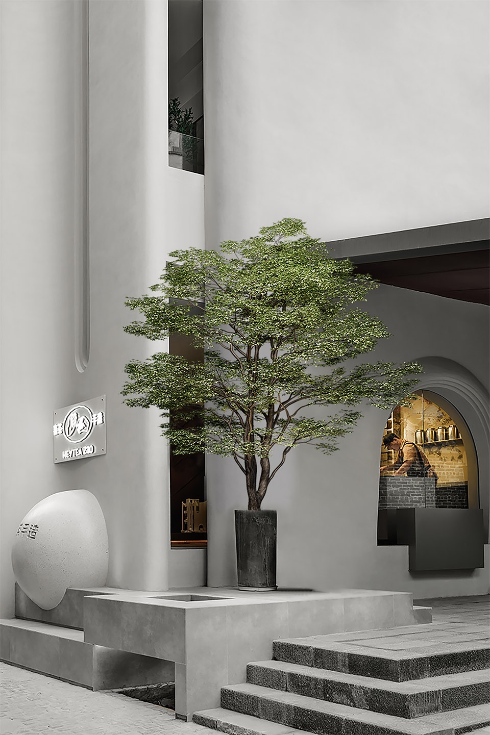
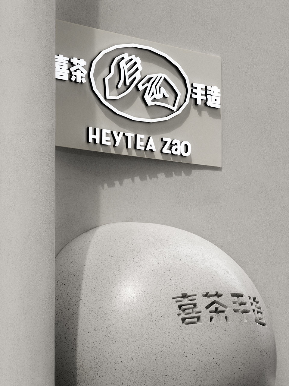
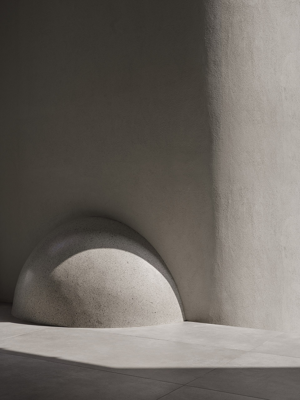
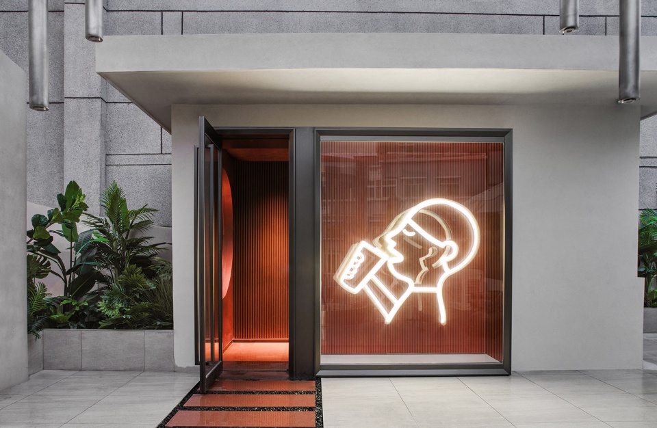
外部刻有“喜茶手造”字样的球体,是贯穿整个设计的游戏角色雕塑,即是引导者,承接着每一个篇章的始终,亦是见证者,与观者建立互动。在主题统一、支线独立的空间布局里,绘出明晰的故事线。球体一般露出室外,一半隐于室内,创造出多维立体的空间效果,充满了互动性和趣味性,带着初次见面的欣喜,人们毫不犹豫地迈入。
The sculptural sphere engraved with the characters “Heytea Zao” plays a guiding role and runs through the whole design. It is a witness that establishes interaction with viewers. In the space with a unified theme and diversified expressions, it helps tell a clear spatial narrative. Half of the sphere is exposed outside and half is hidden inside, creating a multi-dimensional spatial effect. It’s interactive, fun and surprising, attracting passers-by to step inside with joy.
▼入口处带有logo的球体,sphere with logo at the entrance ©Boris
人间星光
Rooftop art life
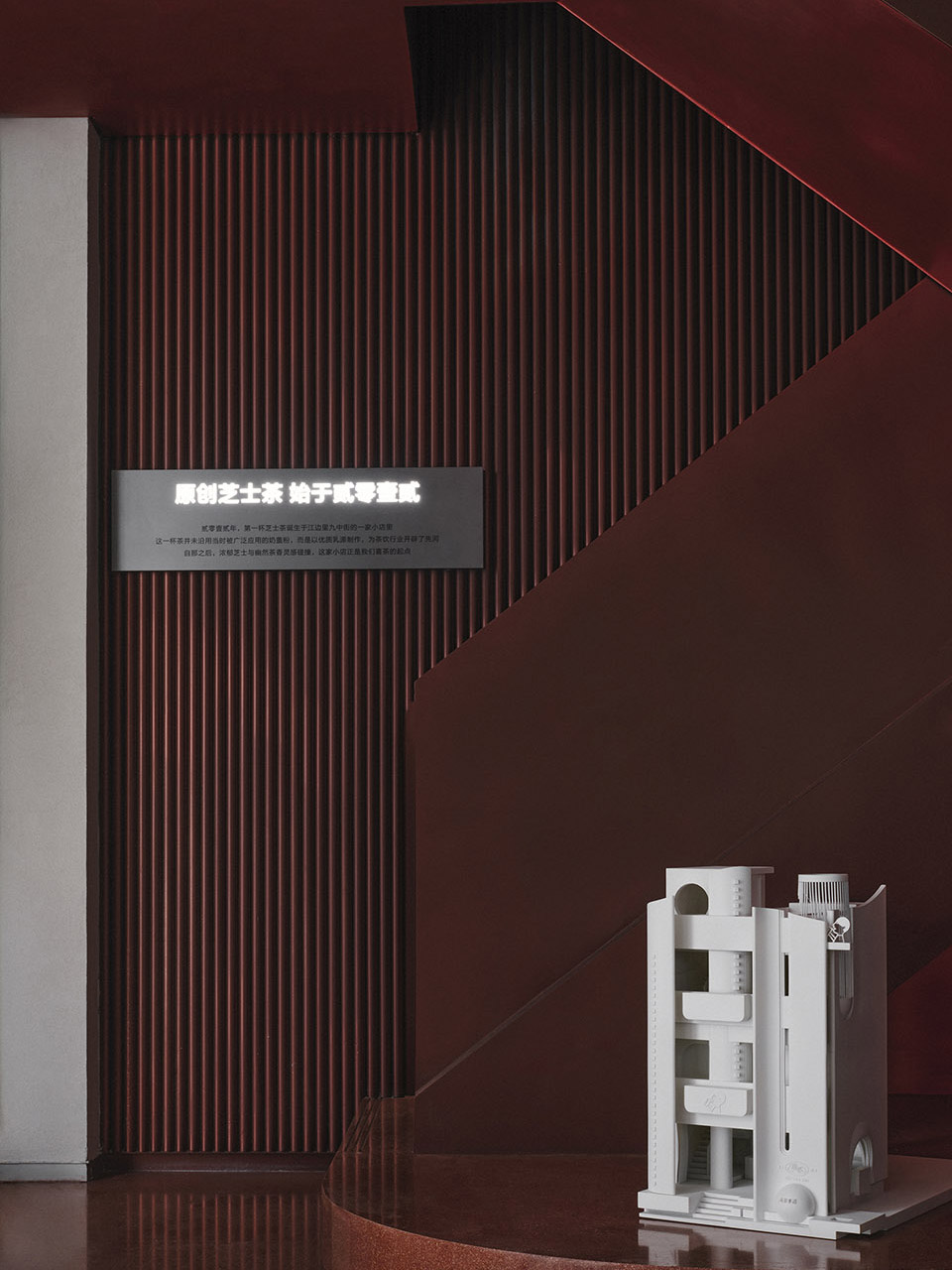
人其实在活在两个世界里,外在追求成功,但是内在寻求愉悦和满足。唯美、逐美的心态是对于客观功用的超越,恰恰能满足人的内心,比如喝杯茶,聊聊天,发发呆,晒个太阳。一个人可以怡然自得,一群人可以纵情狂欢,如同四季的本色流转,无拘洒脱。喜茶南头店的四楼天台,就是这样一个场所,可独处,可聚集。人性尺度的自然设计,达到自然和谐的环境。
We mankind actually live in two worlds, where we seek outward success and inward pleasure and satisfaction respectively. The project’s pursuit of aesthetics goes beyond functions, which meets people’s spiritual needs. People can drink tea, chat with friends, enjoy being lost in thought and bathe in the sun here. The rooftop terrace on 4F enables customers to stay alone or gather with friends. The human scale-friendly design creates a natural, harmonious environment.
▼红色的楼梯间细部,details of the red staircase ©Boris
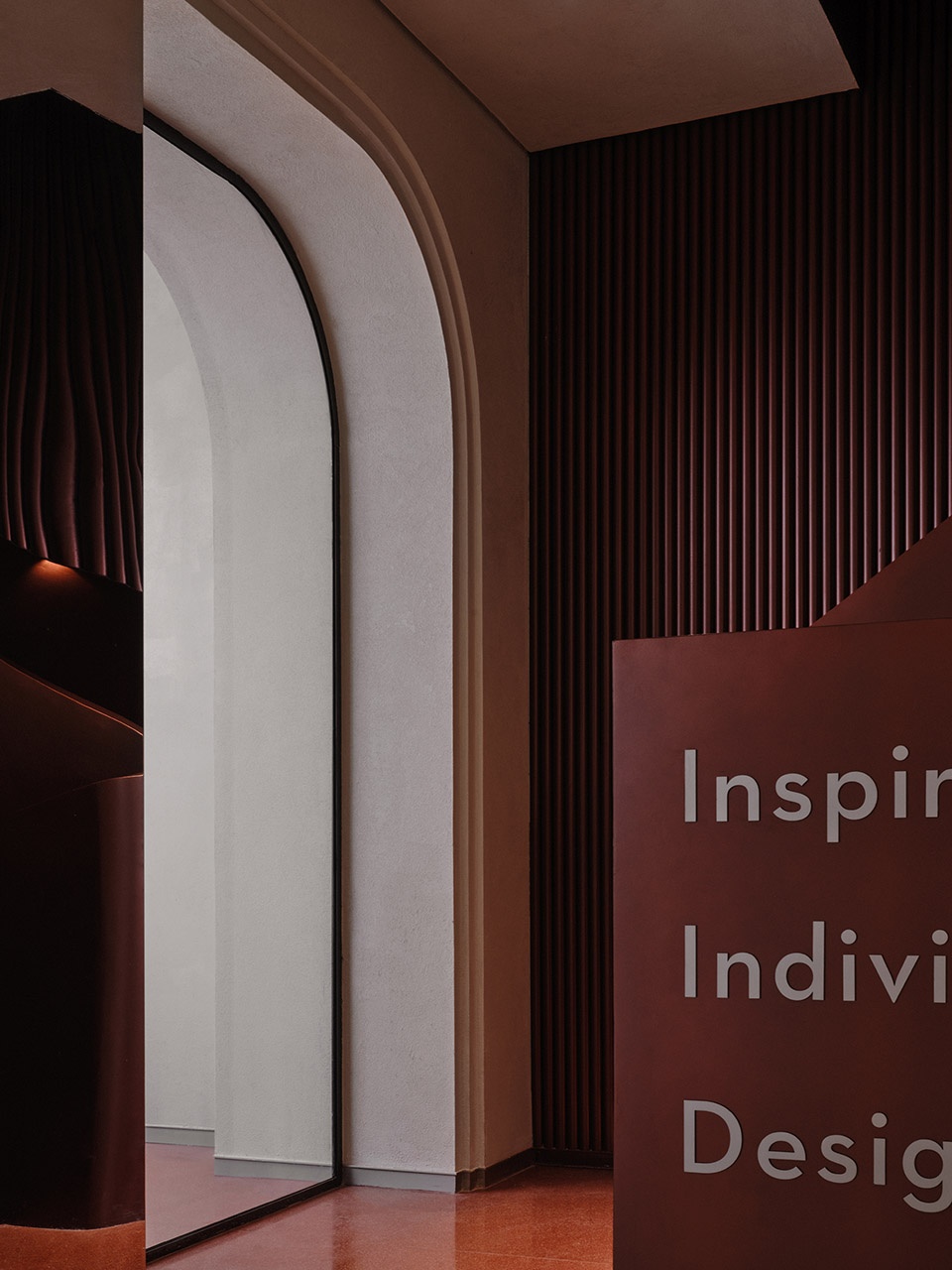
红色的流线型灯带,以现代的方式传递各种可变性及魔幻戏剧效果。沉浸式的体验包裹在空间上方,形成一种特殊震撼的氛围感。创造出酷炫、时尚且高级的空间氛围用以诠释喜茶“不被定义,不被局限”品牌的理念。
Red linear light strips render a variable, magical and dramatic effect in a modern manner. The design brings customers an immersive experience, and produces a distinctive, compelling atmosphere. The cool, stylish and classy spatial ambience interprets the “undefined and unrestricted” brand image of Heytea.
▼高吧台区,bar on the roof ©Boris
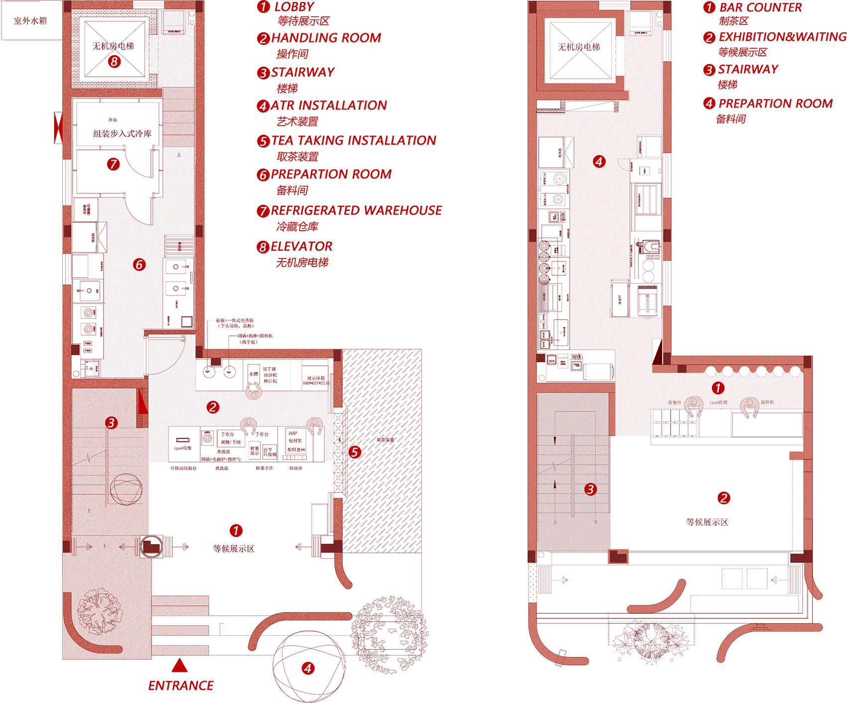
▼(左)1F平面图,(右)2F平面图
(left) 1F plan, (right) 2F plan ©CCD
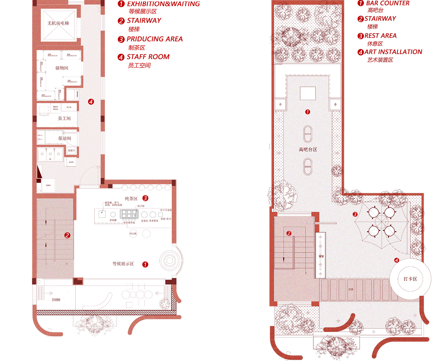
▼(左)3F平面图,(右)4F平面图
(left) 3F plan, (right) 4F plan ©CCD
项目名称:南头古城喜茶手造旗舰店
项目业主:喜茶
项目地址:深圳市南头古城
项目面积:300㎡
完工时间:2021年9月18日
项目摄影:Boris


