
Waku Waku是一家位于墨尔本中央商务区的全新的当代日本餐厅,引人入胜的室内结合其品牌符号,捕捉到低调的优雅和简朴的侘寂美学。我们采用古老的日本哲学,以具有丰富纹理的色调,在瑕疵和短瞬中发现美的存在,颂扬物质的自然美学。
Waku Waku, a new contemporary Japanese restaurant in the Melbourne CBD, captures the understated elegance and simplicity of wabi-sabi in an inviting interior coupled with an iconic brand identity. We embraced the ancient Japanese philosophy, which finds beauty within imperfection and transience through a highly textured palette, celebrating the natural aesthetics of materiality.
▼室内概览,interior overview © Timothy Kaye
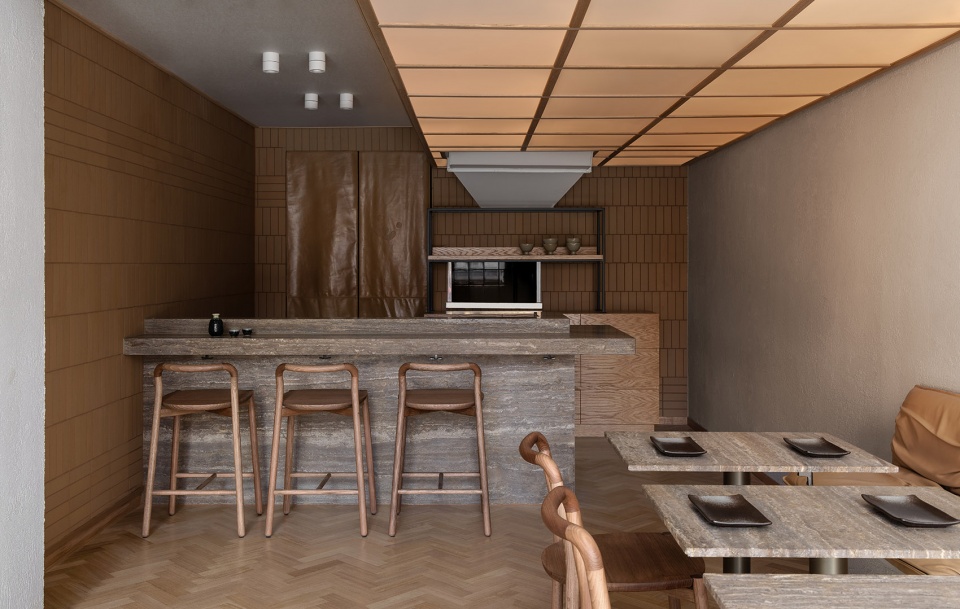
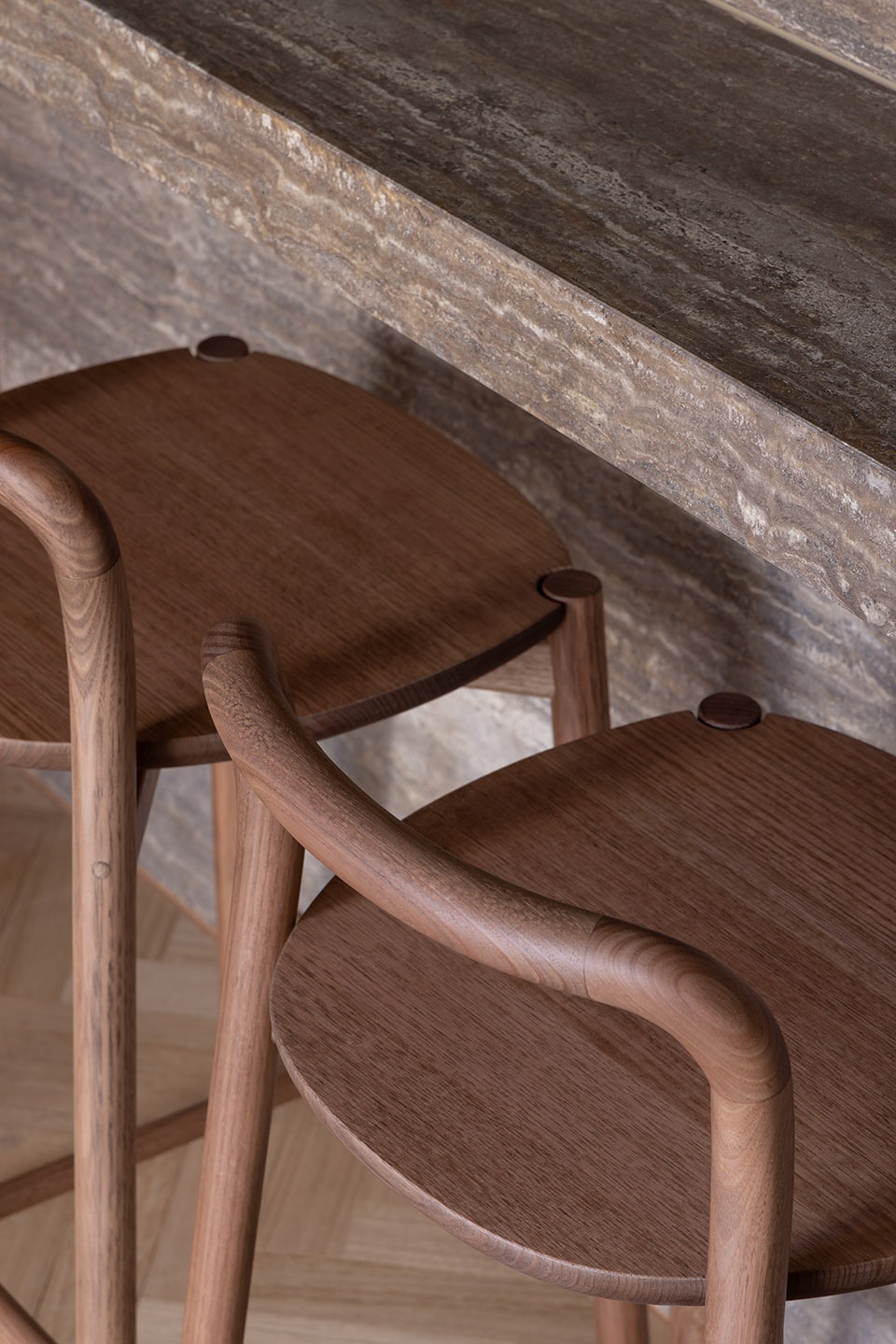
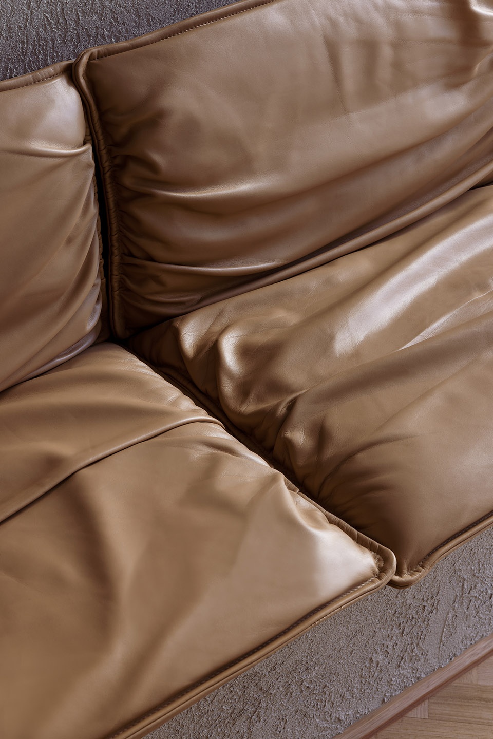
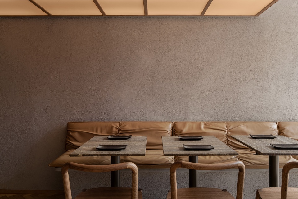
人字形木地板、棕褐色瓷砖和软粘土粗抹灰的墙壁共同创造了一个温暖亲密的空间。洞石钛质柜台和桌面、栗色点缀的木质座椅以及沙色的褶皱皮革家具为用餐体验增添了丰富的触感。这种色调揭示并突出了天然材料的不规则和纹理,帮助顾客在享受用餐时感受到宁静,增进对美的欣赏。
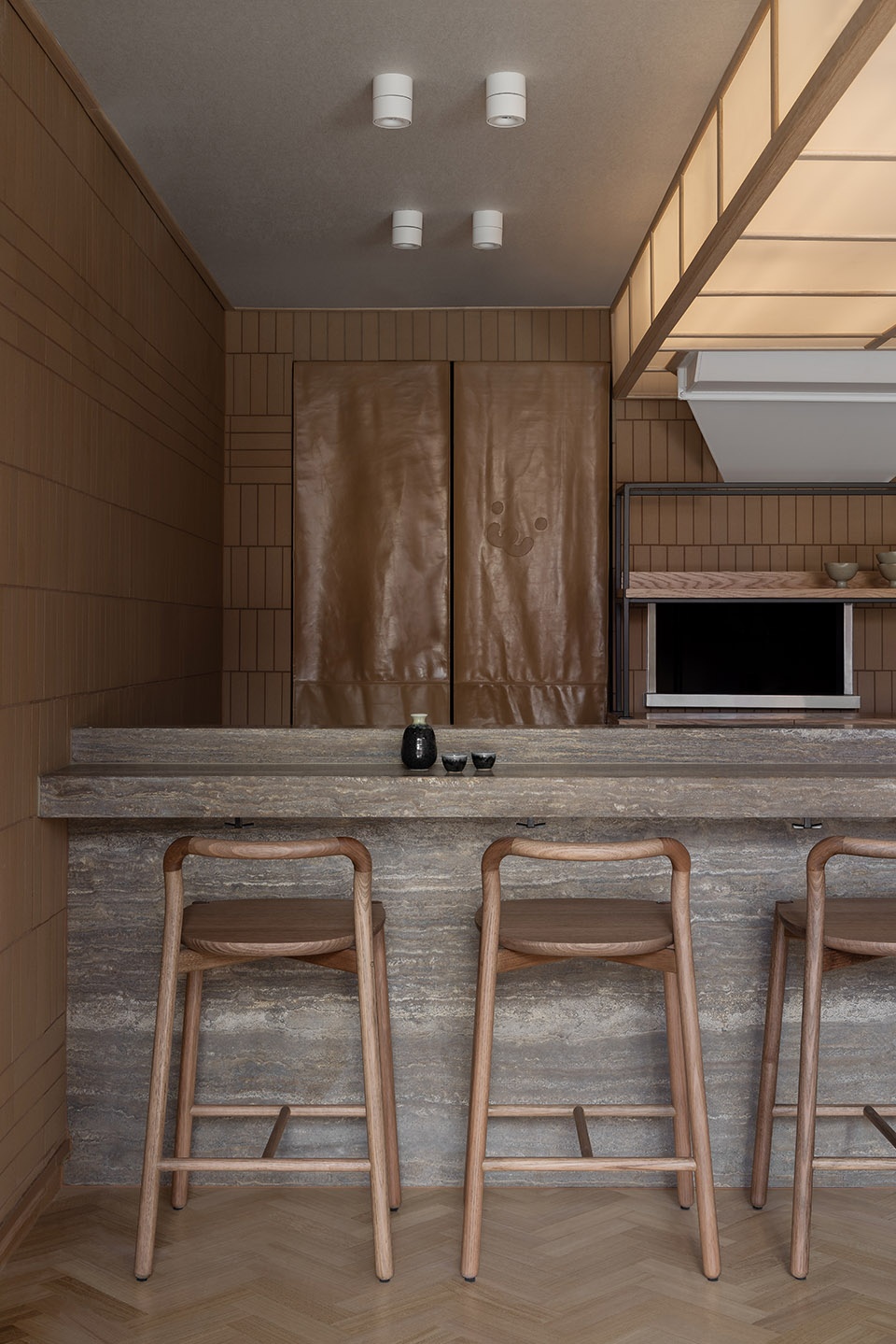
Herringbone timber flooring, tan-coloured porcelain tiles and soft-clay rough-cast rendered walls create a warm and intimate space. The travertine titanium counter and tabletops, chestnut-stained timber seating and sand-coloured crinkled leather upholstery add further tactility to the dining experience. This palette reveals and highlights the irregularities and textures of natural materials, fostering an appreciation of beauty and a sense of tranquillity while customers enjoy a dine-in meal.
▼整体内饰采用人字形木地板和棕褐色瓷砖,overall interior appearance with herringbone timber flooring and tan-coloured porcelain tiles © Timothy Kaye
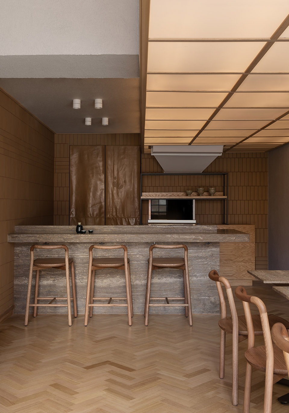
▼吧台区域,counter area © Timothy Kaye
▼软粘土粗抹灰的墙壁,soft-clay rough-cast rendered walls © Timothy Kaye
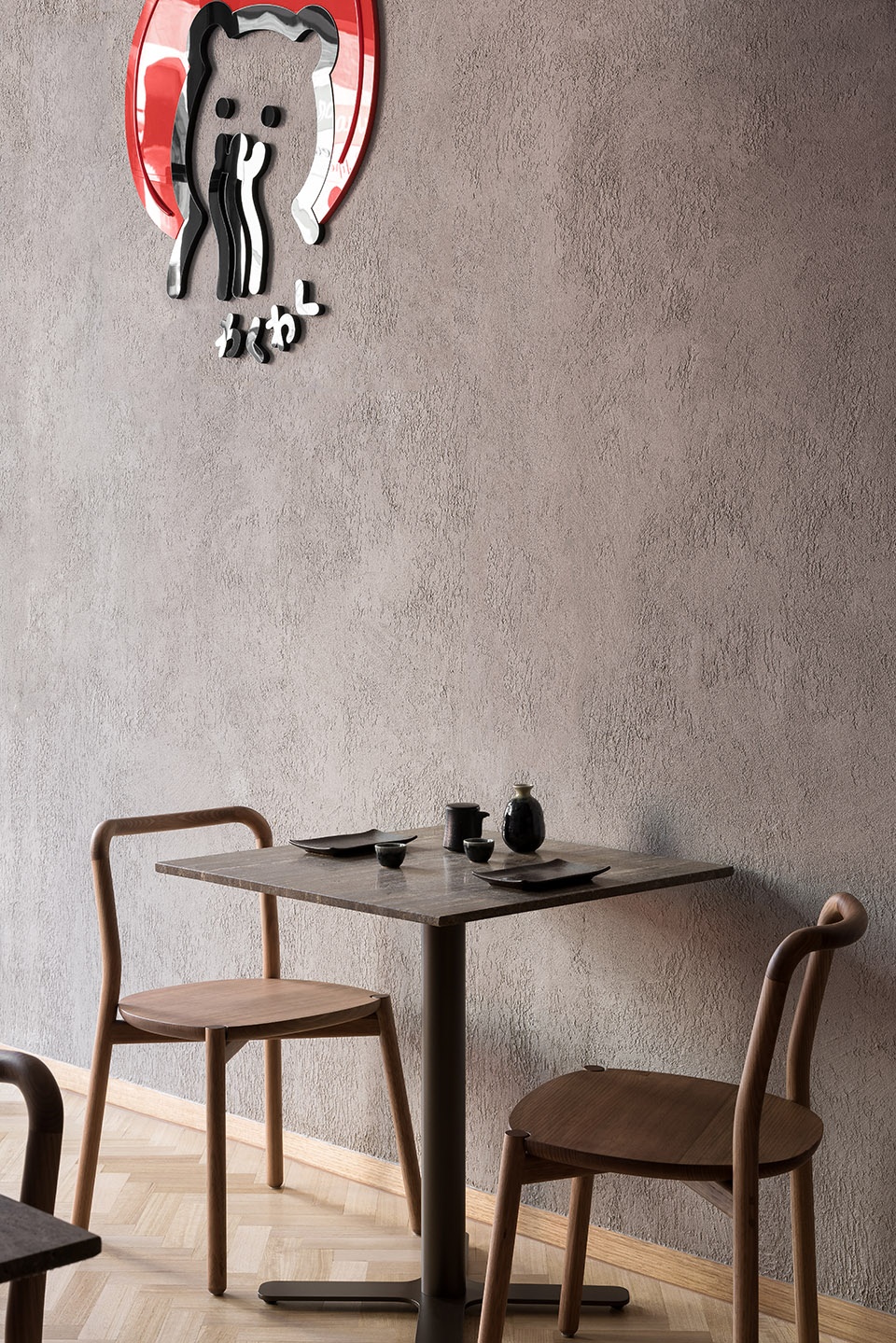
▼栗色点缀的木质座椅以及沙色的褶皱皮革家具,chestnut-stained timber seating and sand-colored crinkled leather upholstery © Timothy Kaye
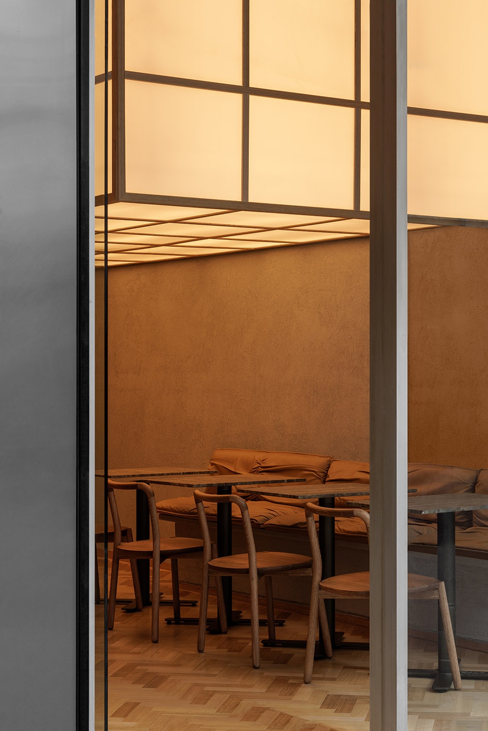
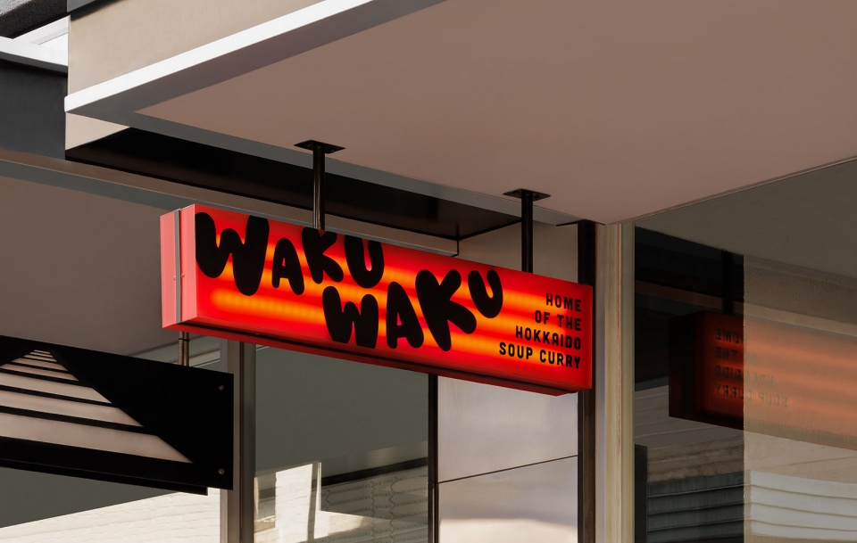
头顶的发光灯罩,让人联想到传统的“障子”屏风,散发柔和的环境光,带来温暖和热情的印象。在室外,醒目的标牌捕捉到CBD巷道的喧嚣,借鉴了日本充满活力的街道氛围。
A glowing overhead lantern, reminiscent of traditional shoji screens, diffuses soft ambient light and casts a warm and welcoming impression. Outside, bold signage captures the hustle and bustle of the CBD laneway, referencing Japan’s vibrant streetscapes.
▼就餐区,dining area © Timothy Kaye
▼就餐区细部,dining area detail © Timothy Kaye
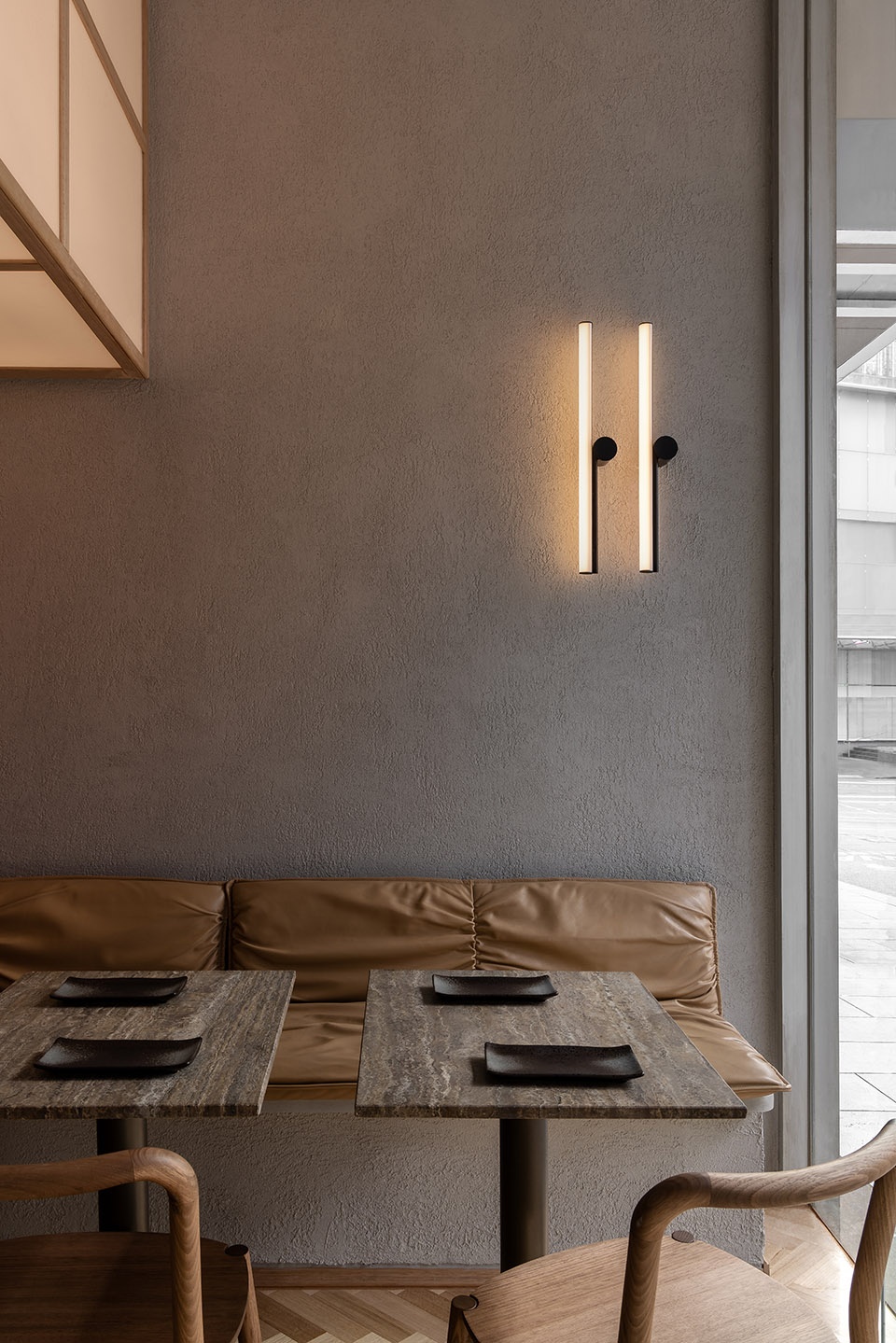
▼头顶的发光灯罩,让人联想到传统的“障子”屏风,散发柔和的环境光,a glowing overhead lantern, reminiscent of traditional shoji screens, diffuses soft ambient light © Timothy Kaye
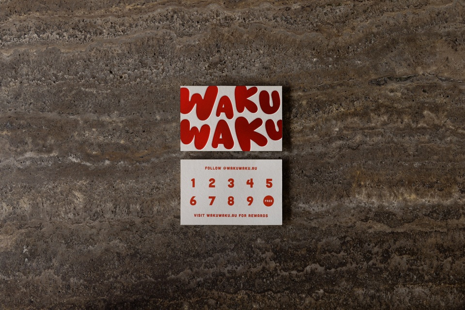
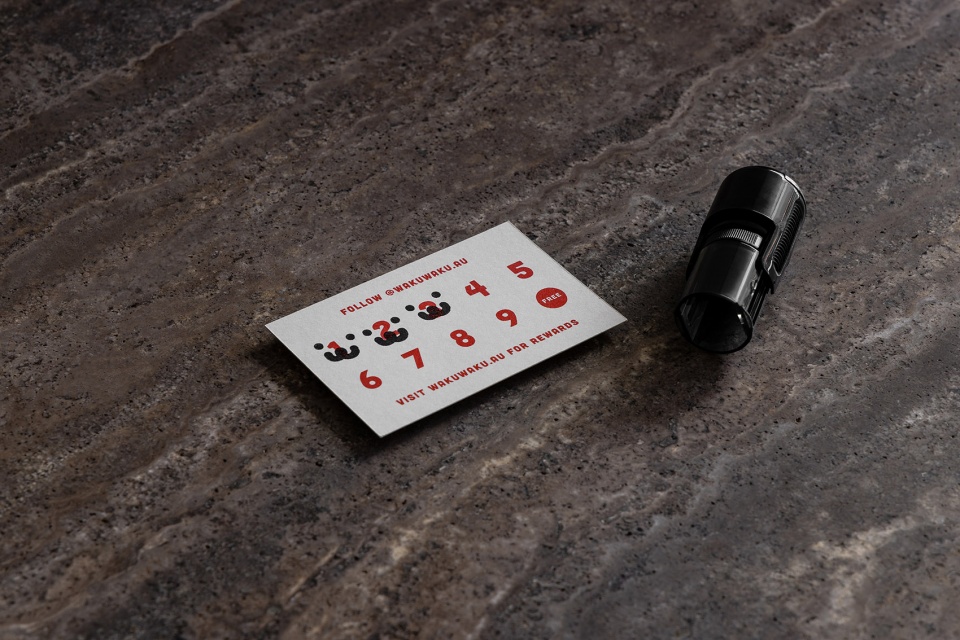
Waku Waku翻译过来是“令人激动的”或“令人兴奋的”。从日本的卡哇伊文化和餐厅的名字中汲取灵感,我们更新并提升了现有的品牌标识,将其充分融入到用餐体验中。简化的色调,大胆的图形和俏皮的标志吸引着大量年轻的食客,在社交媒体、营销活动、贩卖的货品和工作服上都十分有趣,令人耳目一新。
Waku Waku translates to ‘thrilling’ or ‘exciting’. Taking cues from Japan’s ‘kawaii’ culture and the restaurant’s name, we refreshed and elevated the existing brand identity, fully integrating it within the dining experience. The simplified colour palette, bold graphics and playful logo appeal to a younger demographic of foodies, and are fun and recognisable across social media, marketing, merchandise and apparel.
▼招牌,logo © Timothy Kaye
Waku Waku餐厅平衡了侘寂风格的内装与现代、俏皮的品牌,提供了在墨尔本独有的难忘的、热情的用餐体验。
Balancing a wabi-sabi-inspired interior and a modern, playful brand, Waku Waku offers a memorable and inviting dining experience that is distinctly unique to Melbourne.
▼品牌标识设计,brand identity design © Timothy Kaye
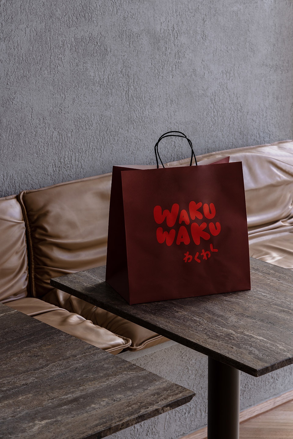
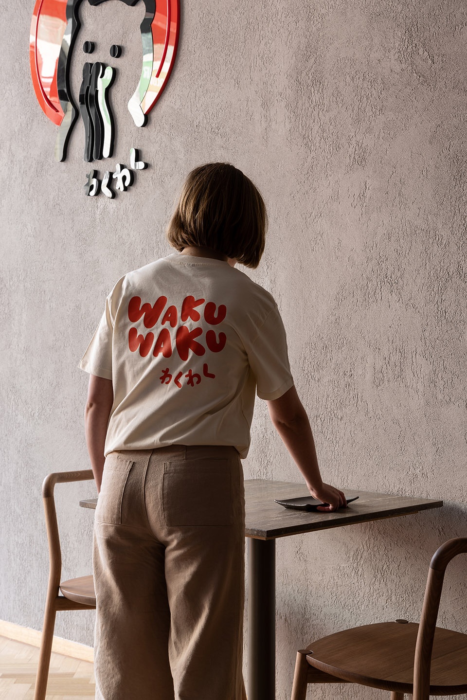
▼大胆的图形和俏皮的标志设计,bold graphics and playful logo © Timothy Kaye
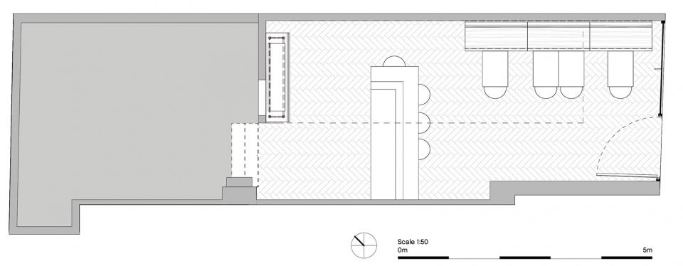
▼平面图,plan © Timothy Kaye
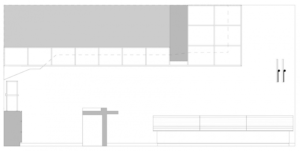
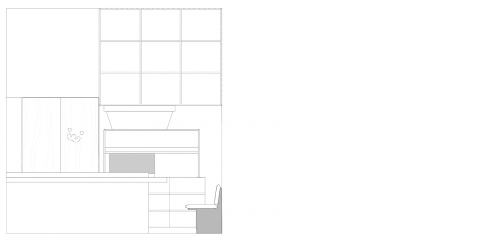
▼带有剖面的立面图,sectional elevations © Timothy Kaye
