
RR公寓坐落于圣保罗Barra Funda社区,业主是一对还没有孩子的夫妇。设计的主要目标是根据项目功能以及布局的需求,对室内空间做出必要的调整,以创造出最宜居的生活环境。在勘查现场时,设计师发现他们从建筑公司得到的最初信息与公寓实际的建成情况略有出入。因此,当项目开始建设时,有必要根据实际情况对部分空间进行重新设计。同时,这些更改必须得到业主的重新批准,这种情况难免会产生一些挫折情绪,磨灭掉一些设计最初的激情。
Located in the Barra Funda neighborhood in São Paulo, the apartment RR was designed for a couple without children. Our main goal was to attend the needs of the program and the place, trying to find the best solutions, making the necessary adjustments. There was some inconsistency between the initial information we received from the construction company and what was actually built there. So, when the construction started it was necessary to redesign some parts of the project according to reality. These changes had to be re-approved by the clients, which always ends up generating some frustration, as the first solution usually creates an initial passion.
▼项目概览,overall of the project © Ricardo Bassetti
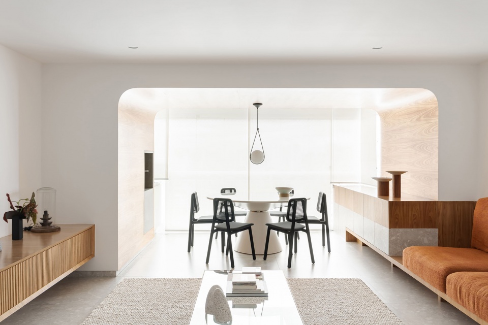
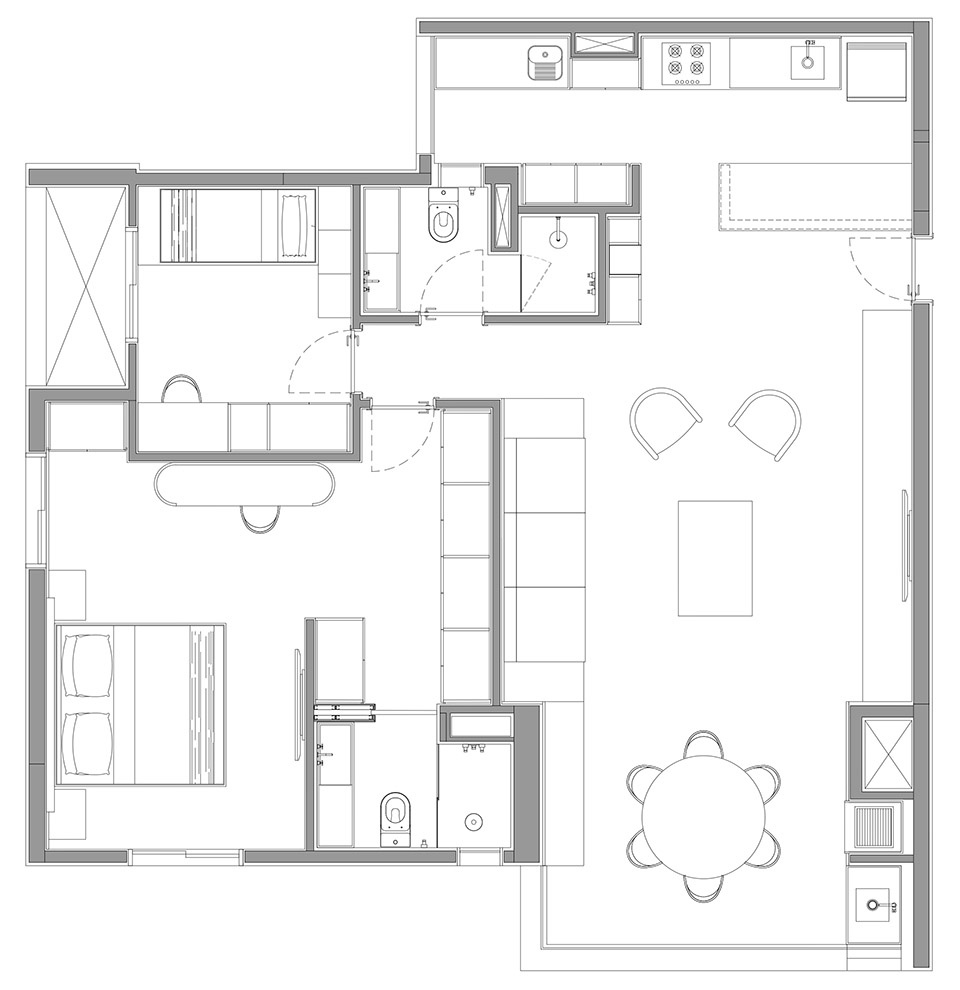
建筑原有的结构不允许设计师在平面上做出很大的改变,因此,房间的位置被保留了下来。主要布局改造其中在室内交通流线与通往各个房间的走廊部分,并根据客户的要求将厨房与客厅整合在一起。此外,设计师还将阳台融入到公共生活区域中,但同时,曲线的形式创造出阳台与公共生活区之间的视觉区分。
The structure existent from the building didn’t allow us to make big changes on the floor plan, so the position of the rooms was kept. We changed the circulation area and the access to the rooms and integrated the kitchen with the living room, which was a client’s request. Furthermore, the balcony is also integrated in the commune area, but at the same time, the curved format creates a visual distinction of this place.
▼平面图,plan © Pascali Semerdjian Architects
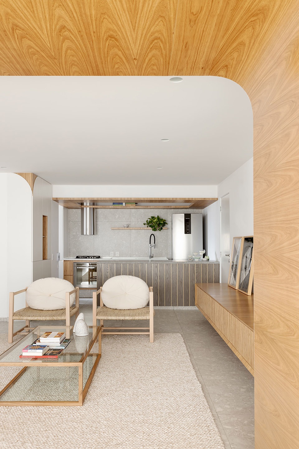
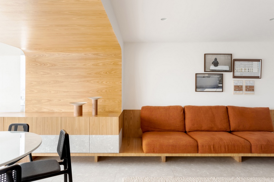
在调整平面的过程中,一些特别的元素逐渐凸显出来。其中一些元素以曲线的形式呈现出来,例如烧烤阳台。阳台空间的内壁上采用了木制饰面,温暖的材质与客厅的白色墙面形成了鲜明的对比,宛如核心与外壳。设计中的另一个重要的元素是厨房上方的木制吊顶,它不仅具有置物的功能,同时,光滑的木材表面也将光线间接投射到厨房中。
There are some special elements in the project that came up during the development of the floor plan. Some of these elements are highlighted with curves, for example the barbecue balcony. This element internally is coated in wood and at the same time, painted in white in the living room, almost as if there is a core and a shell. Another important element is the wooden shelf, over the kitchen; this plan was conceived as a support for objects but also projects indirect lights into the kitchen.
▼曲线的形式创造出阳台与公共生活区之间的视觉区分,the curved format creates a visual distinction of this place © Ricardo Bassetti
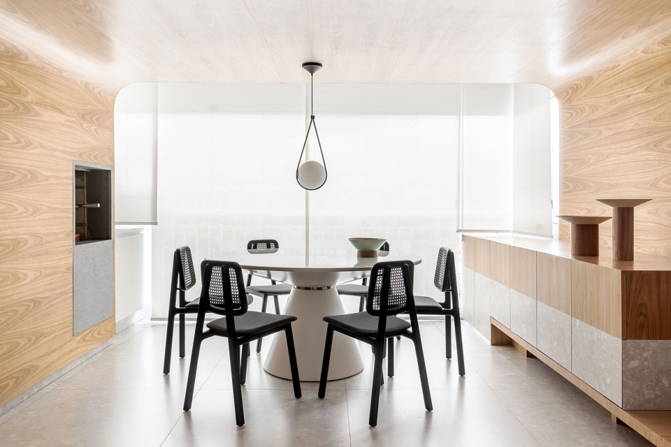
▼阳台区的木制饰面与客厅的白色墙面形成鲜明对比,
The wooden finish in the balcony area contrasts with the white walls of the living room © Ricardo Bassetti
▼厨房上方的木制吊顶,the wooden shelf over the kitchen © Ricardo Bassetti
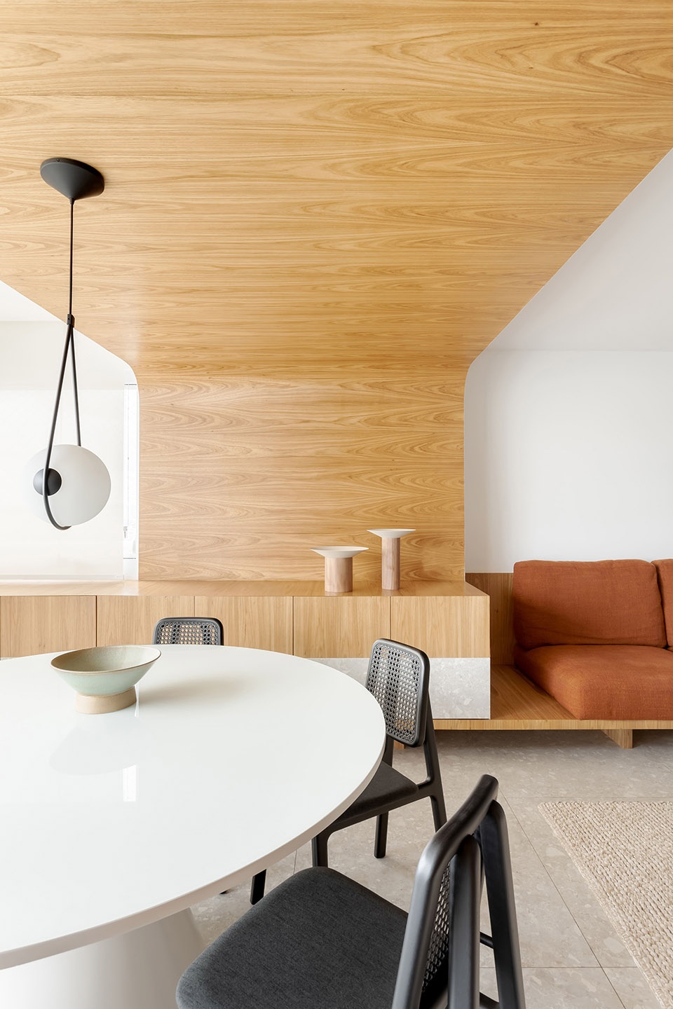
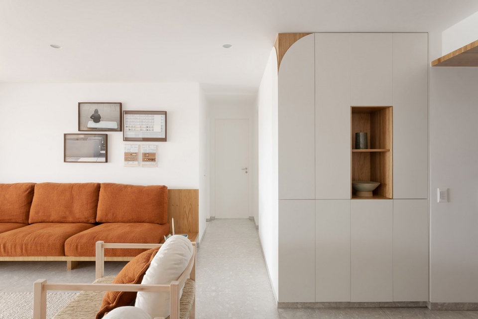
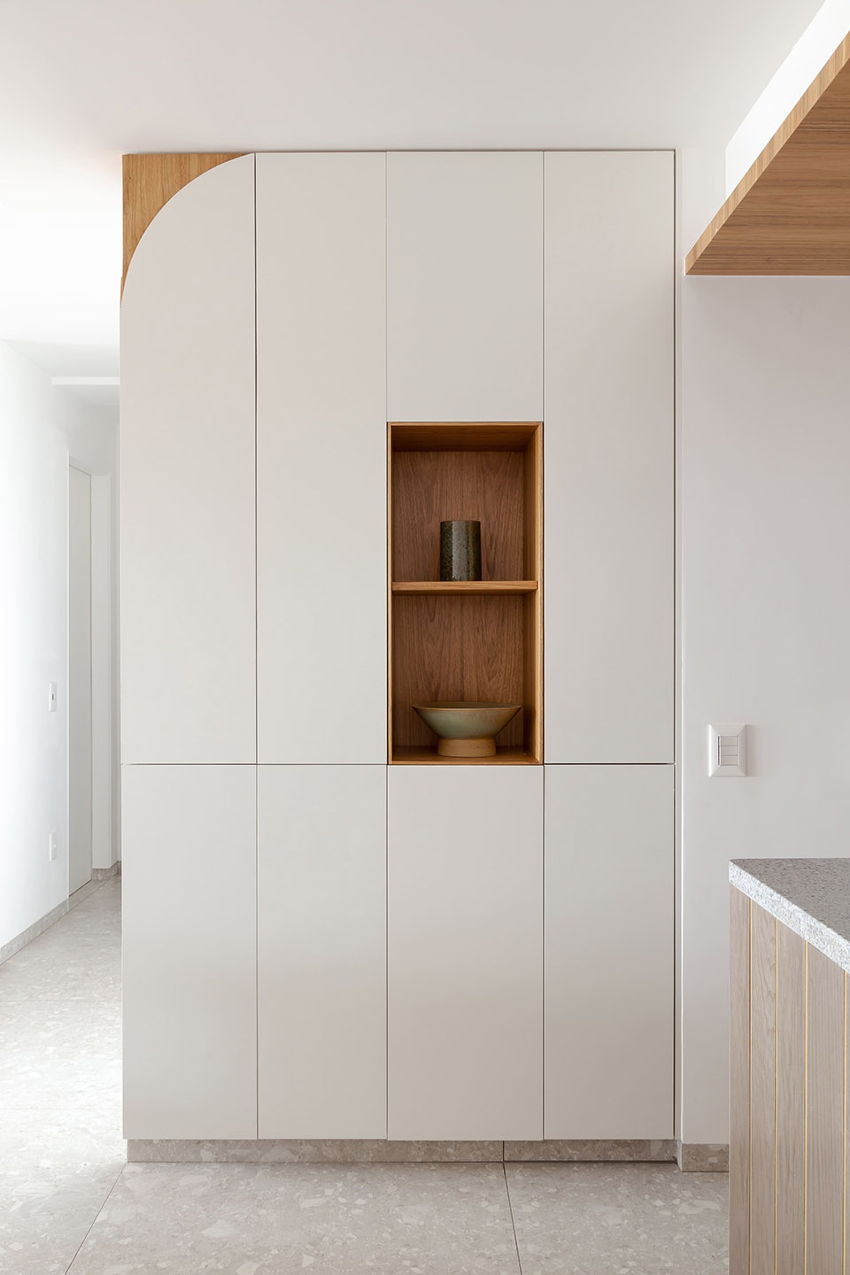
同样的设计概念也出现在靠近厨房的橱柜中,白色饰面被弧线所切割,显露出橱柜顶部木制的一角。本项目采用了一种非常传统的建造方式,包括:砖墙以及灰泥内衬等。为整个公寓铺设瓷砖地板一开始并不是业主的要求,而是设计为满足他们需求而给出的最佳选择,这种地板材质坚固,不仅具有最佳成本效益,同时十分易于清洁,并且在未来不会出现任何开裂的状况。项目中采用了白色微纹理涂料,所有木工元素均采用freijó木材。
This same concept appears in the cabinets close to the kitchen; a wooden corner pops up from the curve of a white plan. The apartment was built in a very conventional way for us in São Paulo: brick walls, lining of plaster, etc. The porcelain applied on the entire floor of the apartment wasn’t a request from the client in the beginning, but was the best option we found to attend to what they were looking for: hard flooring, optimal cost/benefit, easy to clean and in the future won’t present any cracks. Also, all the painting was made with a white micro-textured ink, and the carpentry used Freijó wood.
▼客厅,the living room © Ricardo Bassetti
▼白色饰面被弧线所切割,显露出橱柜顶部木制的一角,a wooden corner pops up from the curve of a white plan © Ricardo Bassetti
▼橱柜细部,detail of the cabinets © Ricardo Bassetti
此外,业主还要求设计师为项目引入一些色彩,以营造出不同寻常的惊喜体验。考虑到这一点,设计团队将主卧浴室的天花板打造为红色,并在天花板的四角采用了圆角的处理方式。浴室的墙壁则采用了白色瓷砖与粉色瓷砖灌浆,宛如粉色的墨水从天花板流下并渗透带瓷砖之间一般。
The client also requested us to bring some color to the project in an unusual and surprising way. With this in mind, we designed the ceiling of the couple’s bathroom, painted with pink ink, and with slightly rounded corners. And to give the idea that the pink ink flowed thru the wall between the tiles, we also choose pink tile grout.
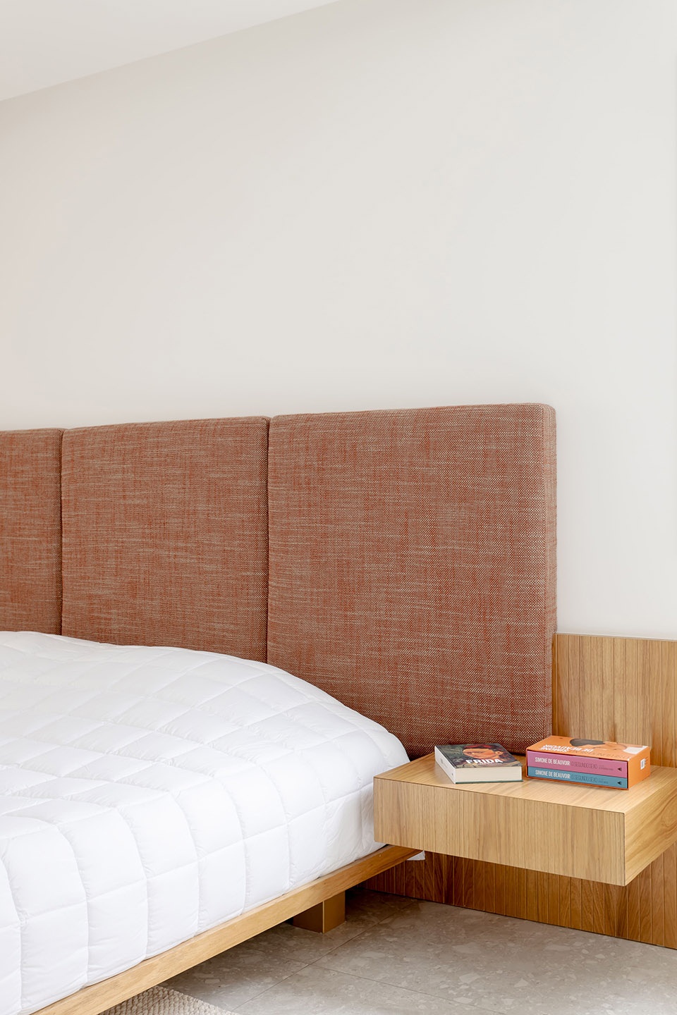
▼卧室,the bedroom © Ricardo Bassetti
▼主卧浴室,the couple’s bathroom © Ricardo Bassetti
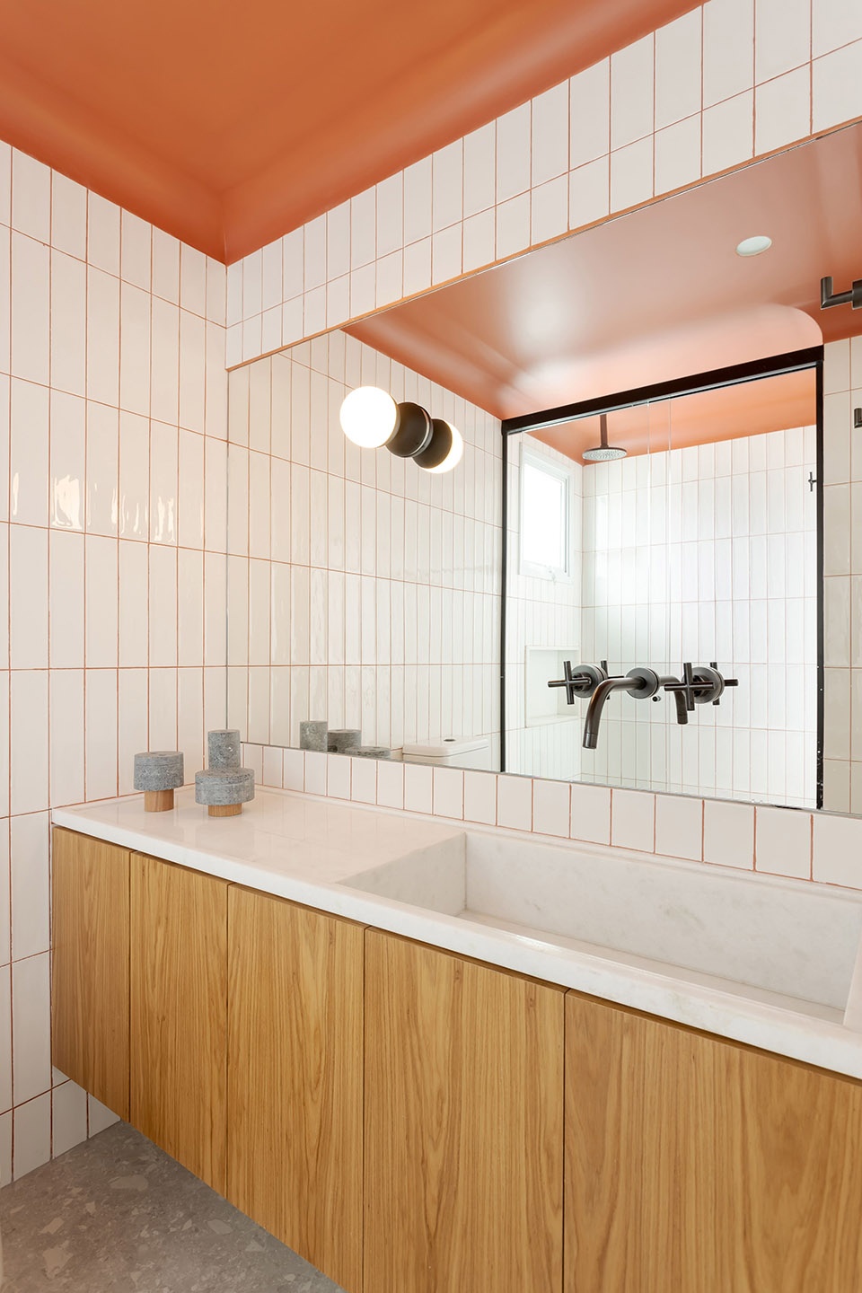
▼浴室细部,detail of the bathroom © Ricardo Bassetti
