
“建筑好比一个巨大的容器,当每一个人都注目那外壳上的花纹时,我独关心是否盛开着美丽的花朵”
“Architecture is like a huge container. When everyone is looking at the pattern on the shell, I only care about whether there are beautiful flowers in full bloom.”
——Tang white
一切发生在年前初夏的一场大雨后,透过中间朋友的介绍我和“周董”约在了咖啡厅见面…..那天雨过天晴后,阳光透过斑驳铁窗直地照进屋子直打在地面上,空气中弥漫的咖啡香也另添了一点懒散… “周董”看起来比实际年龄稳重,谈到将进行的事项时,充满了决心和把握,我不是一个重度咖啡上瘾者,甚至平日喝茶甚过咖啡,于是一直静静听着他从入行星巴克一路到技术品控,再到咖啡的种类、豆子的优劣等,最后才知晓他居然是设计专业的毕业生…
Everything happened in the early summer of a year ago after a heavy rain, through the introduction of a middle friend I and “Jay” about to meet in the cafe…..The day after the rain, the sun through the mottled bars straight into the room hit the ground, the air filled with coffee also added a little lazy… “Jay” look sedate, your age, when it comes to matters will be full of determination and assurance, I am not a heavy coffee addicts, even coffee tea daily, so has been quietly listening to him from all the way into the line starbucks to technical quality control, and then to the pros and cons of the types of coffee, beans and so on, the last to know that he is design graduate…
▼店铺外观,exterior view of the project ©Tang White
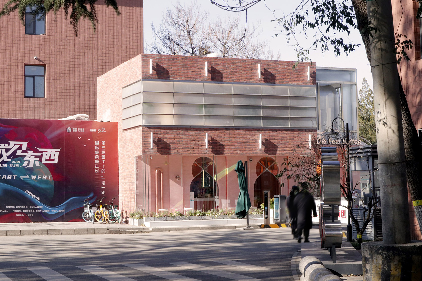
而后才是对店址、空间环境,风格色调等等“正经事”上的话题,店的选址是在五环外一处创意园的大门口,正对来园区的路,位置可说是非常醒目,对角线位置是片白杨树,经风一吹过飒飒作响,环境如此,然而建筑主体已经破旧,外观的改造便势在必行。建筑原是做传达室之用,一栋二层小楼,楼下一连三间,本就不大的空间切分地更显局促,幸好二层并未分隔,可是却缺少室内楼梯,这也成为设计之初要解决的几个主要问题。
And then to store locations, space environment, the style is tonal, etc on the topic “serious business”, the shop’s location is outside the rings at the gate of a creative garden, is opposite to the campus road, the location is very striking, diagonal position is poplar, the wind rustling, environment, building main body has worn out, however, the appearance of reform is imperative. The building is to do the use of the porter room originally, a two-story small building, downstairs in a row of three, this is not big space segmentation ground more cramped, fortunately, the second floor did not separate, but the lack of indoor stairs, which has become a few main problems to solve at the beginning of the design.
▼一层平面,ground floor plan ©观念建筑
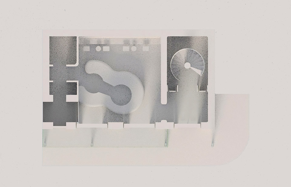
▼二层平面,upper floor plan ©观念建筑

整个案子的建筑设计和室内设计是既分离又统一的,关键词有“现代、极简、西西里、清新”等,之后建筑部分的设计却也确立了“朦胧、新颖、摩洛哥”等基调,我把这些词组频繁,反复地在脑海中闪现,不断提示、联想,一系列的图像开始在心中生成,一旦有卡壳,或不顺利时,我习惯走出办公室,在园区各处踱步,与大自然的接触发挥了不可替代的作用,他将往昔在佛罗伦萨的见闻和感受一一唤醒……
The case of architectural design and interior design is both separation and unified, keywords are “modern, minimalist, Sicily, pure and fresh”, etc., after the construction part of the design but also established the “hazy, novel, Morocco tone,” I put these phrases is frequent, repeatedly in mind, prompts, lenovo, began a series of images generated in the heart, once there are stuck.
▼内部空间概览,overall of interior ©Tang White

咖啡厅的内壁是一片粉色,粗糙的肌理来源于对意大利西西里印象的参照,希望走入的人也能感受到一抹地中海的情调…一层空间里还设置了亮眼的构件,比如通顶的立柱灯,通体发光,既是光源补充,又是平面构成线的隐喻,在一层,吧台占据了最中心的位置,原本是一个同心双圆的概念(这里没有参考斯卡帕的双环)最终测算设备实际需求后调整成异形样式。
The inner wall of the cafe is a piece of pink, the rough texture comes from the reference of the impression of Sicily, Italy, hoping that visitors can also feel a touch of Mediterranean sentiment…A layer in the space is also equipped with bright eye artifacts, such as on the top of the column lamp, connect body to light, as light supplement, and the metaphor of planar line, on the first floor, occupying the position of the center, the bar is the concept of a concentric double circle (there is no double loop) reference scarpa finally adjusted to alien style after measuring equipment needs.
▼通顶的立柱灯,通体发光,既是光源补充,又是平面构成线的隐喻,on the top of the column lamp, connect body to light, as light supplement, and the metaphor of planar line ©Tang White
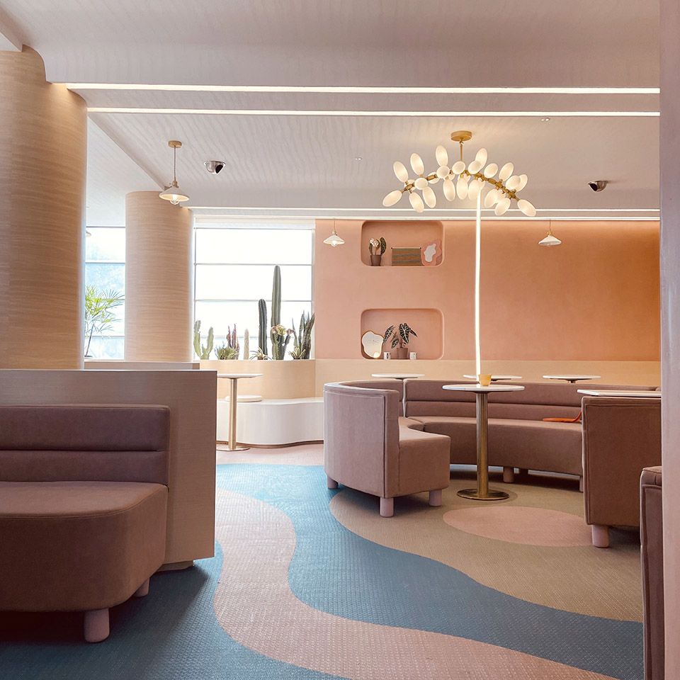
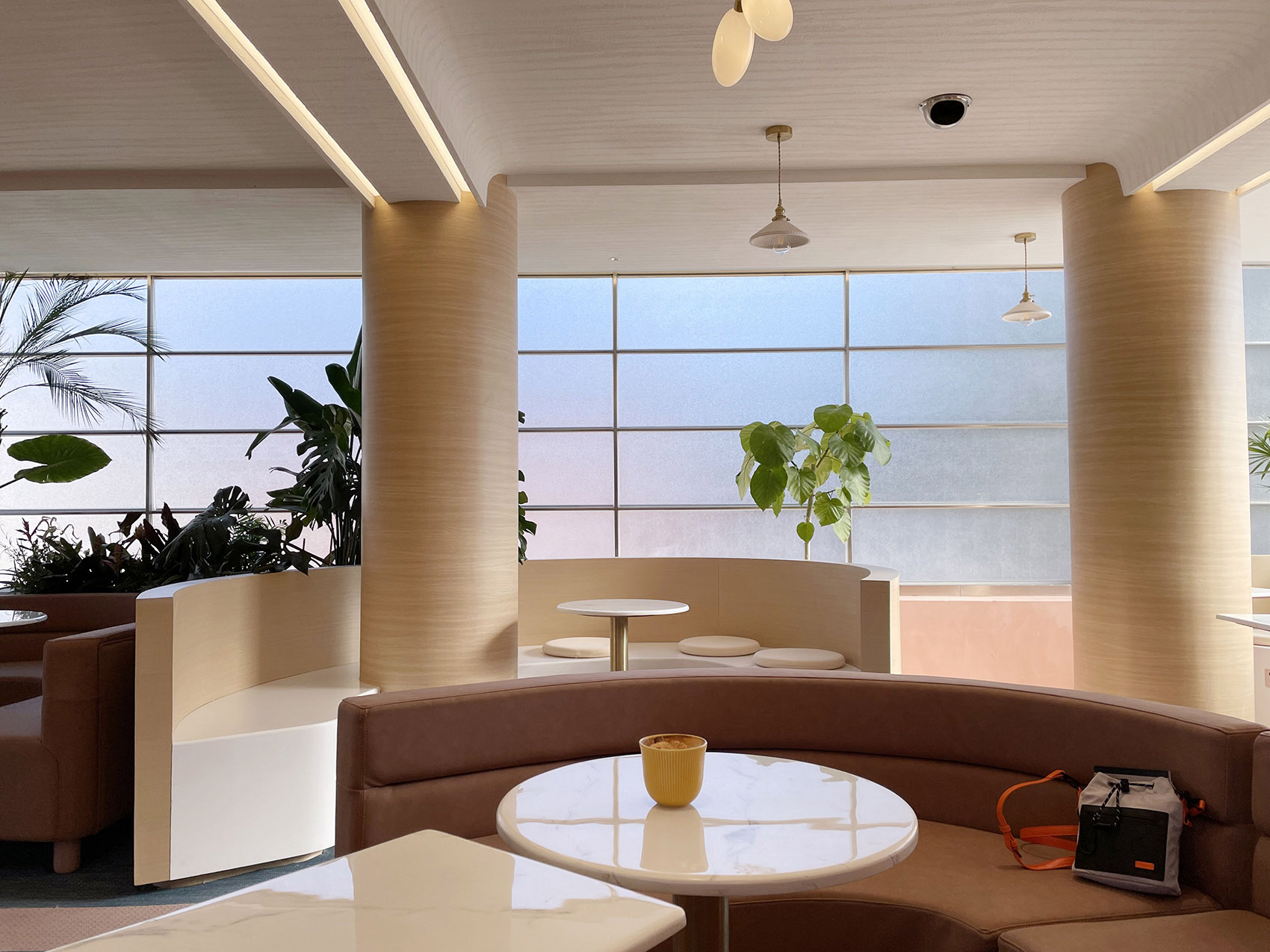
到了二层主就餐区,环绕着墙面是“云”座椅的形式。这样的设置是三层考虑,首一个便是化自海岸的边线,起伏有变化,其次是基于实用性,这样可最大化利用空间,就座的面积会增加,而第三,云座椅有宽窄变化可满足人的躺、坐、倚、靠不同姿势,尽最大程度放松自己,虽然最后也很好的实现出来,但中间过程确非常艰难,基础部分由施工师傅来做,虽有明确图纸,却因没做过而无法进行,只得现场一遍遍教给,包括定位尺寸都标记好,基础做好后,面层就成了难题,最后选用的既不是木板材也不是金属板,而是一种人造石材,还原效果的同时也最大限度节省了成本,一举两得。
On the second floor, the main dining area is surrounded by “cloud” seating. Such a set is two layers, one is to maximize the use of space, the area of the seating will increase, and the other, cloud seat has size change can meet people lie, sit, lean on, rely on different positions, to relax, to the degree that it can though finally also good implementation, but it is very difficult, intermediate process based part by the construction of the teacher to do, although there is a clear drawings, But because did not do and can not be carried out, had to teach the scene again and again, including positioning size are marked, after the foundation is done, the surface layer has become a problem, the final choice is neither wood plate nor metal plate, but a kind of artificial stone, reducing the effect at the same time also maximize cost savings, kill two birds with one stone.
▼云座椅有宽窄变化可满足人的躺、坐、倚、靠不同姿势,cloud seat has size change can meet people lie, sit, lean on, rely on different positions, to relax ©Tang White

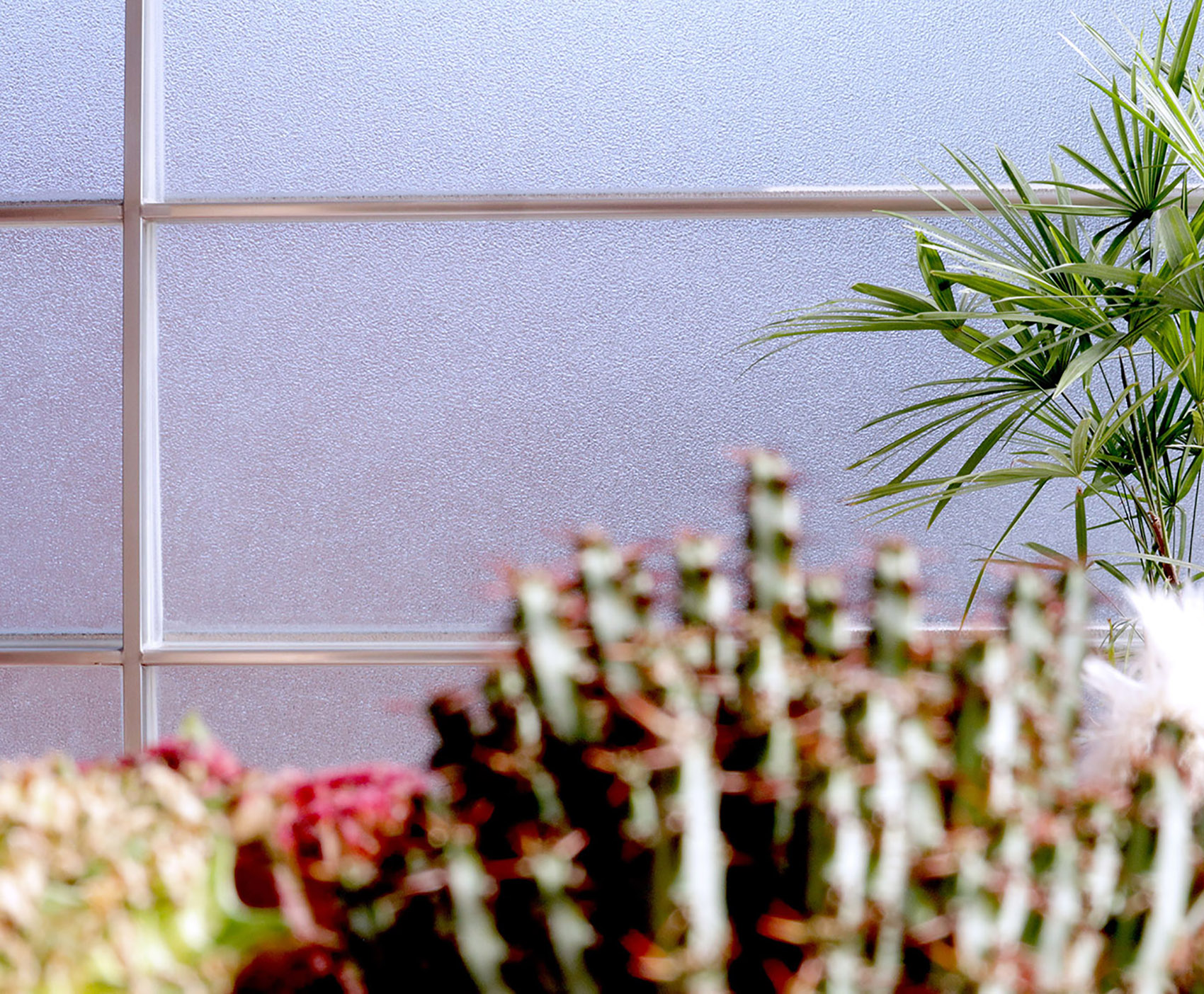
从落成后的成果来看,也许有人会联想到布雷根茨美术馆,我确实认可卒姆托(Zumthor)所讲的“当你试图建立某种秩序或说建筑物,以往曾看过的图像将在适时的开始浮现” 也非常赞叹他对美术馆本体因所在场地环境所作的回应,类似于他想作出湖水透过外墙玻璃折射到室内的波光泛泛的感觉,我反其道而行,在二层建筑立面采用了一种轧花玻璃来屏蔽外界对室内客人的纷扰,磨砂的效果,光依然可透进来,可以反映出实时外部内部环境的变化,随季节也随时间……对此效果,我很沉醉,业主也是满意的,他挑战了一些常规运营思路,却赋予了一家咖啡厅独特的气质,也即建筑氛围,遗憾的是外廓线的一排高柱因为预算关系没有实现,好的楼北侧外挂螺旋梯做了出来,碰到傍晚时分,西天红霞布满,攀上二层平台便是最佳观景地。异形门洞给人是摩洛哥的印象符号,实际上也有一点对棒棒糖的形状的借鉴,小小的童心一把……
From the results after completion, some people may associate with the Bregenz Museum. I do agree with Zumthor’s statement that “when you are trying to establish a certain order or building, the images you have seen before will begin to emerge at the right time”. I am also very impressed by his response to the museum itself due to the site environment. Like he wanted to make the water through the outer wall glass refraction to the indoor smooth broad sense, the opposite tack, I on the second floor used an embossed glass facade to block out the outside disturbance to the indoor guests, the effect of grind arenaceous, enough light still can come in, can reflect the real-time internal external environment changes, the seasons also along with the time…To this effect, I’m very drunk, owner is satisfied, he challenged some regular running ideas, is endowed with a cafe its unique temperament, which is building atmosphere, it is a pity that the profile of a row of the tall secretory because budget does not implement, good floor north plugins do out of the spiral staircase, met in the evening, buddhist paradise hongxia is full, climbing the platform on the second floor is the best view. The shaped door is a symbol of Morocco, in fact, there is a little reference to the shape of a lollipop, a little childlike…
▼轧花玻璃来屏蔽外界对室内客人的纷扰,the embossed glass facade blocks out the outside disturbance to the indoor guests ©Tang White

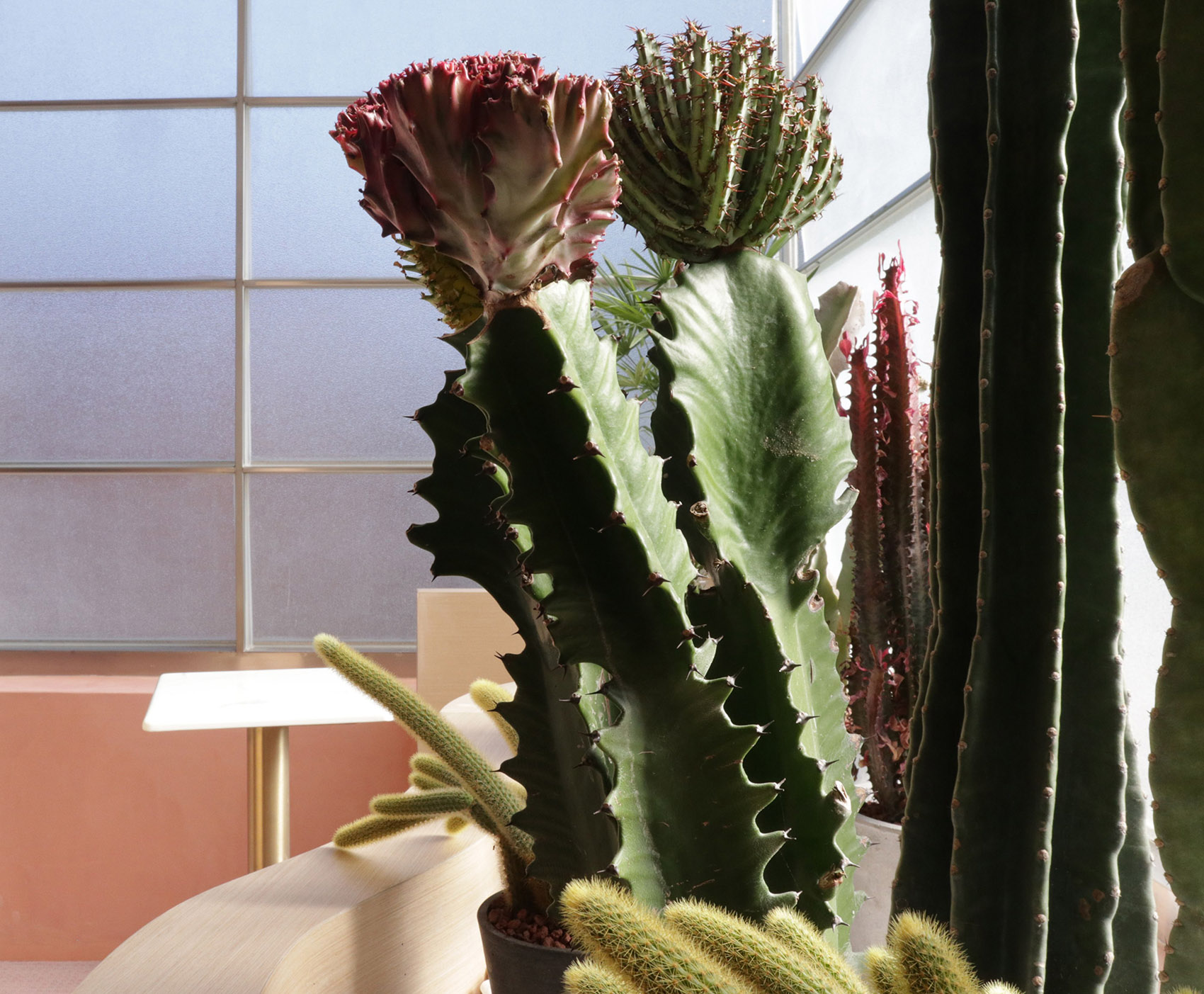
▼沙漠植物彰显摩洛哥风情,the desert plants with Moroccan ambiance ©Tang White
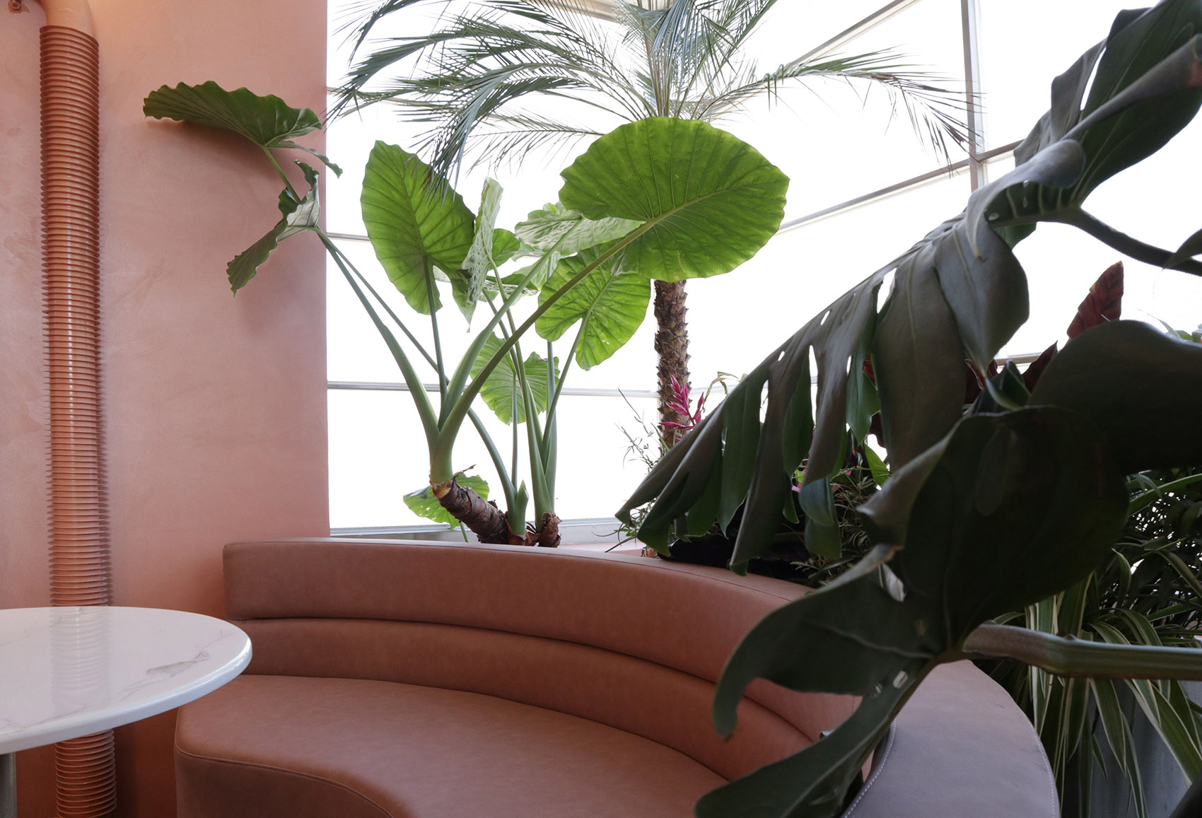
既然有“海岸线”便少不得“岛屿”,一圈圈半弧沙发围合出一座座现代人心中精神的“孤岛”幻想着白色羽毛生于两肋,轻松穿越过山山海海……如此问题,在过程中不胜枚举,或材料或工艺或两者皆有,幸而业主一以贯之的坚持和信任才得以实现。在最后也一并感谢下配合过的施工单位、各供应厂家。
Such problems are too numerous to enumerate in the process, or materials or processes or both, thanks to the consistent persistence and trust of the owners. In the end, I also thank the construction units and supply manufacturers that have cooperated with me.
▼座椅与灯具细部,detail of the seat and the lamp ©Tang White

▼建筑东侧立面图,east elevation ©观念建筑
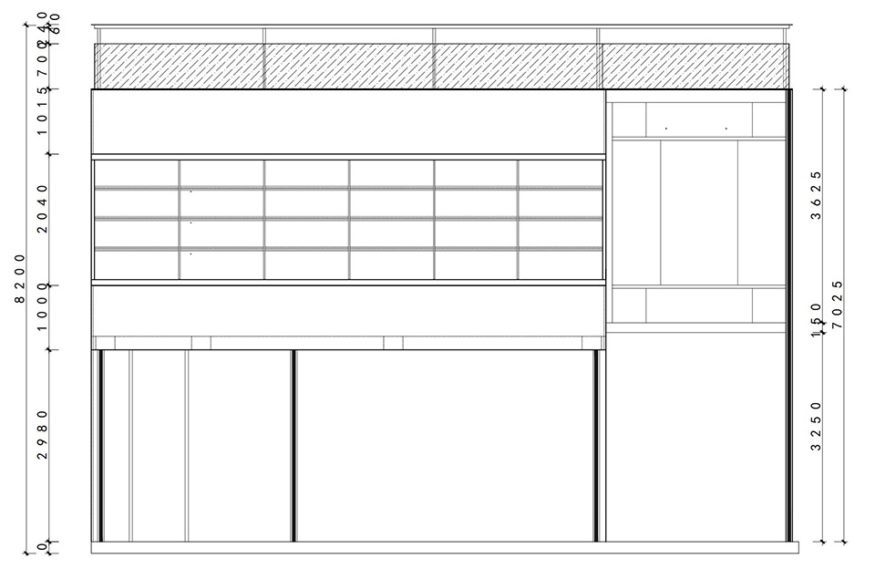
▼立面细部图纸,detailed drawing of the facade ©观念建筑
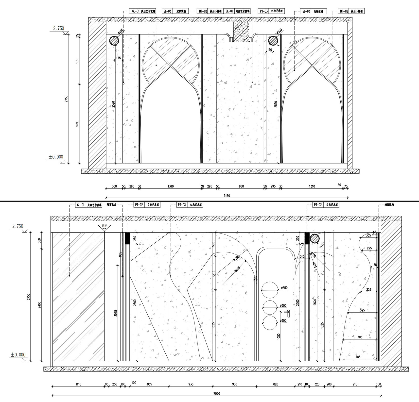
▼细部详图,construction details ©观念建筑

项目名称:北京Feel Coffee咖啡厅改造
项目类型:建筑外观室内空间改造
设计方:观念建筑
项目设计:2021
完成年份:2021
设计团队:李晓烨、白唐
项目地址:北京市朗园文创园
建筑面积:160㎡
摄影版权:Tang White
文案:李晓烨
合作方:B.T.Z.L
客户:FEEL COFFEE
材料:压花玻璃、幻彩玻璃、镜钢、编织地毯、肌理漆
品牌:BOLON/NOVA


