
住宅位于上海长宁区的番禹路街道,房屋始建于上世纪90年代,是位于原英租界街区的旧房改造项目。
The residence is located in the Fanyu Road Street of Changning District, Shanghai. Originally built in the 1990s, it underwent a renovation as an old building situated in the former British concession area.
▼惬意的休闲阳台,A relaxing balcony for friends to gather around © YUUUUNSTUDIO
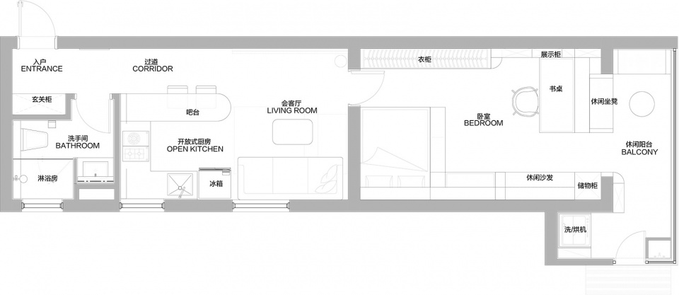
房子的布局是比较典型的一字型户型,饮食起居也追寻狭长的空间一字排开。这种户型作为30年前的保障型住宅更多的是满足一家三口的居住功能,而现如今更多的单身年轻人选择作为独居的公寓。
The original layout of the house follows a relatively typical single-line type, with the living, dining, and bedroom spaces arranged in a linear fashion. This layout was more common in the housing of 30 years ago, designed to accommodate for three-person family. However, nowadays become more young singles apartments to live alone.
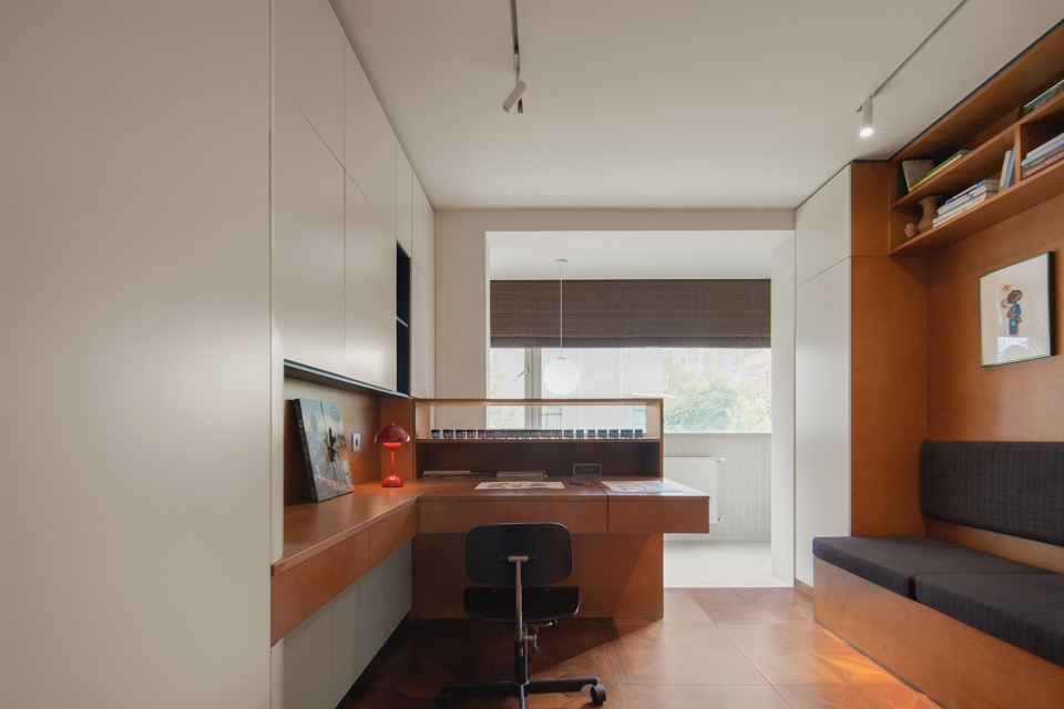
▼创作区舒适的光线,Comfortable natural light in the work area © YUUUUNSTUDIO
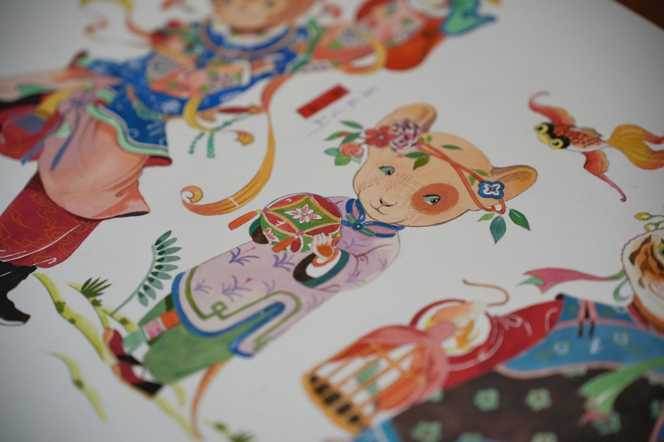
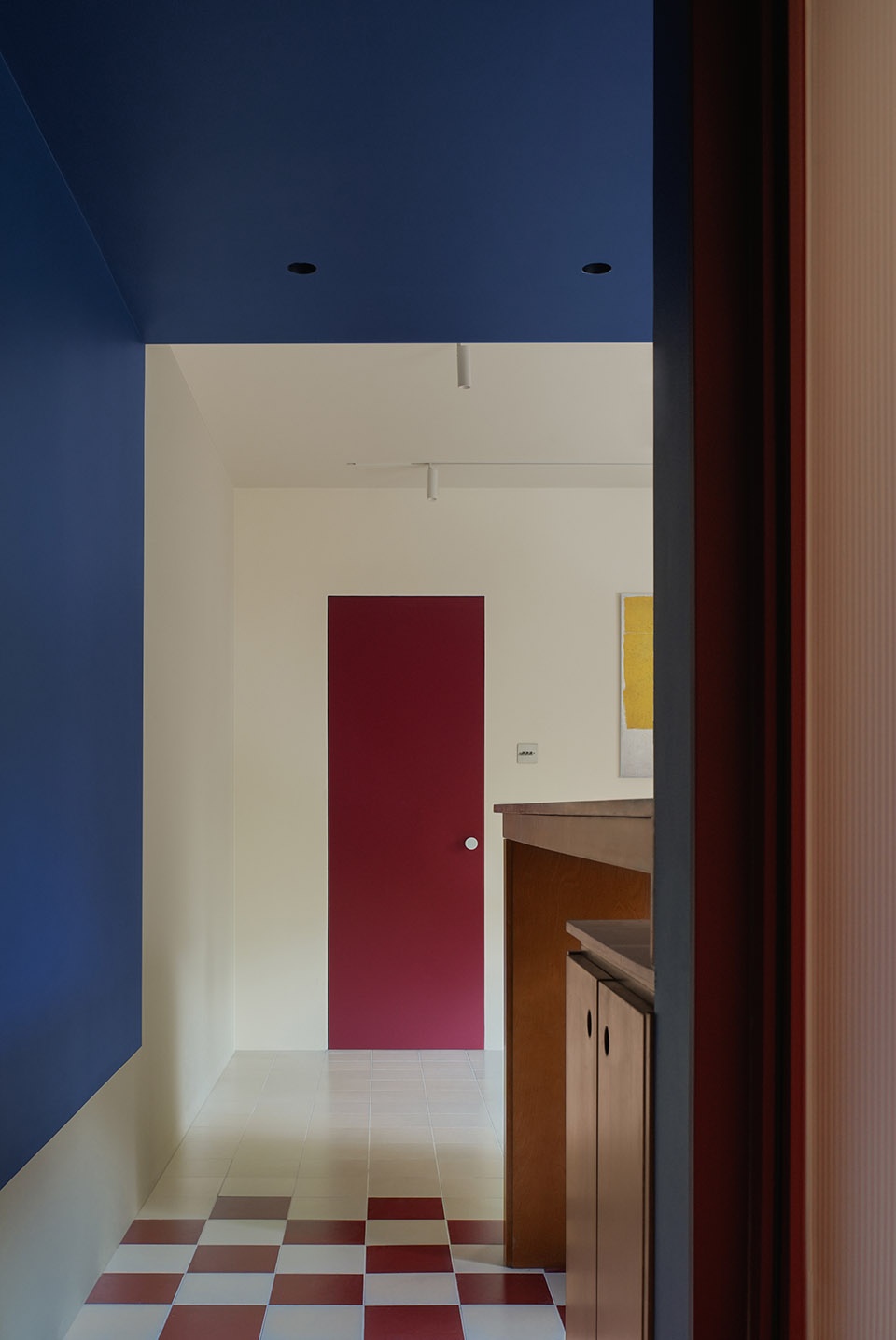
业主Vikki是一名插画师。笔下的作品充满了细腻的手法,丰富的色彩以及天马行空的想象力。在参观了她的工作室时讲解了她平时的作画习惯以及工作流程,因此Nul在思考设计主题的时候,结合屋主本身职业和性格,把主题设定“红黄蓝三原色”来呈现业主的职业特性。例如在蒙德里安的画作中,以几何图形为绘画的基本元素,既从大大小小的原色块和矩形直角形状的组合中寻求所谓“物质与意识的平衡”,因此在转换成空间设计过程中,空间、形式和几何形状在一定程度上支配着不同的材料,红黄蓝被用合理的比例规划在空间的不同的功能区当中,诸如蓝色的厨房区域,红色的卫生间生活动区,以及相对需要低纯度色彩的主卧休息和日常创作的静区。
The owner is an illustrator known for her artworks filled with delicate techniques, rich colors, and boundless imagination. During NUL visit to her studio, she explained her usual painting habits and workflow. Based on Vikki’s profession and personality, NUL decided on the theme “primary colors: red, yellow, and blue” to reflect her professional characteristics. Taking inspiration from Mondrian’s paintings, where geometric shapes represent the “balance between matter and consciousness,” this spatial design emphasizes the dominant role of space, form, and geometric shapes using various materials. Red, yellow, and blue are proportionally integrated into different functional areas of the space, like the blue kitchen area, the red bathroom and living area, and the relatively softer color palette for the main bedroom’s rest and creative workspace.
▼储藏柜分析图,Cabinet diagram © YUUUUNSTUDIO
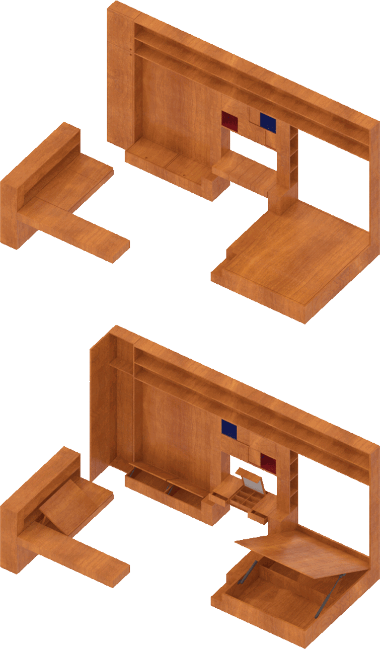
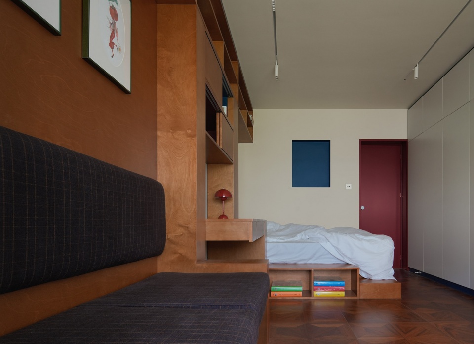
卧室部分通过精心安排蓝色开洞位置,与红色的门形成了垂直或水平面的边缘,以及局部穿插的红与蓝的色块中,一个空间的形式就可以被赋予独特的二维特征。
The bedroom features carefully arranged blue openings, blending with red doors to create unique vertical or horizontal edges, while the interplay of red and blue color blocks adds a distinctive two-dimensional character to the space.
▼主卧视角,Continuing color in the bedroom © YUUUUNSTUDIO
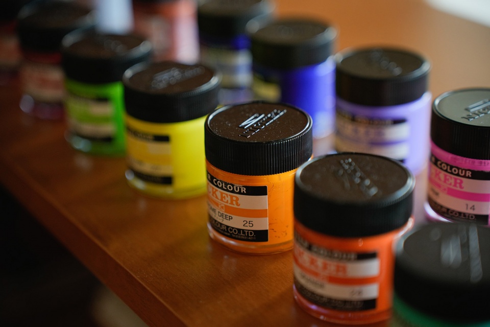
主人工作空间相对弹性,相应的设置了在家中创作的工作区,在设计之初将这个区域安置在光线较好相对靠窗的位置,主人可以在白天长时间用自然光工作。可以被自由调节角度的画架被整体统一成定制的海洋板材质。上方同时可以摆放平时所使用颜料,该区域L型的布局让主人在创作时更加有效率。
The owner ‘s workspace is designed with flexibility in mind, including a designated area for creating artwork at home. Placed near the window to make use of natural light during the daytime, the adjustable easel is custom-made with marine board material, providing storage space for the pigments used in painting. The L-shaped layout enhances efficiency during the creative process.
▼多种功能被整合,A shelf placed for painting tools © YUUUUNSTUDIO
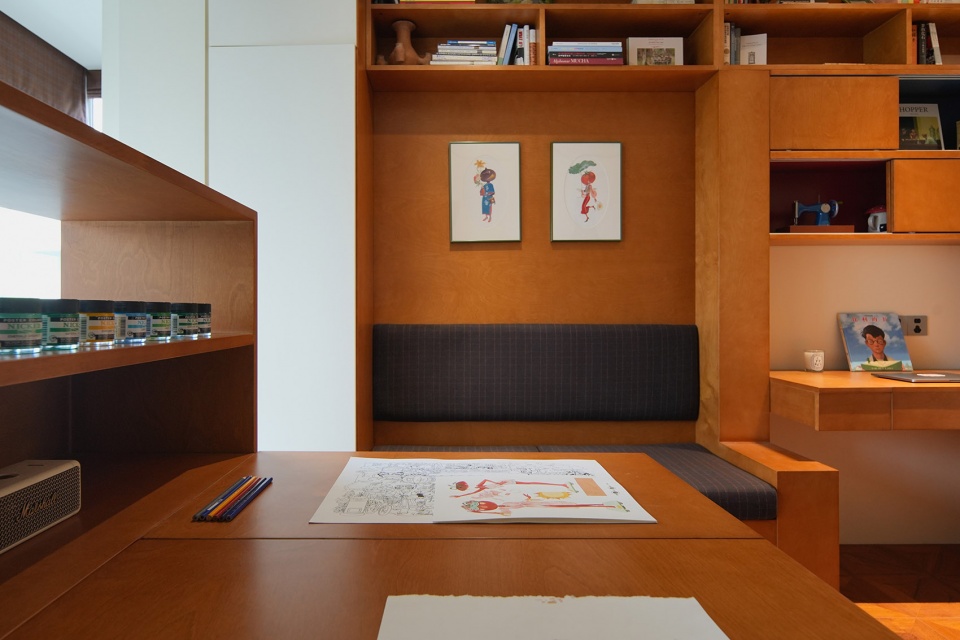
▼可灵活调节角度的画台,Comfortable natural light in the work area © YUUUUNSTUDIO
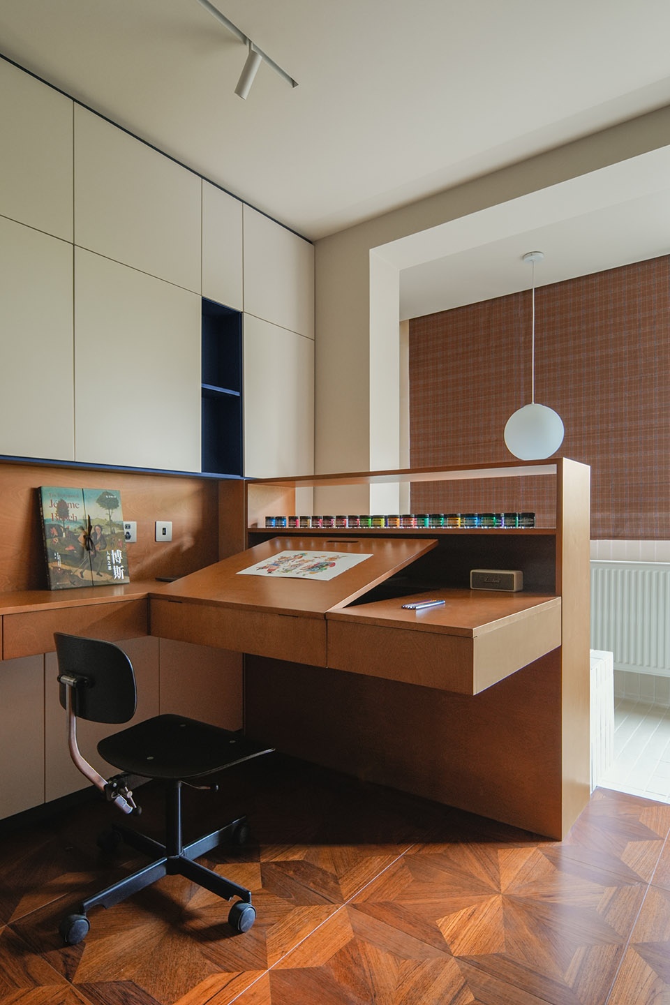
▼捕捉主人的使用习惯,Capture the owner’s usage habits © YUUUUNSTUDIO
▼绘画的细节,Details about the painting © YUUUUNSTUDIO
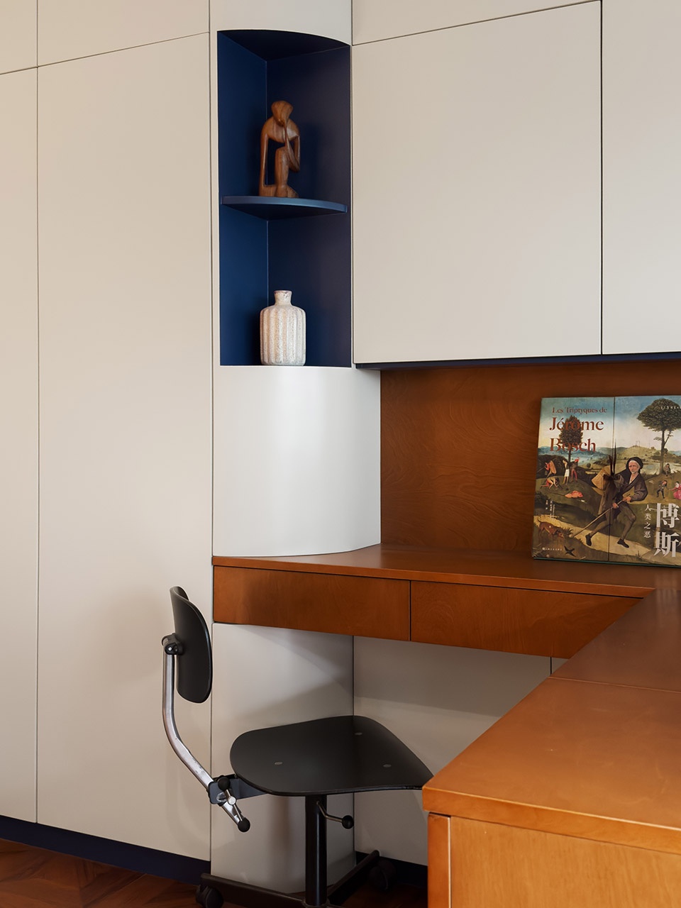
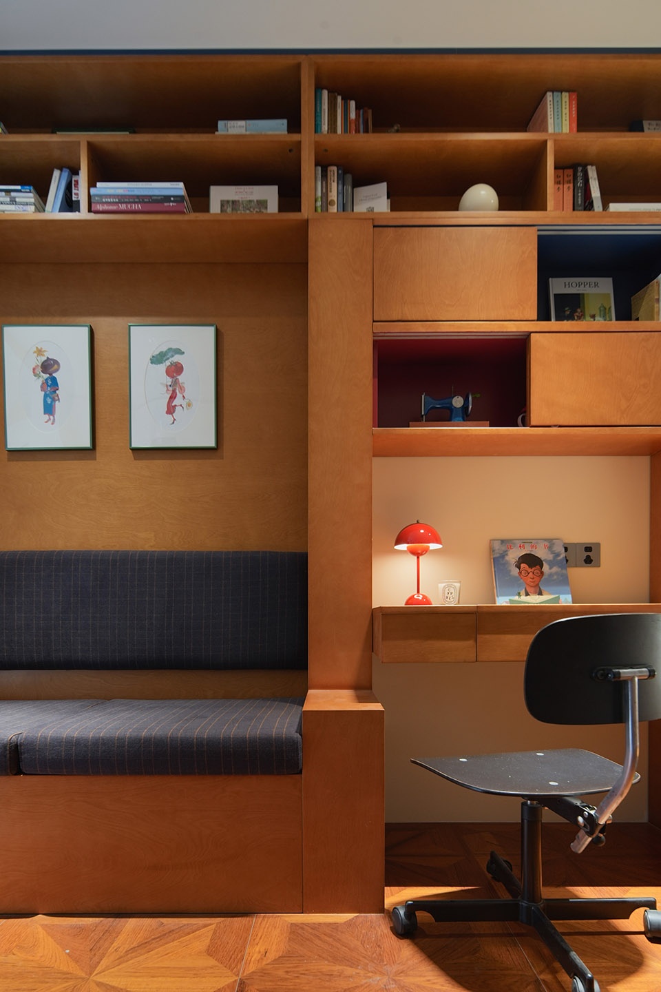
床体的部分则结合了书架,梳妆台以及创作间隙用的休息卡座整合到靠墙的一侧尽量不占用空间的同时又满足了更多的收纳功能。卡座的设置可以让主人在绘画间隙中小歇,该部分选用了咖啡色具有中古质感格纹布料,配以黑色的Kevi Chair中古办公椅。
The bedroom also integrates a bookshelf, dressing table, and a seating area for relaxation during painting breaks. It is thoughtfully placed against one wall to optimize space and offer additional storage options. This seating area, adorned with coffee-colored vintage textured fabric, features a black Kevi Chair giving a touch of vintage charm.
▼多种功能被整合,Multiple functions are integrated into one language © YUUUUNSTUDIO
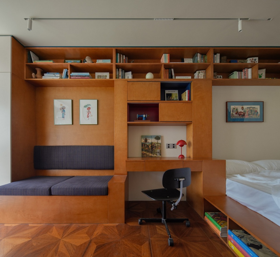
▼整合梳妆台书架与床,Integrate bookshelves with beds and dressers © YUUUUNSTUDIO
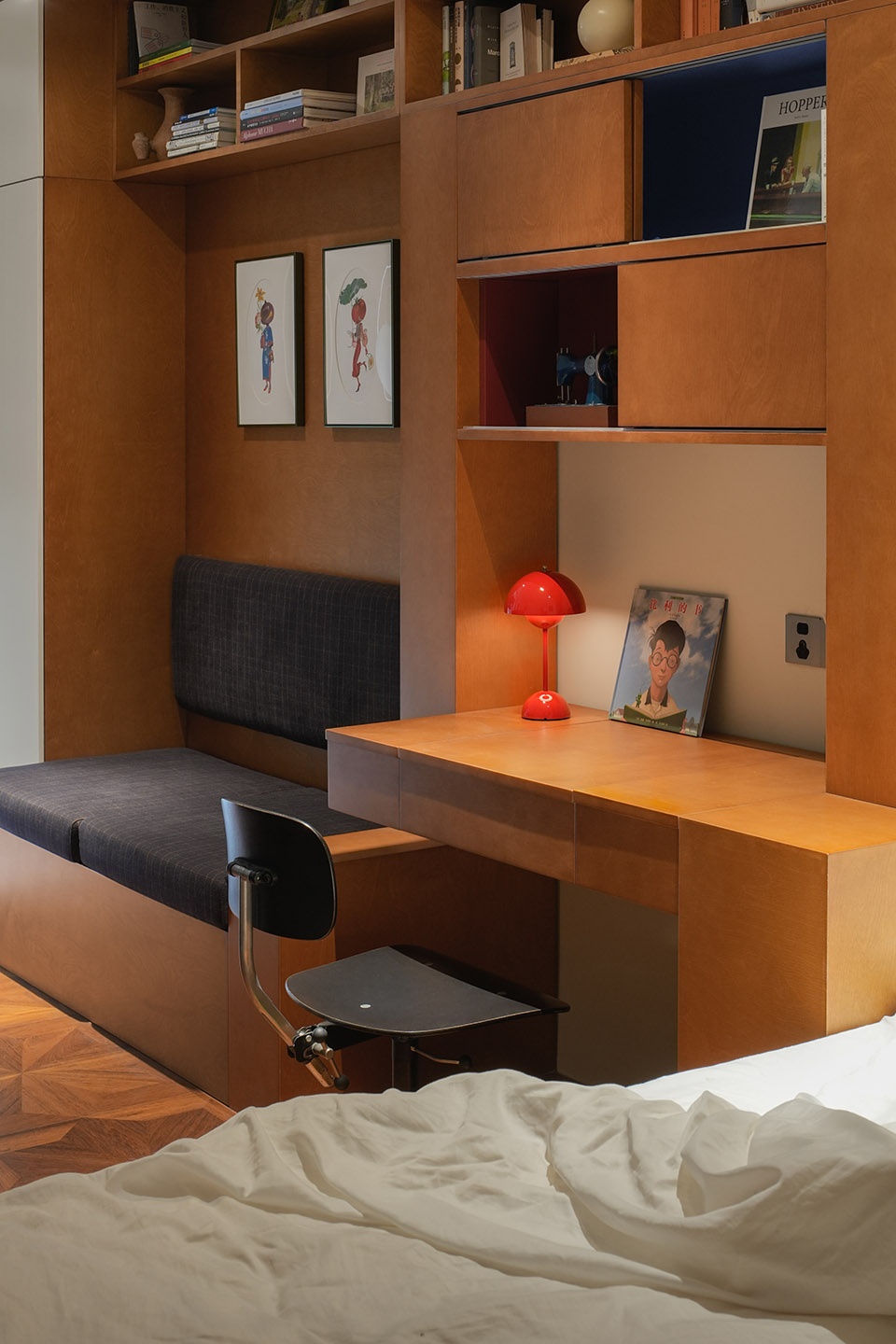
▼多种功能被整合成统一语言,Multiple functions are integrated into one language © YUUUUNSTUDIO
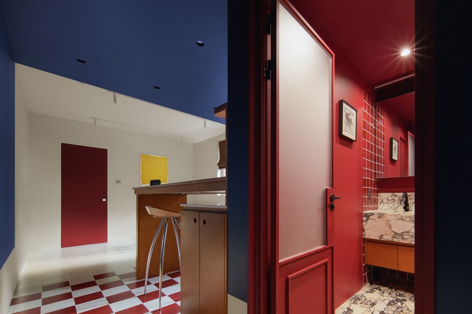
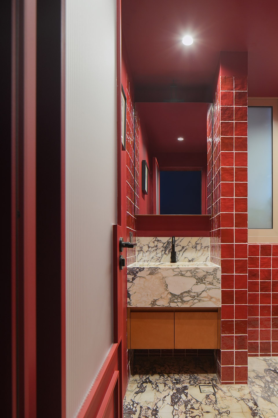
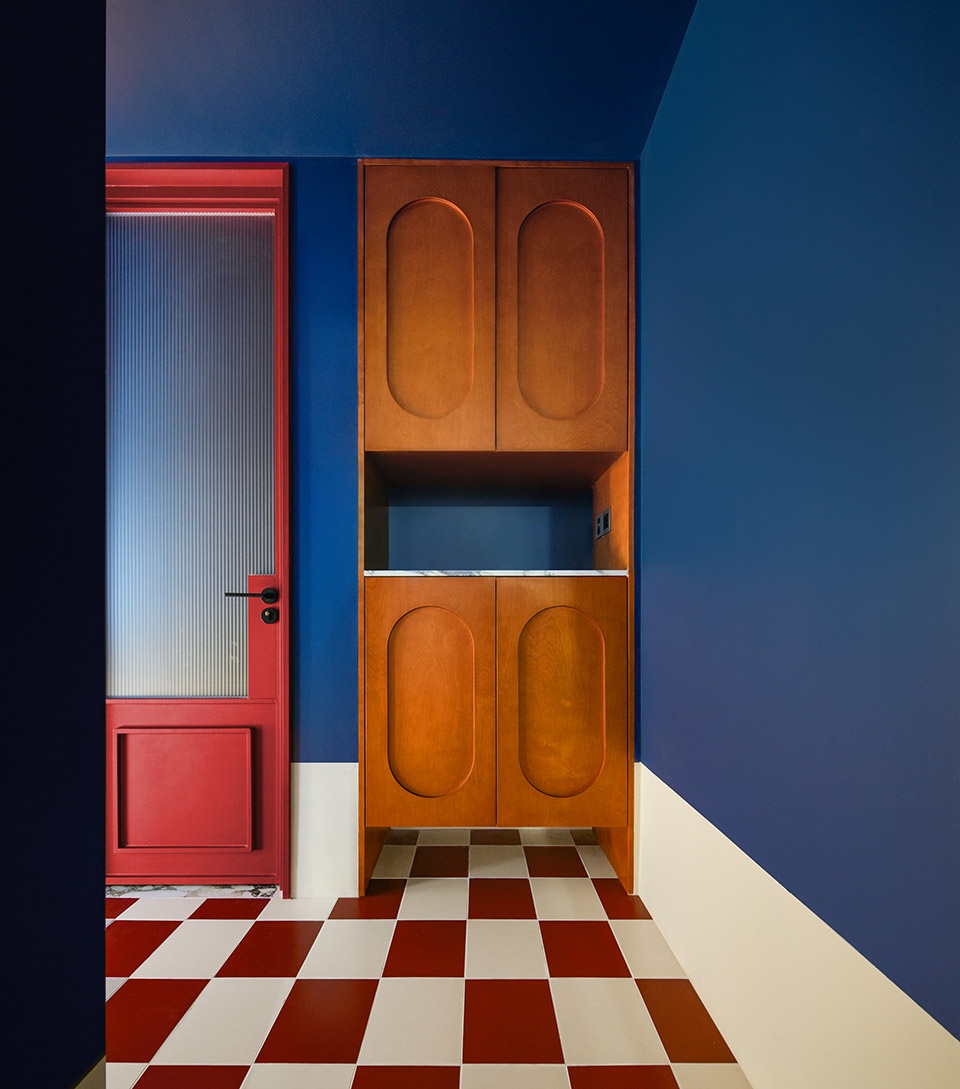
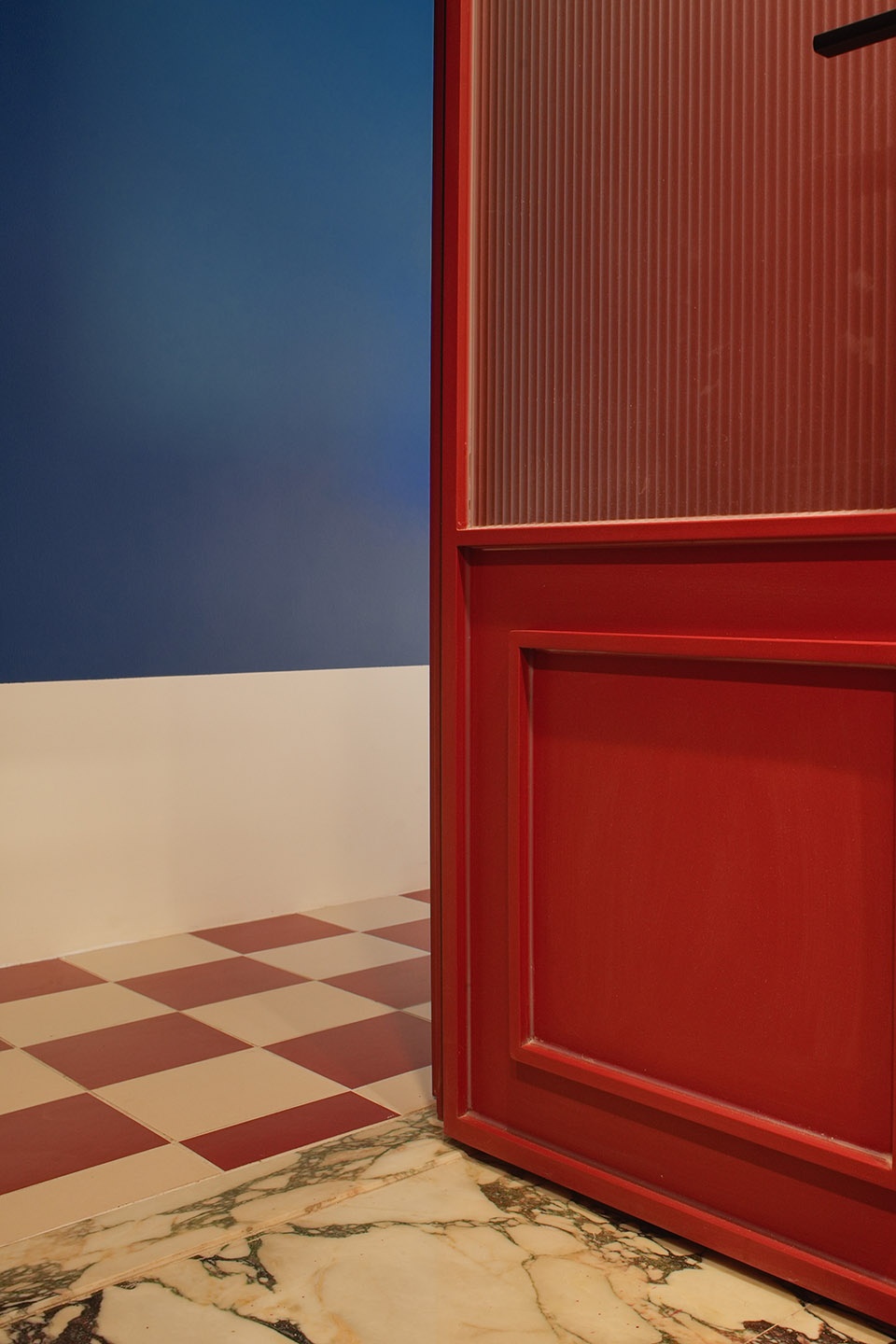
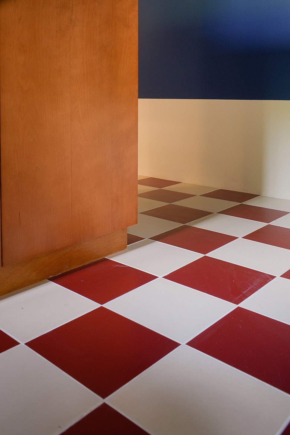
考虑到原有的布局里厨房和卫生间被分割成各自独立的小空间不利于采光,因此在重新布局之后开放了原有的厨房区域的隔墙并重新规划了卫生间的区域。卫生间则被统一规划成红色的区域,红色的手工釉面砖配以红色的涂料和定制的红色铁门。在有限的空间中体验一种情绪的转换。厨房将原有的L型布局重新规划成U型布局并在此结合高吧台容纳了开放式厨房和可以容纳4人的就餐区域,节省空间的同时为厨房营造了仪式感的就餐氛围。厨房通过吊顶贯穿至墙面颜色分割构成几何体量赋予更多的趣味性。
To enhance natural light flow, the kitchen and bathroom, which were previously separated into small, isolated spaces, underwent redesigning. The result is a more open kitchen area with a U-shaped layout, including a high bar counter for an inviting dining space accommodating four people. The suspended ceiling adds an element of interest by visually dividing the kitchen from the wall.
▼客厅与厨房视角,The color that runs through the theme is sprinkled with details © YUUUUNSTUDIO
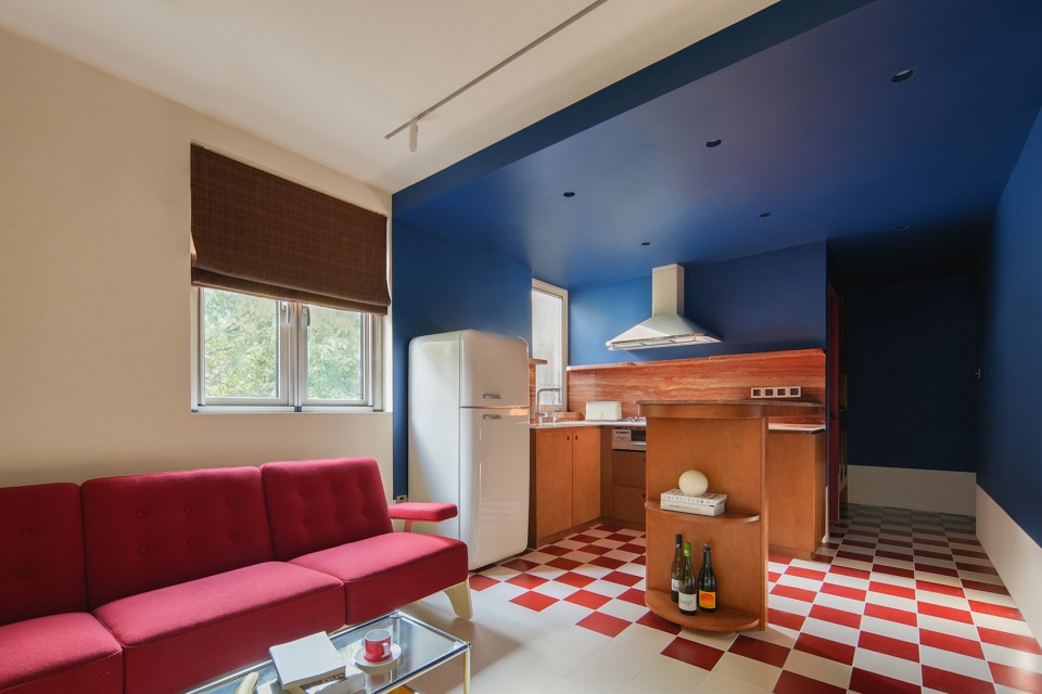
▼客厅视角,The red sofa echoes the space © YUUUUNSTUDIO
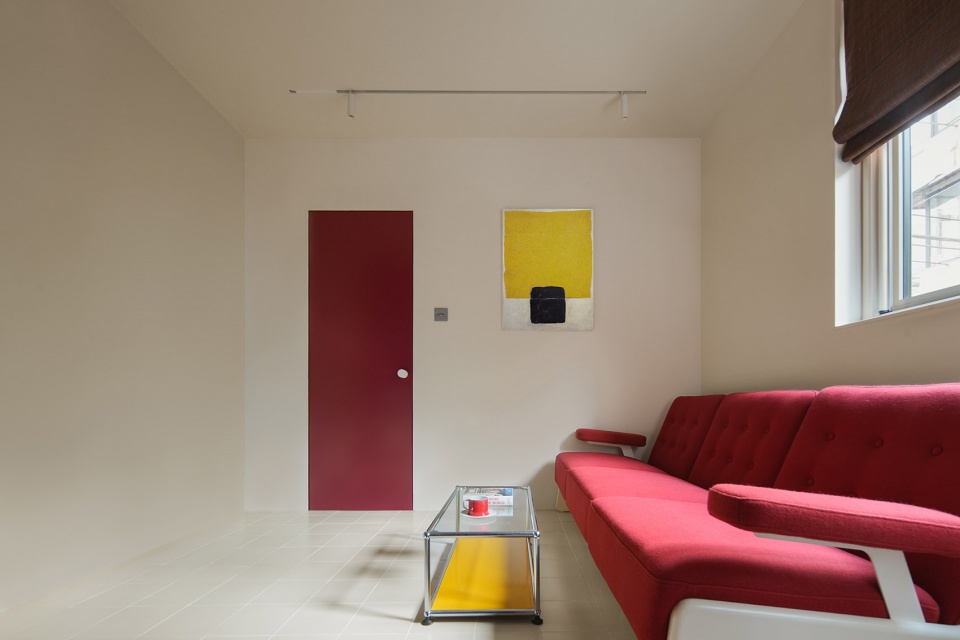
▼”红“与”蓝“的空间构成,The spatial composition of red and blue © YUUUUNSTUDIO
▼卫生间与客厅视角,The colors echo in the space © YUUUUNSTUDIO
▼卫生间视角,Dramatic red bathroom © YUUUUNSTUDIO
▼入户收纳柜,Entry storage cabinet © YUUUUNSTUDIO
▼卫生间材质衔接,Connection of materials © YUUUUNSTUDIO
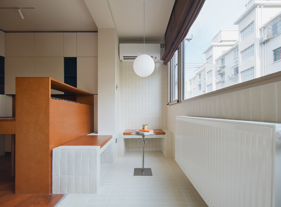
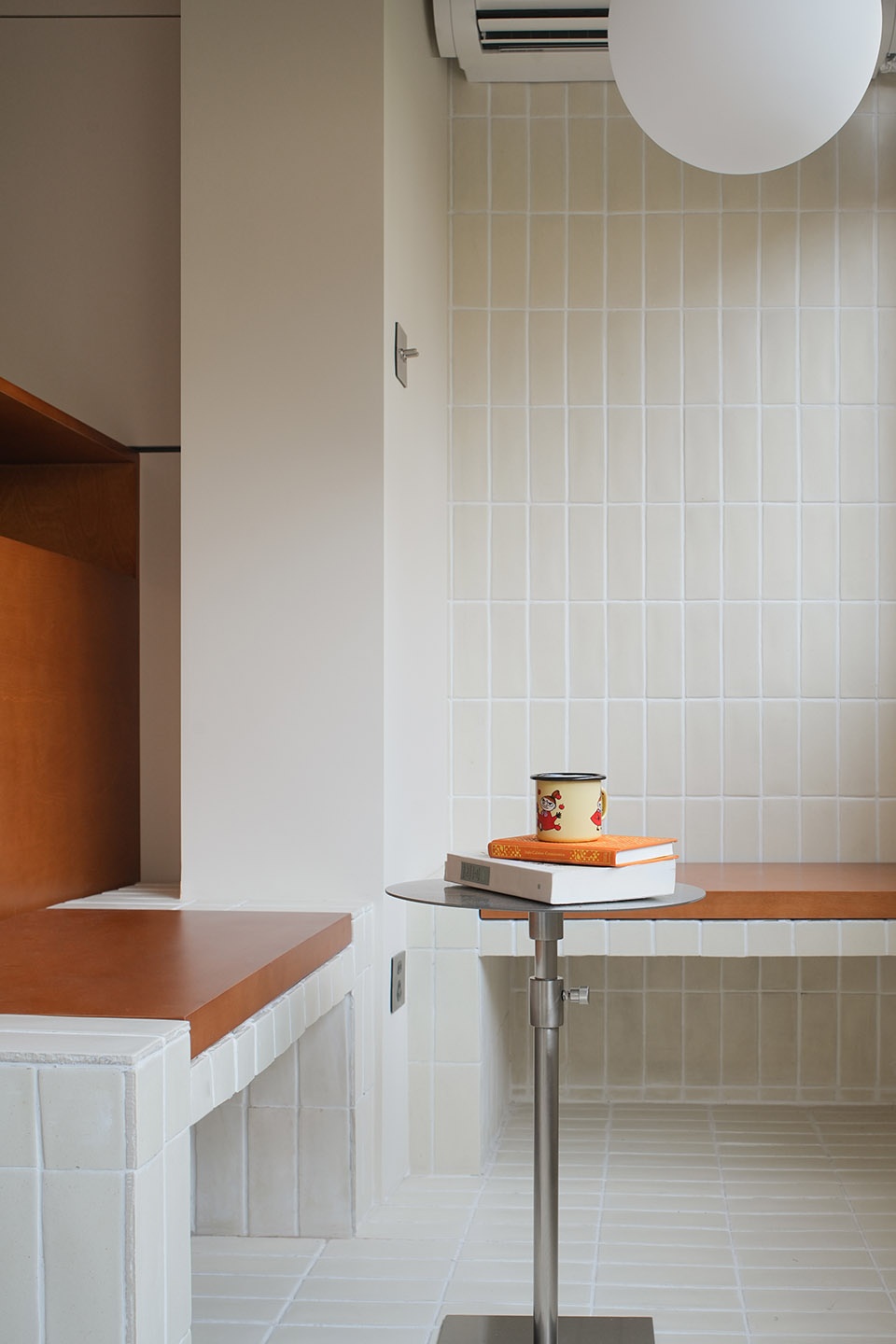
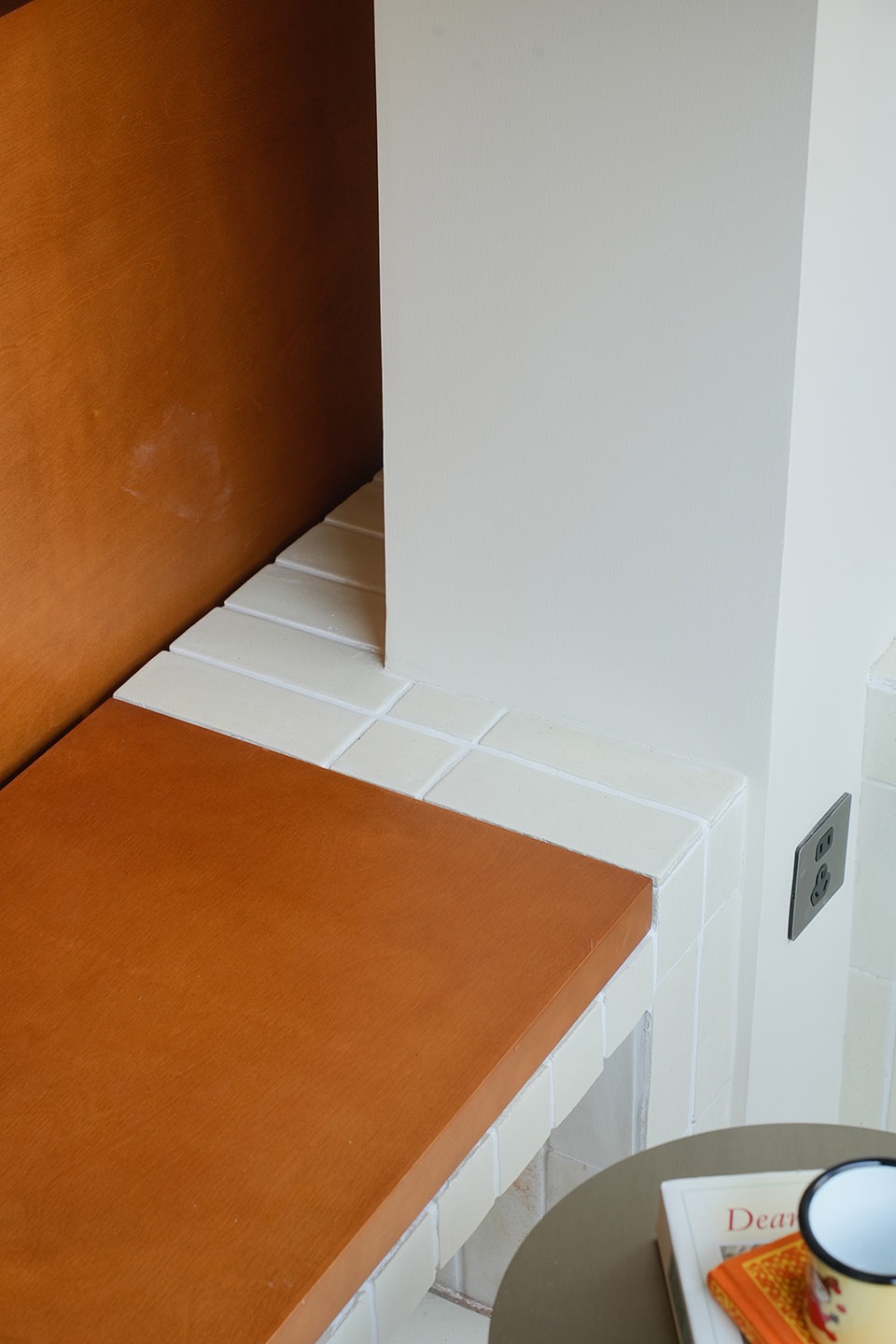
阳台的区域转角的座椅设计配以灵活的茶几可以让主人招待友人在阳台小聚。为阳台提供了轻松惬意的氛围。
On the balcony, the seat designs and flexible coffee tables provide a cozy atmosphere, perfect for entertaining friends and enjoying leisurely moments.
▼阳台局部细节,Details of the balcony © YUUUUNSTUDIO
▼平面图,Plan © Nul-architects
设计周期:2个月
施工周期:6个月
总体造价:32万(含软装)
使用材料:佐敦乳胶漆,宝格丽大理石,红色手工釉面砖,海洋板,红洞石。稻草砖。全屋定制烤漆板。


