
番茄口袋作为国内定义少女杂货新零售行业的一匹黑马,从创业初开始,在北京已经有合生汇,大悦城几家店,整体销售数据也是几大商场的领先者。接到这个任务的初期,我们首先放下了商业的形态,而去更加深入的讨论番茄要什么?于是我们与非常优秀的番茄团队共同提炼出了设计任务,就是番茄的客户 、产品、 空间。
As a dark horse that defines the new retail industry for girls, Qpokee has a few stores in Heshenghui, Joy City in Beijing, and the overall sales data is also well ahead in several major shopping malls. After receiving this design task, we put aside business forms first, but to discuss in depth what does Qpokee need? So we worked with the excellent Qpokee team to refine our design task, which is, Qpokee’s customers, products, space
▼空间概览,overall view of the space ©吴清山
01
客户
The Customers
番茄把品牌的客户定义在16-26岁的少女,有自己的梦想,愿意为悦己而买单。这部分人正是新消费的趋势以及主力客群。CUN尝试用一种风格来吸引及锁定客户群体,而且这种风格最好是经典而反流行的。最终我们选择了“工业风”其中有两个原因,一个是自由风格的延续,另外一个就是三里屯店铺的建筑基本条件。
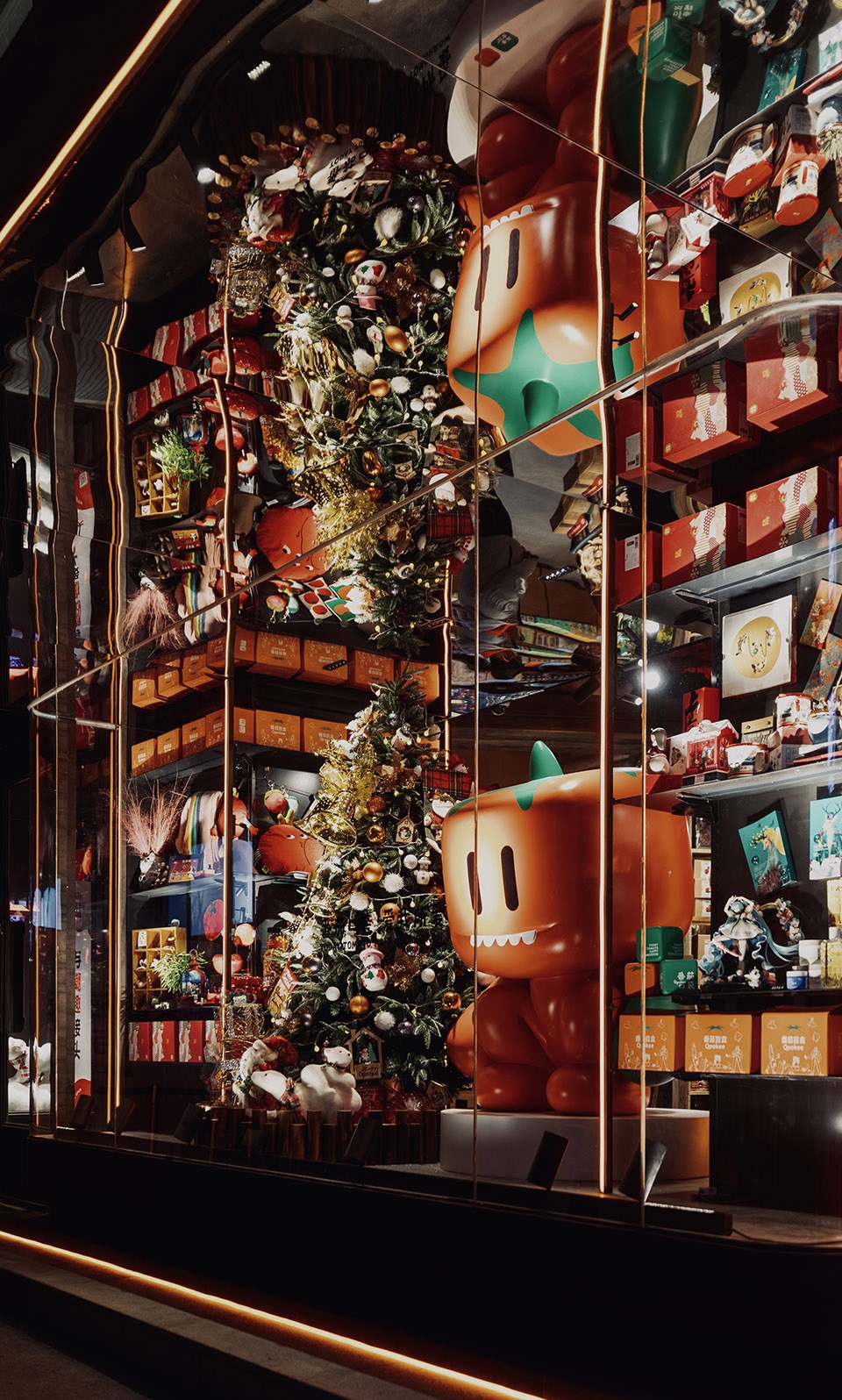
Qpokee defines the age of target customers between 16~26 years old girls, who have their own dreams and are willing to pay for themselves. This group of people is exactly the new consumption trend and the main customer base. CUN tried to use a style to attract and target shoppers, and this style would be better to be classic and anti-popular. In the end, we chose the “industrial style” for two reasons, one is the continuation of free style, and the other is the basic building conditions of this Sanlitun store.
▼吸引客群的装置,installations to attract the target customers ©双双
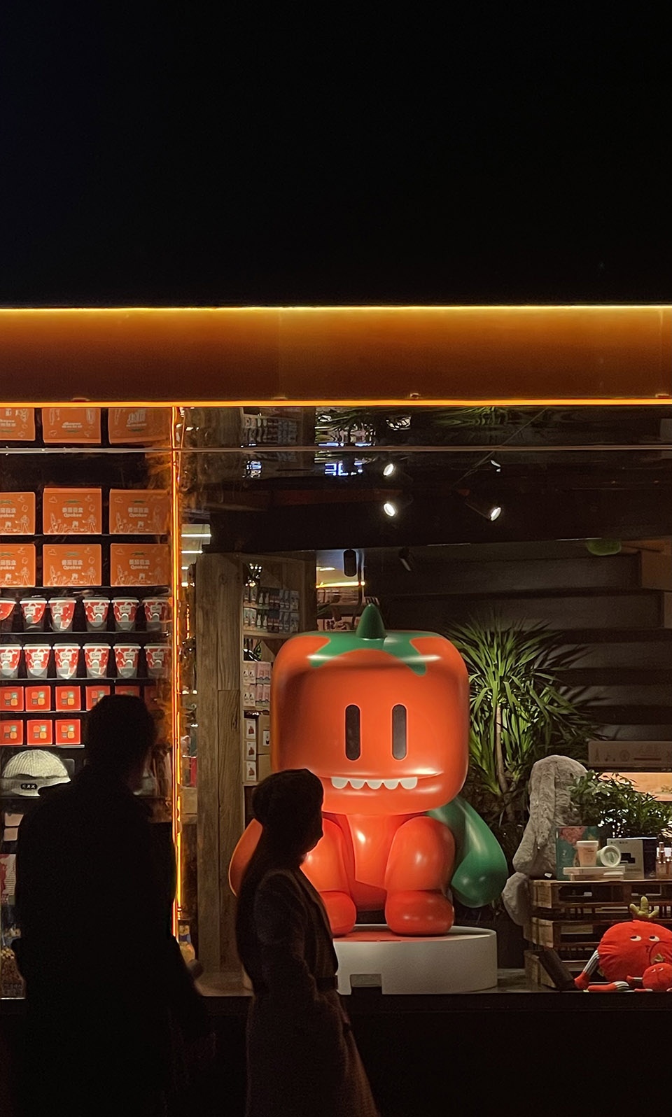
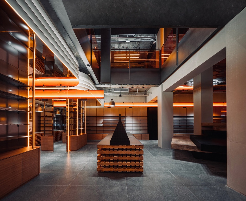
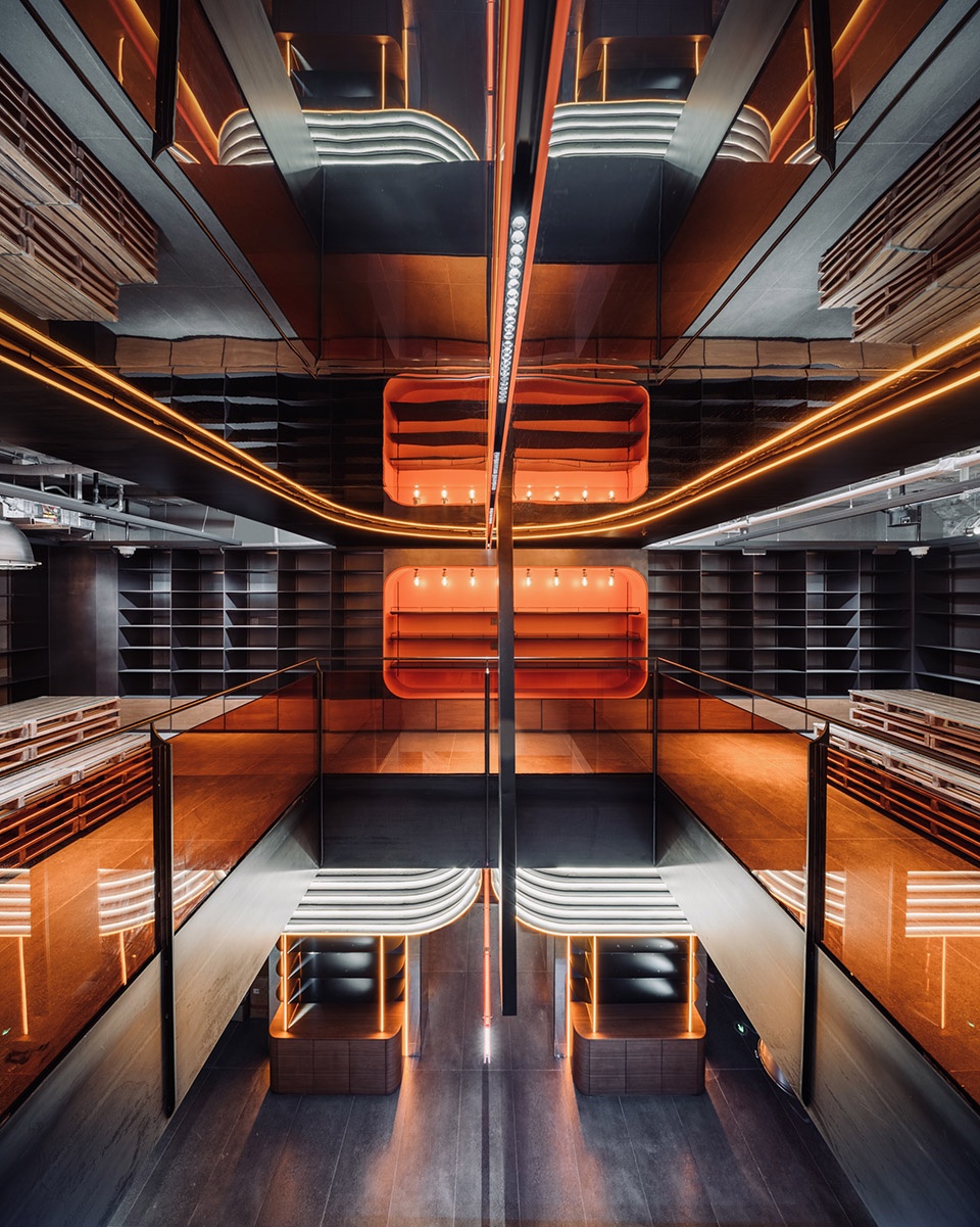
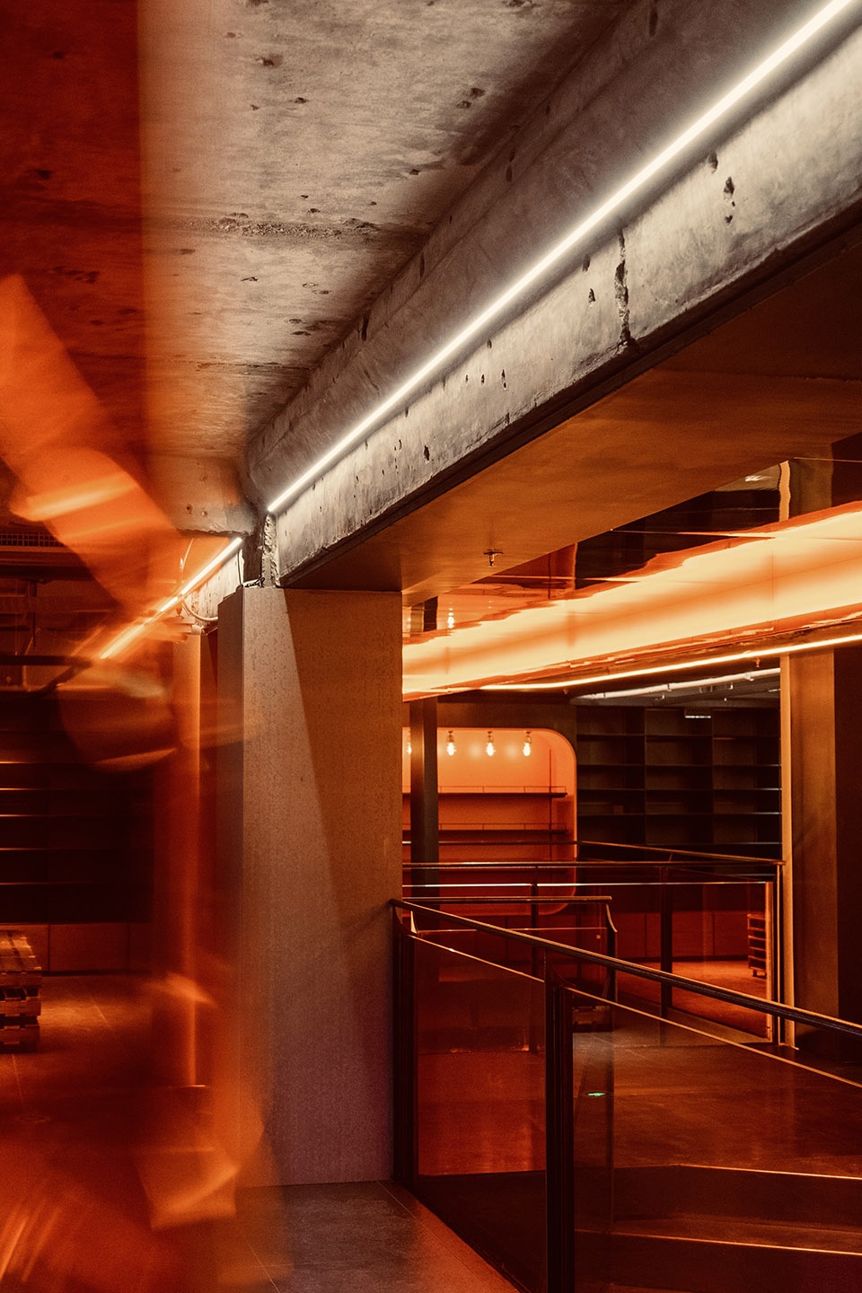
接下来我们把风格当做化妆的粉底,在确定大风格的基础上进行多因素的附加。因为通过对客户人群的调研,年轻的消费群体对喜好的诉求变的更加多元化,与此同时,他们也能更立体的审美复合因素所组成的空间模块。因此我们把潮玩、IP色、小番番、工业化、金属感、结构系,有机的组合在一起,行成了番茄所独有的“暖工业”风格。
Next, we took the style as a foundation for makeup, and added multi-factors on the basis of confirming the whole style. Through our research on customer groups, young consumer groups have become more diversified in their preferences. At the same time, they can also view the space modules composed of composite factors from all aspects. Therefore, we organically combined the art toy, IP color, Qpokee series, industrialization, metallic sense, and structure into the unique “warm industry” style of Qpokee.
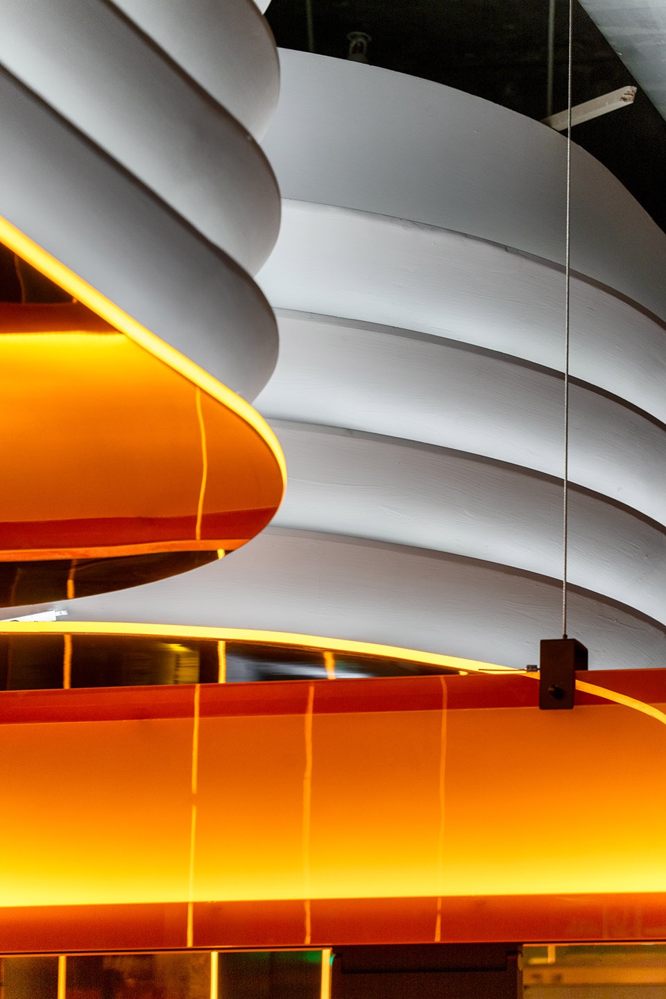
▼“暖工业”风格
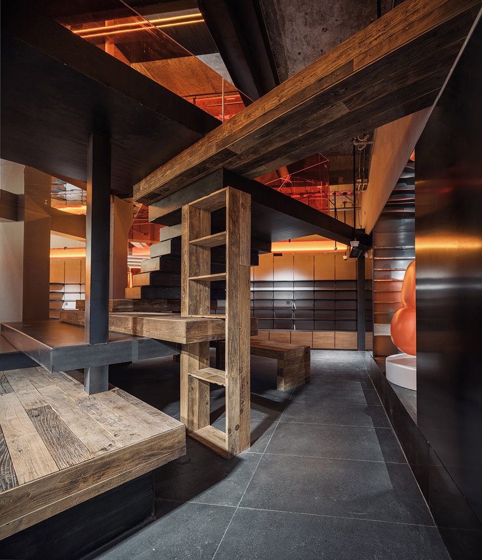
“warm industry” style ©吴清山
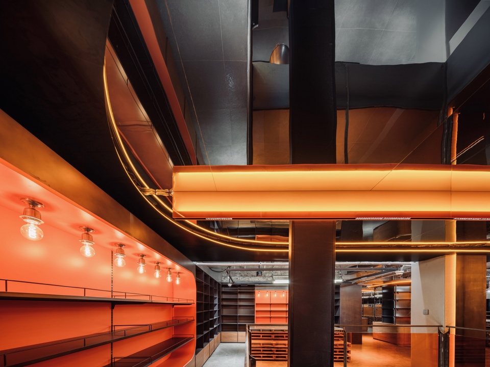
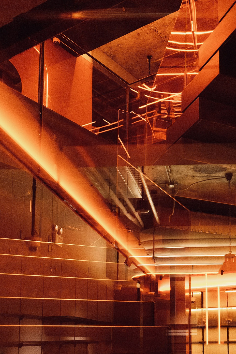
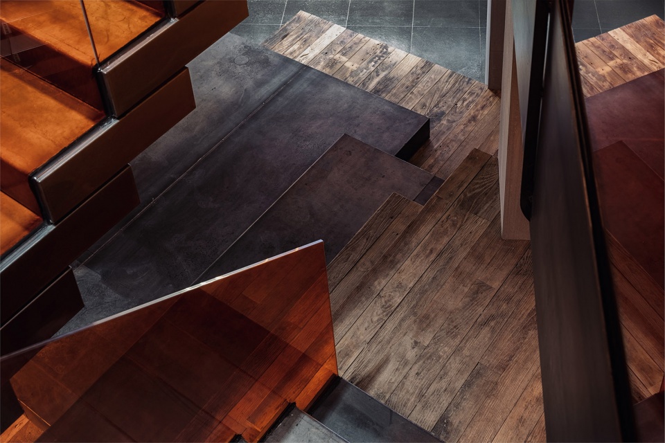
▼暖色的结构和材料细部,closer view to the structure and materials in warm color ©上:吴清山,下:双双
02
产品
The Products
产品:是最重要的部分,因为我们通过数据能够非常准确的发现,品牌已经在运营的店铺成功有大比例的成绩,是来自产品的组配选品和陈列的。在优秀的成绩上做提升,这也是一个非常大的考验。
This is the most important part, because we can accurately find through data that a large percentage of store successes depend on the selection and display of products. It is also a very big test to find improvement on an excellent result.
▼一层展示空间,display area on the first floor ©吴清山
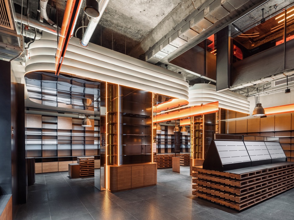
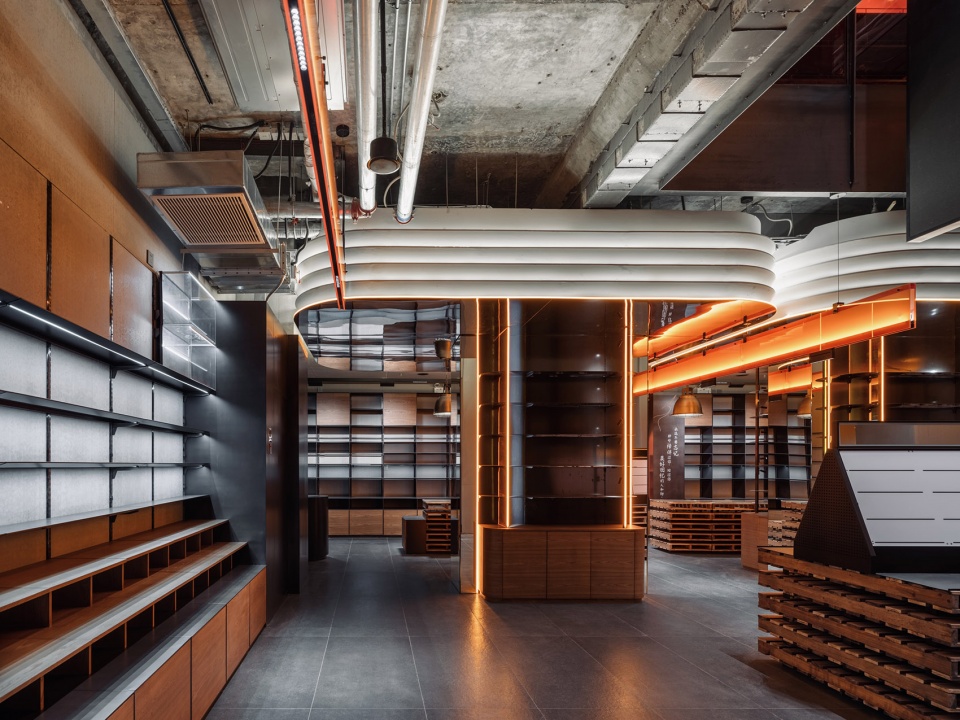
我们通过三个方法来完成这个问题。第一,我们花了大量的时间与番茄的整体团队,特别是店面经理与销售讨论平面布局、通过产品分区布局、动线产品力布局、竖向展示力布局、色彩展示性布局,完成产品布局的立体化设计。第二,我们团队关注所有网络媒体客户端对现有店铺的反馈情况来营造产品视觉化的增强与调整。第三,CUN团队驻现场观察店铺的运营情况,我们一直相信一句话“只有站在水中,才能知道浪的方向”。我们把现场的问题转化成设计目的达以解决。
We adopted three methods to complete this goal. Firstly, we spent a lot of time with the whole Qpokee team, especially the store manager and sales to discuss the layout, finally we completed the three-dimensional layout design through product partition layout, dynamic product layout, vertical display layout, and color display layout. Secondly, our team paid attention to the online clients’ feedback to the existing stores to enhance and adjust product visualization. Thirdly, CUN team stayed on site to observe the stores operation. We have always believed in the saying “You can only know the direction of waves by standing in the water.” We turned the problems on site into design goals to solve them!
▼分解轴测图,exploded axonometric ©CUN Design
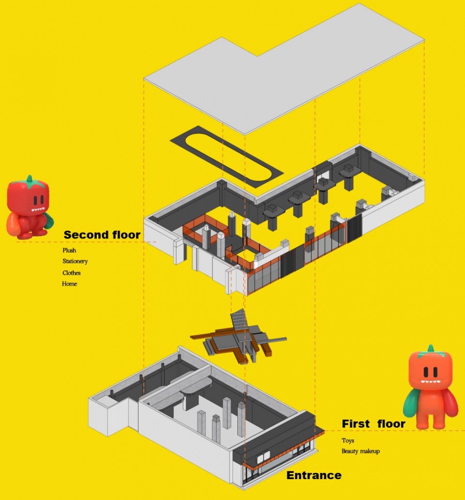
于是结果是更科学而有效的动线,是以双人1200mm为基础尺度扩展形成,这样能更好的节约面积,产品以售卖动线为顺序按照比例与售卖价格做逻辑性的科学布局,视觉用黑色的钢板把复杂产品的色彩做统筹,再用主角型照明系统把产品提升出来,做产品层次呈现。当这些做完,设计为产品又一次完成了增效。
In the end, a more scientific and effective movement line is extended based on 1200mm in width for 2 people, which can better save spaces. The products are arranged in a logical and scientific layout according to the sales movement lines, their proportions and selling prices. The black steel plate integrates the colors of various products, and then the lighting system highlights and presents products on different levels. After all these done, we improved the efficiency for the products again.
▼一层展示架
display shelves on the first floor ©吴清山
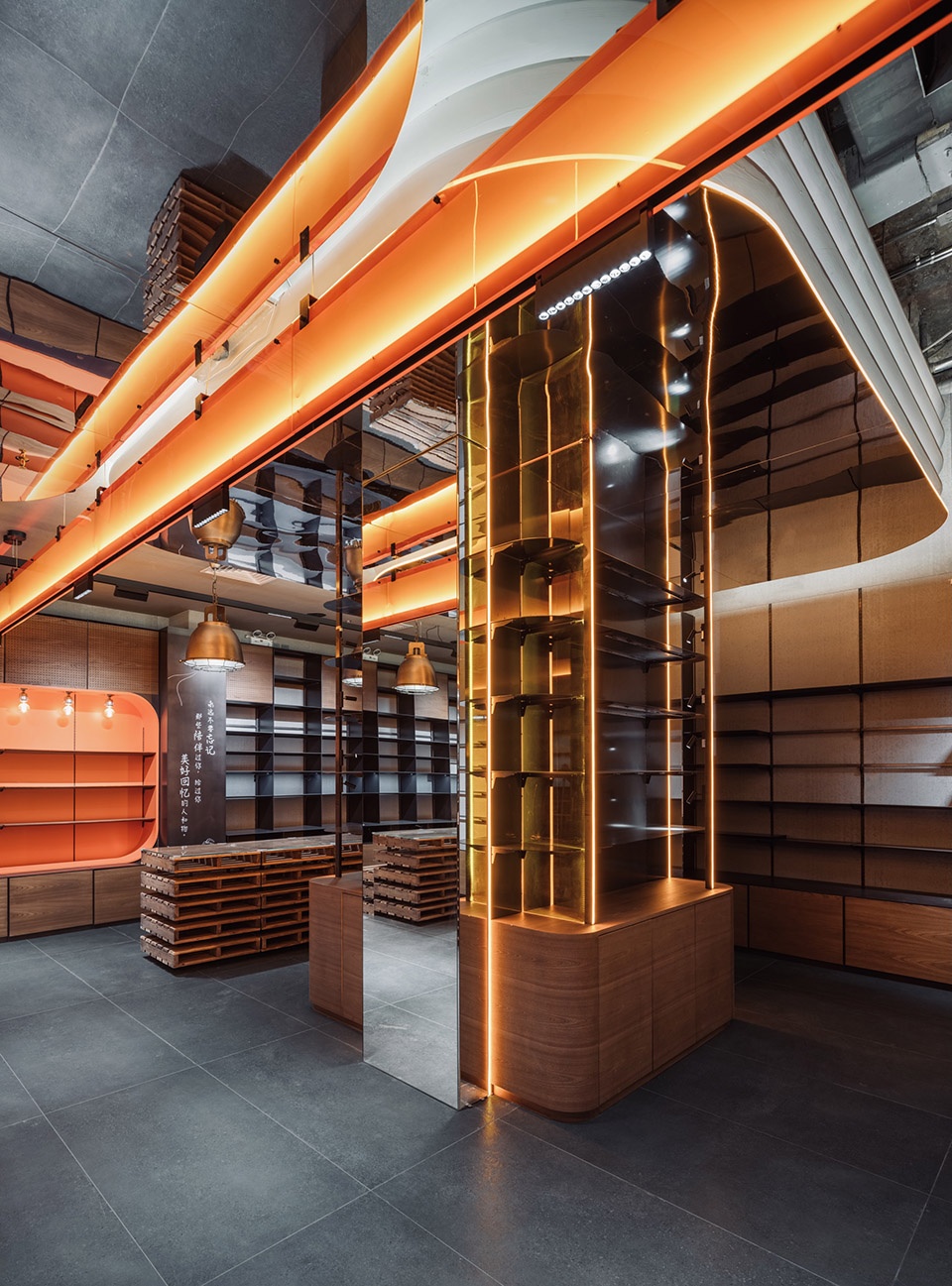

▼黑色钢板细部
details of the black steel panels ©双双
▼二层展廊
display corridor on the second floor ©吴清山
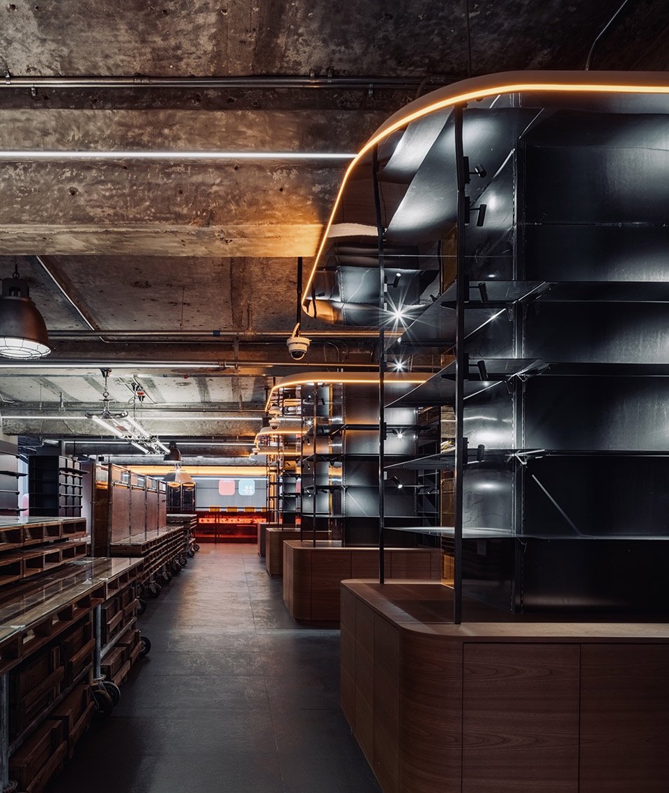
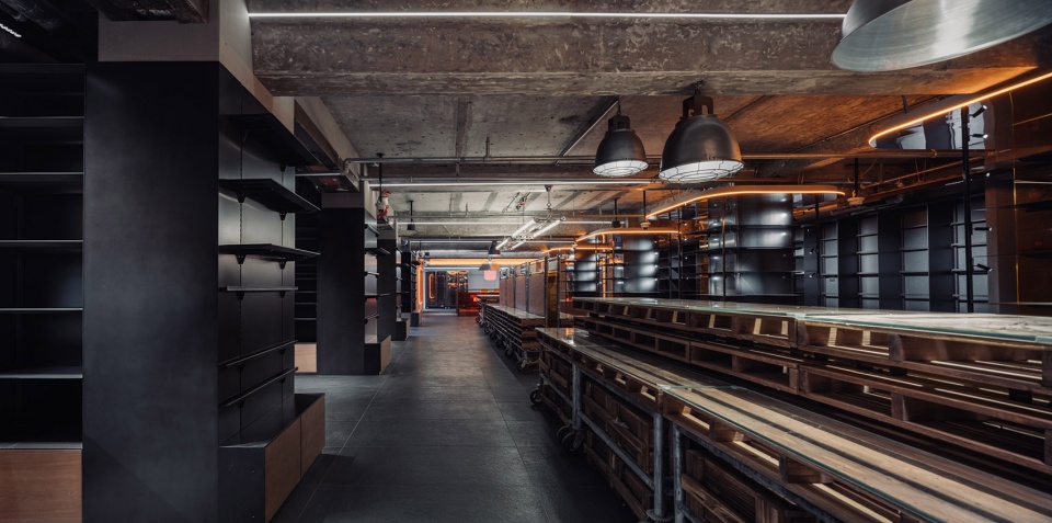
▼用颜色区分出展示区,display area highlighted by colors ©吴清山
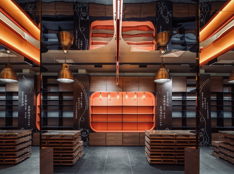
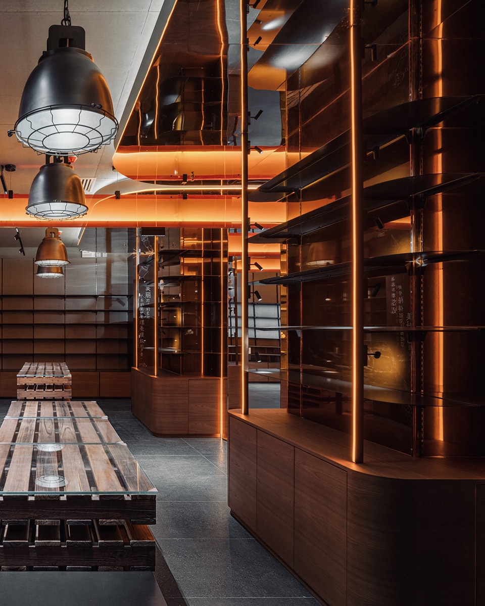
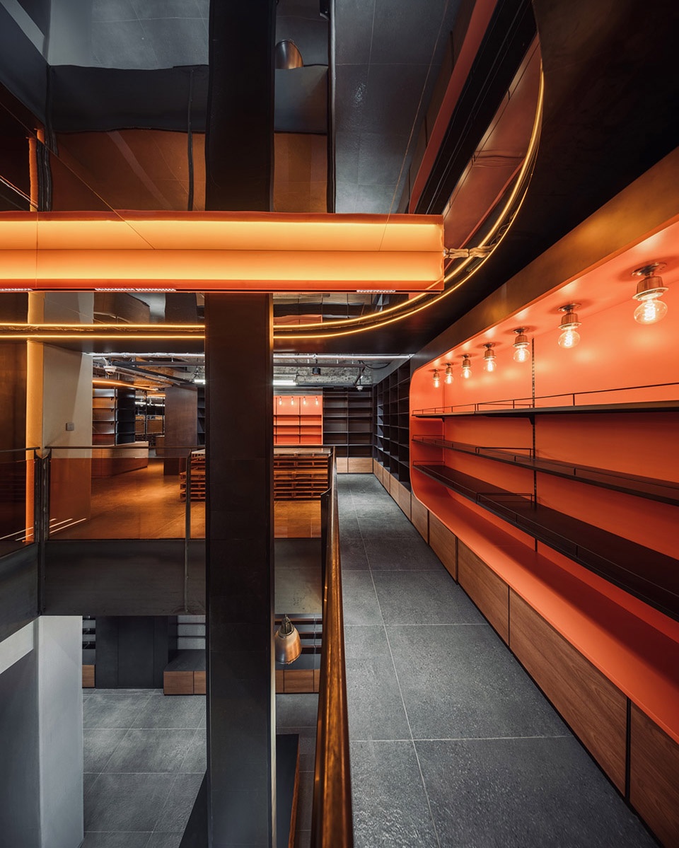
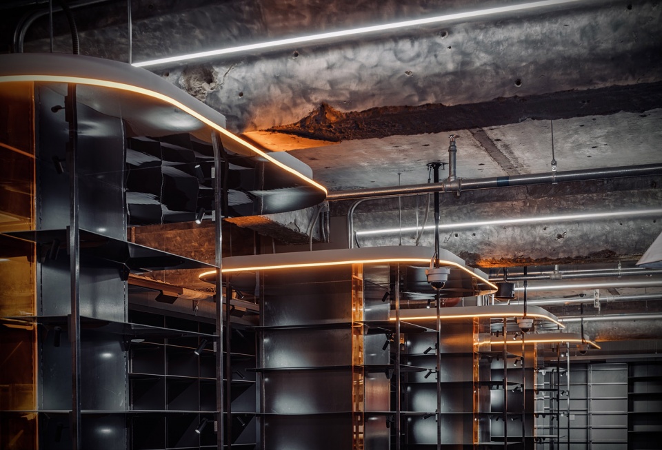
▼黑色钢板与粗糙的天花及横梁,black steel panels contrast with the rough ceiling and beams ©吴清山
03
空间
The Space
空间:这家店铺的位置在三里屯的中街,这条贯通太古里南北区的小街,在城市更新的过程中不断的被重新定义,它有着核心商业得天独厚的区位优势,同时它也存在着自身的短板:店铺500平米,一层却只有100平米的小面积,层高比较低,地处通过区域驻留客流不多等等。我们在这一部分通过整体运用企业的番茄色,在门头用最大面积做了一个超大橱窗,让整体的番茄品牌做到增强化的提升,也增加动态人流量的,停、留、驻问题。
This store is located in the Middle street of Sanlitun. This street, which connects to the north and south districts of Taikoo Li, is continuously redefined in the process of urban renewal. The store has a unique geographical advantage for its core business, but it also has its own shortcomings: The store is 500 square meters, but the first floor has only 100 square meters, the floor height is relatively low, and the location doesn’t have many passenger flow, etc. In this part, we used the representative tomato color of Qpokee as the main color, and used the largest area to make a large display window, so that the overall Qpokee brand can be enhanced, and stopping, visiting, and staying of dynamic passenger flow is also increased.
▼入口空间,雕塑感的楼梯可供顾客停留,entrance space, sculptural staircase for customers to stay ©吴清山
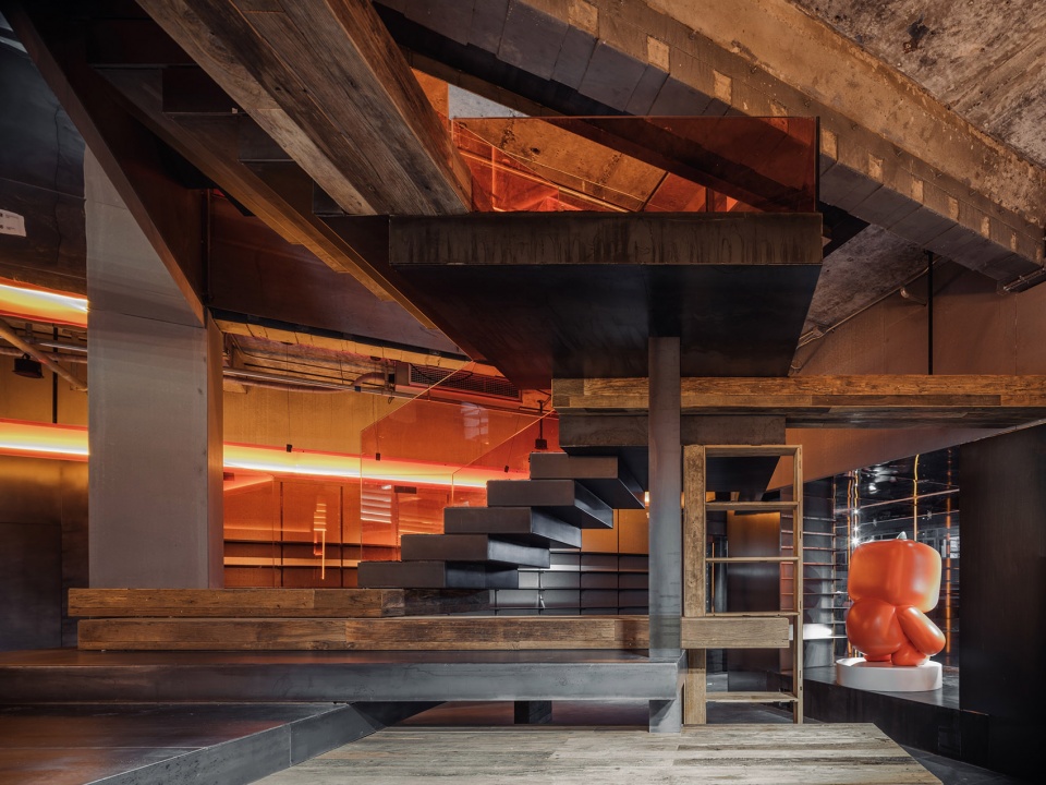
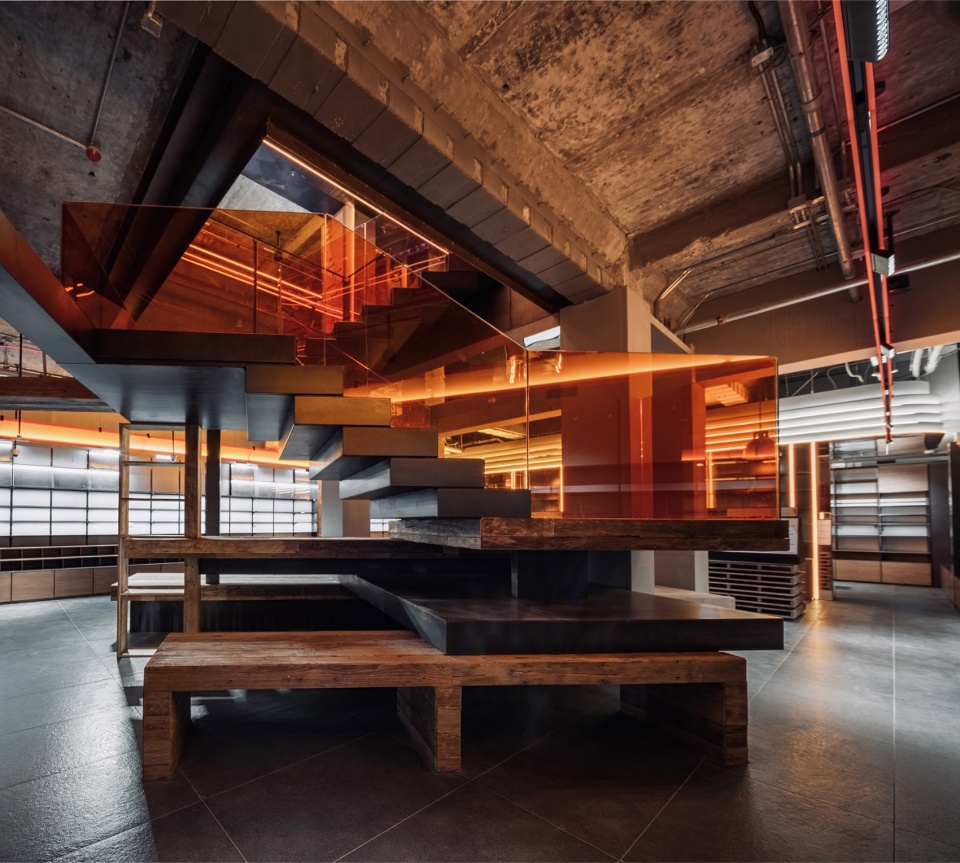
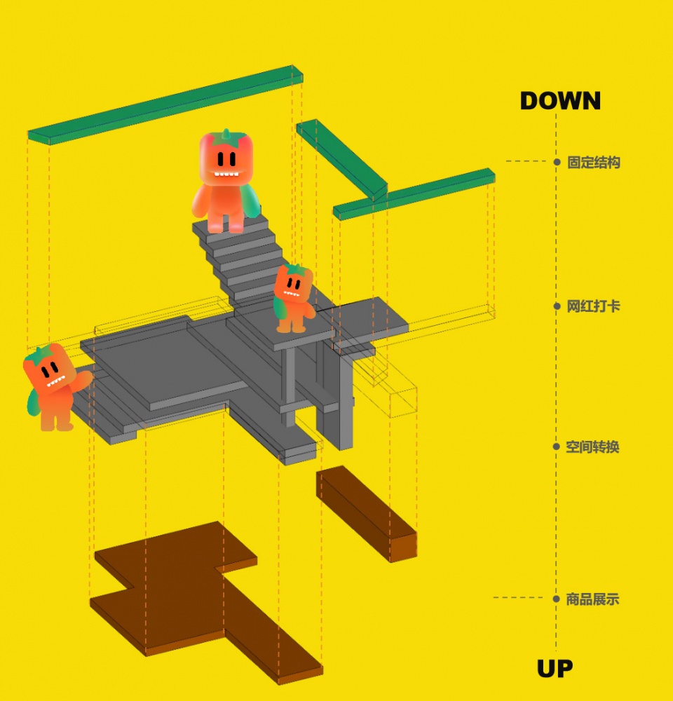
在高价值租金的空间内,我们反而改造和打开了链接一二楼的楼板,让人流能够更好的导入大面积区。然后又用一个结构型楼梯,解决展示、增强、功能、备货的重叠性。楼梯即完成了通过,又用展开面积完成了货品的展示面。整个空间由风格组成视觉,用结构辅助产品,用道具完成功能,让灯光点亮层次。
In the space with high rent, we instead renovated and designed floor stairs linking the first and second floors, so that people can be better introduced into the large area. Moreover, a structural staircase was used to solve the overlap of display, enhancement, function, and stocking. The staircase can be passed through, and it is also a display surface of products. We used the style of the entire space to form vision, the structures to assist products, props to complete functions, and lights to light up the levels.
▼楼梯分析图,staircase analysis ©CUN Design
▼楼梯近景,整合了不同功能
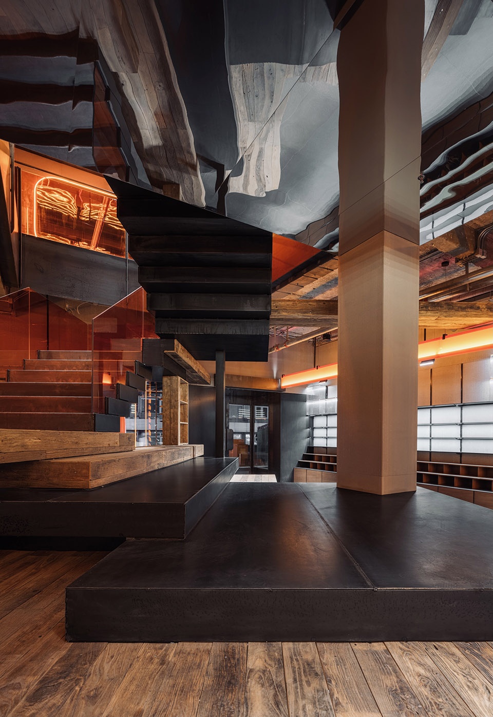
closer view to the staircase integrated various funtions ©吴清山
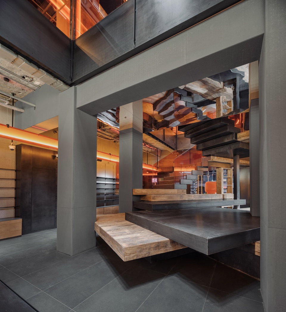
▼楼梯底部的反射钢板
reflective steel panel at the soffit ©吴清山
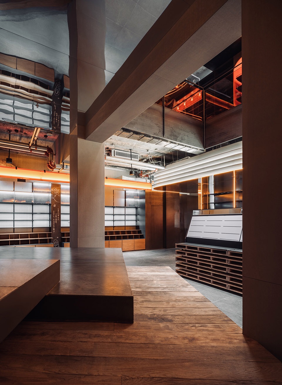
▼从楼梯看向四周的展台
view to the display shelves front he stiarcase ©吴清山
通过一个月的紧张设计和50天的施工,当小番番被点亮的那天晚上,一个小时之内我们的入店与销售数据都达到了新高。
After a month of intense design, plus 50 days of construction, At the night when Qpokee was opened, the store’s flow rate and sales data reached a historical peak within an hour.
▼从楼梯上到二层
enter the second floor through the staircase ©吴清山
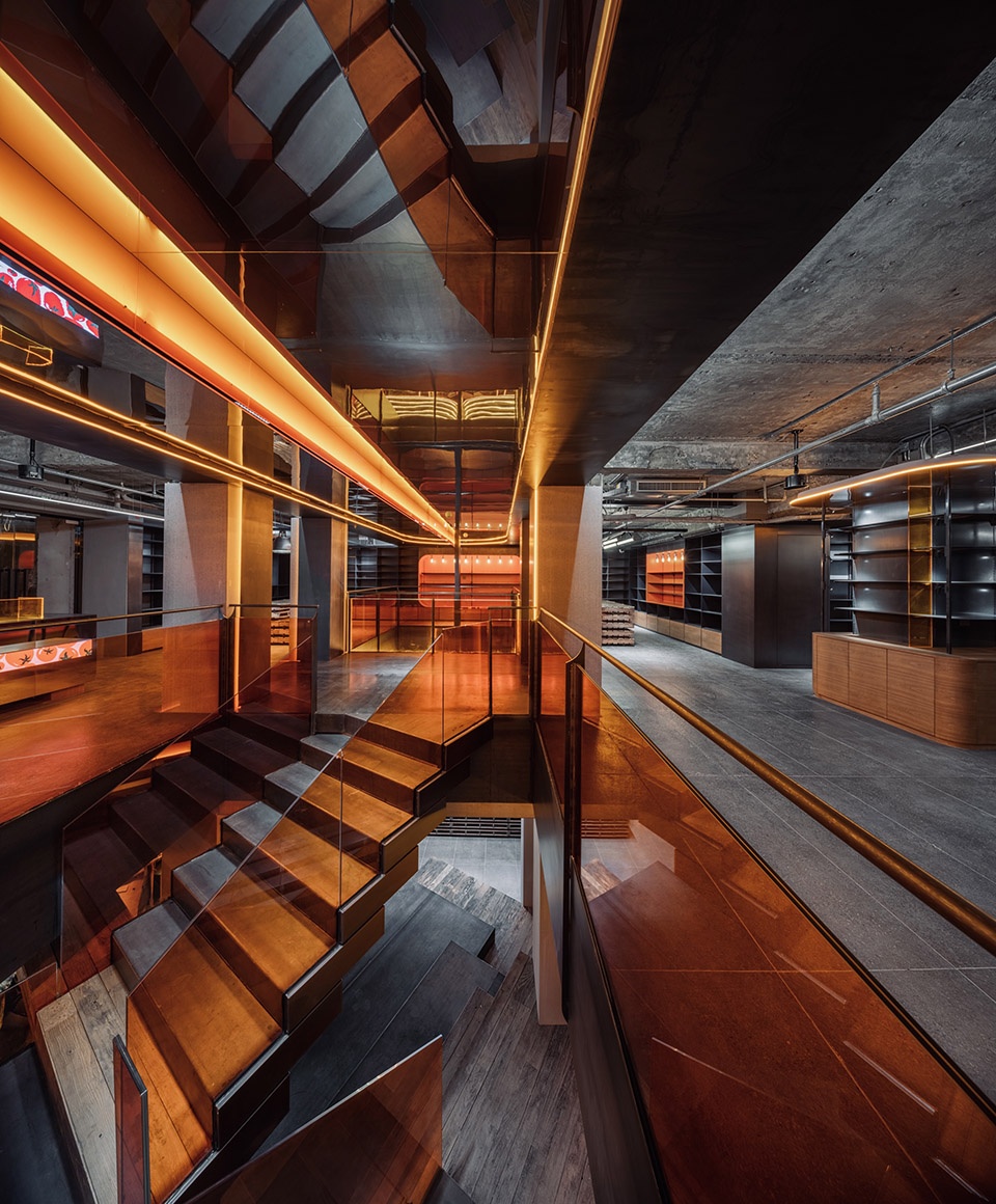
▼从二层楼板开口看向楼梯
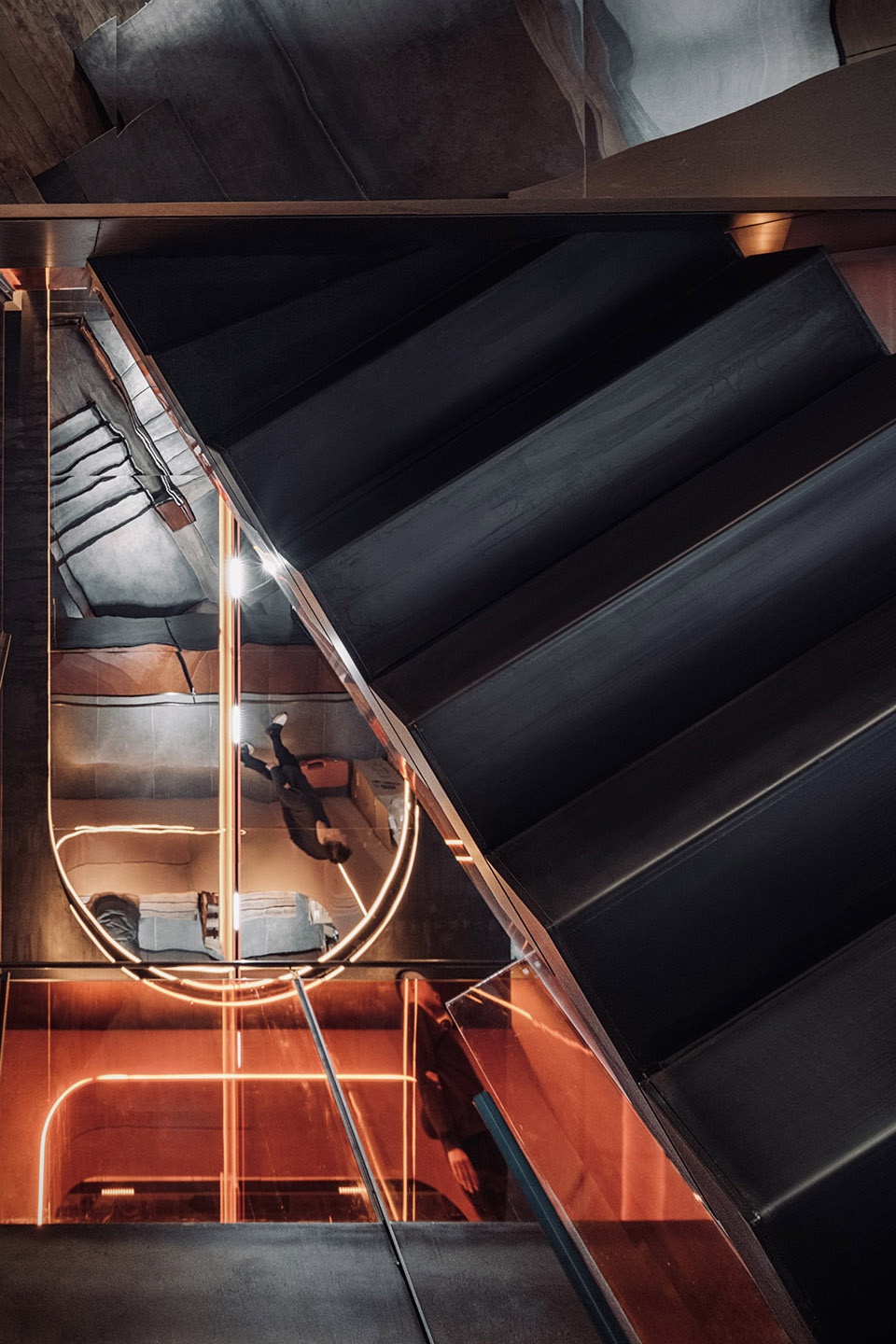
view to the staircase through the opening on the second floor ©吴清山
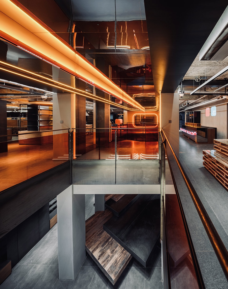
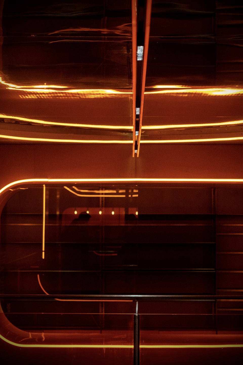
▼细部,details ©吴清山
结语
Conclusion
当下我们今天再来讨论新商业空间的时候,商业空间已经是复合和立体的了!那么空间设计也不应该再用单一思考的方法与技术来解决空间问题。这是一次CUN设计思考的总结与变化,未来我们会在更多的实践中,来呈现为商业赋能的设计力。
When we come to discuss the new commercial spaces today, they are already composite and multi-dimensional! Then space design should no longer use single thinking methods and techniques to solve spatial problems. This is a summary and change of CUN design’s thinking. In the future practices, we will show our design power for business empowerment.
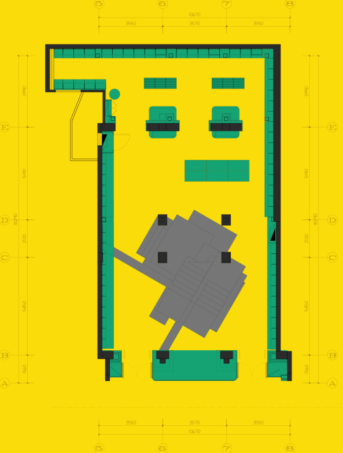
▼一层平面图,first floor plan ©CUN Design
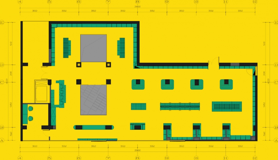
▼二层平面图,second floor plan ©CUN Design
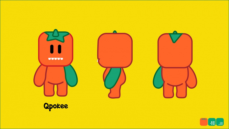
▼Qpokee设计图,design of Qpokee ©CUN Design
项目名称: 番茄口袋,三里屯旗舰店
项目地址: 北京市朝阳区三里屯北街43号同里大厦1层(三联书店斜对面)
项目面积:500㎡
首席设计师:崔树
参与设计师:侯龙洋 马川 付琳 王继周
设计师公司:CUN寸DESIGN (www.cunchina.cn)
开始时间:2021年8月
竣工时间:2021年11月
摄影师:吴清山,双双


